Spotify Marketing: Building Memorable Marketing Campaigns
Do your mornings begin with your Spotify playlist gearing your up for the day ahead? Then you are among the 406 million users across the world who turn to this streaming platform for listening to music.
A sum of little details like frame-worthy vibrant ads, witty one-liners for the ad copies, and a fun and creative approach have helped Spotify become the leading music streaming platform today.

And despite facing stiff competition from other streaming services, Spotify has always managed to stay one step ahead. Today it is making heads turn with its data-driven campaigns.
So, if you want to build a memorable brand that tackles competition effortlessly then the Spotify marketing approach is a great source of inspiration. In this blog, we’ll talk about Spotify marketing and the lessons that brands can take from it.
Spotify Marketing : The Rebranding Inspiration

Today Spotify has billboards that stop you even as you walk on the busy streets on a hectic workday. Along with this, it has crisp email newsletters that make it tempting to give the Premium option a try. But things were not the same for Spotify all along.
Until 2015, Spotify’s ads were simple, and green was the only predominant color used in most marketing materials. However, keeping up with its growing popularity and abiding by the interests of its target listeners, the millennials, Spotify underwent a major rebranding.
In short, the rebranding was to give Spotify an identity that resonated with the emotional connection the brand makes with its audience. Since then, the ads, have been created in a lively splash of colors. Just like the many emotions the listeners experience while listening to the millions of tracks on Spotify.
Here’s what you can infer from this. Aligning your ad design with your brand’s personality is one of the most powerful ways to create a strong brand image.
Kimp Tip: When you sit to brainstorm the theme for your ad design, ensure that you consider your brand identity. Because if you use the right colors based on color psychology and font styles that trigger the appropriate emotions, you can never go wrong. With this, your customers are sure to hit that CTA button.
Want to design ads that convert? Sign up for a Kimp Graphics subscription for all your print and digital ad designs to be taken care of at a flat monthly rate.
Spotify Marketing: Lessons For Every Brand
Spotify’s marketing strategy is simple and straightforward. It has a robust plan of delivering a fully-personalized experience to every user. The moment you signup for a free account, your listening preferences are monitored. Moreover, with extended use of the app, your music recommendations keep getting better.
And Spotify incorporates insights from every user’s listening preferences. With this, it creates meaningful ads that customers easily understand.
If you look at ads and social media posts from Spotify, most talk about popular tracks that others are listening to, artists who are popular, and other snippets of information that anyone would enjoy reading.
On the whole, with its visually memorable designs and fun ad copies, Spotify manages to excite its existing listeners and bring in new listeners too.
So, if you want to replicate this idea, here are some ways to do it.
1. Tell customers what they like to hear
Most ads from Spotify prioritize the music, the artists, and customer data and not the brand. And this makes the ads from Spotify easy to connect with.
We know that there are many online music streaming services out there. So why will someone try Spotify? Spotify uses its ads to give people the answer to this question. It tells people that the tracks from their favorite artists are all there. When users know that they can listen to their favorite artists for free, they will definitely give it a shot. And that’s exactly what Spotify does with these simply artist-focused ads on Facebook.

This idea works because Facebook’s audience selection lets you target your ads to people with specific interests. So, as you scroll through your Feed, if you see an ad like the one in the above image you are sure to stop and take a second look. That’s because you see that the ad mentions your favorite artist/band and you see that it is free. There is a clear CTA button at the bottom. Won’t all this make you eager to give it a try?
That’s exactly how you want your ads to be. Spotify’s ads on Facebook mostly have their signature color-block style and the artist’s image as the visual hook. The CTA takes you to the app download page. With designs like these, you can never go wrong.
Takeaway:
When you have to choose the design for your ad and the copy, emphasize the feature or trait that will capture the targeted audience. Your product might have many features, but highlighting why customers will like this particular product will encourage them to take an action.
2. Focus on versatility
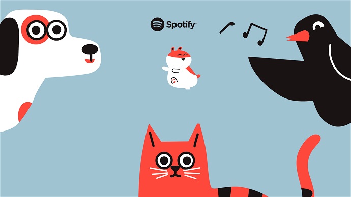
Pet playlists, kids’ profiles, and a whole lot of other features make Spotify special. It is also what makes this brand a household name these days. Building on this, Spotify talks about its multi-faceted offerings in its ads.
Any free user on Spotify who sees the benefits of choosing a premium version will be eager to try it. The user will choose premium confidently when it is made clear that this will bring good value to the whole family’s entertainment. Besides existing users, someone who is not on Spotify will be curious to try the app and explore its many benefits.
Firstly, highlighting how versatile the brand is and how much value its services bring lets Spotify march ahead in terms of its reach and subscriptions. One other thing worth noting here is the use of optimized graphics in these targeted ads. For example, custom illustrations, and softer, more playful colors, are used in ads that target the family audience and kids.
Takeaway:
One product, many benefits- that’s what a customer will find to be a cost-effective option worth their time. Use this idea when you promote your product or services. So, talk about the versatility and the many ways in which customers will benefit from the product. And show them how it simplifies their job or how it helps them save time or how it brings more value for a less price. That’s when you make an impact.
3. Show them the numbers
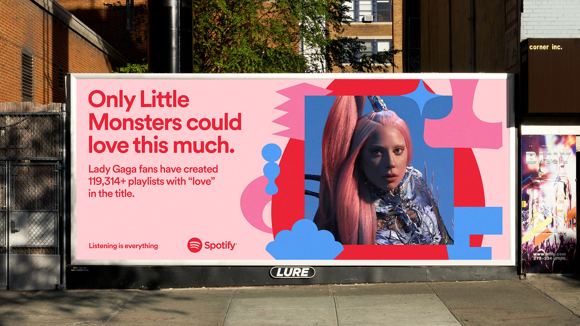
Spotify has over 82 million tracks and 3.6 million podcast titles. But you do not see these numbers on the ads. Instead, Spotify uses more relatable data. Data that amuse people and evoke a reaction.
Take the above ad for example. It has two benefits. Lady Gaga fans who are not yet on Spotify will sign up seeing that the app has their favorite artist. And those who have not listened to Lady Gaga will download the app to try what allured so many listeners. Either way, it can increase the downloads for Spotify.
Takeaway:
Statistics and actual numbers can easily capture your brand’s performance. But the key is to know what kind of data to display. Choose relevant statistics and incorporate data visualization so that your customers will actually pay attention.
Kimp Tip: Incorporating numbers and historical data makes your ads look more credible. You are building trust by displaying proof. But to make sure that too much data does not appear boring, use interactive designs like infographics. They are easy to understand and easy to share as well.
Did you know that you also get advanced infographics designs with your Kimp Graphics subscription today? Book a call with the Kimp team and find out more about this.
4. Transparency wins hearts
Spotify has a freemium model where users can access part of the features for free and listen to music with ads. The premium model comes with an ad-free music experience. The above message from Spotify conveys this message in seconds.
The color palette makes you stop and notice the ad. And the color variations establish the hierarchy in the designs. Finally, the contrast makes sure that the ad registers the message.
Takeaway:
Being honest about what you offer and communicating this in simple words is the key to leaving an impression on your audience. With a brilliant copy and clear design, you can make even annoying ads interrupting your music sound simple.
5. Make it personal
Spotify Wrapped is a trendsetter in personalization in marketing. It gives listeners a peek into their listening trends at the end of the year. Taking customers down memory lane puts an interesting perspective on the services. That’s why most Spotify users eagerly wait for their Spotify Wrapped roundup at the end of the year.
Takeaway:
Personalization is the way forward in marketing. It is not a luxury any longer. 80% of consumers prefer buying from brands that deliver a tailored experience. So, from your emails to ads and social media posts, when you try to personalize the content for the audience it is intended for, you can expect better conversions.
6. Keep it conversational
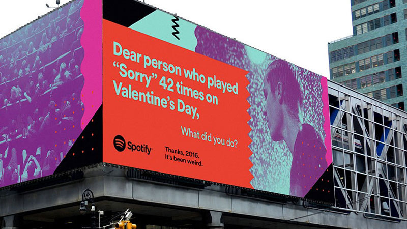
Spotify made headlines for placing a series of ads like the one in the above image. These are the kind of ads that inspire both the audience and marketers. They are the ones that are likely to get people talking.
Ads like these directly address people and not just a random group of customers. And that’s why they work.
To make such quirky concepts work, draw attention to the ad with interesting visuals and bold colors. That will create the visual hook to attract customers and make them pay attention to the creative copy you have curated.
Takeaway:
When you have promotional content, your customers see it, process it, and scroll past it. But when your content is conversational, they will be tempted to respond. Use a friendly tone and choose the right words that will initiate a conversation.
7. Focus on the people

Spotify’s Instagram page is the perfect example of how to put people before products and your brand in general. Without focusing on the brand, Spotify’s Instagram page features artists whose tracks are on the app. It even talks about lyricists and less-known names behind popular tracks.
It does not just help these artists gain more popularity but also nurtures better social media engagements for Spotify.
Takeaway:
Your target audience, potential business partners, and investors are all judging your brand continuously based on your ads and social media pages. What you portray and who you talk about tell a lot about your brand. People are drawn to brands that treat their employees well, focus on their customers and appreciate and acknowledge the people behind the progress made.
8. Listen to your customers
Spotify actively uses its Instagram Story to get into conversations with its listeners. It asks questions, responds to them, and also acknowledges the responses from its followers. Knowing that the brand actually acknowledges your response will motivate you to respond to a question the brand asks.


Takeaway:
If you wish to strengthen your customer relationships, try building strong communication through social media. Ask questions, gather feedback, and let customers know that their opinion counts. Interactive profiles on social media are the ones that continue to expand.
Kimp Tip: Notice how Spotify uses a wide range of colors for its designs. But the contrasting palettes it picks are easily recognizable. If you wish to add such visual consistency to your design, use design templates for your Instagram Story and other social media posts.
Want some brand-relevant templates designed for your brand? Get in touch with Kimp for all your graphic design needs.
9. Design share-worthy content
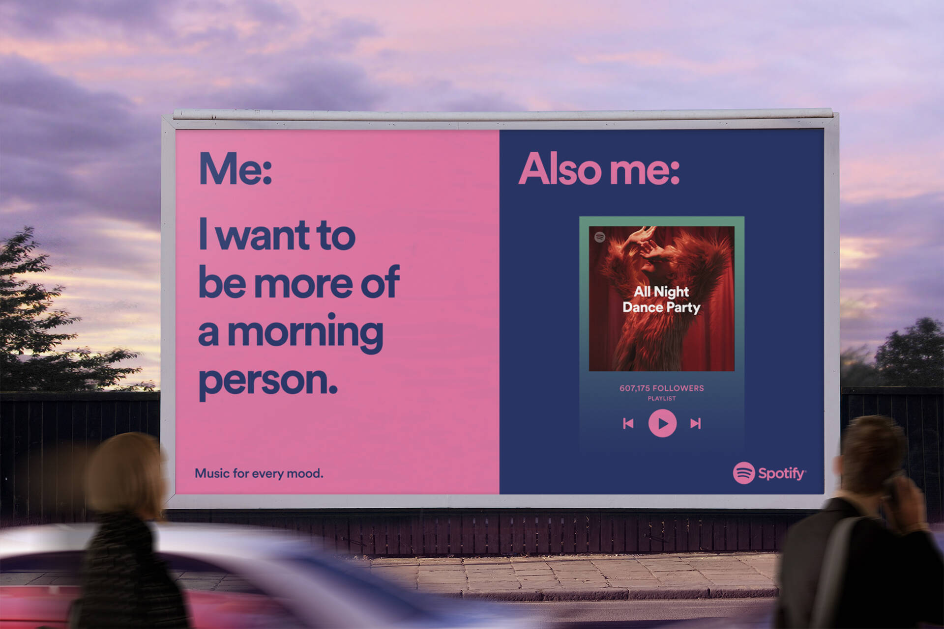
Spotify’s ads are often the kind that people of all age groups will be able to relate with. Most of the ads from Spotify bring a smile to people’s faces. Social media jargon on billboards, digital trends extended to outdoor advertisements, and a whole lot of other ideas help Spotify ads gain popularity.
Not only do these outdoor ads get noticed but also get shared a lot on social media. If your print ad becomes popular on social media, it’s like getting the benefits of multiple marketing channels at the price of one.
Posts that people can relate with, memes, and posts that get people to say “been there, done that” are the ones that get more shares. Spotify has aced the art of creating print ads that people love to talk about on social media. That’s a brilliant way to bridge all your marketing channels.
Takeaway:
Social media is all about likes, comments, and shares. To gain traction on social media, create posts that people will like to share. This is how you get to expand your reach and bring in new leads through existing customers.
10. Choose the right placement for your ads
Spotify’s ad placement is as interesting as the design and copy in these ads. Besides the peppy billboards on busy roads, the brand’s ads are mostly displayed in train stations and bus stations.
These are places where people often use their smartphones. They are probably already listening to music. So, they are more likely to download that new app they saw in an advertisement they just crossed. It is not much of an effort when the phone is already in their hands. That’s how you skyrocket conversions with the right ad placements. And this is also the reason why a fully digital service like Spotify makes use of print advertising.
Takeaway:
Know where your target customers are. The right digital channels, the right type of flyers and print ads, and accurate local advertising together help your brand grow. Do not limit yourself to digital channels. Combining digital and traditional campaigns will help generate better returns on your marketing investments.
Kimp Tip: Make sure that your print ads and digital ads have at least a few similar elements. If customers cannot recognize and connect with your ads on different platforms, it leaves your target audience in disconnected silos making your marketing efforts even more complicated.
Want to streamline all of your graphic design needs? With a Kimp Graphics subscription, your designs for outdoor advertising, digital ads, and social media are all taken care of by the same team.
Build Spotify Marketing Inspired Campaigns With Kimp
Post-and-pray does not work on social media these days. Nearly every brand that wishes to create a digital presence or communicate with the audience is out there. So, to get people to notice your brand and your posts amidst this noise, you need a strong strategy and consistent designs in your marketing visuals, like Spotify has. To make this objective a reality, an unlimited graphic design service like Kimp is just what your brand needs.
Try the perks of graphic design subscriptions by signing up for a free trial today.

