Building Your Brand Image: Apple Marketing Lessons
What started out as Apple Computer Company back in 1976 is now a brand that caters to entertainment, productivity, fitness and so much more. Brands grow. But there are not many that show the same consistency in growth as Apple.

Today Apple is the most valuable brand in the world and it has been holding this position for a long time now. But did you know that back in 1997, Apple was near bankruptcy? Its deal with Microsoft, efficient product positioning, and gutsy marketing helped Apple get back on track. And in 2018, it also became the first trillion-dollar public company in the world.
All this was possible not just because of Apple’s products but also because of the accurate brand positioning and how well the brand has managed to sculpt its brand image. It takes creative marketing, years of it, to actually create the kind of brand image that Apple has.
It is this brand image that gets people to not just buy an iPhone but buy into the ecosystem and keep coming back for more new Apple devices year after year. Brands strive for this kind of brand image that lets them expand and innovate in their field. For all these brands, here are some useful lessons from Apple marketing.
Apple Marketing Inspired Strategies for Building a Strong Brand Image

Brand image is the way your customers perceive your brand. You might feel that your brand is vibrant and positive but do your customers also look at your brand in the same light? If not, chances are your marketing strategy needs to be revamped.
Laying down a strong personality for your brand and using all of your marketing materials including ads and day-to-day posts on social media to establish this personality is one way to shape your brand image. And this takes consistency and patience along with continuous social listening to be sure that your customers are talking about your brand as intended.
Apple does all this and more with its crisp marketing strategies. That’s why we have summed up some of the marketing lessons that any brand can learn from Apple and thus work on their brand image.
1. Be clear about what you want to talk about and where
We often talk about consistency on social media. But we cannot forget that there are different kinds of users on each of these social media platforms. And people use these platforms for very different purposes. Apple thoroughly understands this and creates content that strikes the right chord with the right kind of audience.
For business-related propositions and insights, LinkedIn is the place. Apple hardly posts on LinkedIn. Instead, it makes the most of LinkedIn ads targeting businesses that might be looking for productivity solutions. The below LinkedIn ad focuses on
Instagram is about visual indulgence and Apple makes the best use of it. Exceptional photography capabilities have always been known as some of the biggest strengths of iPhones. The best way to showcase the strengths of your brand will be to show the said feature in action. So, Apple uses its Instagram page to proudly display all of the stunning pictures and videos captured on iPhones. The colorful feed will want any photography enthusiast to buy an iPhone and join the league.
Facebook is where consumers look for consumer electronic brands and details about a particular gadget they wish to purchase. This is where discussions happen about every new upcoming gadget. So, Apple cleverly makes use of Facebook to make product launch announcements, showcase a product and build anticipation and so much more.
Marketing Lesson
While it is alright to repurpose content for your social media campaigns, focus on optimized content for a better engagement rate. The tone of messaging, the visuals, and the overall mood should all be fine-tuned to blend with the environment where the ad or post will appear.
2. Strike the right emotional chord
Take a look at the below ad from Apple that won the brand an Emmy Award for The Best Commercial in the year 2014.
This ad titled “Misunderstood” shows a teen presumably preoccupied with his gadget (an iPhone) while the rest of the family gear up for Christmas. And later the kid shows his family what he had been working on leaving everyone in tears. It advertises an iPhone, Apple TV, and the AirPlay benefit in the Apple Ecosystem. All without using a single word or promotional display of these products.
Such emotional ads have always been Apple’s biggest strength. It has managed to position its products accurately in each of its campaigns. People see the possibilities that Apple devices bring and how they can make their life simpler. And this makes them fall in love with the products and feel enthusiastic about buying them, not just for themselves but for the benefit of the whole family.
Marketing Lesson:
When you plan the idea for your content, ensure that you consistently make an emotional connection with your audience. Trigger a visual response and your customers will remember your brand for a few days. But trigger an emotional response and they will remember your brand until they make a purchase, and beyond.
Kimp Tip: A powerful video can convey strong emotions in just a few seconds. And videos are easy to share too. So, make sure that you pay attention to the video content in your digital marketing strategy.
Need help in creating scroll-stopping videos for your brand? A single Kimp Video subscription can take care of a wide range of motion graphics requirements of your brand.
3. Show what your brand stands for
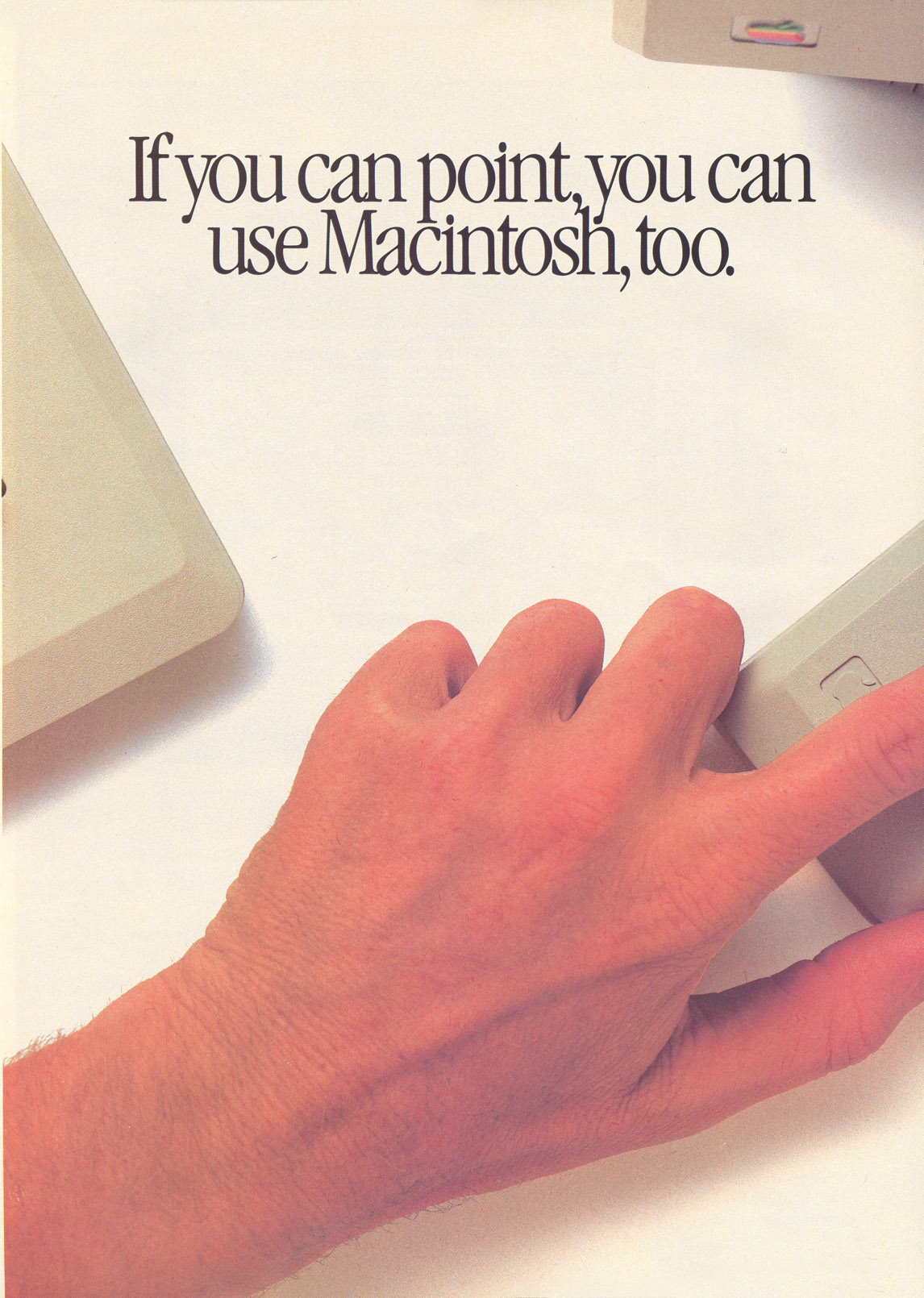
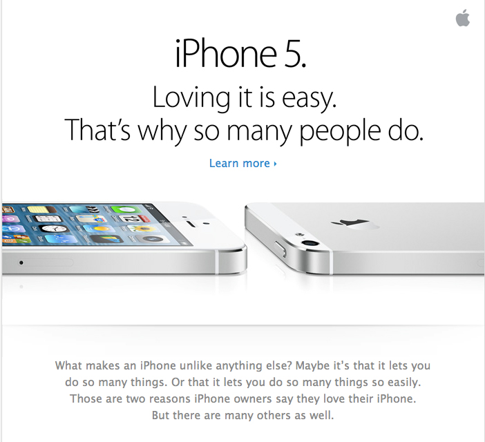
The above image was a print ad by Apple from 1984. It talks about the simplicity of Macintosh machines in the simplest of ways. Now take a look at the below ad from Apple, a recent one advertising iPhones.
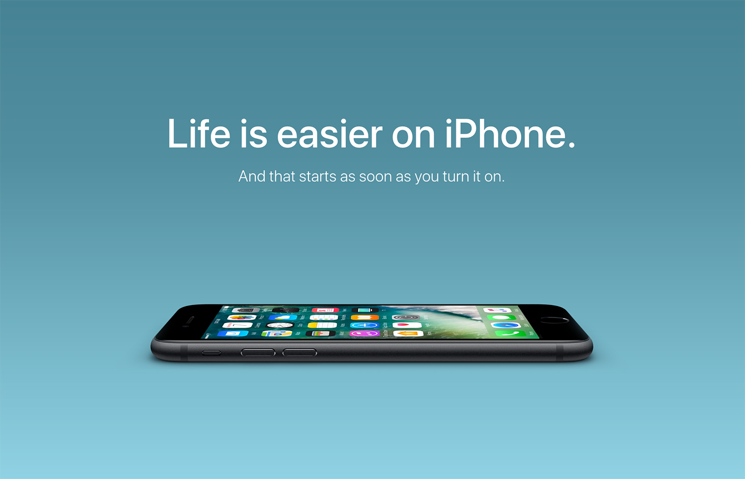
From the time Macintosh machines were introduced, Apple products have consistently been identified as some of the most user-friendly gadgets out there. The brand has always promised to simplify technology while leaving all the sophistication under the hood. And for decades it has adhered to its promises consistently.
Apple has always shown users how it simplifies communication, entertainment, and productivity all while packing a lot of power. Today people automatically identify Apple devices as easy-to-use and simple in their interface. This has become possible only because of Apple’s consistent efforts in showcasing what it stands for.
Marketing Lesson:
Identify a strong value proposition to focus on. This will be the ultimate value that customers choose your brand for. And when you talk about this value regularly in your ads and other marketing content, customers will also start identifying these as your brand values.
4. It is alright to take chances
The very first ad from Apple that created ripples in the world of marketing was the Superbowl ad titled “1984” which features a runner who tosses a sledgehammer towards a vintage screen. The detail worth noting is the colorful uniform of the runner in the midst of the dull monochrome setting and the Macintosh imagery on the runner’s top.
The ad symbolizes the revolutionary introduction of colorful Macintosh machines in the world of mundane beige personal computers.
More than the ad itself, it is the story behind it that makes it worth discussing. Nearly all of Apple hated the ad and even considered giving up the Super Bowl ad slot purchased. But Steve Jobs was sure of the ad and firmly stood for airing it. To date, most people remember this iconic ad as one of the finest creations of Apple’s advertising team.
Marketing Lesson:
If you want your marketing strategy to work, you should be sure about your vision for your brand. When you know what fits your brand’s personality it becomes easier to take calculative risks that help set your brand apart in a competitive segment.
5. Cash in on FOMO
Over the years Apple has managed to establish itself as a symbol of sophistication. Owning an iPhone or iPad is seen as a way to fit in with the tech-savvy generation. By constantly talking about how people love their iPhones and showing off all the brilliant content that people create with their Apple devices, the brand evokes the fear of missing out.
Apple ensures that its ads talk about the reasons to fall in love with the gadget it advertises, not just the features that make the product worth buying. So, when the annual Apple event happens, people start putting together their shopping lists for the holiday season.
Marketing Lesson:
When people know that everyone else is trying something and actually benefiting from it, they might be eager to try it themself. Use customer reviews, user-generated content that showcases the experience, or even statistics that show how many others have already purchased your products. This shows customers how your brand has been performing steadily and growing consistently.
6. Create a timeless brand
Apple has been evolving gracefully. From selling computers to iPhones and smartwatches, the brand has come a long way in the world of technology. The brand that once mocked the use of a stylus and introduced the concept of capacitive touchscreens for better interactions now markets Apple Pencil as one of its core accessories.
A lot has changed for Apple over the years but the brand has continued to retain flavors of the old designs and the use of simple and clear copies in the ads.
iPhone X ad, 2017
iPod ad, 2001
iBook Ad 1999
Decades apart, the ads maintain the signature “say hello to” caption the brand uses while introducing something new. Maintaining consistency in your ad copies is as important as staying in line with your brand for the graphic design. And this helps in building brand recognition and strengthens brand awareness over the years.
Marketing Lesson:
As your brand grows and evolves your marketing strategies and even the products and services you offer might change along the course. Make sure that you keep your brand memorable by creating timeless taglines or vision statements for your brand. Consistently incorporating them in your ads also helps in preserving your bond with your loyal customers who have been staying in touch with your brand for years.
7. Less is more in marketing
From Apple’s logo to the packaging design and ads, the brand is one of the biggest trendsetters in minimalism in design. Even on Apple billboards, you will see that the brand incorporates a lot of negative space so that the focus is entirely on the product.
Marketing Lesson:
From the copy of your ad to the graphic designs, you do not always have to crowd the space to covey the information. Keep it simple and easy to interpret. Minimalism can become your biggest competitive advantage. In a noisy marketing realm, your minimalistic designs can speak for your brand.
Kimp Tip: While aiming for minimalism you can still make a strong impact by using visual metaphors and the right incorporation of your brand colors. With such designs that cut all the fluff, you reduce the distractions and get users to pay full attention to the core message.
Want to design minimalistic ads and posts for your brand? Choose Kimp Graphics to take care of all your graphic design requirements at a flat monthly rate.
8. Get creative
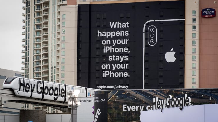

Apple has always been known for its creativity. And staying true to its principles, the brand gets really creative with respect to its ad placements. Apple has always had strong outdoor advertising strategies. What really inspires marketers is the choice of surfaces for ads. You will find Apple ads across buildings, on storefronts, and more.
Marketing Lesson:
Incorporate a marketing mix with both traditional and digital advertisement strategies. Outdoor advertisements for the local customers and online ads for lead generation together help your business grow.
Kimp Tip: Having all your designs created by the same team makes it easier to compare and match your designs so that they look coherent everywhere. And that’s just one of the many perks of working with a graphic design subscription.
Need to keep up with the rapidly evolving graphic design trends across print and digital platforms? Kimp Graphics subscription helps you streamline all your design projects and track them conveniently.
Shaping Your Brand Image With Strong Marketing Visuals From Kimp
Creating one iconic ad is not enough. You need to be consistent in your efforts. The same tone of messaging in your ads, recurring color schemes, a visual hook that gets your ad to be noticed even in a crowded social media space are just a few of the requisites to build a robust marketing strategy. That’s where the perks of unlimited graphic design services like Kimp come into the picture. The same dedicated team handles all your graphic designs. So, they know your brand well and ensure that all your designs are in line with your brand’s personality. And thus you get to slowly and steadily build your brand image.
Register for your free trial and see what unlimited graphic design is all about.

