How To Choose The Best Fonts For Your Designs
“Wait, what does that say? Hand? Hard? Hold? What?” You never want your customers to experience this when they try to read your designs.
Be it your ads, logos, the slogan for your brand, or anything in between, choosing the best fonts makes a big difference!

You might find yourself thinking but why the big fuss? Maybe there’s a lovely cursive font that you think looks really great for your brand. So why can’t you just use it in your design??
Sure you can use it. But what if your customers misread it? Or simply give up trying to decipher it because it is not clear? Not convinced? Let’s give you an example. Can you read what’s written here?

The word above is “advertisement”. Can you believe it? We totally understand if you did not get it right! So do you think your customers will enjoy reading ads or looking at logos with such unclear fonts? If you said no you’re right, they won’t!
Fonts matter, a lot actually. Everything from the basic letterform, to the kerning you use, and the hierarchy of the fonts should be given due consideration in design. And all this is applicable to all types of designs including logo design, business card design, print designs, digital ads, and social media posts.
As you can see, there are so many places where you find yourself in a position to choose a font. So, let’s talk about the factors to consider while making this important choice.
How to spot the best fonts for your brand
The fonts you choose can make or break your design. They influence the impact your design has. So much so that some have the ability to make people instantly believe the message you convey. That’s why you have to look into a few things while finalizing fonts for your design.
#1 – It has got to do with your branding
78% of consumers consider a brand’s logo to be a piece of art. They believe and respect the fact that brands put in a lot of effort to get their logos designed. You would not want your font style to spoil the whole look.
The font that you pick has to embody the spirit and the character of your brand. Every brand has a personality that becomes clear to customers with consistent branding efforts. A personality is what connects with customers at an emotional level and sets the brand apart from others.
Take Volvo’s logo, for example.

For example, Volvo has always been a brand about safety in cars. So, it is all about ‘credibility’ and ‘adherence to the brand’s ‘traditional’ focus on safety. The logo uses a Serif font that captures the trustworthiness and conventional personality of the brand.
Kimp Tip: Typography has a huge role to play especially in branding. Together, your logo font and color can help create a strong first impression on your customers.
Need help with designing a sophisticated logo for your brand? The Kimp Team is here to help.
#2 – How legible is the font?
If people have to spend time squinting their eyes to read what’s on the design, they will not read it. The legibility of your font is much more crucial than the aesthetics. In fact, by choosing the right color, and other visual elements, in addition to a legible font you’ll automatically enhance the aesthetics of your design.
Once you choose a font, be careful with using uppercase text and bold font style. Too much of these can cause a strain on the readers’ eyes.
Bold and decorative fonts look good when used in moderation. They are best suited for titles and headlines. You also have to keep in mind that the font you choose has to work well in many different sizes and weights. This is so that there is readability no matter what the size of the text is, or what the size of the screen is.
Let’s give you an example. Script fonts look great, well, at least most of them do. But in the ad below, due to the use of Script font, the copy is hard to read.
Did you read “I love Cow” or “I love Coco”? See, legibility can be due to font size, style and even the context. That’s why, when you choose a font, you should be sure that every letter in the chosen font looks crisp and legible.
#3 – To serif or not to serif
One of the areas that you need to factor into font decisions is the length of the copy on the design. Typically, Serif is easier to read in lengthy texts as opposed to Sans Serif. This is because of the fact that Serif fonts will help your eyes travel along the line easily.
You also need to think of your target audience. Sans Serif is a more accessible font that is easy on the eyes. It is also easy to read for kids and people with visual impairments.
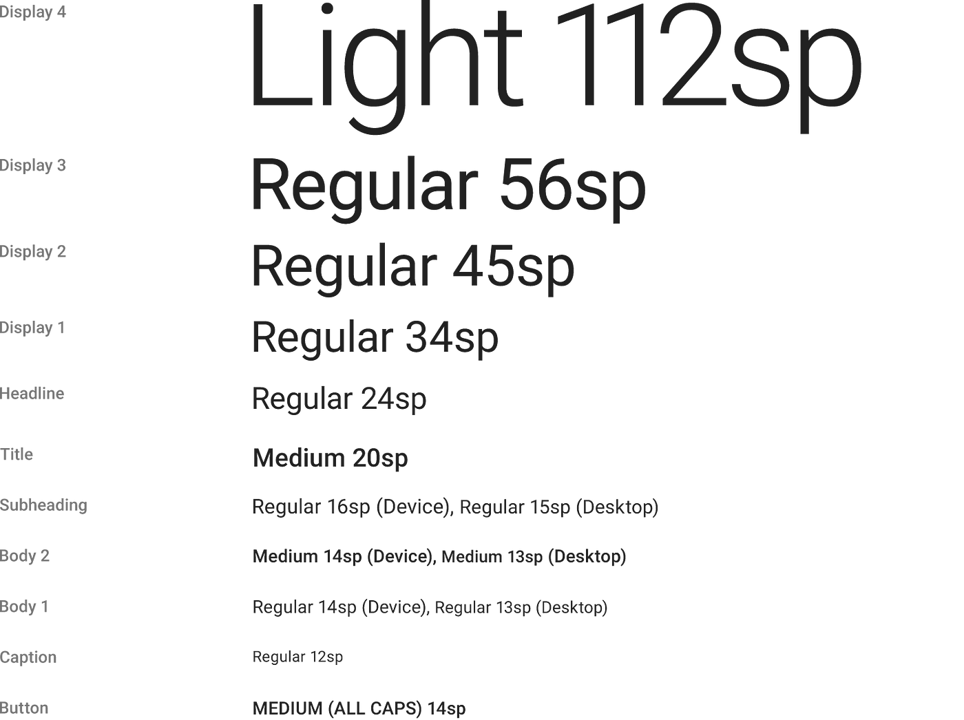
The text in the example above is clearly visible and readable, right? Now take a look at this cursive script called Vivaldi, below. It is a beautiful script no doubt, but it becomes rather hard to read when you modify the size and that could make an entire design obsolete.
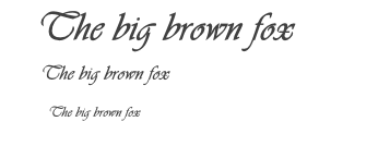
#4 – What are web safe fonts?
It is always a smart decision to use web safe fonts for digital marketing creatives. These happen to be fonts that are supported by all the major web browsers, by default.
Some of the Sans Serif fonts that fall into this category are:
- Arial
- Tahoma
- Verdana
Some of the web safe Serif fonts are:
- Georgia
- Lucida
- Times New Roman
#5 – Avoid using too many fonts in one design
Limit the number of fonts that you use in a design to just 2 or 3. Better yet, play with different sizes of the same font, or pick fonts that belong in the same font family. When you try to put too much into a design, it becomes less effective.
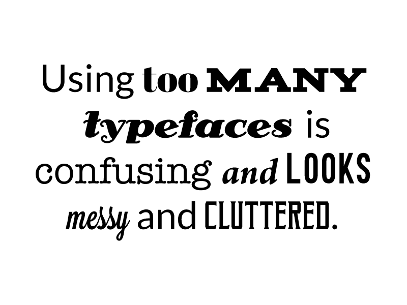
As you can see in the image below, if you can strike the balance with just two fonts or different sizes, it can look quite impressive.

Kimp Tip: From social media posts to ads for print and digital media, you will have to work with font combinations in so many places. If you do not know where to begin, keep it simple. Pick a legible font and use a bigger font size for areas of emphasis and smaller size for taglines. Good ad design is nothing without the copy in it. So, choose a font combination that keeps all of your text readable and impactful.
And if you need any help creating ads that complement the catchy copy you have, book a call with Kimp today.
Where will your content appear?
We spoke about the common factors to consider while choosing fonts. But depending on where the content will appear, you should keep a few more things in mind. Let’s talk about the nuances of selecting fonts for outdoor advertising and print media.
1) Choosing the best fonts for outdoor signage
If your design is going to be displayed at a distance (think billboards and storefront signage), research says that Sans-Serif fonts will leave the best and clearest impression. They are both easy to read immediately.
Fonts like Helvetica, Arial, Verdana and Open Sans are recommended. You should also use bigger font sizes and keep messages powerful but as short as possible. Ideally, try and keep the character limit below 250.

In the above billboard, there is lengthy text but it still reads well because of the font chosen. The brand name and the contact details are slightly more emphasized than the quote. Thus the core information is not lost either.
Kimp Tip: After choosing the best fonts for your designs, make sure they are aligned and evenly spaced. Avoid cramming text into a corner and make it a part of the design. And choose colors that are contrasting with the background so that the text is clear.
2) Choosing the right fonts for print
There are quite a few fonts that you can use in print, depending upon where they will be placed. In the body copy, if the text is small in size you can use Helvetica, Verdana, Leitura News or Electra.

How do you know the best fonts to pair together?
Who knew picking the best fonts for your designs could be that much of a task right? But don’t worry, there are guidelines that can help you figure out which fonts to pair with what, so that your design maintains a cohesive and logical flow while making an impact.
1) Sans serif beautifully balances serif fonts
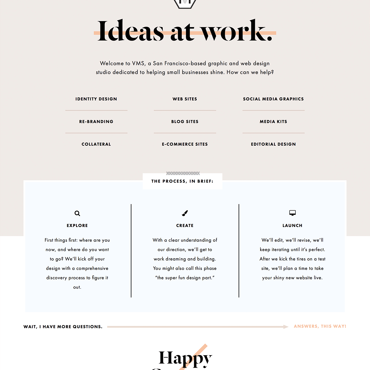
The above image is a combination of the serif fonts Dala Floda, and Garamond along with sans serif fonts Futura and Montserrat. The bold heading in a serif font creates a visual hook. And the sans serif font the sections with lengthy text makes it easy to read the content.
2) Bold Display fonts + Sans serif for poster designs
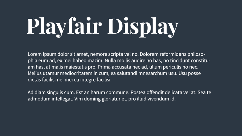
In places like posters where both the headline and the text have crucial messages to convey, display and sans serif font combinations work. Display fonts have the power to draw attention. And sans serif makes the content convenient to read.
3) Script fonts + Serif make a catchy combination
In social media posts you need to maintain a casual vibe while also conveying your message. That’s where ‘chilled-out’ script fonts can be balanced with ‘credible’ serif fonts like in the image below.

Beautiful font pairings to try
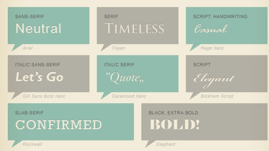
Now that you know how to combine typefaces, let’s talk about some font styles that go well together. If you do not know where to begin, experiment with these combinations and you will soon have more ideas flowing:
- Montserrat and Courier New
- Calvert and Acumin
- Pacifico and Quicksand
- Julius Sans One and Archivo Narrow
- Oswald and Lato
Also while you are at it, make use of this cool cheat sheet that lists 22 different fonts and shows you how well each combination will come together.
The tips above are great when you know the fonts that you’re considering pairing. In case you come across a great font but do not know what it’s called, use a font identifier tool like WhatTheFont.
Once you have identified the font, check for the licensing and usage rights of the font and purchase it if required for commercial use.
Need to download fonts but don’t have a budget for this? If that is the case, you can also download free fonts from Google Fonts or sites like FontM and DaFont. You can also use these sites to help you find the best fonts for your designs:
Kimp Tip: Even when you have the right pairs of fonts, sometimes the additional details like colors of the font and backgrounds can influence their impact a great deal. Choose the right colors for clarity while also keeping your brand color schemes in mind.
Confused about matching your brand’s color schemes and the font colors for impactful designs? Talk to the Kimp team to find out how a Kimp design team can help you out.
Font Overdose?
You might be feeling a bit overwhelmed by all that goes into choosing the best fonts. So we’ve got some examples of the types of fonts a few different brands have chosen to use. Seeing these fonts in action can help you understand some of the recommendations that we have made above.
1) Serif fonts for traditional brands

Tiffany & Co. and Prada are among the brands that use Serif fonts. These are both luxury brands known for ‘elegance’ and ‘sophistication’. That’s exactly what a serif font captures. It also looks conventional and therefore suits brands with rich heritage, like businesses that are decades old.
2) Sans Serif where simplicity matters


Brands like Jeep and Google use sans serif fonts. These are clean, readable and easy to connect with. Sans serif fonts also come in handy if you are looking to create a minimalist logo design.
3) Slab Serif fonts are bold and beautiful

Honda and Sony use slab serif fonts in their logo. And as a result the idea of ‘power’ is conveyed consistently in the branding efforts of these brands. And the chunky slab serif fonts capture that power smoothly.
4) Script fonts are all about their charm

Kellog’s and Coca Cola are well known brands with script fonts in their logos. These look casual and cheerful. There is also an elegance about script fonts that makes them popular among luxury brands.
5) Decorative fonts give off peppy vibes
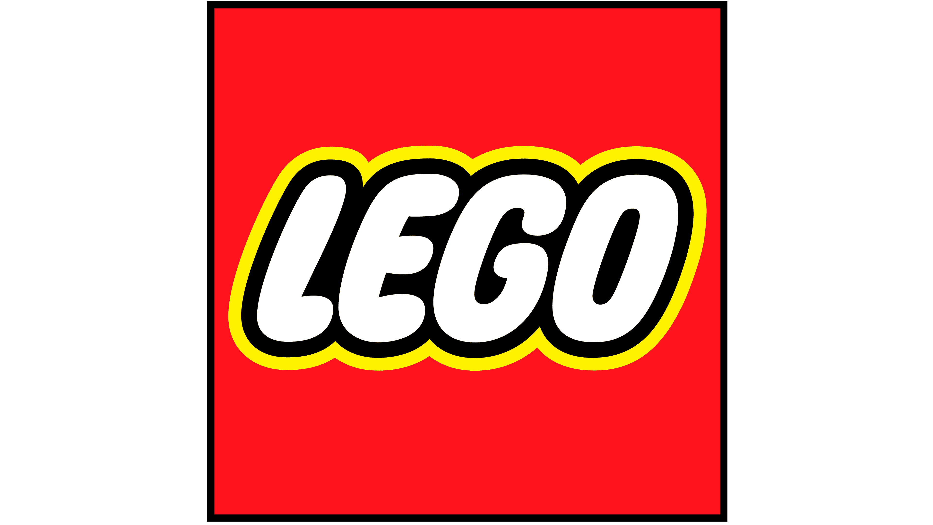

Lego and Toys “R” Us use decorative fonts. These are brands that inspire imagination in kids and focus on creativity. The unique style of decorative fonts make them suitable for these brands.
And with that, it’s over to you…
Phew, that was font-astic wasn’t it? The next time you think of getting a design done, stop and think about what fonts would make the best and biggest impact. Take your time to play around with different styles and sizes, the colors and textures that come with fonts. And see what works and what would not.
Even if you already have a brand style guide you can always try a bit of experimenting. Choosing the right fonts plays a big role in ensuring your designs actually make an impression. Don’t have the time to look into the best fonts for your brand? Get yourself a dedicated design team at Kimp, and we’ll help you out! Just tell us about your brand and the goals of your designs. And we’ll take it from there!
Sign up for a free trial to test the service and see how Kimp can help get design off your to-do list!
