
The New Lamborghini Logo: Lessons in Modernizing a Classic Identity
When you think of luxury sports cars, a few iconic brands likely spring to mind. Among them, Lamborghini definitely stands out with its distinctive design and powerful performance. A key element of the brand’s identity is the unmistakable raging bull logo, a symbol instantly recognizable even to those who aren’t car enthusiasts.
In fact, this emblem has earned its place as a classic in the world of logo design, inspiring creatives across the globe. So, it’s no surprise that the unveiling of the new Lamborghini logo has captured widespread attention.
After nearly two decades, the brand decided it was time to modernize an icon. But what’s the story behind this redesign? How has it been received, and what lessons can we learn from this rebranding effort?
In this blog, we’ll try to answer these questions. But first, let’s take a look at the history and evolution of the Lamborghini logo and how it has shaped the brand’s strong identity.
Evolution of the Lamborghini Logo
While there are car companies selling millions of cars each year, Lamborghini sold a little over 10,000 cars in the year 2023. The kind of exclusivity the brand has maintained in the segment is quite exceptional. There are very few car brands that claim such exclusivity in the industry.
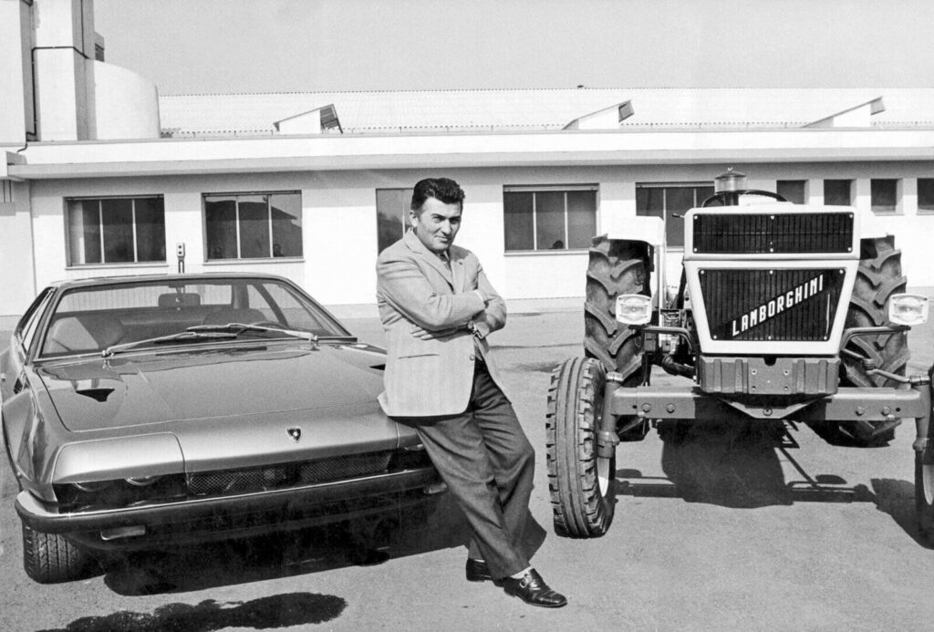
The Italian luxury sports car brand, Lamborghini was founded by Ferruccio Lamborghini in the year 1963 in Sant’Agata Bolognese. His aim was to build a grand tourer and thus the 350 GT was born – to compete in the Turin Motor Show.
Trivia: Did you know that the first-ever Lamborghini prototype was built in a tractor plant? Because Ferruccio Lamborghini initially established a name for himself in the tractor manufacturing segment.
The first Lamborghini logo
The fighting bull emblem has become a strong identifier of the brand and also has been retained in the new Lamborghini logo. This emblem was first introduced in the year 1960 right when the founder ventured into car manufacturing evolving his tractor manufacturing business.
The fighting bull itself is a symbol of power and ferocity. But did you know that there is a backstory to the choice of this symbol?
Reportedly, the zodiac sign of Ferruccio Lamborghini was Taurus and he is known to have had a special interest in bullfighting. Naturally, when a symbol was to be designed to represent his company, a fighting bull was an easy choice.
Take cues from this story. Identify that one symbol or element that feels personal to your brand or to you. Design a logo that tells this story in a visually engaging manner. That’s how you come up with a logo design that cuts through the noise!
As for the color, the first Lamborghini logo appeared in red which is the perfect color for symbolizing strength, speed, and power. Hence it effortlessly complements the tone the fighting bull sets for the logo.
Take cues from this decision and combine colors and symbols that work in unison to communicate the intended message and evoke the intended emotions.
Finally, the font – the first logo used an elegant script font. Given that the company was created as not just another sports car brand but a “luxury” sports car brand, the exquisite font gave the symbol a definition.
Overall, the first Lamborghini logo was a symbol of luxury and it creatively combined the feelings of sporty, fierce, and graceful in a unique emblem design.
What changed about the Lamborghini logo?
Over the years there have been a few small changes in the logo. Notably, with respect to the font used and the placement of the brand name inside and outside of the emblem.
However, the fighting bull symbol has consistently been retained. One of the most popular versions of the Lamborghini logo is the one that was in use since 1998 until it was replaced with the new Lamborghini logo.
The new Lamborghini logo
The last image we saw was the old logo that was in use for more than two decades. Here’s the new Lamborghini logo. Can you spot the differences?
A flat design, toned-down colors, and a sleek typeface – the new Lamborghini logo is the embodiment of a contemporary corporate identity. The brand has introduced the updated logo to appear across their commercial and corporate identity designs. Let’s now delve deeper into what has changed in the new Lamborghini logo and why.
Lessons in Rebranding & Logo Redesign: Takeaways From the New Lamborghini Logo
The significance of flat design
One of the notable changes in the new Lamborghini logo is the adoption of a flat design. Ditching the shadows, glimmer, and other skeuomorphic details, the new one dons a flatter and more modern design.
Take a look at the logo reveal video here to get a better picture.
We have renewed our historic logo to adapt the brand's visual expression with the "brave," "unexpected," and "authentic" values of our "Driving Humans Beyond" mission and is part of the ongoing process of evolution, initiated with our Direzione Cor Tauri strategy.#Lamborghini
— Lamborghini (@Lamborghini) March 28, 2024
The style leans more toward a minimalistic approach which directly contrasts the grandeur of the previous version. And yet it effortlessly preserves the sophistication that the brand and the logo itself has been known for.
The flat design here does not just look modern but is a very practical choice. Flat designs have become the norm these days, particularly in the auto industry with brands like BMW, Nissan, and Volvo switching to cleaner and flatter designs. With this new logo, Lamborghini joins the league as well.
This decision shows the need to stay aware and up-to-date with trends dominating your industry. Yes, when it comes to branding designs like logos, timeless designs transcend fleeting trends. But some trends you just cannot ignore. And the adoption of flat designs is one such trend. Why?
- Because flat designs are scalable.
- They are versatile and look equally impactful on all types of designs.
- Flat designs make it easier to transition from digital to print which is one of the biggest requirements in the digital age.
A well-defined goal for rebranding
Not all logo redesigns face a warm reception from customers and critics. However, things have not been too bad for Lamborgini. While some remark that nothing much has changed, some also applaud the more modern design which feels relevant and current.
What truly makes the rebranding work in favor of Lamborghini is the clear purpose behind their decision to rebrand.
The new Lamborgini logo and rebranding are part of the brand’s shift toward “sustainability and decarbonization” through their measure called, “Direzione Cor Tauri”. In addition to embracing an “electrified” future, the brand is working toward adopting cleaner and greener processes. The no-frills minimalistic logo has been introduced as a token of embracing this approach.
Accordingly, their new logo is to be used not just in their corporate identity (as with a few other auto brands) but also on their cars like the upcoming Temerario and other models. This holistic change helps establish the brand’s strong transition.
Preserving the trope in a logo
One of the pivotal aspects of rebranding, especially for a well-established brand like Lamborghini, is to preserve the core “trope”—the signature element that instantly connects the logo to the brand. Because this distinct element is often the first thing that most people recall when they think of the brand and you do not want to lose that.
For Lamborghini, this trope is the iconic raging bull, a symbol as we’ve seen has not only represented the power and prestige of the brand but also holds a special connection to its founder.
Naturally, in the recent rebranding project, the brand wisely chose to preserve this well-recognized symbol. This decision underscores a vital lesson in logo redesign: even as you refresh and update your brand, it’s essential to preserve the elements that your audience recognizes and values.
In this case, preserving the raging bull not only preserves the brand’s legacy but also ensures continuity and therefore protects the connection with loyal customers who have been associated with the brand for decades.
Moreover, they did not just retain the trope in the new Lamborghini logo but expanded its applications and significance in the brand identity. They have started incorporating the bull without its shield and logotype in several places like their website design, favicon, and even their social media pages.

KIMP Tip: Lamborghini’s success with the use of the fighting bull icon exemplifies the effectiveness of incorporating a pictorial element in your logo. And yes, to make the most impact you also need to consistently use this pictorial element in your branding and marketing graphics.
Need help designing visually cohesive graphics for your brand? Get KIMP!
Tapping into the potential of typography
The new Lamborghini logo features the brand name in a sleeker and more modern typeface. This is slightly broader and bolder than its predecessors. The bespoke Lambotype is the typeface that appears not just on the logo but also across other corporate designs.
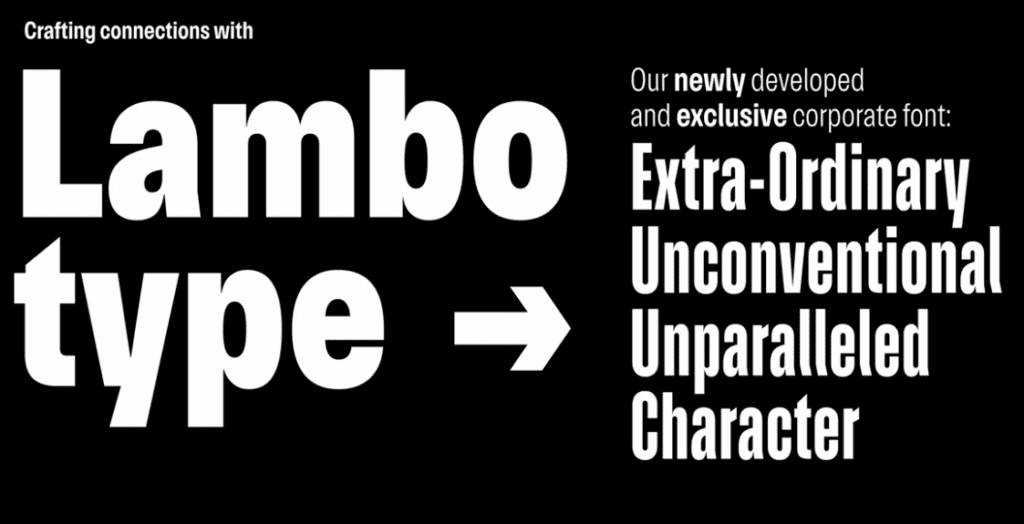
To preserve the design DNA of Lamborghini while also keeping it consumer-friendly, the Lambotype combines sharp edges and organic rounded counters and letterforms.
Another notable element here is that this is a variable font that appears in a variety of optimized widths and weights making it easier to adapt the typeface to diverse applications.
The use of uppercase characters establishes the brand’s authority and preserves the strong and energetic tone of the design as well.
The effective use of colors
While the new Lamborghini logo also uses gold as the primary color similar to the previous version, it’s slightly toned down to preserve the minimalist vibe intended with the new design.
The logo animation at the end of the promotional video here adds a glistening effect to emphasize the minimalistic sheen of the new color in the logo.
Moreover, the brand has switched to using black and white as the primary colors in branding and marketing with gold being used as the accent color. This decision is again in line with the more contemporary aesthetic the brand is working toward.
KIMP Tip: Colors are crucial brand elements. In addition to reflecting the mood of the design and evoking the right emotional response, colors also help capture the unique personality of a brand. In this case, gold color is known to symbolize luxury and hence fits perfectly into Lamborghini’s branding. Therefore retaining the primary color in the logo makes perfect sense.
Taking cues from this, when working on your rebranding project, ensure that you do not drastically alter your logo’s color palette. Instead, switch to shades or tints of the same hue or preserve the original color in some form to retain a hint of the old design.
Integrating shapes and symbols into branding
In addition to the distinct color, font, and bull icon, Lamborghini also extensively uses shapes and symbols to maintain consistency in their visuals. For instance, Hexagons and Y’s have always been part of the brand’s identity. They appear in the interior and exterior design details in their cars as well as in their digital spaces.
For example, the below image shows the seamless integration of hexagons into their website design. From CTA’s to navigation buttons, hexagons appear in several places. And resonating with the recent minimalistic design shift, these hexagons and other icons on the website also appear in trimmed-down minimalistic styles.
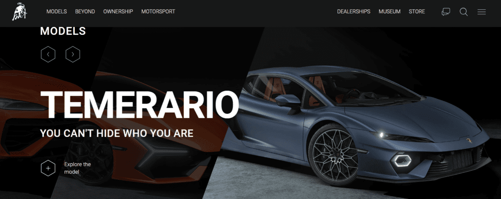
Did you notice the hexagonal headlight on the Temerario featured in the above image? Here’s another post where Lamborghini highlights the use of hexagons in their design details.
A stunning detail of our latest V12 one-off, Invencible: the hexagon, harmoniously integrated into its iconic bodywork. An almost mystic vision, ready to speed on its @Pirelli tyres.#Lamborghini #DrivingHumansBeyond pic.twitter.com/pJb267xtrC
— Lamborghini (@Lamborghini) February 16, 2023
Thus, with the effective use of colors, fonts, and a signature logomark Lamborghini has managed to rebrand without losing its identity that customers have grown familiar with.
Rebrand Confidently With a KIMP Subscription
The new Lamborghini logo is indeed a refreshing update. Aligned with the trends, accurately representing the transition in the organization this design, according to us, definitely hits the mark. What do you think?
Are you planning to work on your brand’s rebranding project? Do you think your logo looks outdated and needs a refresh? Then working with a professional design team can help achieve such impactful details to rebrand successfully.
With an unlimited design service like KIMP, you do not just get a professional design team but also the benefit of unlimited designs. So, be it a teaser for your rebranding campaign, a logo reveal video, mockups to give your team and your customers a preview of your refreshed brand identity or even clear updated brand guidelines – one design subscription can take care of all these design needs. Sign up for a KIMP Graphics + Video subscription now and confidently begin your rebranding campaign.
Wondering how an unlimited design service works and how it can help with your rebranding project? Schedule a demo with the KIMP team today.