Choose The Right Color Palette For Your Designs
You’re walking home from work after a really long day and suddenly something catches your eye. All because someone knew to choose the right color palette. It’s a beautiful, bright yellow advert for a clothing brand featuring sunflowers. You look, read and smile. Even when you get home and the day after, you don’t forget it. And the next time you want to shop for some jeans, you immediately remember the sunflowers and that amazing yellow.

This is what is known as color psychology. Colors have the ability to evoke certain emotions and moods in us. As a brand, when you advertise or promote your brand in any way, understanding what colors will make you memorable is essential. On today’s blog, we talk a bit about colors and how you can incorporate them into your designs the right way.
Color psychology and what colors say
When you are doing your research for your designs, you will realize why certain warm or cool colors reflect your brand best. The moods and the connotations that these colors evoke makes them the best choice.
The theory of color, in short, is the idea that any color can be connected to a mood or a value. Some of these connections will be instinctive while others will be subtle. The colors that you choose will have a big impact on your brand. Below is a snapshot of some moods that are evoked by colors.

Why it’s important to choose the right color palette for your brand
Now that you know what a few popular brand colors stand for, you also need to understand why choosing the right colors is something that is vital for your brand.
When you are picking the colors for your branding, it is very important that you test the colors in every possible use case of the business. Here are some of the main reasons why this is so important:
- Bright and vibrant colors can make people squint or give them headaches if they are used too much. Make sure to use such colors in moderation or if possible, or in minimal amounts.
- High contrast colors will work well if they are looked at from a distance. If you have a store signage or a presentation that you are making to a big audience, choose these.
- Different colors can also bring in different shoppers. For instance, red, orange or royal blue will bring in impulse shoppers while teal and navy can bring in shoppers on a budget.
- They impact conversions too. For example, a study that was conducted by Hubspot evaluated the relationship here. They used the colors green and red separately, to see if it would impact the conversions.
They realized that changing the color to red actually boosted the conversions by 21%. More people clicked on the red button than they did on the green one. All other colors on the pages were kept the same and this was the only difference. This clearly indicates that some colors can even stimulate better reactions. It would be worthwhile for you to actually do some testing, if possible, before you pick colors for your brand. And each time you run a new campaign.
If you are unsure of what colors work well together, research common color schemes and don’t pick and choose at will. They may look great, but might impact business negatively. A good way to get started would be to research different websites and designs and take note of what caught your attention – and why!
Here are some stats on why it’s important that you choose the right color palette:
- Colors can influence up to almost 90% of a consumer’s initial impression.
- People will perceive colors differently based on their gender and age.
- Blue is preferred by 57% men and 35% women.
- Color influences the shopping decisions of 85% of all shoppers.
- Colors can increase brand awareness by about 80%.
- A staggering 93% of shoppers simply rely on visuals alone when they are thinking of making a purchase.
How to choose the right color palette for a design
Since you know how important colors are to your brand, let’s look at how you can choose the right colors when you are creating a design.
- Preferences – this is all about talking to your client and making sure that they are alright with the colors that you have chosen. If you are designing for your own company, make sure that the colors actually do represent what the brand stands for.
- Background – look into the history of your own brand or your client’s brand before you design. If you are working on a branding project, knowing this backstory will help you come up with some cool ideas. It can help you pick colors that make a brand identity shine and truly represent all its nuances.
- Competition – studying the competition will inform you about common colors that those in the same industry are using, and it will also show what you can avoid. This way you will not create something that looks too similar. At the same time you’ll incorporate the colors that work best with your target audience.
- Psychology – as we mentioned above, it is important to know how your audience will react to the colors that you have chosen.
- Culture – based on the cultural demographics of your market, you may want to make sure that your use of colors will not offend or put off a specific ethnicity or culture. At the same time, you want to choose the right color palette to represent the nature/culture of your business so that you come across as authentic. Pick colors that speak to both your brand and your audience.
- Your audience – your customers can change the direction of your designs. Orange may seem like the new black, but if your market research says that your audience likes yellow, yellow it is. Color preferences will also change based on the various age groups of your audience. If you’re not sure where to start, look into a company that is similar and see what colors they employ. See if that has worked for them and collect your research data.
But how can you choose the right colors to combine?
You may be looking to do a completely new color palette for a set of designs or you might want to try and decode the current color palette that you have. There are 4 main types of color palettes that you should know about:
- Monochromatic – this refers to a color palette that has different shades and depths of the same color. They are one of the simplest palettes to create because of this. You will not be at too much of a risk of creating a bad color scheme with this. But if done poorly, they can just look boring.
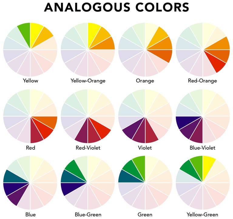
Analogous – this color palette has one primary color and then, colors from either side of the color wheel. These will help you keep consistency and uniformity in your designs. Because there is no big differentiation in the hue, it will be easy to work with this palette. The contrast is brought out through the shade variations. It will not pull attention away from the content.
Complementary – these feature colors that are on the opposite sides of the color wheel such as blue and orange or red and green. They are great for creating a design that communicates balance. When you add tints and shades, you will be able to expand this palette. So you will not run the risk of having too much of a harsh contrast.
Triadic – this color palette is made up of colors that are positioned at equal distance from each other on the color wheel such as blue, orange, and red. This makes for a more diversified color palette and it takes a lot more experimentation to hit the correct notes.
Knowing these types color palettes now, when you get choosing, follow these 3 tips:
- Draft your designs in grayscale first. This will help you focus on the usability and the clarity of navigation more than getting the colors right in the first attempt. Optimize on white space and lay out your elements first. The right type and elements will create the best user experience.
- Use your colors according to the 60% + 30% + 10% proportion. This will give you color balance. It allows for the eyes to be comfortable when they move from one focal point to the other. The 60% will be your dominant hue and the 30% will be the secondary one. The 10% is merely there as an accent color.
- Look to nature when you design because the perfect color palettes are made there. Think beaches, sunsets, sunrises and foliage. Something like Adobe Capture for instance can help you isolate the color palette from a photograph.
Tools that help you generate and choose the right color palette
Got an idea about playing around with colors for your designs? Great! We’ve got some cool tools that will help you out:
This is a free as well as an open platform that will give you loads of color inspiration. They also have thousands of trendy and hand-picked color palettes. All you need to do is simply scroll through these and search for the ones that catch your eye and work for your brand.
If you are an adventurous designer, this is a really fast tool that allows you to generate awesome color schemes. If you use Photoshop and Illustrator, this tool comes with an iOS app as well as Adobe add-ons that you can use. You will be able to browse through literally thousands of color palettes from their community. You can save as well as access these and also use them in your designs with only a couple of clicks.
This tool is similar to the two we just listed out with one exception – they are not just limited to 5 main tones. If you have your primary colors sorted and you want to now explore some additional tones, this is the perfect tool to use. If you also want to study the 4 types of color palettes that we spoke of earlier on, this tool can help you out.
How to pick the primary and secondary colors for a brand
What is your brand identity?
The colors you pick will reflect your brand identity. Your color palette needs to reflect the values and messaging you want to send out. Write down a list of adjectives that describe the character of your company. Ask yourself things like how you would like the brand to be perceived and what makes you unique as compared to your competition. The image below shows the brand identity traits that you might want to think of when picking colors.
Look into what colors mean
Like we said before, check the meanings that the colors you have chosen stand for. You do not want to give out the wrong emotion to your audience.
Research for inspiration
Start researching. Look at some of the successful brands that have created an unshakeable identity with their logos and colors and see how they have selected their primary and secondary color palettes.
Pick the primary color
This will be the most dominant color that is associated with your brand. For example Tiffany’s features blue and Pinterest has red as their primary hue. What you need to look for is a single color that will embody the best possible meaning your brand relates to. You can also try out various shades and tints of that color ranging from dark to soft to neon if that is what you want.
Now choose your secondary colors
After you have decided on your primary color, you can settle on 2 – 4 other colors that will go well with it. These need to complement the primary hue and they can appear next to it or on their own. Remember the 4 color palette types we listed before? Refer to those to pick these secondary colors.
You will also need neutral colors
Neutral colors are usually black, white or grey. They will appear as a background or will also be seen in the lettering that you have in the designs that come from your brand.
Test it out
Once you have completed the color palette selection, test it out in different combinations to make sure that they create the right brand voice and that they also present well together.

Colors are a very important part of your brand identity, style guideline, and the designs that you create. They not only impart a message, but also bring people closer to your brand. You will need to put in considerable research to choose the right color palette for your brand.
Be that brand that stays in the mind of your customers when they think of the products and services that you offer. Make yourself stand out and don’t be afraid to go as bold as subtle as you need to.

