
Oldest Logos: What We Can Learn From Designs That Have Stood the Test of Time
We live in a fast-paced world. Yesterday’s trends feel outdated today. Brand designs like logos are also often subject to these fleeting trends. Amidst this, there are some logos that have defied time and remained iconic and relevant for ages. And this blog is about these oldest logos.

Designing a logo is challenging. But designing one that accurately represents your brand for decades is even more challenging. What secrets do these timeless logos hold? How can we learn from their success and design logos that transcend trends and continue to resonate with audiences?
To explore this, we’ll delve into some of the oldest logos, ones that have not undergone drastic changes for decades. With these explorations, we aim to present to you a few tips and tricks useful in designing timeless logos.
Timeless or Trendy: Striking the Right Balance in Logo Design
When we talk about the oldest logos and the iconic status they have achieved, some might wonder – should you really leave your logo untouched for decades? This confusion stems from the never-ending debate of whether a logo should be timeless or trendy.
In short, there are some types of designs and applications where following design trends feels like the best thing to do. However, with pivotal designs like brand logos timelessness might be a more valuable trait. Because building a brand, establishing the brand identity, and shaping the brand image takes time. In this long process, a well-crafted logo can be the strong foundation holding it all together.
With that said, let’s take a look at some applications where trendy logos work and others where timeless ones are the best fit.
Timeless logos – applications:
- Educational and financial institutions looking to build credibility.
- Healthcare brands aiming to establish trust and authority in the industry.
- Luxury brands looking to preserve their heritage and prove the point that they are all about exclusivity rather than fast fashion.
Trendy logos – applications:
- Fashion brands aiming to represent themselves as trendsetters.
- Tech startups striving to prove that they are ahead of our times.
Additionally, logos that follow trends feel relevant to short-lived campaigns – like event logos, logos for online contests or giveaways, or even logos for limited edition products.
Other than these applications, timeless logos work in almost all industries. Therefore, let’s now delve into the oldest logos in the world of design and understand what makes them special.
7 of the Oldest Logos + Lessons to Take Away From Them
1. Coca-Cola
The image below from the famous logo library 1000 Logos gives a glimpse into how the Coca-Cola logo has changed over the years. Rather how it has not changed much!
The very first iteration of the script logo currently in use was introduced in the year 1887 and since then there have been no drastic changes except for the brief period between 1889 to 1891.
Evidently, the core elements of the script and the distinctive red color have remained largely unchanged in the brand’s identity for over a century. Its distinct style has helped set the brand apart from its competitors.
There are two main ingredients that have helped this logo become one of the oldest logos to remain largely unchanged for more than a century:
- Simplicity – the brand is known for refreshing beverages. Over the years, their portfolio has expanded and the simplicity of the logo has helped make it versatile for diverse applications.
- Timelessness – the Coca-Cola logo was not created based on any trend. It merely focused on a classic identity and hence it has managed to remain trendy over the years.
- Typography – in this case, the brand sticks to the nostalgic script typeface that established the brand in the industry. This helps preserve the brand’s heritage.
2. Chanel
The iconic Chanel monogram is one of the oldest logos among the privileged few to be a century old. First introduced in the year 1925 by Coco Chanel, the monogram is simply a creative representation of the founder’s initials.
The sleek and minimalistic monogram of Chanel has become an inspirational representation of sophistication embodying the essence of the brand.
So, considering that Chanel has one of the oldest logos, what can you learn from this design about creating a brand element that stands the test of time?
- Less is more – when it comes to creating logos for luxury brands like Chanel, some might be tempted to add intricate details to add an elegant touch. But trim off the unwanted and retain only the core elements and you are left with a timeless design.
- Adaptability – while the corporate face of the brand itself has changed over the years, the monogram has always held its position strongly. This is because the monogram can easily be adapted to work on different designs for different media.
- Choose the right colors – the minimalistic black and white color scheme used by the brand has effortlessly complemented the minimalistic and elegant identity. It shows that choosing colors that reflect your brand’s personality rather than those based on color trends helps strengthen the life of your logo design.
3. Louis Vuitton
When we discuss the Chanel monogram in a list of the oldest logos, there is one other close competitor that cannot be ignored – Louis Vuitton. LV has perhaps the only other monogram that has an equally prestigious status in the world of luxury fashion.

The LV monogram is reportedly more than 122 years old and it consists of an interlocking L and V, the initials of the founder’s name.
Here’s an image of an LV catalog from the year 1901 featuring the classic LV monogram luggage.
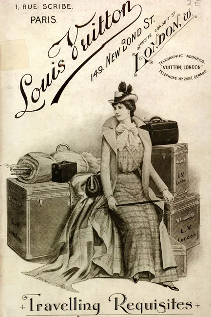
The core idea is more or less identical for both LV and Chanel. However, the renditions are creative and unique. Right from the font to the application of styles in the form of letter placement, the monograms differ in nuanced aspects of design. This shows how a hint of creativity can take even a simple monogram logo to the next level.
What has helped the LV monogram make it to the list of some of the oldest logos to remain unaffected by trends?
- Preserve what makes your brand unique – while a lot has changed about the brand, the one thing they have always been known for, their exquisite craftsmanship, hasn’t changed. Therefore, preserving their iconic monogram has helped preserve this solid trait the brand has always associated itself with.
- Focus on imagery – in the case of Louis Vuitton, it’s not just the brand monogram that you see but also the unique four-petaled blossoms. These distinct flower icons have consistently appeared alongside the monogram and have become a crucial component of the brand identity. This shows how consistent use of brand imagery can help amplify the value and life of your logo.
4. Apple
Apple has always been seen as a brand that’s not afraid of innovation. This almost half-a-century-old brand has one of the most remarkable logos. The first image below shows the Apple logo introduced in 1977 and the second one shows the current logo.
Evidently, the logo has not changed much except for the color palette. The rainbow colors in the logo appeared relevant when the brand introduced the first commercially available colored-display computer. However, as the brand evolved and ventured into a more future-focused portfolio with diverse products, they switched to monochromatic colors. However, the bitten apple symbol has remained the unwavering symbol of the Apple brand.
So, what can you take away from Apple which has one of the oldest logos in the world of tech, an industry known for volatile logo design trends?
- Embrace minimalism for globalization – when transcending borders and venturing into new markets, an overly complicated logo with meanings only a particular demographic grasps easily will make no sense. Therefore, Apple has a simple no-frills design that easily connects with and is recognized by people around the world.
- Subtle distinction goes a long way – in this case, the bitten piece in the Apple logo is an element of visual intrigue. Similarly, identify a unique design trait that makes your design more interesting. This helps create a solid design that lives beyond trends.
5. Nestlé
Nestlé’s logo is one of the oldest logos with a strong story behind the design. Trademarked in 1868, the nest symbol from Henri Nestlé’s coat of arms has evolved into a solid brand identifier.
The image here shows the first-ever nest symbol trademarked by the brand.
Take a look at the current version of the logo used. As can be seen in these images, the use of a flat design is one of the notable changes. However, the core symbol, the nest has been retained in the logo.
The nest in the logo was introduced as a symbolic representation of the brand’s name in German meaning “nest”. Moreover, the mother bird feeding its young ones was added as a narrative capturing the brand’s core product at the time, infant cereal.
Over the years, the nest symbol of the Nestlé logo has become a representation of nurturing and care, the values the brand continues to stand for.
So, what can you learn from the Nestlé logo about creating timeless designs in branding?
- Symbolism – the Nestlé logo is an excellent example of the use of symbolism and metaphorical representations in logo design. In this case, the nest represents the brand’s commitment to providing nourishment and care. Similarly, identify visual cues or metaphorical representations of your brand values and you have a timeless logo design.
- Though this is one of the oldest logos in terms of the overall design, the brand has continuously tweaked the logo to align with the changing market trends. Today the logo looks sleeker and more contemporary to appeal to the drastically diverse audience segments the brand caters to.
6. Cadbury
As seen in the above image, the Cadbury logo has not seen extreme changes since 1921. Similar to the Coca-Cola logo, typography has been one of the biggest distinguishers of the brand’s identity. The other notable trait preserving the design and carrying the brand’s heritage has been the brand color purple. This design exemplifies the idea that the consistent use of a combination of brand elements can help craft a timeless brand identity.
Despite being one of the oldest logos out there, the design still feels relevant to the brand and resonates with its audience. Here are a few things to take away from this:
- Tie back to the roots – the original script logo was inspired by the signature of William Cadbury. Therefore the design holds a special connection to the origins of the brand. This has helped establish the design and the brand as a symbol of tradition and reliability.
- Prioritize brand positioning – in this case, the royal purple color and elegant font work together to position Cadbury as a premium brand. These elements communicate a sense of quality and indulgence, which is key to the brand’s appeal.
KIMP Tip: The Cadbury logo is another great example to establish the power of bespoke fonts and typographical details in logo design.
Need help designing creative wordmark and lettermark logos for your brand? Get a KIMP Graphics subscription!
7. Johnson & Johnson
The Johnson & Johnson brand deserves a special mention on our list of the oldest logos because this one is an example of how even the most iconic logos might sometimes have to be replaced.
The first image here shows the old Johnson & Johnson logo which was in use since 1886 and the second one shows the logo introduced in 2023.

Given the use of the founder’s name, a personalized script font worked really well for the brand. To an extent, it helped embody a sense of personal care and commitment. The brand’s logo became one of the most recognized symbols in the industry.
As the brand finally emerged from the long line of lawsuits and expanded its focus into pharmaceutical and medical technology the brand embraced a much-needed change – a refreshed logo.
While retaining the signature color, there was a big shift in terms of the typeface used. The new one is a more professional and modern sans-serif font that accurately captures the brand’s corporate identity moving forward.
So, what can you learn from Johnson & Johnson’s journey of having one of the oldest logos and making a decision to part with it?
- Build trust – the handwritten script in the old logo gave the design a personal touch and humanized the brand making it feel approachable and trustworthy. This trust has helped foster lasting customer relationships.
- Embrace brand evolution – as companies grow and diversify, their branding requirements may change. The transition of Johnson & Johnson’s logo reflects the importance of aligning brand identity with current business goals and market positioning.
Draw Inspiration From the Oldest Logos & Create Stunning Designs of Your Own With KIMP
Feeling inspired by the design details in the oldest logos we discussed today? It’s time to impart these ideas to create your own masterpiece. Looking for a professional design team that can materialize your visions and bring your ideas for logo design to life? Get KIMP! Choosing KIMP means that all your design requirements in branding and marketing are sorted at a flat monthly fee.
Want to see how that works? Register now for a free 7-day trial!