
Hotel Logos: Designing Excellence in Hospitality Branding
Hotel logos are more than just symbols. They are meant to represent a promise. They are meant to encapsulate the essence of a hospitality brand, conveying feelings of comfort, security, or luxury. From the familiar embrace of a home away from home to the reassurance of a safe haven in a foreign city, a great logo instantly communicates a hotel’s core values.
Well-crafted hotel logos leave a lasting impression. They are the cornerstones of the hospitality brand they represent shaping how guests perceive and remember a hotel.
This blog delves into the art of designing hotel logos that give a visual sample of the experience the hotel creates, and represent the core personality of the hotel brand. Let’s begin by understanding the nuances of branding in the hospitality industry.
The Power of a Logo in Hospitality
The hotel industry was valued at $1.5 trillion in 2023. Evidently, the competition is tough and growing steadily. But besides the competition, what are the other factors that make a good logo and branding strategy important in the hospitality industry? Here are a few:
- As we briefly discussed earlier, your hotel logo communicates your brand’s values effectively. It tells customers what to expect when they stay at your hotel. Is it comfort or luxury or value for money? Your logo gives a gist of this. Therefore, your logo is what helps your brand stand out to the right audience.
- On another note, data shows that about 80% of travelers rely on OTAs (online travel agencies) for travel bookings. Therefore there has been a surge in the number of OTAs available as well as the properties listed on these OTAs. Often, your hotel’s logo is one of the first tangible elements that make your brand stand out among all these listings. If your hotel logo design cannot make a first impression there, your hotel is not likely to get shortlisted by your target customers.
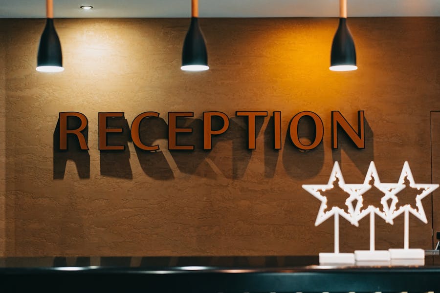
- Finally, hotel logos are crucial because they help lay the foundation for a cohesive representation of the brand across various touchpoints. From the reception area to guest rooms, hotel signage to online platforms, your logo will act as the face of your brand in various places. Hence you need a powerful and memorable logo.
Given the power of a logo in hospitality branding, how do you design one that truly makes an impact? Let’s analyze the logos of famous hotel brands across the globe and how they incorporate these logos into their branding.
5 Famous Hotel Logos + Tips & Tricks to Take Away From Them
1. Mandarin Oriental Hotel Group
The first one on our list is one of the most iconic logos in the hospitality industry. The Mandarin Oriental Hotel Group’s logo is a symbol of elegance. It demonstrates how a logo with a strong visual narrative plays a crucial role in shaping a brand’s image.
The signature element of the Mandarin Oriental Hotel Group logo is the fan which ties back to the brand’s Oriental heritage. But it’s not just about connecting to its roots. It’s about how the brand creatively incorporates this symbol extensively in its branding.
To begin with, there is a unique fan created for each of the hotel locations. And these designs, while retaining the core structure, take cues from the local culture. For instance, the fan of Mandarin Oriental, Prague draws inspiration from Czech folk art.
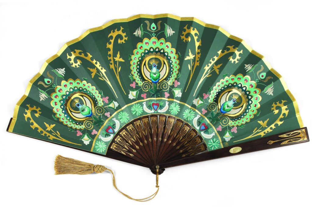
This demonstrates the brand’s ability to retain its authority while also adding a local touch.
In addition to customizing the fan for each location, they also use the symbol extensively in their branding. Like the subtle incorporation of the symbol in the QR code for initiating the live chat.
KIMP Tips:
Here are a few takeaways from the Mandarin Oriental Hotel Group logo:
- Cultural elements help preserve your brand’s core, like the fan symbol in this case.
- Aim for something simple and easily adaptable. Instead of an intricate fan design, the Mandarin Oriental Hotel Group logo uses a flat design which allows for the symbol to easily be tweaked for various applications.
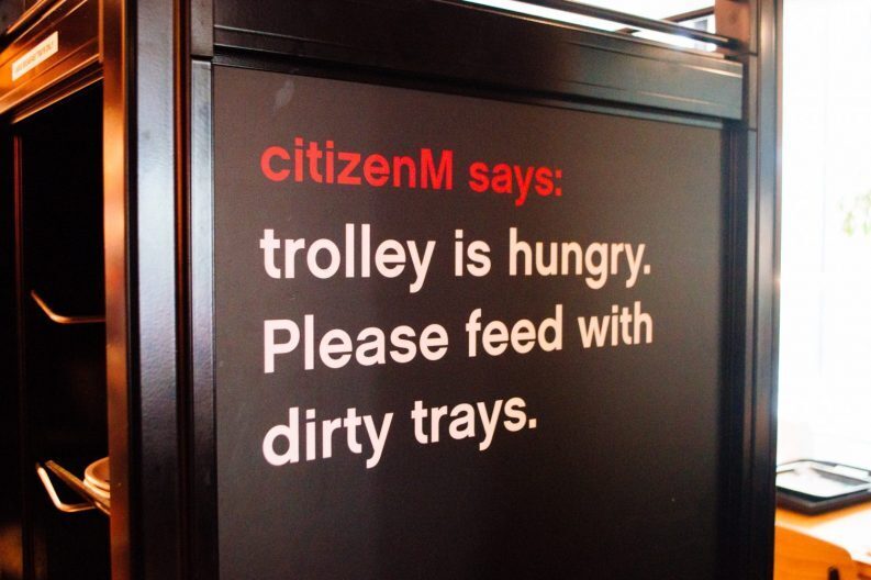
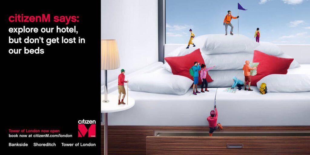
2. CitizenM
The logo and overall brand identity of CitizenM go beyond lessons in hotel logos. They exemplify the use of a clearly defined brand personality to stand out in a competitive space.
CitizenM is about affordable luxury. Accordingly, they define their brand personality as one focused on “mobile citizens” who love traveling far and wide (hence the M). Naturally, this element of focus takes center stage in their logo design in the form of their unique M monogram.
But here again, it’s not the logo itself but how the brand has created a strong and unique identity around this logo to represent their “fun” personality.
They use witty copy and a consistent color scheme with unique illustrated characters across diverse marketing channels. From branding at the hotel locations to the digital designs, you will see consistent visual themes everywhere.
KIMP Tips:
So, what can you take away from the logo and branding of CitizenM?
- Defining your brand personality gives clear direction to your branding and helps set the stage for your brand identity.
- Consistency in various elements like imagery and copy is essential to shape your brand identity.
Need help creating visually consistent branding and marketing designs? Sign up for an unlimited design service, like KIMP!
3. DoubleTree
Now the DoubleTree hotel logo is on our list, particularly for brands looking to give their hotel brand a makeover. DoubleTree’s successful rebranding and revamped logo show what the right logo can do to your brand image.
The below image shows a side-by-side comparison of the old logo vs the new one introduced in 2011.
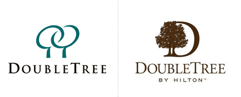
While the old logo looks simple and modern, the new one looks chic and more professional too. It’s a design that encourages consumers to take the brand more seriously.
Firstly, there is the logomark which seamlessly blends the monogram into the imagery creating something original and unique to the brand.
The second visible difference between the old and new logo is the kerning. The tightly spaced letters look more sophisticated. And thus despite using similar serif fonts, the designs look poles apart in their aesthetics.
Finally, there is also the addition of the “by Hilton” suffix to leverage the equity of the Hilton brand name. This was a move introduced particularly since the brand began to expand to several global locations where the Hilton brand had already established a space for itself.
KIMP Tips:
So, here are a few things to learn from the logo and rebranding strategies of DoubleTree:
- It’s not just about choosing the right symbols but also using the right visual styles to integrate them into your logo design. In this case, the sleek illustrated tree symbol used currently looks more refined than the simple abstract tree symbol used earlier.
- The revamped DoubleTree identity combines heritage and modernity to create something memorable. Similarly, when rebranding hotel logos, choose designs that transcend trends and feel timeless.
4. Six Sense
Thailand’s famous hotel brand, Six Sense has a unique logo take takes cues from traditional elements signature to Thailand. The six dots in the logomark represent the marks of blessing that Buddhist monks made on auspicious occasions. Additionally, they are also meant to represent the five primary senses and the 6th sense of intuition arranged in a balanced triangular structure.
This interesting representation of an element of cultural value is what makes the Six Sense logo a great source of inspiration in designing hotel logos.
In addition to these layers of meaning, we cannot ignore the strong impact of shape psychology in this design. Triangles are often seen as symbols of stability and therefore in this case they help reinforce the brand’s credibility.
KIMP Tips:
So, what are the key takeaways from the Six Sense logo?
- Understand shape psychology and use the right shapes to evoke the right emotions in your logo design. This is what takes hotel logos from beautiful to meaningful.
- Given the traditional background of the logomark in this case, a simple sans-serif font might not have made the same impact as the serif font currently in use. This reiterates the need to understand and align the mood of the chosen fonts and symbols to create something cohesive and clear.
5. Shangri-La Hotels and Resorts
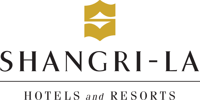
How do you combine a hint of sophistication and a touch of contemporary aesthetics in hotel logo design? The logo of Shangri-La Hotels and Resorts shows how this is done.
Their unique combination mark logo has a signature S monogram and the logotype in a luxurious serif font. The kerning lets enough breathing room for the letters creating a sense of space, a sense of comfort.
The monogram itself is inspired by the Asian calligraphic lettering style but with a touch of modernity to embrace the evolving identity of the brand. Their current logo is an accurate representation of their identity that preserves the roots of the brand while also appealing to the modern generation.
What makes the current logo relevant to the brand and impactful in their branding is that they introduced the refreshed design as a part of their 50th anniversary. Definitely a good time to combine new and old to appeal to diverse generations.
To amplify the message and emotional value of the new logo, they also introduced a bright gold color to the monogram. This is meant to evoke a sense of warmth like the warm glow of sunrise.
KIMP Tip:
What design lessons can you acquire from the Shangri-La Hotels and Resorts logo?
- Colors play a crucial role in logo design. In this case, the elegant gold helps preserve the luxurious aesthetic of the logo.
- Rebranding your hotel brand is a good idea when there is a strong reason behind and you also need to time your rebranding well. In this case, the brand used their 50th anniversary which is a good milestone and an opportunity to rebrand. Similarly, identify relevant milestones where rebranding feels relevant.
Other Tips to Remember
- To take your hotel logos from “meh” to “wow” you need the right combination of colors and fonts. Identify the overall tone of your logo in alignment with your hotel brand’s personality. Based on this choose colors and fonts that resonate with this personality. A quirky font cannot complement a luxurious color palette. You need them both to work in sync.
- While the logo’s diverse elements each carry significance and add to the meaning of the logo, keep the overall design simple. This is pretty crucial for hotel logos in current times because you need marketing campaigns that span diverse digital and traditional channels. A complicated logo with too many intricate details that look good on a screen might not always create the same impact on print.
- Consider the story your logo tells or the emotions it evokes and how this connects to your brand. This would be a better way to come up with logo ideas rather than deciding based on fleeting trends.
- Unlike other industries where a single monogram or a single wordmark logo might be sufficient, combination logos and identities built with multiple elements like a wordmark, logomark (pictorial element), or monograms work well in the hospitality industry. This ensures that you have multiple cohesive versions of your logo to be displayed on merchandise, marketing materials, and more.
Create Stunning Hotel Logos With KIMP
Hotel logos carry a lot of weight in hospitality branding. Therefore, you cannot compromise on the aesthetics and overall quality of your logo. You cannot settle down for an ordinary design. You need something extraordinary to cut through the noise. Hence working with a professional design team for your hotel logo design might be a good idea. And with an unlimited design service like KIMP, you don’t just get one logo designed but the foundation for your brand’s identity in the form of brand guidelines, branding designs, business card designs, merchandise designs and so much more.
Ready to take your hotel branding to the next level? Get KIMP! Or register now for our free 7-day trial.