Shape Psychology: Unlocking the Secrets of Designing With Purpose
In graphic design, the more prominent elements like colors and fonts often take center stage. However, there is one silent influencer that can either bring the whole design together or cause the idea to fall apart depending on how you use it: shape! In this blog, we’ll delve into the world of shape psychology.
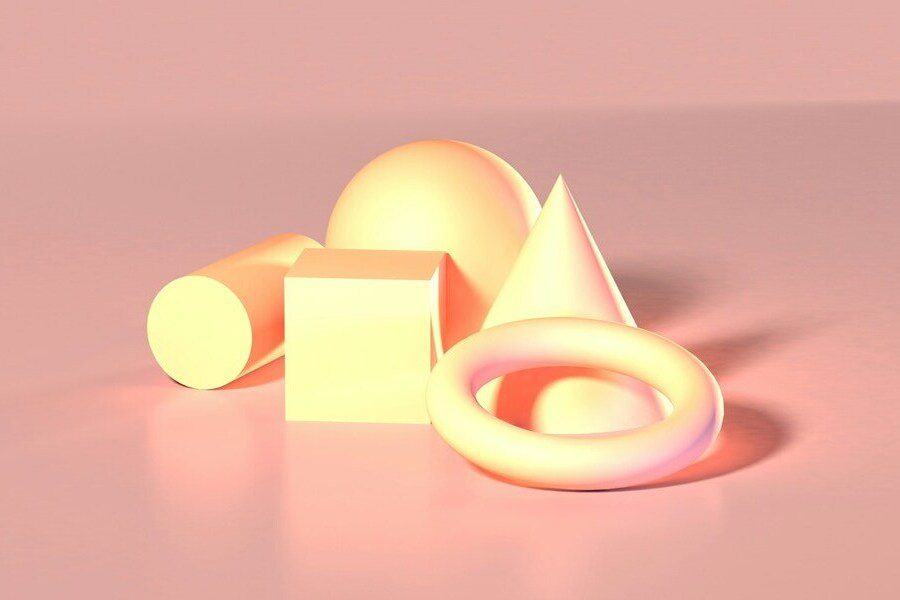
Beyond their aesthetic appeal, shapes carry a powerful psychological weight, influencing how we perceive and respond to visual information. Therefore, understanding and harnessing shape psychology can elevate your designs from good to extraordinary.
So are you ready to explore the psychology behind shapes and how to use them aptly to create impactful designs? Let’s get started.
Shape Psychology: 5 Shapes & What They Mean
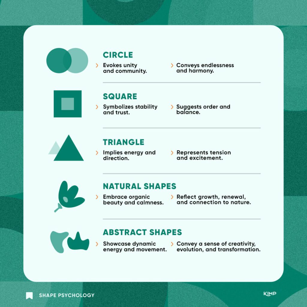
1. Circles/Ovals
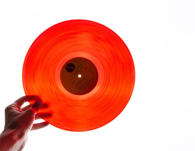
Circles and ovals are probably some of the most popular shapes in design, and perhaps the most used as well! Circles symbolize unity and wholeness.
The continuous form of a circle with no beginning or end also makes this shape an accurate representation of infinity. Circles are also seen as perfect representations of the idea of a community where individuals are bound together as a cohesive unit.
Here are a few other emotions that this shape can evoke:
- Harmony
- Calmness
- Symmetry
- Interconnectedness
- Balance
On the whole, circles elicit positive emotions.
So, how do you use these shape psychology interpretations of circles in your design?
Use it as the core element in the logo of brands meant to represent unity or a sense of community. Like the Olympic Games logo representing teams from around the world coming together.
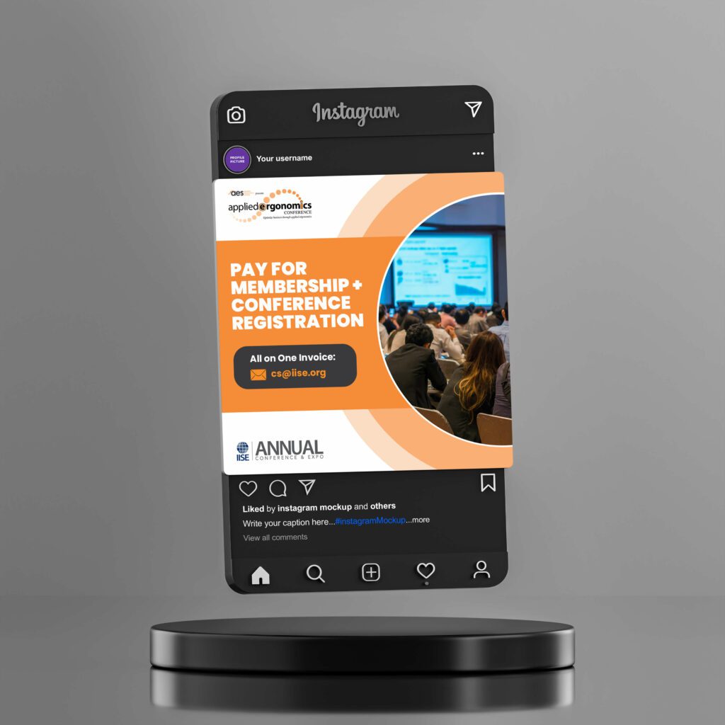
Or perhaps as one of the main shapes in print and digital designs that talk about conferences or events that communicate strength in connections.
KIMP Tips:
- If you wish to add more meaning to your design, manipulate the space within the circle.
- Different colors can drastically alter the mood of a circular design. So understand color psychology for maximum impact.
- Add textures or patterns to a circle to add depth and visual interest.
2. Squares/Rectangles

Squares and rectangles are often perceived as symbols of stability in shape psychology. With their equal sides, they communicate a sense of dependability and conformity. The right angles that give them a solid shape also lead to squares and rectangles being perceived as symbols of stability.
There is a sense of order and balance attached to squares and rectangles. Therefore, here are a few more traits often attached to them:
- Strength
- Credibility
- Trust
- Professionalism
- Solidity
According to these interpretations based on shape psychology, you might often see squares/rectangles being used in logos of brands aiming to evoke professionalism or establish their trust in the industry. Like the Microsoft logo.
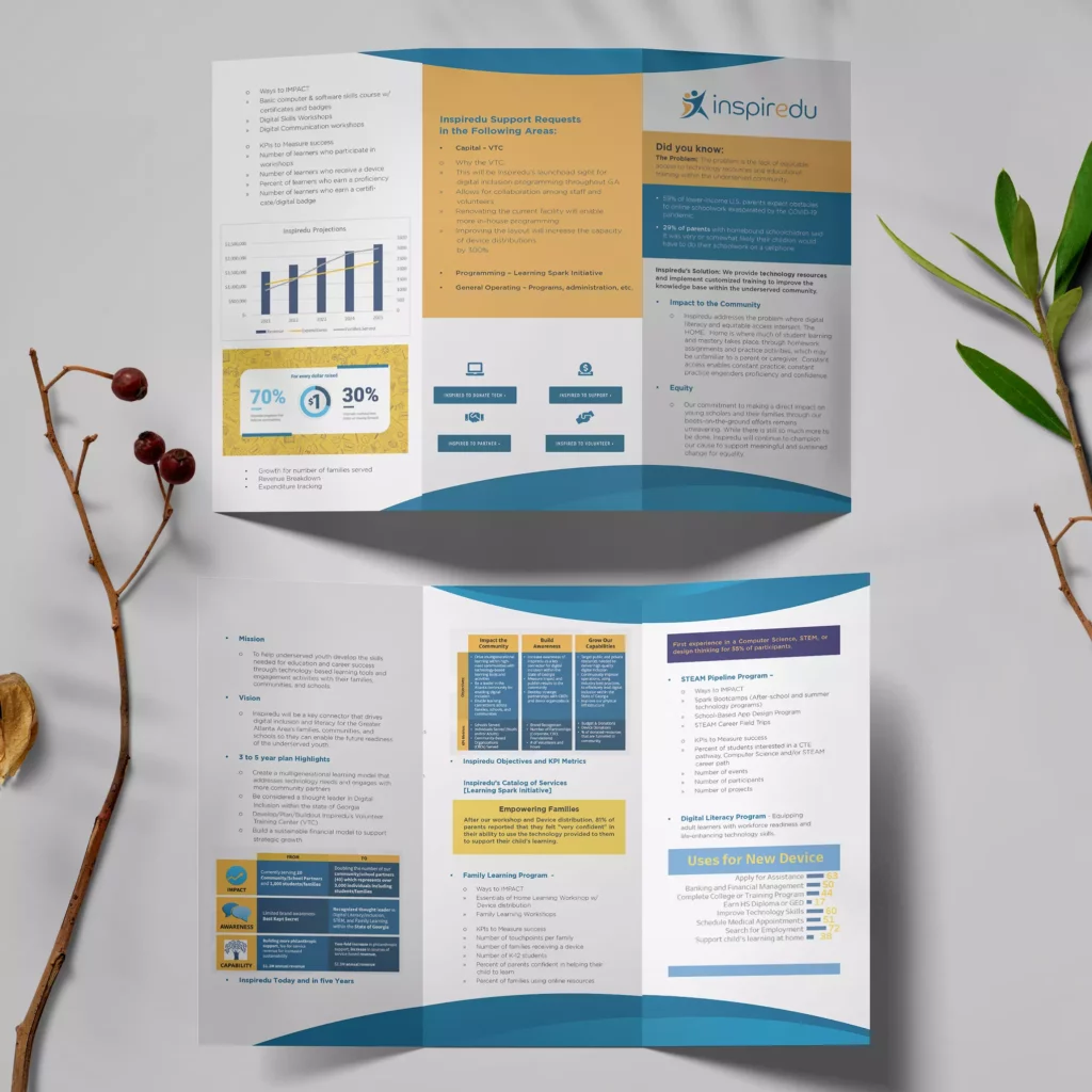
Or in designs filled with useful information. In such cases, squares and rectangles create a sense of order and eliminate clutter. Like the brochure design here:
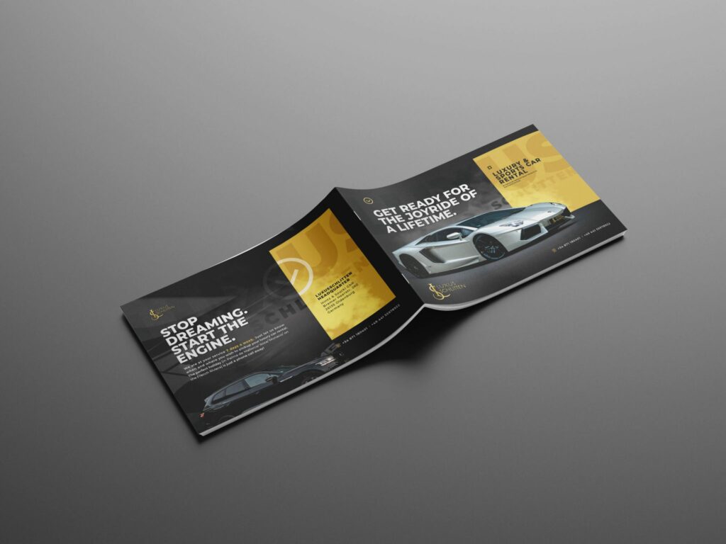
The solidity of the structure also comes in handy when you have to create a sophisticated theme for a luxury brand’s ad for print or digital media. The golden yellow rectangles in the below design elegantly accent the luxurious aesthetic.
KIMP Tips:
- Remember that given the somewhat rigid appearance of squares and rectangles, they are often perceived as masculine symbols.
- Too many squares and rectangles can lead to the design looking boxy and rigid which might contradict the theme if you are aiming for a casual tone.
3. Triangle
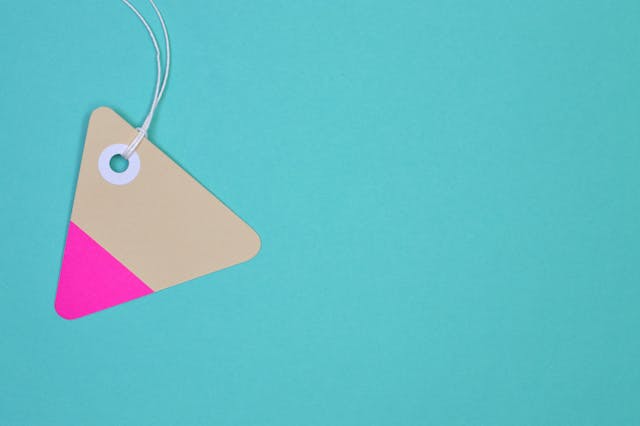
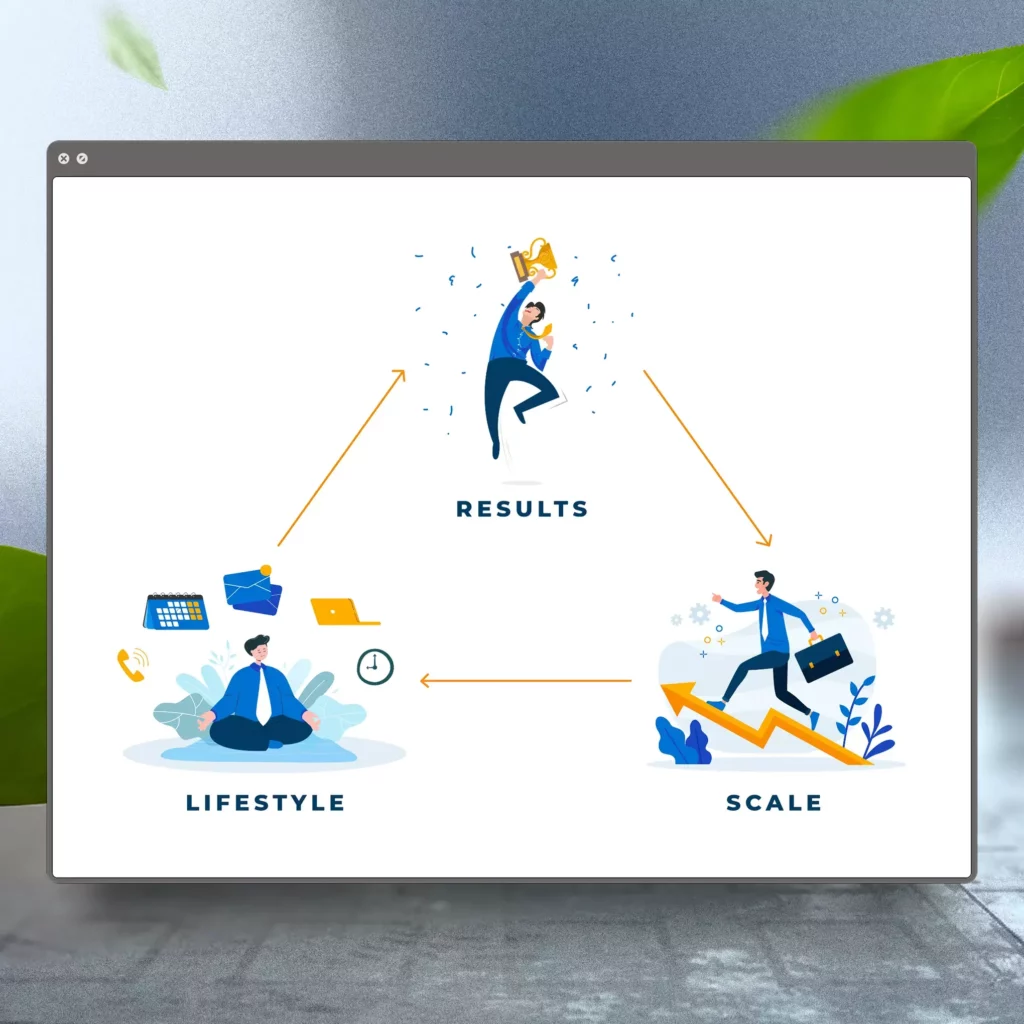
According to shape psychology, the triangle is one of the best shapes to represent dynamism. Additionally, their pointed edges impart a directional element to them. This is also why they can also be seen as a representation of movement.
Therefore, if you wish to capture progress and innovation accurately using shape psychology, then triangles might be a great choice.
Here are a few interpretations attached to triangles in design:
- Power
- Strength
- Energy
- Excitement
- Transformation
An equilateral triangle on a solid base can also be seen as a symbol of stability and security. This can be used in branding designs like logos. This comes in handy in the triangular logo of Google Drive where the shape is apt to capture the security they provide.
The below design taps into shape psychology to make the most of the energy and excitement that triangles create and thus encourage action.
KIMP Tips:
- Since the pointed edge can represent direction, use triangles to establish a hierarchy in your design. Use it to direct the viewer’s attention to crucial elements in the design, the core message.
- To capture stability and positive change, use triangles pointed upward as downward-facing triangles can sometimes evoke a sense of instability.
4. Organic nature-inspired shapes
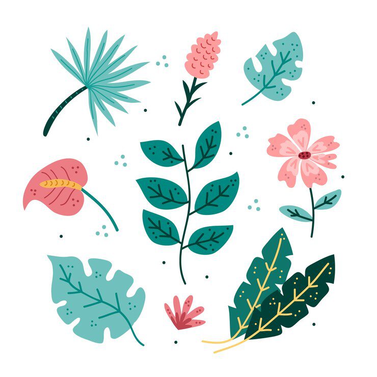
Organic shapes inspired by nature are the perfect balance between the rigidity of geometric shapes and the unpredictability of abstract shapes (more about them in the next section).
These are shapes inspired by the forms found in nature, such as leaves, clouds, and waves, and often evoke a sense of fluidity and spontaneity. Moreover, since these are shapes people are used to seeing around them, they feel familiar and easy to connect with.
The interpretations here depend entirely on the elements of nature from which they are derived. For instance, wind is associated with freedom, whereas the sun is associated with happiness, flowers with beauty, and so on. This makes it easier to identify the most suitable shape to resonate with your theme and the message.
The use of nature-inspired organic shapes in your design can communicate:
- Creativity
- Purity
- Growth
- Calmness
- Beauty
Based on these shape psychology principles nature-inspired shapes are valuable as core imagery in the branding of brands with organic brands or those that promote good health and wellbeing.

Several nature-inspired shapes can be impactful ways to create a sense of serenity. Like pastel-colored flowers and pleasant greenery.
KIMP Tips:
- Use organic nature-inspired shapes in designs that call for a feeling of warmth and comfort.
- In most cases, natural shapes evoke a sense of purity. Hence avoid overusing them
- Avoid using these shapes in contexts where there is no clear connection to nature, as they may appear misleading or irrelevant.
5. Abstract shapes
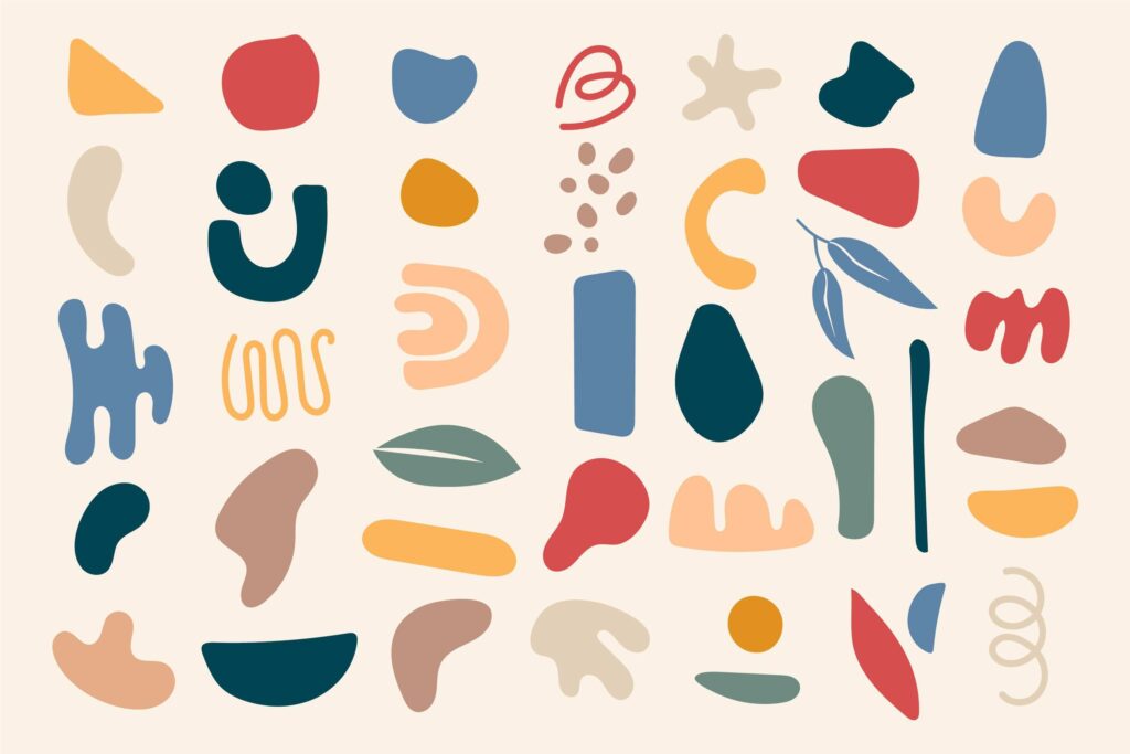
Organic nature-inspired shapes deviate a little from the disciplined tone of geometric shapes to add a touch of creativity. If you wish to further bend the rules and create something unique and hard to replicate, then you need abstract shapes. These are the most interesting shapes to explore in shape psychology because they are free-spirited and bold.
Abstract shapes are not confined by traditional rules and hence are suitable in the branding of contemporary brands and brands focused on creativity or art. Like the Spotify logo.
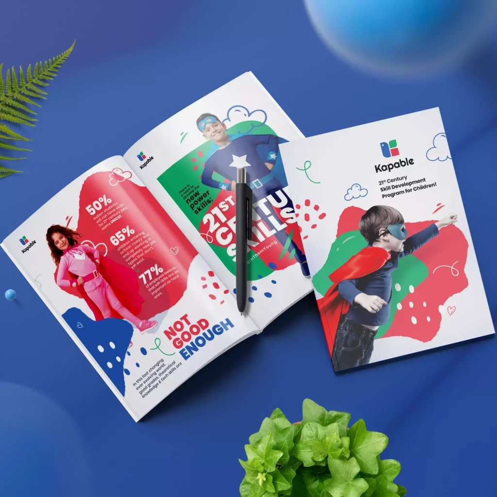
Squiggly lines and irregular shapes are also effective in designs with a cheerful tone and a sense of celebration. Like the brochure design here:
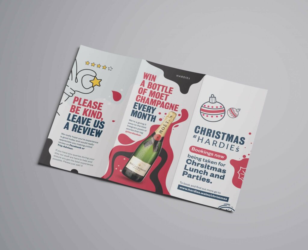
Given the free-spirited nature of abstract shapes, they also work well in promotional designs for brands with a young audience. Abstract shapes and a vibrant color palette can be the perfect combination for such brands. Here’s an example:
KIMP Tips:
- Abstract shapes generally carry an informal tone. So, avoid using them in designs that should carry a strictly professional tone.
- Abstract shapes appear volatile and loose. Combine them with a few solid structures and elegant fonts to create a sense of stability and order.
Tips to Leverage Shape Psychology in Your Designs
With so many interpretations associated with different shapes, the impact depends on how you apply shape psychology to your designs. In other words, how you use these shapes and combine them with other elements. So, here are a few quick tips for you:
Choose the right color and shape combinations
Just like shapes have different interpretations, colors have too. Hence, for maximum impact, you need to combine the nuances of shape psychology and color psychology.
To tone down or amplify the emotion use relevant colors. For example, foliage shapes in pale green tints are more suitable to represent “healthy” and “organic” whereas, deeper shades of green applied on the same foliage shapes feel more suitable for a luxury theme like gourmet foods or luxury organic skincare.
Shapes as the binding element
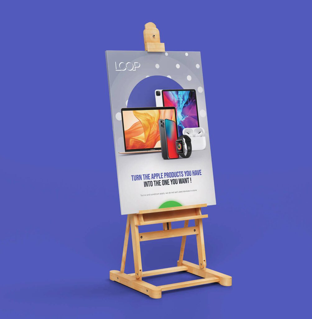
The circle in the poster design here acts as the binding element. It acts as a focal point in the design. Moreover, it also frames the diverse gadgets displayed in the image keeping all of them in the same place.
Similarly, when you have multiple products or services to highlight, and different images to display, easily recognizable shapes help create a hierarchy, and to establish the relationship between these different images or products.
Here’s another example. The square here throws the spotlight on the product.
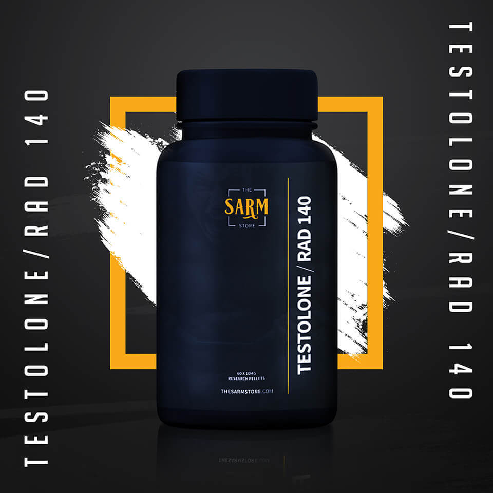
Shapes can thus be used to bind multiple elements together in design creating an organized clutter-free layout.
Use shapes to direct attention to the core message
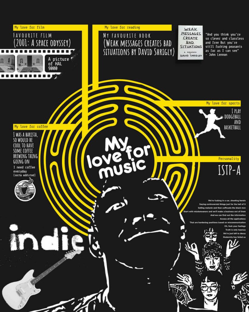
In the design below, the circular element at the center is the most prominent component. This circle immediately draws the viewer’s attention and acts as a focal point for the entire composition. The circle here is used to instantly communicate what the design is all about.
The central circle here also depicts a stack of records, which are circular in shape. This reinforces the musical theme and adds visual interest.
Arrange elements to create shapes
While clearly illustrating and defining specific shapes is one way to reap the benefits of shape psychology, carving shapes out of solid elements, manipulating negative space between letters to create shapes, and arranging multiple elements in specific shapes are the other ways to do it.
For instance, in the Adidas logo, the three stripes are arranged to create a triangle symbolizing movement and progress. The shape also captures the energy and excitement of the brand.
Shapes in typography
You can also leverage shape psychology through font shapes. Shapes of letterforms play a significant role in how users perceive the text. Therefore you can strategically use it to enhance the message of your design.
Some fonts come with pronounced rounded characters or angular shapes. Use such unique fonts to complement the prominent shapes in your design.
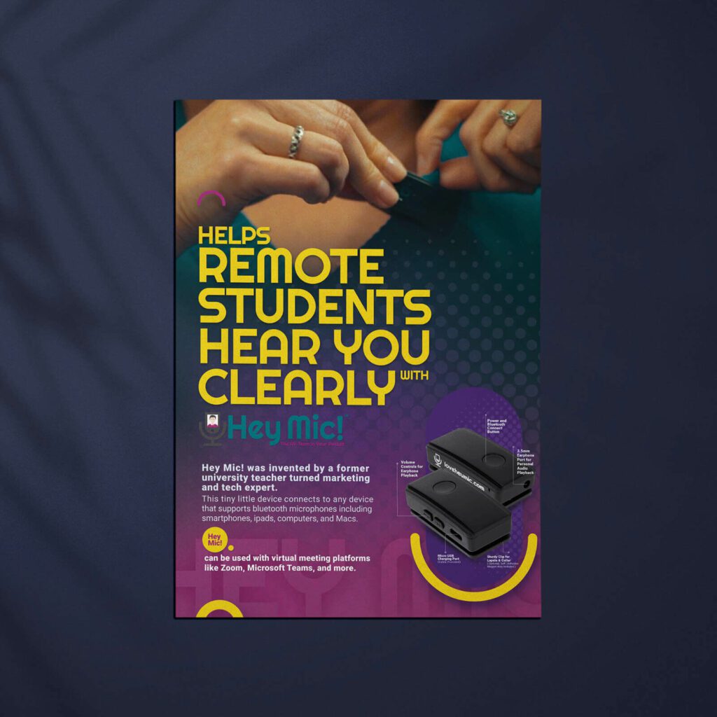
For example, in the design below, the circular fonts and the yellow circular accents in the design create an overall cohesive look.
Mix and match multiple elements of the same shape to create a strong theme
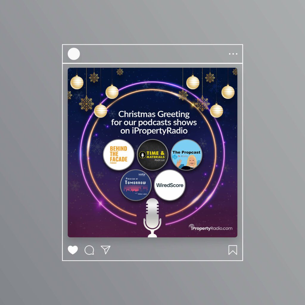
How you combine shapes matters. Similar shapes combined can amplify the theme. Whereas, a combination of shapes like squares and triangles can help create a balanced aesthetic while maintaining a professional tone.
In the below design, the circular baubles, the snowflakes, and the other circular elements all blend well to create a cohesive and cheerful aesthetic.
Unleash the Power of Shapes With Designs by KIMP
To conclude our discussion, shapes are more than just visual elements; they influence how the viewers perceive the design and how well they understand the message. Thus shape psychology can be your secret ingredient in creating designs that effectively deliver your message. But let’s face it, some design practices, like the intuitive application of shape psychology can take years to master. So, why not leave it to the pros? Looking for a design team that can choose the right shapes to create impactful designs for your brand? Look no further. Choose a KIMP subscription.
Register now for a free 7-day trial!

