5 Essential Elements of Design in Marketing and Beyond
Ever felt like you have the perfect plan for a logo but things look off when you put your ideas to paper? Or perhaps you are trying to create an ad and you feel like there’s something missing in the design? The secret is to meticulously weave the threads of the essential elements of design to create a visual symphony.
No more worries about staring at a blank paper or a blank screen. Today we are going to talk about the core elements of design, components that help shape the visual narrative. Whether it is a logo for a brand or a social media post, a billboard design or packaging labels, you need to know what elements to use and how. That’s precisely what this blog is about to address – the 5 important elements of design and how to use them effectively. Without further ado, let’s go.
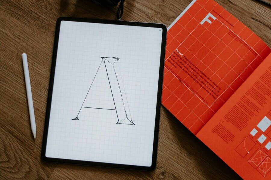
1. Lines – to Guide the Viewer’s Eyes
Lines serve as the building blocks of any design, quietly shaping the visual narrative. To put it simply, a line is the trajectory traversed by a point through space.
Picture it gliding in a straight line, curving gracefully, or dancing in a playful wave. It might even take on the bold, energetic vibe of a jagged line or embrace the fragmentation of a broken one. In essence, a line is something that takes a stationary point and sets it in motion. So, no surprise, it’s one of the core elements of design that you need to get familiar with.
Being the fundamental elements of design, lines are also the most versatile. You can personalize them to meaningfully tie elements together in a design. Or perhaps to separate them! You can use them to direct attention toward particular sections in the design. Sometimes, lines introduce order and sometimes they can introduce chaos as well!
Considering all these factors, understanding the different types of lines and the purpose behind each and the associated psychology is one way to ensure that you use lines effectively in your designs.
Using lines to tell a story – understanding the types of lines and their purposes
Straight lines infuse stability into a design. And when vertical, straight lines can symbolize strength or even stability. On the other hand, horizontal straight lines can create a sense of balance. And finally, diagonal straight lines can symbolize movement. The intuitively arranged diagonal lines in the Adidas logo with their dynamic mood is a good example.
Curved lines infuse fluidity into your design. If you are looking to create something more dynamic, curved lines feel more relevant. Furthermore, they imbibe a sense of creativity. Take the below logo design for example – the curved line with varying weight helps introduce a sense of motion into the design. The simple Swoosh of the Nike logo is another example of a curved line being used to create a sense of motion.
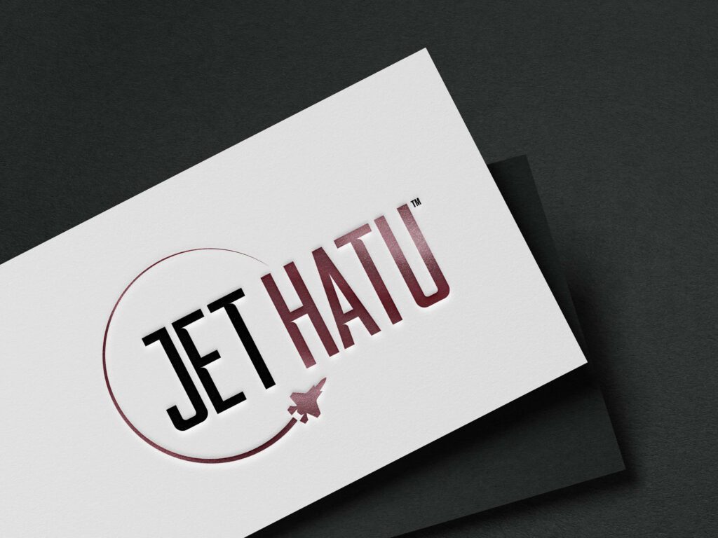
Jagged lines help evoke excitement. Given the unpredictable nature and the unconventional form of jagged lines, they are useful in designs where you need to bend the rules and appeal to the youth. Take the design below for example. The design has an overall quirky vibe and hence the curved lines and jagged ones complement the overall mood perfectly.

KIMP Tip: These three main types of lines can further be customized by varying the weights, textures, continuity (dotted lines and broken lines), and other aspects so as to further personalize the purpose. For example, if you wish to introduce an element of intrigue without losing out on the stability of straight lines, dotted straight lines come in handy.
2. Shapes – to Define Structure In a Design
When talking about the elements of design, shapes are as pivotal as lines. Lines that do not form shapes end up vaguely communicating the message or missing their meaning altogether. Because without clearly defined shapes, there is no specific visual structure in the design.
In simple words, shapes are two-dimensional elements of design with clearly defined boundaries that separate them from the rest of the elements. Naturally, they consist of 1 or more lines that lay down the placement and purpose of these shapes.
Much like lines, shapes can be of different categories each of which elicits a different mood and fulfills a different intent. Let’s look at some of the most used categories in shapes along with some examples.
Exploring the dynamics of shapes and their interpretations
Geometric shapes like circles, rectangles, and triangles are your best bet if you are looking to create a sense of order. Or if you are looking for something more traditional. Moreover, shapes like rectangles and squares also have their way of establishing authority and therefore feel relevant in designs meant to carry a professional tone, like the rectangle in the below design.

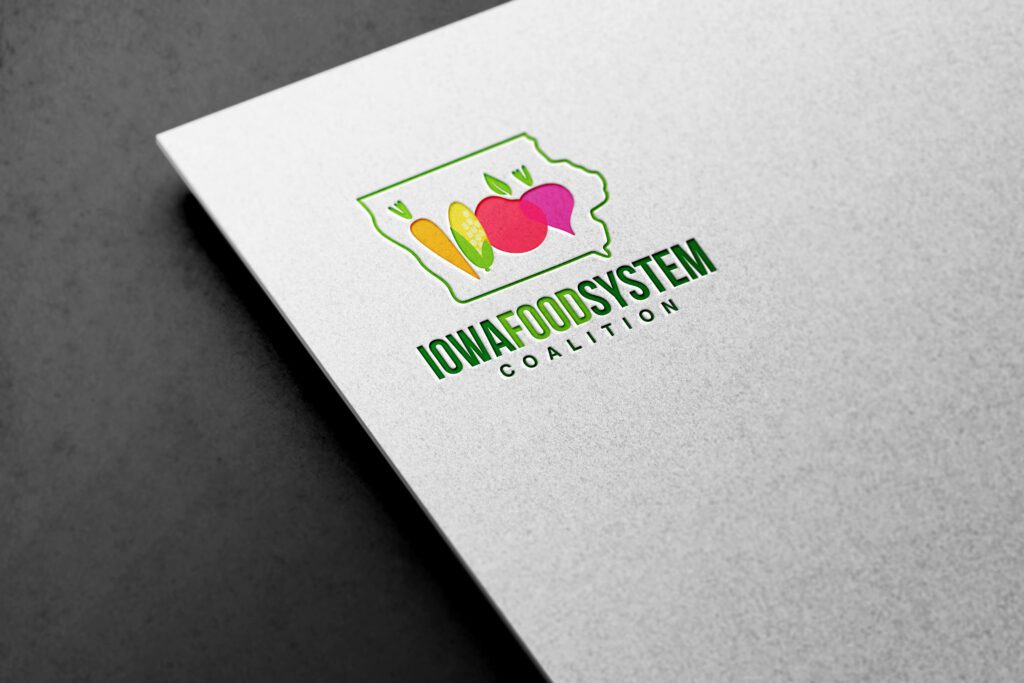
Natural shapes are those derived from natural settings and natural elements. So, if you are looking to achieve artistic expressions that mimic the randomness of the natural world, natural shapes feel pertinent. Similarly, organic shapes like leaves, mountains, trees, or even fruits and vegetables feel relevant to food brands and ads promoting organic products. The use of organic shapes in the below logo achieves this impact.
Abstract shapes are expressive and are suitable for applications where you wish to create open-ended conversations. Since there is often no direct interpretation of abstract shapes, they encourage viewers to interact with the design by interpreting the meaning. Take the below social media design for example. From the casual typeface to the abstract font, everything about the design creates a calming and thought-provoking theme.

KIMP Tip: Understand shape psychology so that you do not use too many contrasting shapes that confuse the viewer. Also, remember that using too many shapes can lead to visual chaos!
3. Colors – to Introduce Emotions Into a Design
Once you use lines to guide the viewer’s eyes and shapes to define a structure, then comes the part about creating an emotional connection with the viewer. This is where we come to one of the most crucial elements of design, color!
Colors help add the much-needed additional layer in design – emotions. So, you need to choose the right colors and implement them the right way to create the intended impact and communicate the message clearly. Let’s go over some parameters that help you achieve this.
Diving into the transformational effects of colors
Understand color psychology. Colors have different moods and some colors hold some cultural value as well. This is why when using colors in pivotal branding designs like logos, some brands invest a lot of time and effort into finding the right ones. In the below logo design, red and yellow are the main colors and this combination is quite popular in the fast-food segment. These colors are known to evoke excitement, create a sense of urgency, and make you hungry thus suitable for a restaurant logo.

Choose the right hue, shade, tint, or tone. Hue is the solid color whereas tint is what you get on mixing white to it and shade is when you add black to the hue. Tone on the other hand is when you combine grey with the selected hue. The below example uses the most relaxing tint of purple so as to create a soothing mood for the promotion of the essential oil. A solid hue of purple will feel more vibrant or a darker shade of purple on the other hand will feel more suitable if a touch of luxury is required.

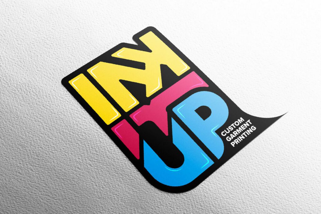
Since colors are essential elements of design, you also need to work with them in the right combinations. Color harmonies help you find the right color combinations that look visually appealing while also delivering your message as intended. Check out our blog on the color wheel for an overview of color harmonies. The logo design featured below uses a triadic color scheme. Triadic color schemes are known to be dynamic and balanced and therefore feel relevant to the garment printing business here.
4. Textures – for Adding Depth and Sensory Appeal
Once you guide your viewer’s gaze to the right element with lines and evoke the right emotions with colors, textures help you enhance the interaction and create a more memorable experience. In simple words, textures are about how a design or particular portions in it feel – the kind of tangible experience they create. Therefore textures are some of the most useful elements of design that help strengthen the sensory impact of a design.
In the case of print designs, embossing, engraving, and other techniques help create tangible textures. Whereas in digital designs, you can create visual textures using color variations and the use of specific shapes as well.
Let’s quickly look at some examples of designs that incorporate textures and the role played by the chosen textures in each.
Using textures to bring your designs to life
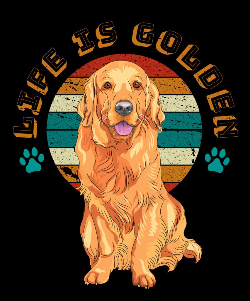
The below design uses both colors and lines to create implied textures so as to add more realistic details to the design. These realistic details help enhance the emotional depth of the design as well. Despite being an illustration, the portrait of the dog looks life-like and feels warm and cheerful due to the textures in the design. That’s one way of using textures in your design.
The other way to use textures is to add shadows and highlights to break any monotony and create elements of visual interest in the design. Take a look at the below book cover design. The 3D texture makes the infinity symbol stand out and establishes it as the focal point in the design. This makes the ordinary print design look extraordinary.

Finally, there’s one other application of textures in design and that is to establish visual themes. For example, shimmery and glittery textures help create a luxurious visual theme. Therefore, you can use them in ads and other marketing designs created for a luxury fashion brand or a jewelry brand. On the other hand, adding subtle distortions and noise helps create a vintage theme like the design featured here.

5. Space – Creating Visual Harmony in Design
Even with the other elements of design intuitively laid out, if space is not strategically planned and executed, it takes a toll on the visual harmony of the design.
Both positive space and negative space are factors that can make or break your design. Because they determine the clear communication of the relationship between elements. In other words, space determines whether the subject stands out or blends in. It tells whether different pieces of text in the design are to be read together or in a particular order.
So, how can you ensure that you use this element effectively in your design? Let’s find out.
Utilizing space to influence perceptions
Positive space is any area occupied by elements of design like lines, shapes, and textures. Negative space on the other hand is the area that’s left blank in the design. These could be spaces between and around other elements of design or sometimes within them as well.
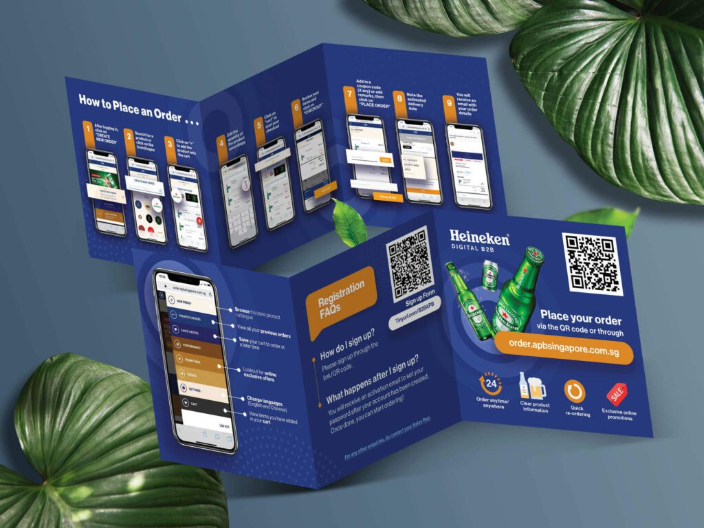
The strategic use of positive and negative spaces ensures that there is a clear hierarchy in the design. Take the first image in the below brochure design for example. Since the idea is to deliver step-by-step instructions, the consistent-looking positive and negative space utilization in the design creates a rhythm – a smooth-flowing structure.
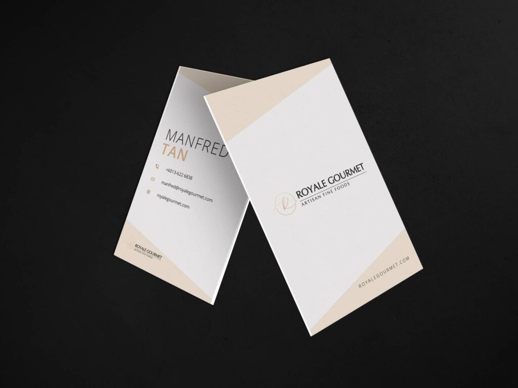
In the business card design featured below, the negative space intentionally created around the brand name and contact details ensures that your focus is immediately directed to these key elements. This is how you use space to establish the element of focus in your design.
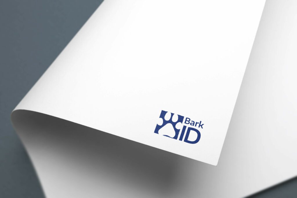
Finally, there’s one other creative use of positive and negative spaces and that is intentionally creating negative spaces within positive spaces, as you see in the logo design featured below. The paw print is created as a negative space enclosed within the square in the logo. This technique helps add a layer of meaning, an element of visual intrigue without taking up too much space.
Bring These Elements of Design to Life With KIMP
All of these elements of design share strong bonds with each other and create magic when they come together harmoniously. And achieving a harmonious blend of these elements of design is important to create visual appeal and to attain conversions.
After all, these are times when your target audiences are bombarded with visual stimuli on various screens and in print as well. So, you need to be careful about piecing your design together so that the design is interactive and the message is clear.
Working with professional designers makes this part simpler. So, what are you waiting for? Register for a KIMP subscription and start working with a designated design team who can help you stitch these design elements together to bring your brand to life.
Sign up for a free 7-day trial now!

