Gestalt Principles: How They Shape Visual Perception in Design
Art is subjective but design isn’t! What does that mean? While artistic expression is open to interpretation, effective design relies on predictable human responses. This is because design often hinges on principles grounded in human psychology. One of the cornerstones of design psychology is the Gestalt principles.

In simple words, Gestalt principles are rooted in the innate ability of human beings to see patterns and perceive relationships and thus lead to interpretations. Therefore, they can be used as a roadmap for creating designs that are not just visually appealing but also meaningful. Evidently, these are the kinds of designs that most brands need in their marketing and branding applications.
So today, we’re going to give you an overview of Gestalt principles, their significance in design and some tips and tricks to make the most of them. What is in it for you? Some fresh perspectives to help take your brand designs to the next level.
Gestalt Principles: An Introduction
Not all businesses that have a great idea end up creating great ads. That’s because the execution part is as important as the ideation part.
When it is an animated graphic like a video there are many ways to bring the idea to life. Subtle animations draw attention to certain parts of the design or even retain the audience’s gaze. However, with static graphics, you have very little to work with, right? Not exactly. There are intricate details like the positioning of elements, the scale of different components, their colors, and other factors that you can tweal to optimize the viewer’s response to the design.
In other words, there are a few principles that you can apply to these details so as to ensure that your design eliminates ambiguities and presents the intended message with utmost clarity. Moreover, these principles can also be applied to your designs to ensure that they evoke the right emotional response thus strengthening your ties with the existing customers and shaping your brand’s reputation with new leads.
Gestalt principles are among these principles that help enhance your designs.

A gist of Gestalt psychology is that “The whole is more than the sum of its parts”. This school of psychology originated thanks to the work of Max Wertheimer, Kurt Koffka, and Wolfgang Köhler. Their idea was to view designs as “structural wholes”.
So, now let’s address the big question – why are Gestalt principles valuable in graphic design?
Significance of Gestalt Principles in Design
- Research shows that about 94% of users will abandon a website if it’s poorly designed. So, applying dependable design principles like Gestalt psychology can help address such gaps and create visually appealing designs. This is because they help boost the visual harmony in the design thus enhancing its aesthetics.
- Sometimes you have a design that grabs attention because of its visual appeal. However, it does not convert. That’s where the application of Gestalt principles can help optimize the design to ensure that the pivotal message is clearly presented. This is because they help establish hierarchy and clearly define the relationship between the different parts of the design ensuring that the main message stands out.
- Complicated designs can confuse your audience or even frustrate them. This in turn leads to poor customer experience which can affect your brand reputation. Therefore, applying Gestalt principles helps you create an organized presentation of the information simplifying the idea and improving comprehension. This in turn helps strengthen your brand’s credibility and reputation.
In summary, Gestalt principles help establish consistency across all your designs, nurture emotional connections with your audience, and eventually boost engagement.
Gestalt psychology can make a big difference in design projects ranging from product design to web design and brand graphic design. Let’s now understand the most commonly used Gestalt principles and some strategies to apply them to your designs.
7 Gestalt Principles & How to Apply Them to Your Brand Designs
1. The closure principle
How many times have you come across broken or incomplete shapes and noticed your brain automatically fill the gap? This is a gist of the closure principle of Gestalt psychology.
This principle is based on the idea that the human mind seeks complete structures. For this, we look for patterns and shapes to form even in something that looks random or incomplete.
So, how can you use this idea in your design?
Sometimes, the closure principle is valuable in simplifying a design by eliminating a few lines and curves and yet communicating the message. For instance, can you recall the “copy” icon? Different apps and brands might use their own versions of it but the core structure consists of overlapping rectangles. The rectangle in the background is only partially visible and yet our mind perceives it as a complete structure.
As can be seen in this example, this Gestalt principle could also be useful when you have to create a flat design rather than a three-dimensional representation.
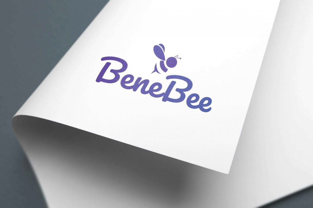
Another application of this will be to create unique minimalistic illustrations of well-known objects. This is useful, particularly in logo design where you need to create something that stands out. For example, look at the bee icon in the below logo. Despite its missing parts it still appears whole.

The WWF logo also applies a similar principle.
KIMP Tip: While applying this principle ensure that you strike the right balance between what’s present and what’s missing. You need just enough room to encourage users to use their imagination without leaving them puzzled.
2. Proximity principle
The next on our list of Gestalt principles is the proximity principle. This principle suggests that our brains perceive objects placed closer to each other as related objects and those placed away from each other as separate entities.
Therefore, when you have a design with multiple elements each with a different role to play, you categorize them as groups of related elements and use negative space to create a visual separation between these elements.
In other words, by strategically arranging elements in close proximity, you can create visual hierarchies, enhance readability, and improve overall design coherence.
The below image is a snapshot of the interface of Google Docs. The proximity between the toolbar icons and the visual separation of the collaboration icons (on the right) clearly establish their different roles.

Similarly, when designing an app or website UI you can apply the proximity principle to represent the relationship between elements on the page.
In fact, there are several other ways to use this idea. For example, the below restaurant menu groups items in a particular category close to each other.

KIMP Tip: White space is the crucial component in establishing the proximity and separation between elements. However, optimize the amount of white space used because too much space can lead to the element being overlooked. Besides, this can also increase the amount of screen space required which can be an issue when optimizing for mobile.
3. Similarity principle
The proximity principle was about intentionally arranging elements close to each other or separately irrespective of their visual appearance. However, the similarity principle tells how our brains immediately relate similar elements, even if they are not placed next to each other. In other words, if two or more elements share visual characteristics, like shape, color, texture, or size, they are perceived as a group whereas dissimilar elements are seen as separate categories.
For example, in the below email design, after you encounter the first orange rectangular button for the CTA similar buttons in the rest of the email are all instantly perceived as CTAs.

Similarly, the infographic in the below image features various social media platforms. However, to categorize them based on their parent company, they use 3 different colors. So bars of the same color are easily comprehended to belong to the same company. This is a great example of how Gestalt principles are applied to the simplest of design elements.
KIMP Tip: Given that elements sharing evident similarities are seen as related elements, avoid using the same color, font size, and other attributes for elements in the design that are not related in any way or elements that have contrasting roles to play.
4. The principle of common region
If similarity and proximity are not enough to establish a relationship or separation between elements, then it’s all about boundaries and grouping. In fact, this visual cue of a defined area overrides other grouping factors in Gestalt principles like proximity or similarity.
The idea behind creating distinct aisles and designated areas for various product categories in a store is a crude everyday example of this principle. Whereas from a design perspective, the below infographic should give you an overview. Despite carrying similar icons and fonts, the common area defined through color contrast helps differentiate the product promoted from the usual scenario.

KIMP Tip: Use easily understood visual cues like containers and boxes in contrasting colors to define the common region. But remember, too many borders and boxes can also lead to visual clutter.
5. Continuity principle
As you must have gathered by now, Gestalt principles are about how our brains perceive and organize visual information to make sense of the world around us. Similarly, the continuity principle is built on our tendency to perceive elements as part of a continuous pattern or flow. Our innate desire to look for “continuity” and connections.
What experienced creatives do is that they tap into this inherent tendency of the human mind to seek visual continuity to guide the viewer’s eye through a composition. In other words, they use this principle to create a sense of direction and establish relationships between elements.
For example, take a look at the restaurant menu here. The arrangement of the image and text sections alternate in each row. So, by the time you are in the third row, your eyes naturally glide in a zigzag pattern to proceed to the next text section. Therefore, the design does not just look well-organized but also makes it easier for users to maneuver through the presented details.

Gestalt principles like the concept of continuity can also come in handy when you have to create more detailed designs like infographics or charts, for instance. Because these are designs where there are a lot of key details to be represented. And using visual cues to establish virtual paths can ensure better comprehension of the data. The design here exemplifies this approach.

KIMP Tip: Use lines, curves, gradients, and color variations to create a flow in your design – to emphasize the direction in which a user’s gaze needs to be directed.
6. Symmetry principle
Most other Gestalt principles talk about the relationship between two or more elements eventually leading to the perception of the role played by an individual element in the design. Meanwhile, the symmetry principle takes a step back and looks at the bigger picture. The order and balance in the design as a whole. This includes elements arranged in proximity and those arranged far away, as well as similar and dissimilar elements.
When you look at a design that shows the mirroring of elements around a central axis, creating a sense of stability and visual harmony, do you instantly find the idea pleasing? That’s what the symmetry principle is about. Besides, symmetry exists in various forms in nature like the wings of a butterfly or a snowflake or even a simple pinecone. Hence symmetrical arrangements are perceived to be beautiful.
No wonder, symmetry feels essential where there is a need for a sense of order and seriousness, making it ideal for designs requiring a formal or professional tone. And a well-planned symmetry also makes your design look more professional and credible.
Symmetry is what creates visual intrigue in the below brochure design.

The symmetry principle is also a reason why the text and images in the below ebook design look cohesive and polished.

7. Figure-ground principle
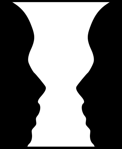
In psychology, the Rubin Vase illusion is often used to indicate the essence of the figure-ground principle.
In simple words, the figure-ground principle touches on our inherent ability to distinguish between a focal object (the figure) and its surrounding background (the ground). For instance, in the below logo design, do you instantly perceive the thunderbolt icon as sitting on top of the alphabet “A”? This design taps into the ease of differentiating between figure and ground to create an additional layer of meaning within a simple design.

As can be seen in this example, this is one of the Gestalt principles you can use to draw attention to the most crucial element in a design.
KIMP Tip: Remember that our brains can instantly separate objects based on contrast. Therefore, contrast is one of the strongest attributes you can use to distinguish between figure and ground and thus elevate the clarity of your design. This could be the contrast of color, size or even shape.
For more information on visual contrast and how to make the most of it in design, check out our blog here.
Unleash the Magic of Gestalt Principles With Designs by KIMP
In conclusion, good graphic design is all about the optimal use of the power of perception. Effective designs are those that are built on concrete principles like the Gestalt principles. Because these are tried and tested methods of attracting viewer attention and retaining it.
But mastering these principles takes time, practice, and a keen eye for detail. That’s why working with a professional design team that has already mastered the art of applying these principles to create impactful designs can make a big difference.
Signing up for KIMP gives you access to a talented design team and support for unlimited designs as well. Ready to give unlimited design subscriptions a shot? Register now for a free 7-day trial!


