Design Terms That Every Non-Designer Needs To Know
It can be a lot of fun working with a designer until you realize that you are speaking two different languages. When you have no idea what the other person means, or have to Google every other word they’re saying, you know it’s time to brush up on design terms.

So in this blog, we are giving you a breakdown of the various terms designers use so that you know exactly what you are dealing with.
Branding design terms
Combination mark
This is something that brings together or combines the logomark and the logotype.
Logomark
Logomarks are also known as a brand mark and are symbols that represent a brand. They do not contain the name of the brand and are rather abstract and simple.

Logotype
This is usually the name of the company designed in a unique way with aesthetic appeal.

Icon
An icon is a very simple method of getting the idea across to the reader. They also simplify and separate the text in any web design. They should not be confused with a logomark, and can be used in a wide range of applications.
Design terms related to color
CMYK
This stands for Cyan, Magenta Yellow and Key and is a color model that isused for print designs. How it works is that tiny dots of these colors are laid out. And when they are used in different combinations, they will show different colors. If you add, for example, all four colors together, you will end up with black.
Color palette
This is a set of colors that complement one another and will bring together the elements in a design.
Gradient
A gradient will allow you to add depth and dimension to the design that you create. It will also allow for the viewers’ eyes to flow smoothly from one color to the other. Using flat colors can create a final output that is just as flat. Chaotic use of colors can be too busy but with gradients you can ensure order and aesthetic appeal. There are a few types of gradients that you can use.
- Linear – here the color will transition from a starting point and end in a straight line.
- Radial – here the colors will spread out from the central starting point in a circular pattern.
- Angle – the pattern flows counter-clockwise. The line that denotes the beginning and end of the color spread is clearly seen.
- Reflected – the color spreads equally on both sides of the starting point. This is fantastic to use when you are designing something with a glossy finish.
- Diamond – the color spreads in the shape of a diamond. This starting point would usually be one corner of the diamond shape.
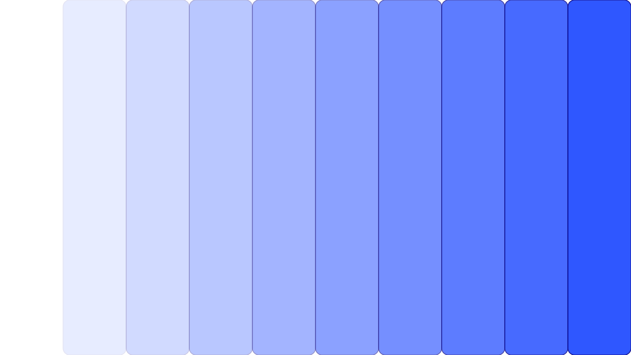
Hues, tints, tones and shades
A hue is basically any color on the color wheel and these colors can come together to make other secondary and primary colors.
Now, when you mix black, white or both into a hue (color) on the color wheel, you get variations. These variations are what we call tints, tones and shades.
When you mix white into any hue you get tints. It is a light and desaturated version of the color that is not as intense. They are also known as pastels and are calmer colors.
When you mix black and white with a hue you get a tone. Essentially you’re adding grey to the hue. You can make the tone lighter or darker based on the amounts of black and white that you are adding.
If you simply add black to a hue you get a shade. This is darker and much more intense than the original hue. Adding black can be tricky because just a small amount can be really overpowering.

Negative/ white space
This refers to the space that surrounds the visual elements that you have in your design. That said, the space is not negative and it does not have to be white either. It is just more of breathing space in the design and it can have any color, pattern and texture. White space is also quite important when you design. It helps to create emphasis to the right points of focus and also to evoke a mood.
Opacity
This term refers to how transparent your image is. It is typically shown as a percentage. 0% means that the image is hidden and 100% means that the image is fully transparent.
Pantone
These are colors that represent a specific shade. Essentially you can communicate the exact color you need through a pantone code. This is considered as the basic language for colors in graphics. The formula that has been developed by pantone is known as a spot color. This means that the pantone palette is made up of 18 basic colors and not screens or dots.
RGB
This color model is used for screens and stands for red, blue and green. When you add all these colors, you can get the color white.
Saturation
This term describes the intensity of the color in the image. A saturated image will have colors that are overly bright. If your images are under-exposed for example, you can use graphics to increase the saturation of color in them.
Image type design terms
Raster Images
These are also sometimes called bitmap images and are made up of thousands of pixels that will then go on to determine the color and the form of the images. For example, photos are raster images. Resizing these can be difficult as these images are made of a finite amount of pixels.
When, for instance, you give a raster image larger dimensions in Photoshop, the software will have to make up data in order to add to the size of the image and this will result in poor quality. There are several different types of files that you need to know about within Raster images.
- GIF – the Graphics Interchange Format is a raster file that will support transparency and animation. GIFs only have the ability to show up to 256 colors and that makes their file sizes very small.
- JPEG – this stands for Joint Photographic Experts Group and is the most widely used raster format when it comes to web designs. These load fast and are compressed files.
- PNG – these files do not lose their quality even when they are compressed and stand for Portable Network Graphics. They have a web-based format. These files were actually developed so that the quality of GIF files can be enhanced.
- PSD – when a designer creates an uncompressed working raster file image in Adobe Photoshop it becomes a PSD file. The letters stand for Photoshop Document.
- TIFF – Tagged Image File Format is used rather commonly for exchanging raster images across applications. It has a somewhat higher quality than JPEG or PNG and is used mostly by photographers and publishing industries.
Vector images
Vector images are made up of many points. These points have an X or a Y coordinate. These points will then join paths and form shapes and you can then add color inside these shapes. Vectors can be increased in size without you having to worry about the quality. They are usually used for logos and graphics that can be used as many different outputs from leaflets to even billboards. Let’s look at the different types of images that fall under this category.
- AI – this stands for Adobe Illustrator document. This format of file has been created by Adobe systems and they have single-page vector designs.
- EPS – Encapsulated Post Script can be resized and is widely used for vector designs. It has very high quality and is used in many print elements like logos, brochures and business cards.
- PDF – developed by Adobe, Portable Document Format is a file type that can be downloaded and viewed by any computer. They are ideal for you to share work previews as they are universally viewable.
Resolution
There are 2 types here which you need to be aware about which is DPI and PPI.
- DPI is something that you have to be concerned about when you are working to produce a printed output. It also stands for dots per inch. This essentially refers to the number of dots per inch on one printed page. Higher the number of dots here, higher the quality of the image. The standard for a printing image is 300DPI.
- PPI stands for pixels per inch. If you create an image that is large in Photoshop, you will have to increase the number of pixels per inch, where Photoshop will make up the data and you will also lose some quality.
Resolution will only apply to raster images as vectors will not work with pixels.
Font, text, and typography design terms
Ascender
This is a linear extension of a letter shown above the midline.
Baseline
This is the even visible line on which all of the letters that you put into your design will sit.
Cap height
This is the distance between the baseline and the very top of the uppercase letters.
Descender
This is an extender on a letter that will appear below the baseline. The areas in red in the example below are the descenders for the given letters.
Kerning
This refers to the adjustment of the spacing in between the characters of a particular font so that there will be a more visually pleasing outcome. For instance, you may want to have a bit of space between the t and the i so that the arm of the t will not merge with the i. You will also need to make sure that the kerning you do is accurate when it comes to using capitals such as T or A in any headline.
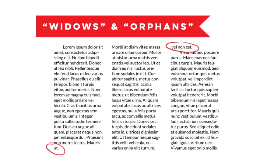
Orphans and widows
When you work with typesetting, widows are the paragraphs that end with a line in the beginning of the next page or the column. Now orphans on the other hand, are paragraphs that begin at the bottom of the page or the column. They do not look too appealing and usually need to be padded out with more copy, or your designer can try and fix them. If there are any single words that fall at the final line of any paragraph, try and work on them as they look unsightly.
Sans Serif
These are a group of fonts that do not use the lines and stubs at the end of characters like in the case of serifs. Some of the popular fonts that fall within this group are Helvetica, Arial and Geneva. San serif fonts are a little difficult to read. They are often used only in short texts like captions and headlines.
Script
These fonts mimic handwriting that is cursive. It has a personal touch to it like in the case of calligraphy. You can choose from two different types of script fonts – formal and casual. The formal group has a lot of fancy touches in them. They are also very easy to identify because they have curls and flourishes that go outward from the serif. Now on the other hand, the casual script font has fewer curling bits. If you want to give your design a homely feel, you can use this type of font. However, when you do choose a font like scripts you have to be careful as the readability can be lower.
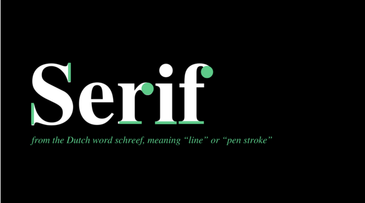
Serif
Serifs are a commonly used type of font. The letters in this case have decorative stubs on them as shown in the image above, where you can see the highlighted green bits. There are four main types of Serif fonts.
- Old Style
- Transitional
- Didone
- Slab Serif
Tracking
Tracking refers to either increasing (for the most part), or decreasing the space between letters in a line or in a block of text. It is usually applied horizontally. Leading happens when the same principle is applied vertically. This basically refers to maintaining the same space between 2 lines. The main goal here is to make sure that your type is legible and that the descenders will not merge with the line immediately below.
General design terms
Alignment
The alignment essentially refers to how the elements in your design, which includes text and images, are arranged in relation to one another. These images can be aligned to fit the page as well as look just right with each other.
Aspect Ratio
This happens to be the proportional relationship of the height to the width. You will see it in an x:y format. For instance, an image that has the dimensions of 6 x 4 will have an aspect ratio of 3:2. This will decide the ratio and the shape of the image and not the size of it.
Contrast
This is a principle in design that happens when two elements in the visual are rather dramatically different. The bigger the difference, the more the contrast. The contrast in design will help you deliver the message across by guiding the eye of the viewer to the focal points. It also helps with improving readability. You can see contrast being applied in terms of color, size, value, or any other aspect of a design.
Compression
Compressing an image is essentially what happens when the size in bytes of a graphic file is reduced, without it having a negative impact on the quality of the image. When the file size is reduced, it makes it easier for these files to be emailed, and will also only take up less space in storage. They will then also be easily downloadable from web pages.
Flat Design
A flat design is a style of user interface design that has very simple and two-dimensional elements along with bright and vibrant colors.
Balance
This relates to the balancing of the elements in the page so that the graphical and text components are laid out correctly and evenly. There are 3 main ways to achieve this.
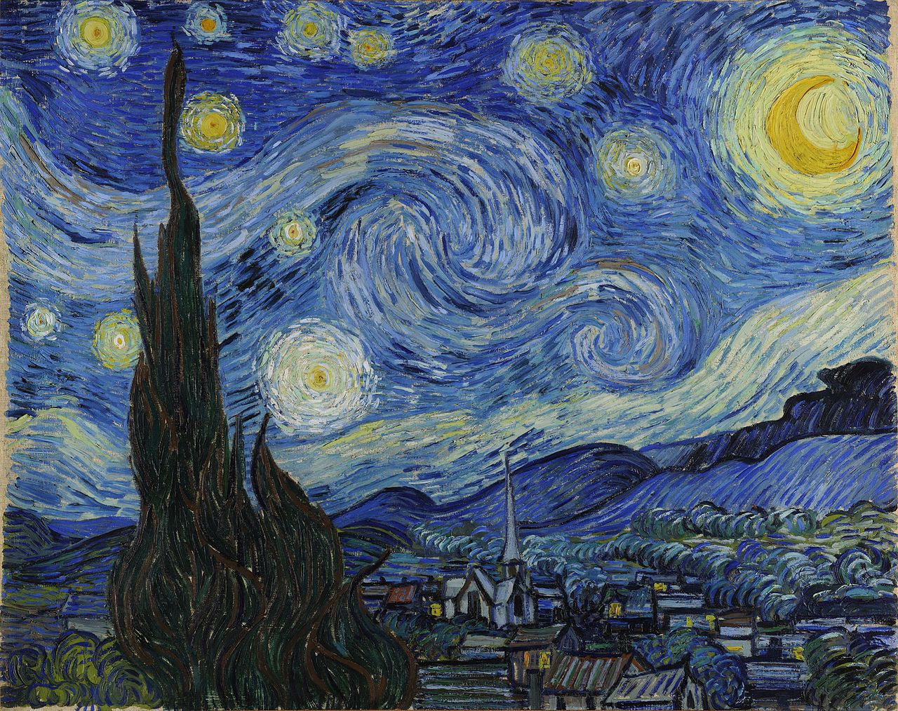
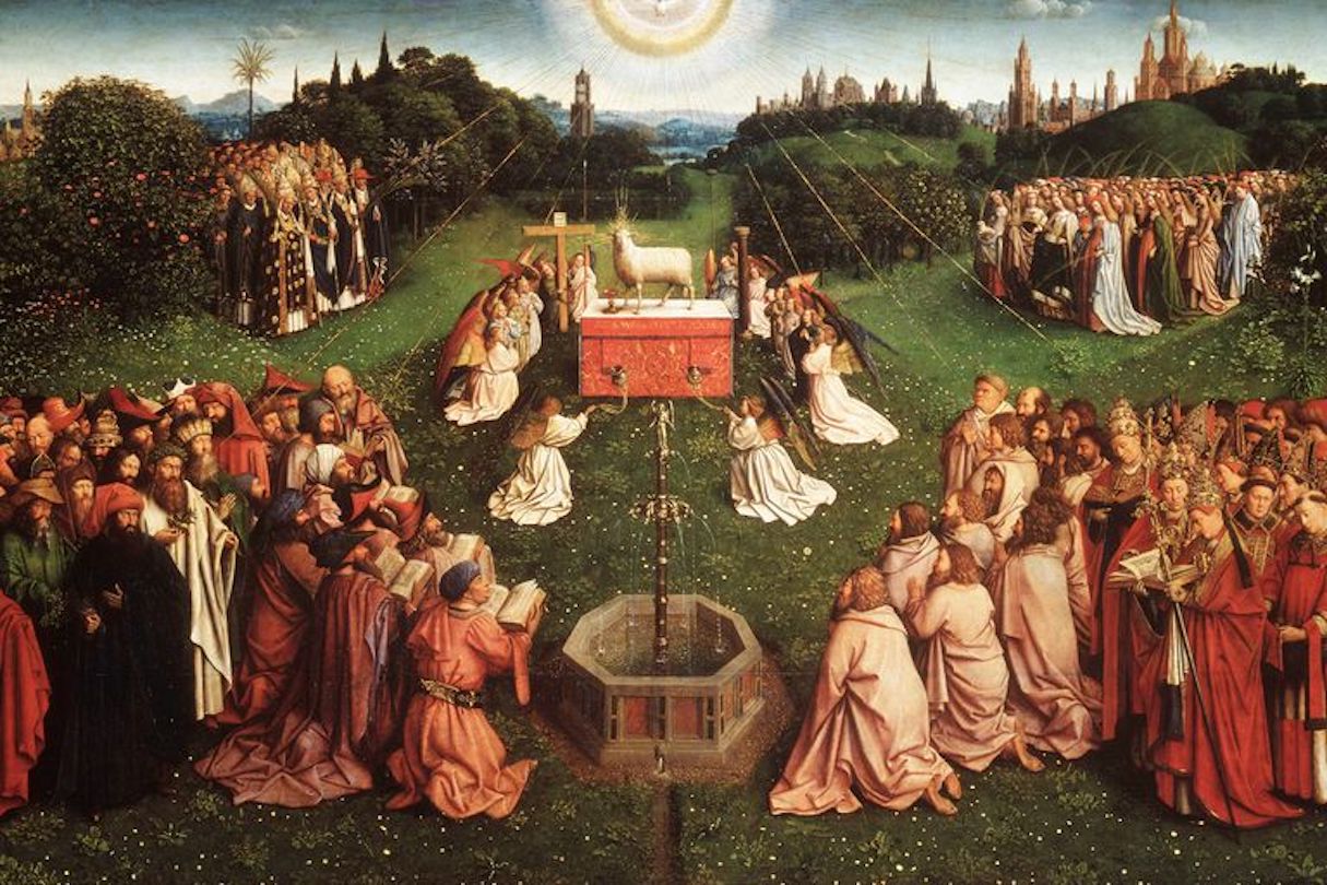
- Asymmetrical – This painting from Van Gogh is the perfect example of asymmetrical design where different objects and colors are used to create the perfect piece that is not distributed evenly. In graphics, when there is for example an image on one side and text on the other, it is said to be asymmetrical.
- Symmetrical – all design elements are balanced out evenly on both sides of a central line.
- Radial – in this type of design, the elements would radiate out from a central point, which will, in turn create balance in the design.
Composition and the layout
The composition of a design (aka the form) is the arrangement of the various design elements. If the composition is successful, it will attract the viewer and will also carry their eyes across the complete design. It is made up of many different elements like the balance, the alignment, proximity, the white space and the contrast.
Scale
The size of one design element when compared to another element in that same design.
Texture
In graphic design, when you speak about texture, you are referring to the sense of touching, actualization and feeling. This characteristic will uplift the other elements of your design like the colors, the content, patterns and illustrations.
Trim and bleed
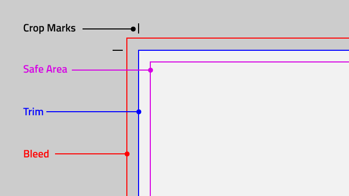
The Trim size will represent the final dimensions for the design that you are doing. The bleed is basically when the design extends beyond the trim size. When the final design is done, the bleed area will be cut off most of the time. The purpose of the bleed area is to make sure that the design reaches all the corners properly without having any white borders that may look quite unsightly.
Knowing your terms can help you loads
We’ve brought you a lot of that we know will help you as a non-designer, but learning about design doesn’t end here! Just like trends in designing, design terms change as well. And the more that you try and stay updated, the better you will be able to follow through with your work. This way, when your team members or boss tells you what you need to get done and the details come with jargon, you’ll know exactly what they mean.


