Web Banner Design Tips To Get You More Clicks
Are web banners a part of your digital advertising strategy? Are you using the right web banner design tips to connect with customers? If not, you are missing out on a great opportunity to increase your web traffic.
Web banners have a long history. The first-ever web banner was uploaded by AT&T Corp on October 27, 1994. Ever since then, web banners have come a long way.
Do you want to establish a strong presence on the internet and ensure everyone knows your brand? Are you planning to run a full-funnel campaign and wondering which medium is the best for brand awareness?
Then we would like to happily introduce you to one of our favorite mediums in digital marketing: web banners. You can see them everywhere – whenever you go to any website, watch a video on YouTube, or even browse something on Google.
And that is why they are the best choice for your brand awareness campaigns.
Web banners have a long history. AT&T corp launched the first-ever web banner on October 27, 1994. The rest, as they say, is history.
Web banners have become increasingly popular over time. And with good reason too. They’re affordable, you can measure your results, and they’re effective.
While it looks like it is a small creative design and brands do not have to worry about it, the truth is far from it.
Design plays a major role in the success of your web banner, and that is why the Kimp team has compiled our best web banner design tips for you.
The 7 Best Web Banner Design Tips
Did you know the Kimp had its humble beginnings in web banner design for our clients back in 2003? Yes, web banner design is our origin story, so it is safe to say that we know a thing or two about it.
Most of the time, brands and marketers spend a lot of money hosting their banner ads on the best sites and analyzing the traffic. But when the clicks dry up, they often feel stumped.
We can tell you why the clicks dry up. It is because the design is not doing its job.
So how to make it do its job? Well, follow the tips below if you want to know how or connect with the Kimp team and try out our graphic design services to get it done in a jiffy.
1) Banner Size And Placement Matters in your web banner design
Banners come in many shapes and sizes depending on where you plan to advertise. Even within a single platform, different placements call for different sizes. Familiarize yourself with all the banner sizes you’ll need to prepare for your preferred placement.
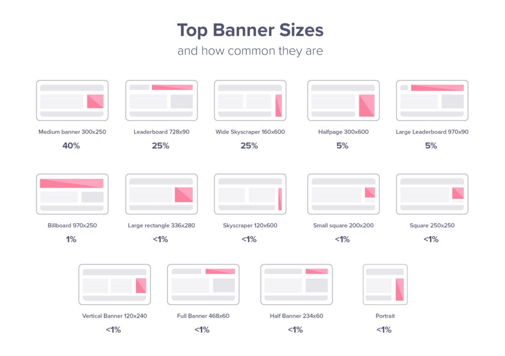
Among the various sizes available on Google Ads, Adsense recommends the following as the top-performing ad sizes:
- 728×90 Leaderboard
- 300×600 Half Page
- 336×280 Large Rectangle
- 300×250 Medium Rectangle
- 320×100 Large Mobile Banner
Rectangle and leader board banners feature in the list of top sizes responsible for 89% of the clicks.
Image Source: Match2One
You can use the same banner in different sizes based on the platform you choose. And remember, banners are not just for websites, you can use banner ads for social media, YouTube videos, newsletters, and search engines too.
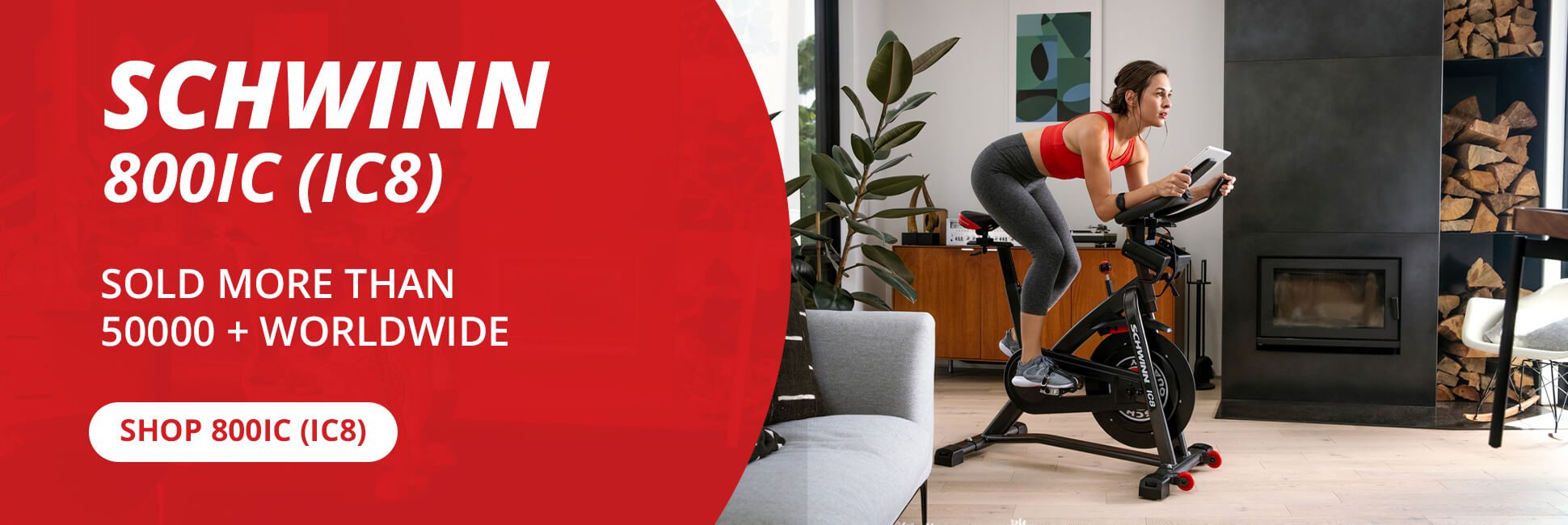
Designed by Kimp
Designed by Kimp
For banner ads on newsletters and websites, always opt for placement above the fold. Try not to stray too far from the main focal point on a page. This way you can grab the attention of site visitors more easily.
Designed by Kimp
Kimp Tip: When you create a web banner design, create a whole set with different banner sizes so that you can experiment with different placements without going back to the drawing board.
Need help with your web banner designs? With a Kimp Graphics unlimited design subscription, you do not pay by the design and marketing becomes easy!
2) Structure & Visual Hierarchy Are Important
How can we talk about banner design and not speak of the most important section – structure and hierarchy of design? These factors control how the customer interacts with your ad, and if you get this right, you are golden. If the customer takes too long to spot the CTA, you likely won’t be getting any clicks or conversions.
For best results, design the web banner such that:
- The CTA is always above the fold
- The most important elements such as your logo or an image speak the loudest
- It is easy to understand the design without overcrowding
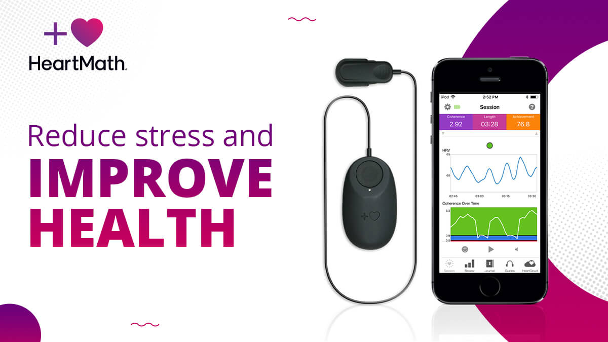
Designed by Kimp
Below are the key elements in any web banner design, ranked according to importance:
- Value proposition – This should take up the most space. Your value proposition offers important features and incentives that will get your audience’s attention. This includes descriptions like “Limited Time” or “30% Off”.
- Call-to-action – This should be a clear focal point in your ad and play a supporting role in your value proposition. Depending on your goal and messaging, try simple phrases like “Learn More”, “Get Started” or “Order now”.
- Company logo – Building brand awareness is one of the main objectives of banners. Include your logo, but don’t let it overpower your value prop or CTA. A common placement that works well is the top left corner.
- Image – If you have a product or service that you can represent through an image, it can be useful to include. But it should not overpower the three other elements of the web banner designs. It should simply provide a complementary backdrop.
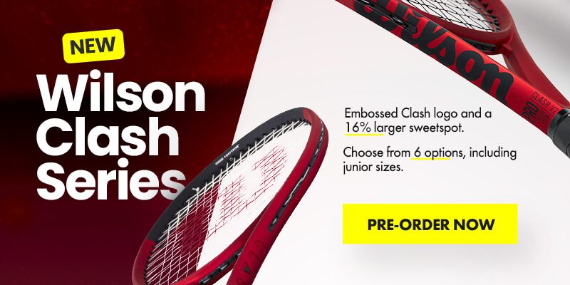
Designed by Kimp
Highlighting one image by making it bigger is one of the most effective ways to make the customer click where you want them to.
Need help getting your web banners designed? Work with the Kimp Graphics team for an engaging and effective web banner design!
3) Pick the right images for your web banner design
Visual elements that hold high significance in your banners include branding elements, font, imagery, and colors. While the color and font are easy choices, images are not so easy. You can always let the brand style guide help you with colors, fonts, and branding elements. But how do you pick the right image?
You want a visual aid to convey your message easily, but we know the cardinal rule of marketing design: KISS (Keep It Simple Stupid).
In your web banner design, the CTA and messaging are very important. So keep it simple and pick one or a maximum of two images for your web banner design.
Sometimes, instead of too many images solving the problem, they create an ineffective design that does not get any clicks. And nobody wants that. Most web banner designs include just the text and a CTA, but an image can help if you use it well.
Designed by Kimp
Kimp Tip: Even when you choose to include images, make the right choice and opt for branded/unique images. Stock photos are easily available but fail to provide authenticity to the message unless they are edited and customized. Also, you can always pick a stock photo as a reference and work with a design team to design something similar but branded for you.
With Kimp Graphics, we ensure that the graphic designs we deliver to our customers are 100% unique and customized to their requirements.
And if you want to know what stock photo websites are best to look for inspiration, check our guide here.
4) Choose the right colors for your web banner design
If you have been following Kimp’s blogs, or other marketing design resources, you know that marketers swear by the impact of color in the campaigns’ success.
Even with large scale designs, people spend hours picking the right colors. And when your ad is hardly 320×100, color has an even bigger impact.
What is that impact? Well, there are major factors to pick colors carefully for your web banner design:
- Choose brand colors for stronger brand awareness.
- Use colors that trigger the right emotions in your customers as per color psychology. For example, customers associate blue with trust, and purple is linked to luxury.
- Accentuate visual hierarchy by using the right color combinations. The colors you use, in combination with your elements and/or pictures, should help guide the viewer’s eye. You want to take them from the value proposition to the CTA while being aware of your logo.
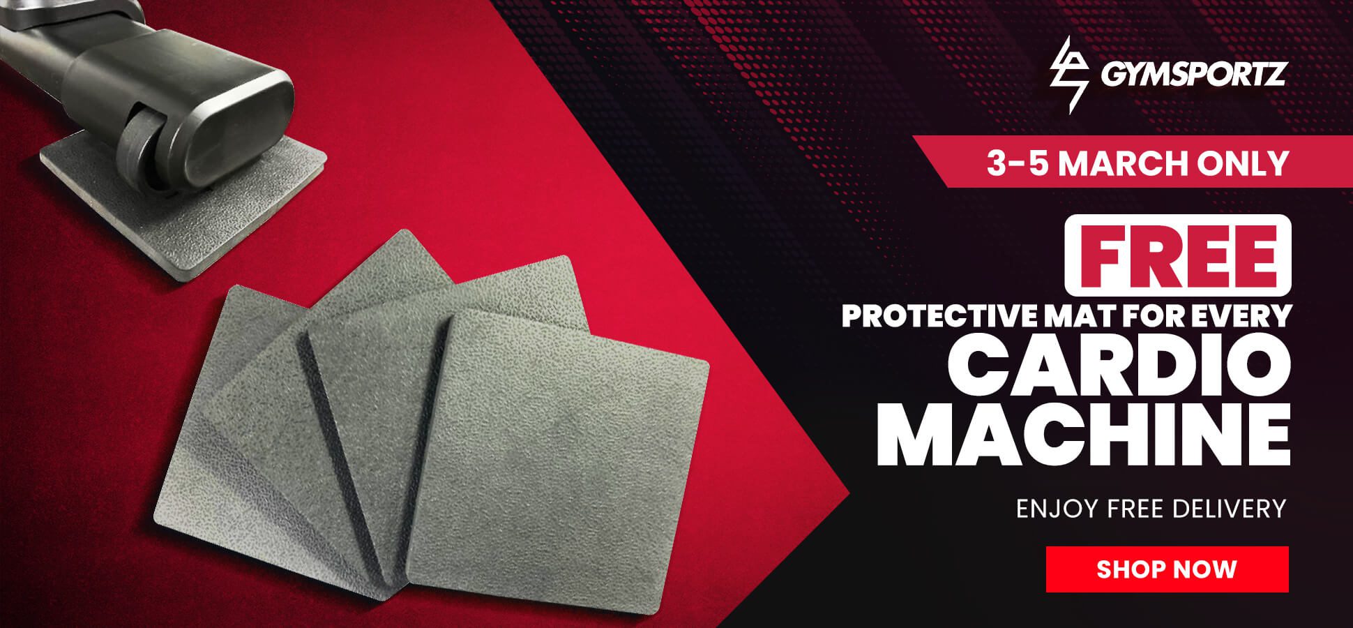
Designed by Kimp
Focus on the color for your text too. Your CTA should stand out against your background color, and your value proposition text should as well.
If you’re open to experimentation, color offers you the opportunity to go wild. From dual-tone to pastel, and vivid to minimal color schemes, you’ve got a lot to work with. And in those cases where you have control over the exact placement (e.g. website ads or newsletters), consider what will make you stand out while still reinforcing your message.
Kimp Tip: For YouTube videos and newsletter banner ads, consider leaving a small margin around the banner so that it does not clash with the background. Often you do not have control of where exactly the ad is displayed, so this is a good way to protect your ROI.
5) Find The Right Fonts
After the color and the images in your web banner designs, you must pick the right fonts for your design to be successful.
Fonts convey a subtle message about the tone and the emotion about the contents of your web banner. And the different styles you use for each font such as size, design, and color shows their importance.
By varying the sizes, you can also guide the customer on how to read the web banner design.
Designed by Kimp
Ensure your headline and body copy are different sizes, but don’t use font sizes less than 10 pt unless it’s for a disclaimer of some sort.
Consider Gotham, Myriad Pro, and Helvetica Neue LT Std for your banners. They are the most used fonts in display ads. And with good reason. They are easy to read, but customers also perceive them as stylish and modern. A few more options along these lines are Proxima Nova, Brandon Grotesque, Bebas Neue, and Open Sans. Fonts that are too thin, scripts, or all uppercase will make your banners less effective by making your messages unclear.
If you are feeling adventurous, you might want to try custom typography. It can make your ad appear original and bring more attention to it. As with all fonts, just be sure that the font is easy to read.
Designed by Kimp
Kimp Tip: Web banner designs cannot have too much text. They need a clear, simple message. So pick an easy-to-read font and stick to it. Do not experiment with font combinations. Pick a single style and stick to it with only changes for showing hierarchy (i.e. different sizes for headlines or body).
6) Consider Animation In Your Banners
The marketing world loves motion graphics a lot. Anything with a little movement gets immense traction on the internet. But running videos is not possible on web banners. They take up a lot of space, are very complicated, and take forever to load.
So what you can do to take advantage of motion graphics’ popularity is add animation to your web banner designs.
Adding animation can help you get your audience’s attention. HTML5 and GIF banners are very popular for this reason. They can help get your message across and draw attention to your CTA at the end.
But before you jump on the animation bandwagon, consider the value it brings to the table. Work on creating something that improves the effectiveness of the message and does not distract from it. A simple GIF of the product works great. Keep it simple and see it work.
Keep your animation at a max of 15 seconds, which should include no more than three loops.
For simple animations, you can just get a Kimp Graphics subscription. We have just one flat monthly fee plan for graphic design and no tiers. Take one subscription and you get all you need. For more complex animations give Kimp Video a try!
7) Consistently Represent Your Brand
One of the most important web banner design tips is that you need to be consistent. Your banners are going to direct to your site. So they must follow the same design style and language. This helps with building trust and avoids confusion on the customers’ part.
Designed by Kimp
Can you imagine a potential customer clicking on a banner that’s been designed with images and colors that look nothing like the site they direct to? They’d probably think they landed on the site by mistake. Or they’d pause in their consideration of the product or service to start evaluating the inconsistencies. Neither of these is an outcome you want.
So focus on creating consistency in tone, content, and design style. You can experiment and have some fun with the details, but remember your ultimate goal is to tie it into your brand. And to get your audience to click, click, click.
Consider developing a brand style guide to ensure consistency at all steps. Read our guide on that here.
Ace web banner designs with Kimp
We told you, banner designs are a part of our origin story. This is what we have built the entire company on and trust us there is no better way of taking your brand awareness to new heights. Our clients vouch for that and our designs too.
We have two unlimited design services for graphic design (Kimp Graphics) and video design (Kimp Video). For these subscriptions, you pay a flat monthly fee to work with a dedicated design team who can deliver designs across a ton of different categories.
And if you want to try us on before committing, sign up for our 7-day free trial now.
