B2B Website Design Essentials: Tips, Tricks, and Examples
On the surface, B2B and B2C marketing might seem like two sides of the same coin. However, there are nuanced details that set them apart, details that need to be factored in when building the marketing strategy for your B2B company. Your B2B website, being at the crux of your marketing strategy and your brand’s online presence, must reflect these nuances. That’s precisely what this blog is about.
Designing a B2B website involves understanding and addressing the unique challenges and goals that come with catering to business clients. From longer sales cycles to complex decision-making processes involving multiple stakeholders, there are several factors to take into consideration.
Therefore, let’s explore some tips and tricks to design a B2B website that enhances user experience and builds your company’s credibility.
Understanding the Core Design Differences Between B2C & B2B Websites
To begin with let’s understand how B2C and B2B websites use color, fonts, and other fundamental website design elements differently. In the examples we’ve analyzed, we discuss a few aspects that work for B2C websites but might seem irrelevant on a B2B website. On the whole, you have more creative freedom with a B2C website than with a B2B website.
Colors
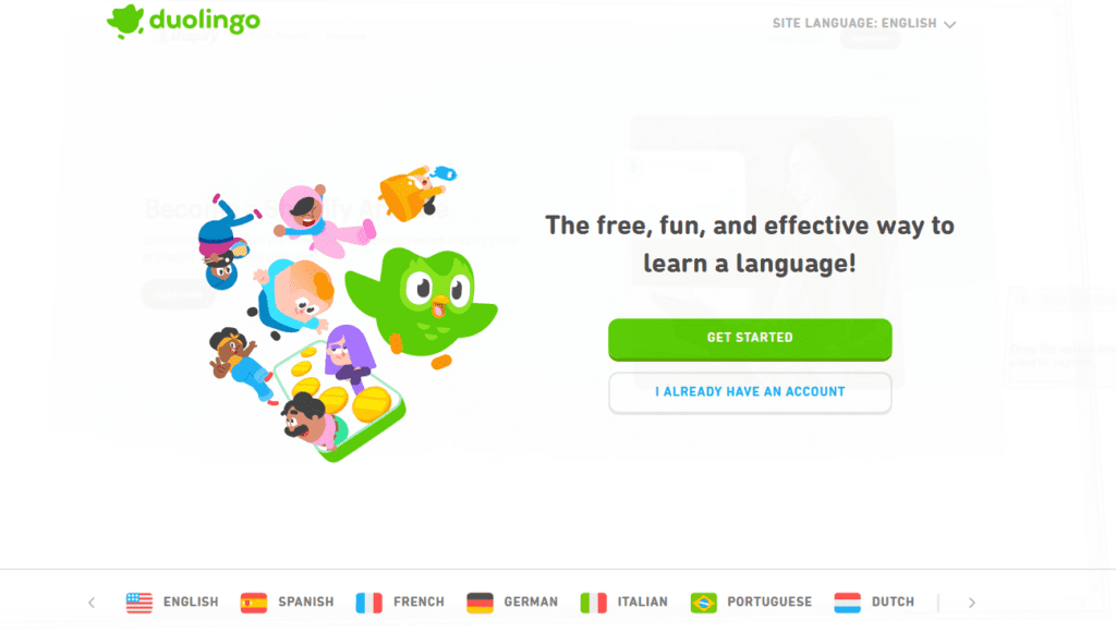
B2C websites can use colors that are more casual in order to make their brand feel more approachable and consumer-friendly. Because the core idea is about capturing emotions or evoking excitement. However, with a B2B website, it’s more about evoking a sense of credibility and professionalism.
Accordingly, bold and bright colors work well for B2C companies whereas muted professional color palettes work well for B2B companies.
For example, the Duolingo website uses a playful and vibrant color palette that makes learning feel more enjoyable.
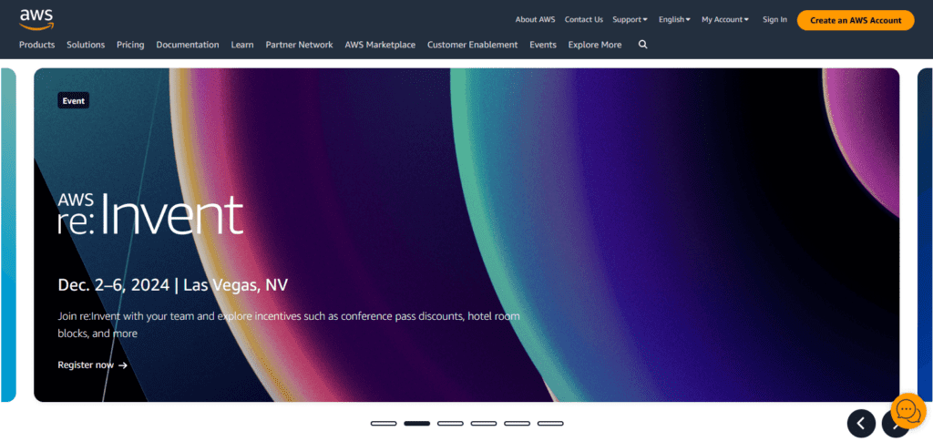
In contrast, consider the renowned B2B company AWS (Amazon Web Services). This B2B website uses a more professional color palette that exudes a sense of security, reliability, and stability – crucial for B2B clients entrusting their cloud computing needs.
Fonts
Similar to colors, the fonts should also be chosen to resonate with the target audience demographic. Hence when it comes to B2C websites, you’ll notice a wide spectrum of choices ranging from fun and modern fonts for young consumers to elegant sophisticated choices for the luxury consumer segment.
However, with a B2B website, professionalism again takes center stage. Moreover, there is also a great deal of focus on legibility and so you might want to choose practical easy-to-read fonts that simplify the possibly complex information you present on your website. Elegance in the B2B segment can also come in the form of exquisite serif fonts.
Let’s look at a B2C and a B2B website to understand these factors.
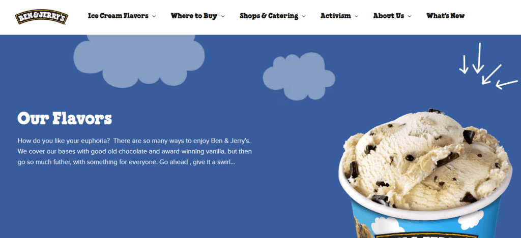
The quirky font that you’ll find on the title text and other sections on the Ben & Jerry’s website looks good on the consumer-facing brand. However, this might not be entirely suitable for a B2B business that needs to be taken seriously by its business clients.
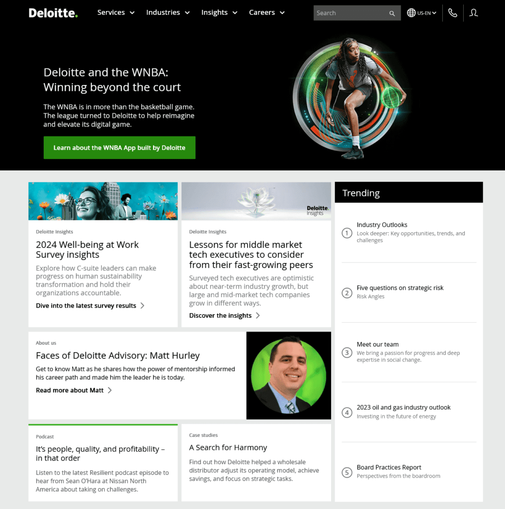
On the other hand, a sleek contemporary sans-serif font combination like the one used on the Deloitte website can create a more formal tone for a B2B website.
Imagery
You are more likely to find raw and relatable photos, and lifestyle shots that evoke strong emotional responses on B2C websites. However, on a B2B website, you are more likely to find photos of products, services, corporate environments, team members in action, screenshots, and screen recordings of the product being promoted.
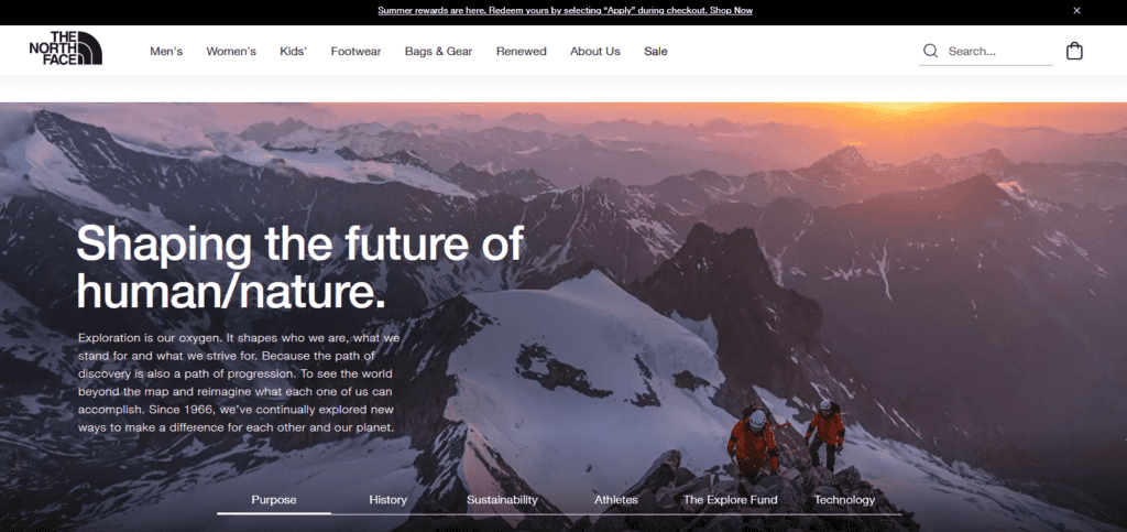
The About Us page of the popular outdoor clothing company The North Face features immersive visuals of outdoor settings capturing the essence of the brand and instantly connecting with outdoor adventure seekers.
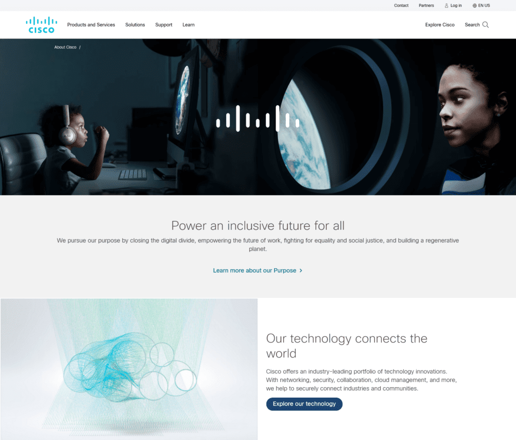
In the B2B website example here, the About Us page of the Cisco website features carefully curated images that represent futuristic technology that the brand’s work resonates with.
KIMP Tip: One common denominator here is that on a crucial brand design like your website, generic stock photos hamper your brand’s authenticity no matter who your clients are. So, get professional quality custom graphics designed for your B2B website by signing up for a KIMP Graphics subscription.
Overall tone
One final differentiator between B2C and B2B websites is the overall tone used. As established in the above examples, most B2C websites deploy an informal and friendly tone while B2B websites require a more professional tone. This is because B2B buyers are often making complex decisions and need to be convinced of the value you offer. However, B2C audiences are looking for products or services that connect with them on a personal level and solve their problems.
B2C businesses achieve this through a tone that’s built on an emotional narrative whereas for B2B businesses it needs to be more straightforward and focus on the solution provided, the value created.
Quick Tip: Despite all these differences, there is one common denominator for all types of B2B and B2C websites and that is the fact that these fundamental design elements need to resonate with the brand identity.
Now for more detailed tips and tricks for B2B website design, let’s analyze a few well-known B2B company websites and what makes them good references.
Level Up Your B2B Website: Insights from Top Brands
Hootsuite
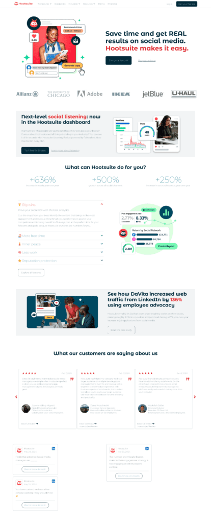
Renowned social media platform Hootsuite has a data-focused website that instantly establishes the value proposition.
Secondly, B2B buyers appreciate facts and figures. Notice how Hootsuite integrates statistics and industry data throughout their website. These data help establish the fact that the tool works as promised.
Finally, there is also social proof displayed on the home page, both in the form of logos of their clientele and customer testimonials. This strengthens their credibility and encourages potential customers to consider their services.
To summarize, a good B2B website should:
- Clearly communicate the value proposition.
- Include social proof to build credibility.
- Provide proof of performance in numbers and through customer stories.
Oracle
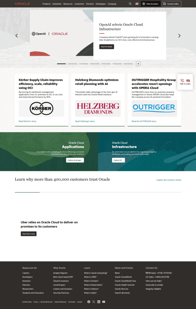
The software giant that offers a wide range of cloud-based solutions for businesses has a sleek website. From a clean professional color palette to legible fonts and subtle yet distinct font variations that establish the hierarchy the Oracle website is a great example of B2B website design done right.
The attention-grabbing detail on their homepage is the carousel of updates welcoming the visitors. It gives a snapshot of what’s new and what the company’s up to. This along with the customer success stories is enough to show the authority of the company in the industry.
From a design perspective, the Oracle website also demonstrates how keeping the information, the text on the homepage as crisp as possible can encourage users to explore the website a little more.
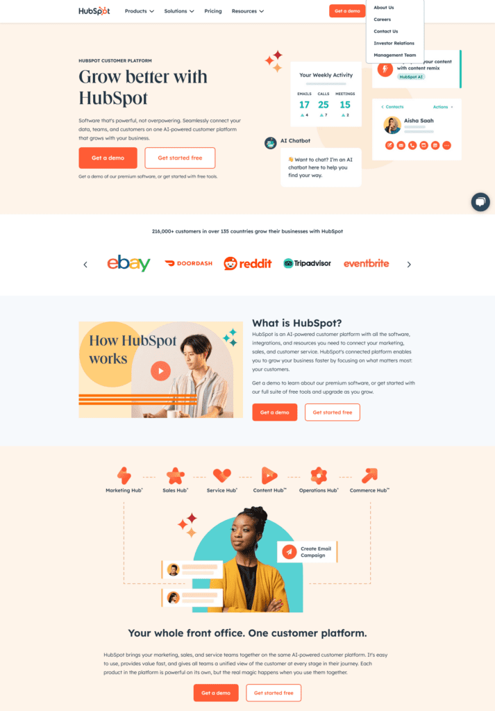
HubSpot
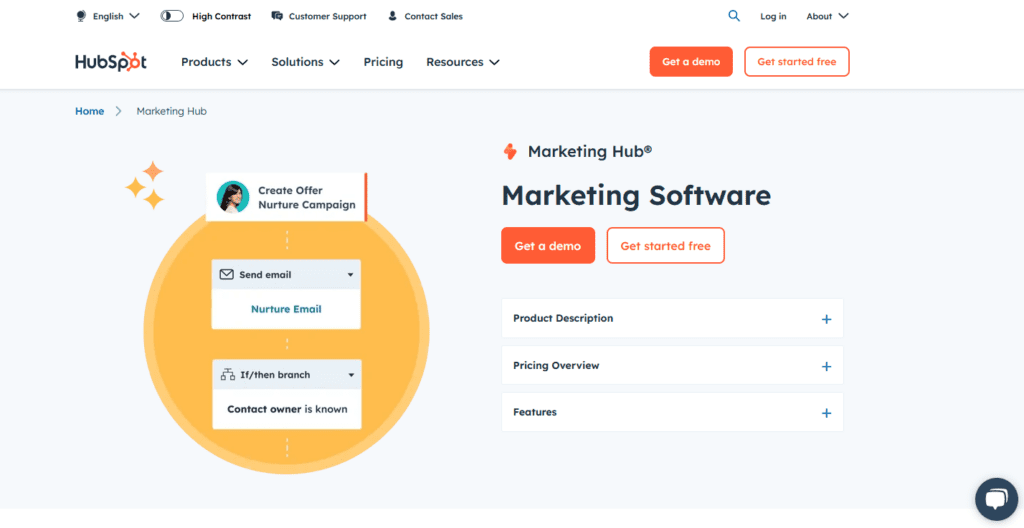
Known for its comprehensive suite of marketing, sales, and customer service tools, HubSpot has an exemplary B2B website when it comes to the accessibility factor. While the website itself is user-friendly and filled with convenient navigation and clear, well-structured layouts throughout, their option to switch between high-contrast and regular modes is a trait worth mentioning.
Another noteworthy detail is the placement of a relevant CTA above the fold on most pages. This makes it easier to drive users to take action.
Finally, there is also the intuitive use of brand colors. As we discussed earlier, bright and bold colors can be tricky to work with, especially in the B2B segment. This is also because a common practice is to choose backgrounds or use brand colors as the prominent colors on a website. Therefore, HubSpot tackles this by using orange as the accent color to draw attention to crucial elements and to add to the visual appeal without overwhelming the users.
SAP
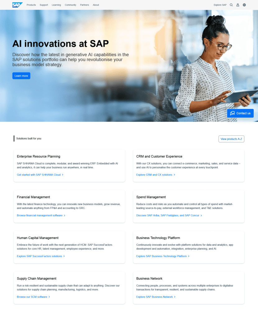
SAP is a global leader in enterprise resource planning (ERP) software solutions. The SAP website is modern and informative with the latter being the word in bold. Whether it is the homepage or the product page or even the About Us page, SAP packs in informative content that appeals to B2B buyers who are looking for all the data they need before making the big investment.
One distinct detail to note is that, unlike many other sites that rely a lot on visuals, SAP keeps the people-focused imagery to a minimum while prioritizing more results-focused screenshots, infographics, and other data-rich imagery that adds value to the narrative.
This might be the approach to especially if the business happens to be an industry leader. Moreover, the wide spectrum of solutions they provide and the industries they span are the areas of focus and this shows in the practical and data-focused design.
Plaid
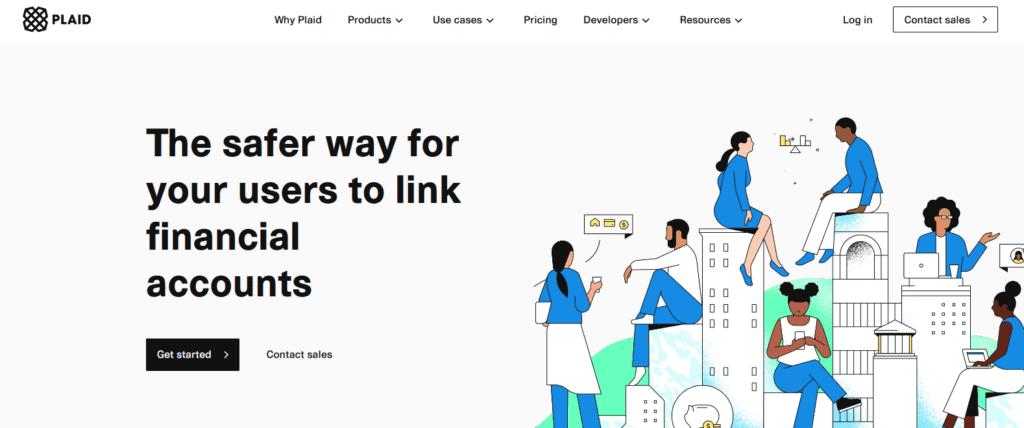
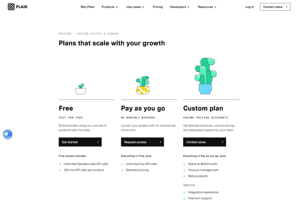
Plaid is a well-known firm that helps companies build fintech solutions. Probably the first thing you notice on the Plaid website is their distinct visual style. They use custom illustrations in place of cliched imagery and this helps differentiate them from the rest in their segment.
Even the hero image on the website’s homepage consists of illustrations that carry subtle animations to instantly attract attention. On another note, notice how they include diverse subjects in their illustration which silently sends a positive message about the firm and the way they choose to represent themselves.
Moreover, they use microinteractions in the form of simple animations and transitions throughout their website including their navigation menus. This makes the design engaging overall.
The Plaid website is a great example to show that simple decisions like switching to custom illustrations can make a big difference in your B2B website design.
Need help designing custom illustrations for your brand? Get a KIMP Graphics subscription.
Customer.io
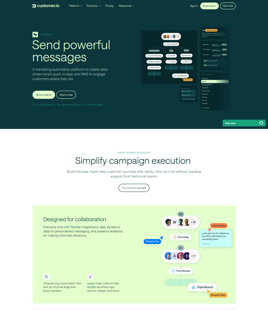
The popular marketing automation company Customer.io breaks away from the traditional choice of blues and greys for B2B websites. Instead, they use a vibrant palette of teals and greens. This is a great example of deviating a little from the industry standards and still nailing it.
Given that their primary colors are pretty strong in their character, they are used wisely and the palette stays monochromatic in most places except for the occasional pastel purples used to differentiate cards in the UI. This ensures that the website is easy on the eyes and visually appealing on different screens.
The Customer.io website also comes as a reminder that you do not need too many font styles and variations to create a hierarchy. After all, when it comes to B2B website design, it’s more about the use of fonts relevant to your brand identity and the right font pairing.
Shopify
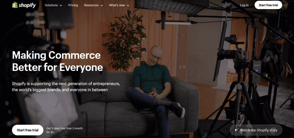
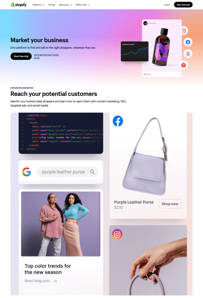
Shopify is one of the most popular B2B ecommerce platforms out there. What makes their website unique is their intuitive use of visuals throughout. This is one of the most visually immersive B2B websites in the segment.
The homepage itself incorporates a text overlay style with video playing in the background. The website also incorporates relevant videos and images throughout. This makes it easier for B2B buyers to grasp information and make informed decisions.
Yes, this directly contrasts with the minimal use of imagery as in the case of the SAP website. This is particularly true because these B2B companies have very different target audiences despite both falling under the B2B umbrella. While Shopify caters to entrepreneurs and small business owners, SAP targets established businesses and corporations often with complex needs. This collectively demonstrates that the effectiveness of text and image usage depends heavily on the target B2B audience and the message you want to convey.
Design Stunning B2B Websites With KIMP
To conclude, B2B website design is about a subtle balance between professionalism and engagement. It’s about ensuring that your website not only looks credible but also effectively communicates your expertise and solutions to potential clients.
Ready to take your B2B website design to the next level? Consider signing up for an unlimited design service. Particularly a subscription that also covers website design, like KIMP. This ensures that all your digital and print designs including your website will be created by a dedicated design team that understands your brand and brings it to life.
Register now for a free 7-day trial!

