Refresh Your Logo Without Losing Your Audience
Have you been feeling that your logo is in need of an upgrade? Maybe your brand has evolved over time, or maybe your audience has. Whatever the reason, from time to time it’s only natural that you’ll want to refresh your logo. The thing is, it might seem like more trouble than it’s worth.

Especially when you consider all that brand recognition, you’ve painstakingly built up. This is a valid concern. And not one to take lightly. The reality is it takes a lot of the time to come up with the right logo to represent your brand and connect with your audience. And when you’re looking to refresh your logo, your goal is to connect more effectively with your customers.
We hear you loud and clear. And so, we’ve put together a few tips to help you refresh your logo, without losing your audience.
How to refresh your logo when it’s outdated
Change the color palette
Color and color theory play a major role when it comes to high quality logo design. If you choose your colors wisely, you will be able to convey certain messages and also maintain the brand identity of your business. At the same time, the colors you choose help you connect directly with your core market.
And all these reasons may be why the idea of changing your color palette can seem unnerving. But there are a few reasons why you may want to consider changing your color palette. For one, the initial color palette that you chose may not embody your brand anymore. This could be as simple as lightening or darkening the colors used, or going for a full out overhaul. Or you may be looking at running some campaigns for which you want to tap into a particular aspect of your brand. This would mean a temporary update or modification, but one that could go a long way.
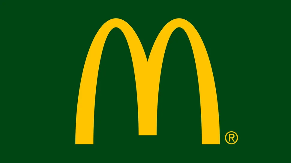
For instance in this example above, McDonalds changed their red to hunter green to show that they are going green and healthy across many European countries. The golden arches were retained to leverage brand recognition, while the change in color piqued curiosity.
Why not lose the text?
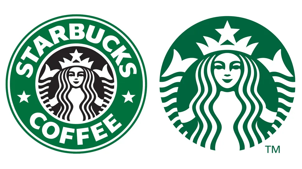
Any marketer’s dream is having a logo that is instantly recognizable. It also becomes a millstone around the brand’s neck. Once your logo has become extremely well established, any attempt to refresh your logo seems next to impossible. That said, you can still use the recognizability of your logo to your advantage. You can do this by simply getting rid of all the text in your logo and focusing on the visual elements themselves.
The success of this kind of move will depend on your brand being well known. But, if you can pull this off, you will gain a huge promotional win. For example, Mastercard tried this rather recently with a Pentagram rebrand and minimized their logo to just a couple of circles that overlap each other. Apple, Starbucks, and Nike are other companies that fared well from this strategy.
Change the font that you usually use
The fundamentals of design may not change but trends and preferences tied to elements like typography, do. Which explains the ongoing shift between sans and sans serif fonts. A serif font can help a brand look very authoritative and gives it a look of sophistication and respectability. But, a few years down the line, it may simply look outdated.
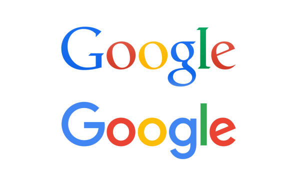
When this happens no matter how much you loved the font that you initially picked, you will need to update and change it. A very good example of this is Google who made the font change in 2015. They left behind their serif wordmark for a sans font that looked friendlier and more modern. In order to maintain brand recognition, they kept their color scheme consistent and added a small and playful tilt to the letter ‘e’ at the end of their name.
Do a play on nostalgia
If you are a brand that has been around for a while, chances are that you have accumulated a whole bunch of different versions of your logo. For sentiment’s sake, and in this case marketing’s sake, you may want to do a little scavenger hunt through the pile to see what you can use to refresh your logo.
Sometimes, reusing an older version of your logo for a campaign can be like a breath of fresh air. This is especially true if you can use them in re-rendered vectors that will make them look fresh and crisp. In addition, when you do this, you will also play to the sense of nostalgia amongst your customers. Some of your oldest or most loyal customers will definitely enjoy this move.
Simplify your logo
If your logo has been around for a long time, then you’ve probably had to refresh your logo a few times. And if this is the case, you might want to look at what you can remove rather than what you can add. A lot of little changes here and there over the years may have led it to looking a bit messy or cluttered.
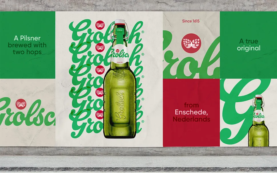
Even if your logo has been left largely untouched through the years, it may still benefit from a more simplistic take. Logos are used on pretty much everything today such as on banners, social media profiles, icons for apps and other such formats. This naturally means that there should be a lot of scalability. In either of these situations, the best option that you have would be to just go back to basics. This was the concept behind the way Grolsch refreshed their logo.
Maintaining your brand identity while refreshing your logo
Try and stay in the same color family
When you refresh your logo, try not to switch out all the colors that you have in your current logo. Rather what you could do is choose different shades of the colors that you have now. This will have an impact and add some character to your logo refresh.
For those colors that you will be switching to new options, be sure to double check the meanings and ideas that they are associated with. You want to make sure that you’re remaining true to your brand identity, and continuing to resonate with your audience. The wrong colors could have a negative impact on your business.
Know why you’re refreshing your logo
You should never refresh your logo or change it altogether just because you want to keep up with just any trend that you’re seeing. There should be a solid reason behind why you want to revamp your logo and that reason needs to be one that will serve the best interests of your business. For example, have your values and mission changed? Are you offering new products and services? Or does your logo no longer represent all that your brand stands for? If your answer is yes to any of these questions, then yes you should refresh your logo!
Define the key component that is recognizable in your logo
Image the Nike logo without that trademark swoosh? Would you even recognize it? Perhaps not. Just like this, every logo has a component or components that make it immediately recognizable to all their customers. When you refresh your logo, make sure that you identify the part of your logo that is the most recognizable. And make sure that you do not remove or change that component. If anything, aim to enhance it!
Logo refresh vs. logo redesign
Trying to decide whether a logo redesign or a logo refresh is what your brand needs? Then you need to answer these questions:
- How much have you actually invested in the current logo that you have?
- Do your target clients and prospects know your brand logo well?
- If you had to do a large scale redesign, would there be any logistical challenges?
- Is your logo representing the current state of your brand?
- Can your current logo depict where you want your brand to be in the future?
Think about the investment that you have made in your logo and how much it has contributed to the success of the company. If this is rather significant, and your brand seems to have gained recognition from that investment, avoid a drastic change. Instead you could simply brush up and refresh your logo.
Next think about whether your logo accurately represents all that you offer as a business. Perhaps over the years, what you offer in terms of products and services has changed. And your logo no longer represents your brand as well. In this case, you will need to consider a complete redesign.
So why should you refresh your logo?
- It will help your brand capitalize on brand equity and will not let your investment go to waste.
- It will allow you to continue using your marketing materials with a bit of a refresh, rather than an overall redesign.
- Your customers will still be able to recognize your brand, and what it represents, easily.
- To make it more versatile, so that you can use it across different channels and engage your audience even more so.
Below are three examples of logos that were refreshed, to give you a little inspiration:
In this example, Netflix opted to refresh their logo by creating a simpler version. They did this so that it would transfer better across devices, and appear more consistent regardless of placement.
To achieve a similar refresh of your own try removing any effects (e.g. bevels or gradients), and then compare how it looks at different sizes, inverted, and on light or dark backgrounds. As you’re doing all of this, see if the different versions of your logo are maintaining its look and feel. If that’s not the result, keep removing elements until you whittle it down to a simple, iconic version.
Delta updated the elements in its logo design to create a more modern look. They’ve changed their font, updated their colors, and made their arrow sharper to create more contrast and impact.
If you’re interested in a similar refresh, consider updating your color palette to create more impact, and increase contrast. And think about a font update – have you thought about a sans-serif font?
The NFL’s logo refresh came about because of placement. They needed more negative space in their design to be able to embroider the logo on all of the different types of clothing and equipment they use and sell.
If placement is a big deal to your brand, then be sure to let your designer know all of the different ways your logo will be used. This will help them figure out how to refresh your logo exactly as you need it.
A word to the wise…
Don’t ever settle for the very first idea you get, when you’re about to refresh your logo. Do plenty of research and also try different versions to see what produces the strongest impact. Work with your designer to get mockups done. And then run it by your team and your most important stakeholders – your customers!
You can do this by simply reaching out to a few of them directly to get their feedback. Or you can even turn your logo refresh into an opportunity to engage your audience on social media for their feedback. This will help you decide the version that works best for your brand, based on data and not just personal preferences.


