Designing Tranquility: Analyzing the Visual Identity of the Headspace Brand
Traditionally, meditation is perceived as something serious. Something that is hard. But there’s one company that has been working consistently to break these stereotypes. A company that has been working to make meditation more accessible and fun. Yes, we’re talking about Headspace. A brand that comes as a breath of fresh air with its vibrant identity in an industry filled with blues and beiges.
This blog dives deep into the secret sauce behind Headspace’s success. We’ll analyze their unique branding tactics, explore how they’ve redefined meditation visually, and see how this approach has helped them stand out and grow. So, buckle up and get ready to discover how powerful design can be in transforming even the most serious industries!
An Overview of the Headspace Brand
The meditation market is projected to grow from $6.61 billion in 2023 to about $18.21 billion in 2028. With the stigma around mental health slowly fading, and the increasing focus on well-being, this market is experiencing a boom. Headspace is a leading player in this exciting space, revolutionizing the way people perceive and approach meditation through its innovative branding strategies.
Let’s now talk about the core building blocks of the Headspace brand and how they shape their branding strategies.
The Headspace logo
The logo of Headspace is clean and simple. It’s a combination mark with a sans-serif font for the logomark (text) and a simple orange circle for the logomark (pictorial element).
The Headspace brand is not one that’s meant to be perceived as too formal or traditional. It’s meant to be seen as an approachable brand, one that makes meditation feel less formal and intimidating! The use of a modern sans-serif typeface and the lowercase letters help in this aspect.
At the same time, the brand is also meant to be seen as a stigma-dodger. One that breaks free of the boring and brings more life into the concept of mindfulness. The vivid orange circle achieves this by breaking the monotony and adding a visually intriguing twist to the logo.
Colors of the Headspace brand
Several industries fall victim to visual stereotypes. Imagine a meditation app. What colors come to mind? Tranquil blues, calming greens, maybe even a serene waterfall scene? Headspace throws that image out the window. Their bold choice? Orange as the primary brand color.
In a world where meditation apps often rely on stereotypical calming hues, the primary color of the Headspace brand is a vibrant orange. So, why does it work for Headspace? Because when your brand colors can capture your brand personality, the way you want your customers to feel, then they make great choices. In this case, the optimistic orange perfectly complements Headspace’s mission to uplift and energize users
Also, Headspace doesn’t stop at a single color. Their palette expands to a spectrum of lively hues, incorporating warm tones like orange and yellow alongside calming blues and greens. This creates a unique and refreshingly wholesome feel.
Illustrations representing the Headspace brand
The next standout element representing the Headspace brand is their unique illustration style. The orange circle from the logo plays a vital part in this visual style. You will see this orange circle morph into an expressive friendly face in their social media posts, emails, and more.
The many characters that are created using these fluid shapes help add to the emotional depth of the designs for Headspace. And this is particularly important when talking about personal topics like mental health and mindfulness.
All of these brand elements including the logo, the colors and the illustrations cohesively work in favor of the brand because of the brand’s consistent branding and marketing efforts. Whether it is a simple social media post or a personalized email or an outdoor ad you’ll find creative incorporation of these colors and illustrations in the design. Together they summarize the brand and represent its personality effectively.
Let’s now talk about some strategies that have helped the Headspace brand to grow to where they are today!
Branding & Marketing Strategies: Lessons From the Headspace Brand
Forging connections through emotional storytelling
One secret ingredient that can take an ad from good to great is emotional depth. Creating relatable ads and stories helps customers visualize themselves in the place of the characters featured in your ads. That’s precisely what Headspace does.
The below commercial is a good example to show how emotional storytelling has helped shape the Headdsapce brand.
The video focuses on the everyday scenes – of getting stuck in traffic – of simple frustrations that can end up overwhelming you. And then it seamlessly communicates that the Headspace app can be your quick escape from an overwhelming day.
Instead of choosing a staged and unrealistic setting to talk about meditation, the brand here chooses to position the app as a solution to the everyday challenges we all face. Thus making the ad relatable and memorable. This is a good example that shows that emotional connection rather than promotional content has helped establish the Headspace brand.
Building credibility through strategic brand partnerships
Partnering with the right brands can be an effective way to position your brand, build credibility, and expand your reach. Strategic brand partnerships have been crucial elements in the growth of the Headspace brand.
Headspace partners with brands with shared values as well as those with similar target audiences for more effective communication of their brand message.
The Nike x Headspace partnership is a good example. This partnership integrates Headspace’s guided meditations into the Nike Training Club app, allowing athletes to focus on both physical and mental well-being.
There’s a new @NikeRunning Audio Guided Run on the Nike+ Run Club app, which means now you’ve got three ways to put #MeditationInMotion. Try The Big Day and get moving this weekend: https://t.co/lXaSte60cV pic.twitter.com/8PhJDDepVT
— Headspace (@Headspace) September 21, 2018
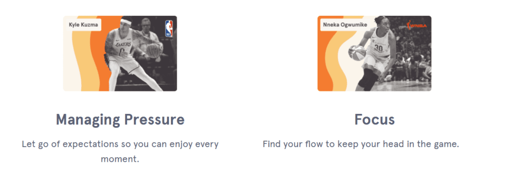
The Headspace x NBA partnership is yet another example. As a part of this partnership, Headspace introduced the “Performance Mindset” program inspired by NBA and WNBA athletes.
In this case, the first example focuses on reaching a wider group of fitness enthusiasts and reiterating the significance of mental health and well-being. Whereas the latter builds trust through content created in collaboration with well-known NBA and WNBA stars.
KIMP Tips: Here are a few takeaways from the above examples.
- When choosing potential brand partners, consider those with shared brand values and target audience segments.
- Create co-branded opportunities and content that adds value for both brands and resonates with your customers.
- Looking to build credibility through partnerships? Then choose established brands in complementary industries to leverage their credibility.
Leveraging value first marketing
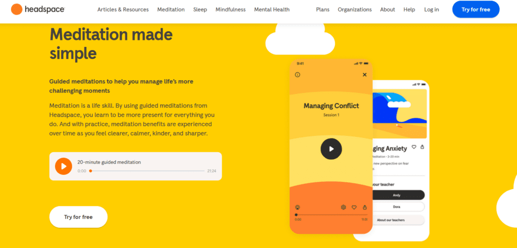
The market is saturated with marketing messages – ads from brands trying hard to sell their products and services. Amidst this creating value before you start selling is one way to stand out and Headspace does that effectively. Take their website for example. You’ll find free short guided meditations to give you a glimpse of the experience the Headspace app delivers.
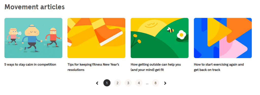
Additionally, there are plenty of free articles on mental health, meditation, mindfulness, sleep and other categories. These thought-provoking articles and other resources create value before promoting the product itself. These articles change your perspectives on meditation and mindfulness and evoke your curiosity to find out more thus convincing you to download the Headspace app.
Additionally, Headspace also has a strong video content game. Their YouTube channel has videos catering to diverse mental health topics relevant to people of different age groups and interests.
Things get even better once you download the app. They offer a treasure trove of resources to email subscribers and to those with the app. For example, when you download the Headspace app on an iPhone you gain access to plenty of fun and playful stickers for use in iMessages. These use the signature brand illustrations featuring relatable characters for various scenarios.
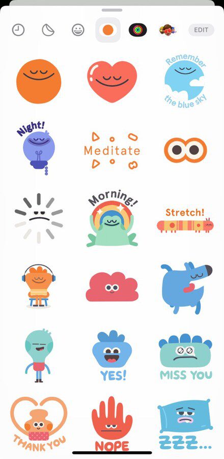
In conclusion, don’t underestimate the power of providing valuable content upfront. Free trials, informative articles, helpful tutorials, or even something as seemingly mundane as message stickers all demonstrate your expertise and build trust with potential customers.
Tapping into the power of audience segmentation
In a competitive and rapidly progressing market, a one-size-fits-all approach does not work. Understanding your audience and segmenting them based on demographics, needs, and interests allows you to tailor your message for maximum impact.
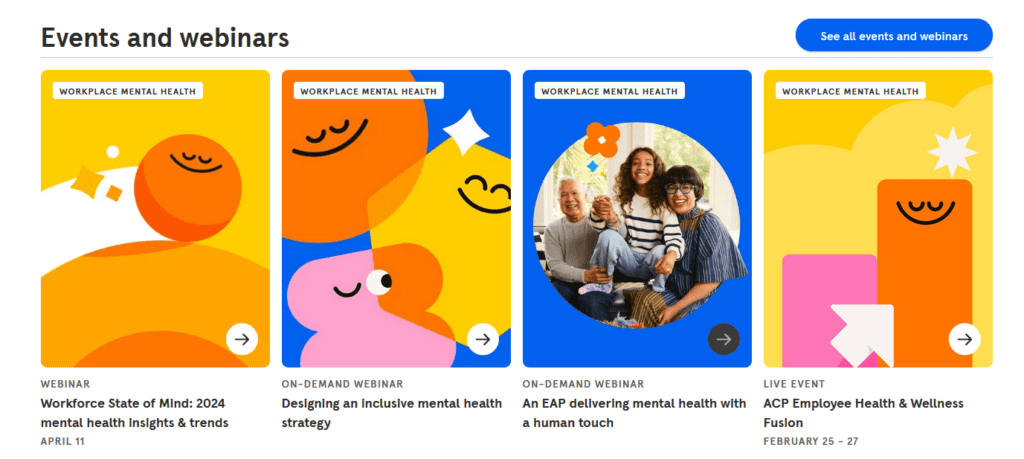
Audience segmentation has been a pivotal part of the Headspace brand’s marketing approach. For example, recognizing the growing demand for workplace wellness solutions, Headspace developed “Headspace for Work.”. This program offers plenty of useful resources, Employee Assistance Programs, coaching and clinical services and so much more.
They also host webinars and events that focus on employee health and well-being.
The other example of audience segmentation by Headspace is their kid-friendly YouTube Playlist called “The Mindful Adventures of Unicorn Island”. This one is filled with creative narratives that help teach mindfulness to kids. They also use illustrations optimized to themes that kids can relate to.
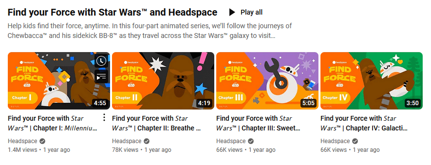
They also have a playlist curated to the interests of Star Wars fans titled “Find Your Force With Start Wars And Headspace”. This series showcases Chewbacca and other characters in visual narratives about meditation and mindfulness. This series works well with older kids and teens who are fond of the Star Wars franchise.
These services and content from Headspace show how knowing your audience and identifying the right segments helps create content that resonates with them effectively. As can be seen in all these examples, the specific videos and services in each case might not resonate with everyone. But with the right audience, they hit all the right chords!
Unleashing the multi-channel marketing approach
When promoting a mobile app, most brands stick to digital channels. This is where the Headspace brand stands out! They adopt a good mix of marketing channels for a seamless multi-channel marketing strategy.
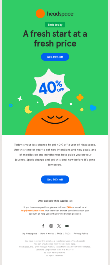
To begin with, they have a strong email marketing strategy. Subscribers gain access to well-timed personalized emails about special offers for subscriptions, new services added to the portfolio, etc. And the signature Headspace illustrated characters bring these emails to life.
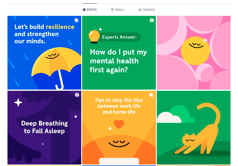
Headspace is also consistent on social media. Have you seen their aesthetic feed on Instagram? Their social media channels are consistent with their website and app both in terms of delivering resourceful content and in their aesthetics.
Taking their digital product to the outside world, they also regularly deploy aesthetic on-brand billboards like the one below.
Given that today’s consumers are overwhelmed with a variety of media, non-intrusive advertising meets them wherever they are. And a multi-channel approach like the one adopted for the Headspace brand helps achieve this. Moreover, multichannel ads help create a seamless brand experience across diverse touchpoints.
KIMP Tip: For your multi-channel approach to work, you need a strong brand message and the consistent delivery of this message. This also calls for a strong visual identity to represent your brand across all touchpoints online or offline.
Develop a clear brand style guide and work with a designated design team like KIMP to make this happen.
Ignite engagement by focusing on community building
Would you like to have customers for your brand or fans? If it’s the latter, then it is about focusing on community building. That’s because, in today’s digital landscape, people crave connections and belonging. These are the factors that help nurture stronger brand-customer relationships.
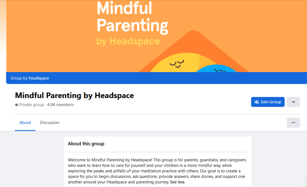
Community building is all about creating a space for your customers to connect with each other and talk about their shared interests. Headspace takes community building seriously. They leverage Facebook Groups for this. There are several dedicated private groups where they create a “safe space” for diverse audience demographics. These include:
- Everybody Headspace
- Mindful Moments by Headspace
- Headspace for Educators
- Mindful Parenting by Headspace
- Sleep by Headspace
All of these groups are filled with stories and discussions on their respective topics. These are places where Headspace users can connect with other Headspace users from across the world and ask questions, find answers, and engage in meaningful conversations.
Create a Strong Headspace-inspired Visual Identity With KIMP
In conclusion, the Headspace brand offers a wealth of insights for brands looking for ways to stand out in a competitive space. Their innovative approach to branding and marketing highlights the importance of:
- Building trust through value-first marketing
- Connecting with the audience at an emotional level
- Strategic partnerships
- The power of community
- Understanding and tackling audience segmentation
- And most importantly, creating a strong and unique visual identity
As you channel your efforts to tackle the other points, the visual identity part is where we come in. A dedicated design team, unlimited designs, and unlimited revisions – the perfect combination to elevate your brand in a cost-effective way!
Ready to see how an unlimited design subscription can help you create a strong visual identity for your brand? Register now for a free 7-day trial!


