From Green Owl to Global Icon: The Evolution of the Duolingo Logo & Brand
On one side there are brands still on the fence about having a mascot. On another, there’s a brand whose green owl mascot is nothing short of a pop-culture icon! If you have encountered the Duo costume at a Halloween party recently, that tells enough about the popularity of the green owl mascot from the Duolingo logo!
Duo is not your regular mascot. He has so much personality that he makes you laugh, cry (you’re not the only one receiving the “Spanish Or Vanish” threats!), and everything in between!
From playful encouragement to hilariously frustrated outbursts, we doubt if there ever was a mascot so emotive as Duo!
This charismatic green owl mascot proves that a mascot with a strong personality, perfectly aligned with the brand’s voice, can build a loyal following – not just customers, but true fans.
In this blog, we’ll explore the rise of Duolingo and dive deep into how Duo, has become the heart and soul of the brand.
The Duolingo Brand in a Nutshell
In 2011, Luis von Ahn and Severin Hacker came up with the idea for an app that would make language learning accessible. And that’s how the green owl took flight!
Fast forward to today, and Duolingo boasts the title of the world’s #1 language learning app, with a whopping 88.4 million monthly active users and about 27 million daily active users as of the last quarter of 2023.
Evolution of the Duolingo logo
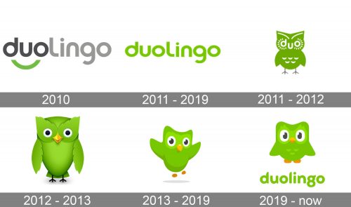
The below image gives a peek into the evolution of the Duolingo logo over the years.
As can be seen, the very first logo was a simple wordmark and lacked character. However, it did introduce the signature brand color green. The current version of the Duolingo logo puts the mascot Duo at the heart of the design and therefore looks more dynamic and unique.
As another signature element, the brand uses a bespoke typeface, Feather Bold. This distinctive sans serif font with its geometric form and chunky strokes aligns with the friendly and bold personality of the brand.
Now let’s talk about the mascot that forms the life and soul of the Duolingo logo, Duo!
The Duolingo mascot
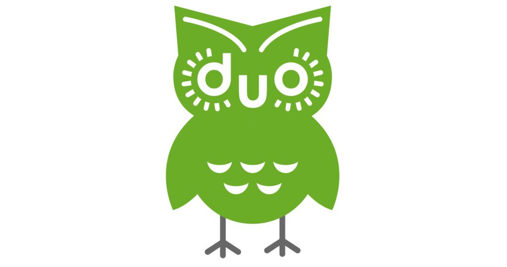
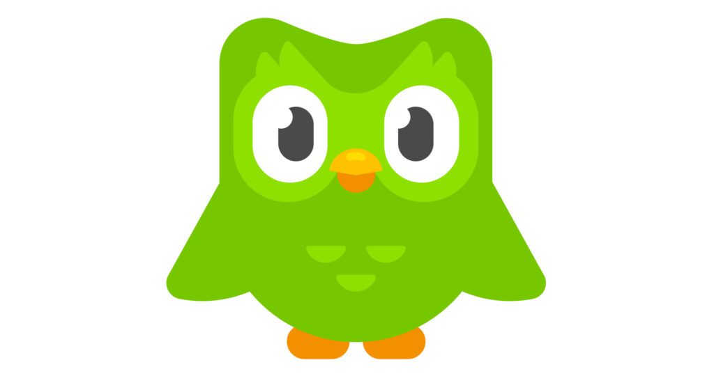
The first image shows the very first version of the green owl introduced into the Duolingo logo and brand. Whereas the second image is the current version. That’s a huge leap, don’t you agree? The current version is livelier and easily adaptable to different applications.
As a matter of fact, the main transformation was to ensure that the mascot aligned with the gamification that the whole app is about.
According to Tyler Murphy, head of design at Duolingo, “ Previously, we had two versions of this owl all over the place: happy state and crying state. He didn’t have the full spectrum of emotions like you’d see in a videogame.”
Therefore, the recent version of Duo introduced in 2018 came with a wide spectrum of emotions and he appears in different settings.
This has helped Duo evolve beyond the Duolingo logo to become a popular face on social media earning the brand more than 2.5 million followers on Instagram and about 10.7 million on TikTok.
It doesn’t end there. Duo is also probably one of the most meme-ified mascots in recent times. There’s even a subreddit dedicated to Duolingo memes!
All this fame did not happen overnight. It was the result of solid branding strategies built with Duo at the center of the Duolingo brand and the creative use of social media. Ready to take away some marketing lessons from this mascot-focused branding approach of Duolingo? Let’s go!
Beyond the Duolingo Logo: How the Brand Gave Voice to the Owl That Never Talks
1. Making an impact through live mascot appearances
One of the most brilliant strategies deployed by Duolingo is to regularly feature the real-life activation of the mascot from the Duolingo logo. After all, in the early days, mascots in marketing meant people wearing signature costumes until digital versions of these characters started dominating the scene.
Duolingo posts a lot of videos featuring people wearing the Duo costume in real life, interacting with others in real-world settings.
This idea of bridging the gap between traditional and modern is very much essential and effective, especially for a business that exists mainly in the digital space, like the Duolingo app!
Moreover, these real-life appearances of the mascot make Duo a true brand ambassador beyond being a figment of the Duolingo logo!
KIMP Tip: Wondering how to tap into this idea for your own brand? This could be in the form of real-world appearances of your mascot in live events, pop-up shops, or even in your guerilla marketing efforts. When people take photos with your mascot and share them on social media, it helps boost your social media presence significantly.
2. Crafting the personalities of characters through stories
While Duo is the main character in the Duolingo logo and the core brand identity, the brand also utilizes a set of other characters that appear in different places across the app. These characters help keep the interface interactive and add a personal touch to every interaction.
The brand pays attention to the character building of every single character besides Duo by telling creative stories around each one of them. And by creating content that establishes the respective character’s quirks and personality.
Take Lily for example, with her signature resting unimpressed face! Instead of lengthy descriptions– they leverage memes and playful videos to showcase her signature expression, instantly conveying her personality to users.
With such video stories, users understand the characters better. They might see themselves in one of these characters thus connecting with them better.
KIMP Tip: Similarly, instead of just designing a logo that features a mascot, consider ways in which you can breathe life and personality into your mascot. Deploy short and engaging videos with relatable stories that showcase the unique traits that make your mascot special.
To design short social media videos or to edit long-form videos to add value to your brand page, get a KIMP Video subscription!
3. Sometimes you have to go “over-the-top”
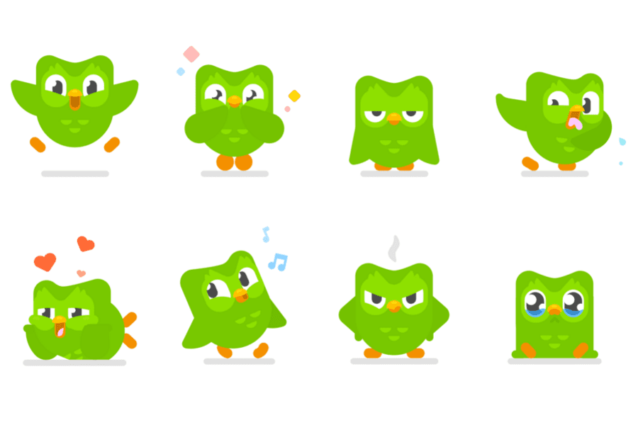
How can you humanize your mascot without imparting some raw human traits to it, right? Duolingo nails it with Duo. On the Duolingo logo Duo looks like a friendly playful green owl. However, if you have added the Duolingo widget to your smartphone homescreen, you’ll know how dramatic Duo can sometimes be.
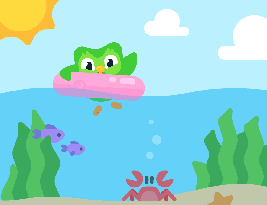
This unexpected personality trait is a core element of what makes Duolingo so unique and engaging. With the moods of Duo, Duolingo uses playful exaggeration. The frustration in his eyes on missed lessons is a good example. The below image gives a glimpse of some of the strong emotions that Duo expresses and they are downright funny sometimes! This hint of drama is often the reason why Duo is the center of various meme trends on social media.
In addition to the different widget illustrations capturing Duo’s various moods, Duolingo also uses social media posts and videos to amplify these moods of Duo. This holistic approach has helped establish Duo’s unique personality over the years.
KIMP Tip: In addition to creating a mascot and crafting a story around it, infuse strong human emotions into your mascot. This not only amuses your audience but also nurtures a strong connection.
A dedicated design team with illustrators and graphic designers who can consistently work on your designs can make it possible to tweak your mascot creatively and relevantly for each application.
4. Celebrate shared experiences to nurture loyalty
Duolingo understands the need for continuous engagement which is essential for something like language learning. That’s why they adopt various strategies to encourage users to regularly visit the app, like the celebration of “Streaks” depending on how many consecutive days you take your lessons.
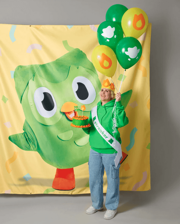
They have a streak celebration kit that lets users throw a party to celebrate their streak. They even have free downloadables like the “Streak Society” certificate, party invitations, custom Spotify playlists for the party and so much more. No wonder, you’ll come across various Streak Party trends on TikTok. And of course, Duo and other Duolingo characters are crucial components of these celebrations.
KIMP Tip: Get creative when it comes to incentivizing your customers for engaging with your brand, your app, your social media posts. Virtual rewards and loyalty points are just a few easy ways to keep the interactions two-way.
5. Leverage merchandise marketing
A few years ago, experts were advocating the need for going digital in the marketing world. Now it’s the other way round! Marketers and marketing experts are discussing the need to go beyond the digital presence. This is particularly essential when it comes to crafting a memorable brand mascot. This is where merchandise marketing comes into the picture.
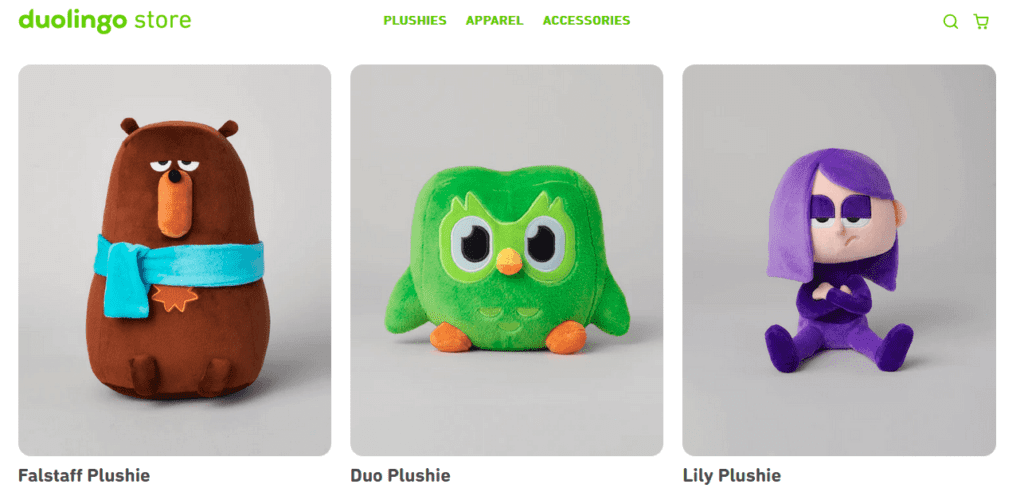
Duolingo taps into merchandise marketing to help Duo transcend the Duolingo logo into the real world. From plush toys to clothes and accessories, there is variety that caters to different user preferences and allows fans to integrate Duo and other Duolingo characters into their everyday lives.
Do not underestimate the power of user-worn merchandise. They go beyond being collectibles that remain strong brand reminders building brand loyalty. They also act as mobile billboards and take your brand to a wider spectrum of audience through your customers – when they flaunt a t-shirt featuring your mascot or when they place an action figure on their work desk.
KIMP Tip: When it comes to choosing merchandise to promote your brand and mascot, look beyond the obvious. Understand your audience to identify the types of products that make the most sense to them.
Now, let’s dive into some of Duolingo’s winning campaigns that seamlessly blend their mascot and brand narratives into a cohesive branding strategy.
A Look at Duolingo’s Most Effective Duo-Focused Brand Activations
Lawyer Fights Duolingo Owl – April Fools’ Campaign
We discussed the dramatic personality of Duo a while ago. And we’re sure you have come across several social media discussions and memes surrounding these moods of Duo. The brand capitalized on this with their April Fools’ campaign.
The mock commercial featured a lawyer dramatically claiming to fight for users feeling threatened by Duo for neglecting their lessons.
The witty commercial was a hit! The core message was so relatable after all. The mascot from the Duolingo logo, Duo, was the central figure of the campaign. His “notorious” personality was cleverly leveraged to create humor and a sense of relatability.
Duolingo’s SuperBowl commercial
In 2024, Duolingo let Duo make his Super Bowl debut with the 5-second ad titled “Buttception”! Take a look at this weird commercial here:
If this is the first time you’re encountering this commercial, you’re probably scratching your head, “What did I just see?”
So did a lot of people around the world when they first saw the ad. This bizarre and unexpected ad was also accompanied by a push notification urging users to “Do your lesson, no buts”
The unconventional and eccentric nature of this commercial generated massive buzz and online discussion.
Duolingo’s Super Bowl ad highlights the power of taking risks and embracing the unconventional. It proves that even a short, enigmatic ad can create a lasting impact if it aligns with the brand’s personality and resonates with the audience.
Now, let’s shift gears and explore how Duolingo utilizes social media to further amplify its quirky personality in addition to out-of-the-box campaigns like these.
Decoding Duolingo’s Social Media Success
If your campaigns are all humorous and your social media posts are bland, do you think your social media pages will do your brand any good? Obviously not! Duolingo understands this well. Hence you’ll notice the signature sassy tone of voice on their social media pages. Here are a few posts we wanted to highlight.
Identify the language that works for your brand
Absurdity is the language of Duolingo on various occasions. They make it work in their own unique ways. The below post is one such instance. The weird image and the sarcastic post caption are a direct contrast to the ideal picture of professionalism that several brands aim for when creating social media designs. However, it works for Duolingo!
hope this ruined your day ❤️ pic.twitter.com/Ckd0LH5jAC
— Duolingo (@duolingo) February 23, 2024
Similarly, identify the language that works for your brand and communicate more in it! But yes, consistency is the key.
Moment marketing
In January 2024, Mickey Mouse and a host of other characters entering the public domain was a hot topic of discussion. Duolingo was quick to capitalize on this historic moment. They posted the below illustration combining Mickey Mouse and Duo. This bold and fun post was received well on social media.
Keeping the conversations two-sided
Getting people to talk about your brand is not an easy job. But Duolingo has aced this skill and there’s always someone talking about Duo’s quirks. A true social media genius will be a brand that not only posts the right content but also listens to what the audience is talking about the brand. Duolingo definitely belongs to this category.
They not only post comical posts on X and Instagram but also give witty responses to people talking about the Duolingo brand or about Duo. The below example where Duolingo retweeted a user’s post with a cheeky caption shows how the brand likes to keep conversations light-hearted, humorous, and two-sided. Like the below response to a user’s Tweet.
and i don't like that you haven't done your lesson yet, we can't get everything we want https://t.co/eTdphykaCg
— Duolingo (@duolingo) December 1, 2023
Capitalize on meme marketing
When the world is making memes about them and the green owl, why wouldn’t they?! If you have been following Duolingo on social media, you’ll know that they are great with memes. You’ll find animated memes and static ones both classic memes and some trending ones that everyone’s talking about! Like the below meme they shared when people were discussing Twitter’s rebranding and the death of the blue bird!
Tap into current events
The Barbie Movie of 2023 was an iconic moment in pop culture. Duolingo is not one to miss big trends especially if they are in pop culture which a majority of their audience can easily relate to. Hence they came up with the below video featuring Duo all dressed up for the Barbie movie premier event.
Keeping Your Mascot Fresh in a Digital Age With KIMP
As we’ve seen with Duolingo’s masterful use of Duo the owl, a mascot can become an integral part of a brand’s identity. But maintaining the relevance of the mascot amidst changing trends requires constant engagement. Duolingo does this by:
- Featuring Duo in their memes.
- Putting Duo at the center of trend-focused posts.
- Create themes with Duo at the heart of them.
These are a few ways in which the brand keeps the mascot from the Duolingo logo relevant, relatable, and firmly in the spotlight. And yes, you need consistent visuals and cohesive campaigns to achieve all this. You need a dependable design team, a robust creative workflow to bring these campaigns to life. That’s precisely what you get when you sign up for an unlimited design subscription, like KIMP.
To experience the power of unlimited design in designing mascots and using them to elevate your brand, sign up for a KIMP subscription today! Or book a call with our team to learn how our subscriptions work!

