
The WNBA Logo & Brand: Building More Than A League
Behind every great brand, there’s a story worth sharing. In the realm of sports branding, the WNBA brand is one such with a journey worth looking back on. Now that the gaming season is on, there’s no better time to talk about the evolution of the WNBA logo and brand than this.
From facing intense competition to living up to the expectations of fans, keeping up with the evolving trends to managing sponsorships and partnerships, there’s so much a sports brand has to tackle. Now for a brand that’s meant to stand for the empowerment of female athletes and to capture their excellence in the game, things are even tougher.
In spite of that, how did the WNBA brand manage to emerge as a winner? That’s what we are going to explore in this blog. Let’s unleash the magic behind the WNBA logo and brand and take away some marketing lessons along the way.
Dribble, pass, and let’s go!
- A quick look at the WNBA brand history
- The WNBA logo evolution
- Creating the “fashion statement of the year”
- Branded app marketing to foster ongoing relationships with customers
- Standing up against pay gaps
- Handling brand sponsorships like a pro
- Staying on top of its social media game
- Slam dunk your way to better marketing with Kimp designs
A quick look at the WNBA brand history
The idea of WNBA (Women’s National Basketball Association) was only born in 1996. That’s five decades after the inception of the NBA (founded in 1946). But better late than never right? And the best part is that despite the late start, WNBA has done remarkably well and is on its way to catching up with the older and more established sports leagues.
The 2023 game marks the 27th session of the league and has already garnered a lot of attention on social media.
When it first started out, WNBA had 8 teams which has now expanded to 12. Moreover, there are talks about expansion to accommodate teams from more cities. Yes, the WNBA brand and the league’s popularity, on the whole, are growing at a welcoming pace. And now the WNBA logo stands as a well-recognized emblem in the pantheon of sports branding. It stands testimony to the success that perseverance and consistent branding efforts bring.
How did WNBA manage to pull this off? How did the league manage to carve a brand that carries along the talented female athletes and gives them the exposure they deserve? Let’s find out. We’ll take a look at the unique brand identity including the WNBA logo design evolution, the brand strategies, and campaigns that have helped the league march steadily ahead.
The WNBA logo evolution
The story behind each WNBA logo is a marketing lesson in itself. In the 27 years since its inception, the league has changed its logo twice and what we see today is the third version. Every single logo design and the upgrade that came with it had a strong intent behind it. Little details like these have been pivotal in the growth of the WNBA brand.
The first WNBA logo
The first-ever WNBA logo was very similar to the NBA logo to capture the essence of the shared roots of the leagues.
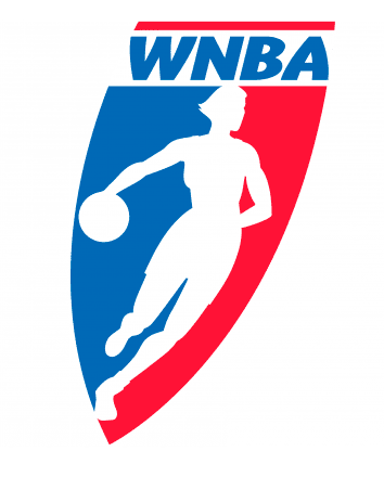

While retaining the color scheme and the silhouette idea, the WNBA logo debuted with a unique shape. The shape of a logo can drastically affect the emotion the logo evokes. In this case, the forward slanted shape conveys a sense of movement which is a great idea for a women’s basketball league.
While the NBA brand name appears more rigid and traditional in the NBA logo, the WNBA logo had a slightly slanted and more modern wordmark. A hint of feminine grace and oodles of energy made this a powerful first logo for the brand.
It’s a well-known fact that the player in the NBA logo silhouette is Jerry West. And this iconic symbol has become a unique identity of the NBA brand. Whereas on the WNBA logo, the silhouette did not take after any player in particular. It was added as a symbol to represent every female athlete. It paid tribute to the women in basketball.
The clear intent here has turned out to be the reason behind the success of the WNBA logo. And the idea has been retained to date.
WNBA logo 2013 – the updated brand identity and brand colors
The silhouette was updated to capture the essence of modern women in basketball. And this time the player was not dribbling the ball but going for a dunk. A symbolic representation of advancement for the WNBA brand.
But that was not all, the logo also came with an updated color scheme. In the 16 years since the WNBA league was formed, it evolved tremendously. Despite sharing the roots, it was no more seen merely as an extension of the NBA.
To indicate that the league was on a path of its own and branching away from the NBA, the color scheme and the refreshed silhouette were great assets in the new design.
One of the reasons for the change in the colors was to bring more diversity into the logo design. Another is the relevance to the game. The orange + oatmeal combination is the signature color scheme that can remind anyone of the basketball game. Naturally, this color scheme worked really well for the WNBA brand. That’s why even today the WNBA logo follows this color scheme.
Kimp Tip: Choosing brand colors or logo colors is perhaps one of the toughest decisions. If you feel stuck, find inspiration from your industry – choose colors that reflect your industry. Another is to find inspiration from the products you cater to. If the colors you choose for your logo help customers instantly think of the product you sell or the industry your brand belongs to, then you are on the right track.
Need help designing your brand logo? Get a Kimp subscription!
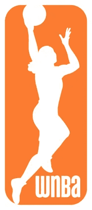
WNBA logo 2019- the most recent brand refresh
One of the most noticeable traits of the WNBA logo redesigns is that the woman in the silhouette has been changing to adapt to the times and trends. The 2013 logo silhouette was a modern take on the subtle vintage-styled hairstyle.
The silhouette in the 2019 logo (which has been in use since) looks sleeker and more powerful. One of the biggest changes is moving the silhouette out of the box which is symbolically allowing the woman in the logo to break free of the boundaries. This also brought in more room for movement and therefore indicates a better scope for advancement.
The logo lets the protagonist, the basketball player, take up all the space she wants. In short, the current WNBA logo captures the essence of the brand – women breaking barriers and making history.
When you look at the marketing strategies and campaigns from WNBA over the years you’ll know that it’s not just about creating an iconic logo. You need to have your branding collateral and marketing designs aligned with the spirit of the logo. Together they should relay the information cohesively. That’s when the logo works and the marketing strategies work as well.
This harmony in branding and consistency in brand identity is what helped the WNBA logo emerge as an icon in sports branding.
Are you ready to explore some of the historic moments and successful campaigns in the WNBA brand history? Here we go.
Creating the “fashion statement of the year”
Merchandise marketing is a timeless approach in sports branding. Wearing a t-shirt or a hoodie sporting your favorite team’s logo or the name of your favorite player is a whole emotion in itself, isn’t it? WNBA is well aware of this trend and so it made the most of it with its iconic orange hoodie.
When the refreshed logo was launched in 2019, just in time for the 2020 game the WNBA branded merchandise line was out. An orange hoodie featuring a white WNBA logo was the bestselling item among them.
The brand along with its broadcast partner ESPN approached celebrities and social media influencers to help kickstart the #OrangeHoodie trend on social media.
The hoodie gained traction when Kobe Bryant was spotted wearing one at a Lakers game.
This set a new trend on social media and sent the sale of the orange hoodie spiking upward. People started posting pictures in their orange hoodies. In December 2020, the hoodie was named the “Best Fashion Statement of the Year”. This marked a period of drastic growth in the WNBA brand’s digital presence.
Kimp Tip: The design concept of the orange hoodie is definitely a thing to talk about. It’s a lesson in simplicity. It shows how you can put your brand color to good use and also firmly establish your brand identity. All this without creating clutter. These are valuable insights to take in when you design merchandise for marketing.
Branded app marketing to foster ongoing relationships with customers
While the above campaign shows the WNBA logo and brand in a traditional marketing approach, here’s an example that shows that the brand does not fall behind when it comes to modern marketing approaches either.
Data shows that about 45.7% of sports fans watch their favorite games on their smartphones. Therefore, mobile marketing is something that can help sports brands stay current. WNBA knows this and that’s one of the reasons behind the introduction of the WNBA app.
WNBA recently launched its official app to help fans stay connected to their favorite games anytime and anywhere.
The WNBA app has a delightful interface. It’s a great place for fans to stay updated with everything that’s happening in their favorite game. Talk about keeping all your fans in the loop! Apps like this one help build a more closely-knit community which is very much essential in the world of sports branding.
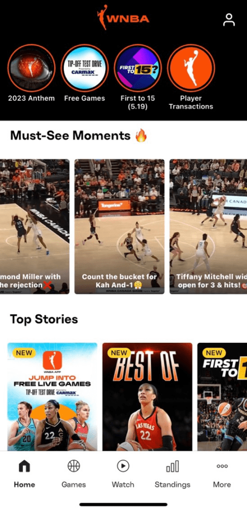
One of the most prominent aspects of the app is its social media-like feed. The app has a Story section where it shares quick updates similar to the Story feature on Instagram, Facebook, and other platforms.
There’s also a video-focused section titled Must See Moments. This section has short videos of crucial moments from the game. These bite-sized videos are presented in a vertically scrolling interface. This is a format that most fans are familiar with. And therefore, it’s a great move from the WNBA team.
Standing up against pay gaps
Did you know that the highest-paid mascot in NBA, Rocky, makes more money than the highest-paid player in the WNBA player?
Shocking as it might sound, pay gaps due to gender bias exist everywhere and the world of sports is no exception. Topics like these do not get the attention they deserve. But, if you have been following the growth of the WNBA brand, you must know that the brand is not one to shy away from expressing its opinions.
In fact, the fact that the league has strongly distinguished itself from the rest of the sports leagues and voiced its opinions firmly is also a notable aspect of the WNBA brand.
The WNBA brand has, several times, stood as an example of feminism in its truest sense. WNBA’s Take a Seat, Take a Stand campaign is a good example of one such instance when the brand took a stand to support women.
Kimp Tip: Brand image does not build itself overnight. Every little brand asset including your logo and tagline, every marketing campaign, and every conversation on social media should be a reflection of what your brand stands for. Consistent designs, consistent copy, and a relatable brand tone of voice get you there. That’s how WNBA got where it is today.
Handling brand sponsorships like a pro
Brand sponsorships are of paramount importance in the world of sports. WNBA has always stayed ahead in this aspect. With its careful selection of sponsors to the clear value-driven campaigns created in collaboration, a lot of measures have helped WNBA make the most of brand sponsorship and also attract the most productive ones.
A successful brand partnership is when brands with similar objectives and brand purposes come together. Because anyone can partner with another brand. But making this collaboration work in favor of the brands involved and getting the best ROI from these collaborations don’t happen all the time.
That’s why WNBA’s roster of carefully picked brand sponsors has always had brands that stand in favor of bringing change in the world of sports, of standing in support of women in sports. As of 2022, WNBA had an impressive list of 38 league-level sponsors from various industries. The list includes Gatorade, Nike, 2K, Kia, American Express, and others.
In addition to clever brand partnerships, WNBA also stays ahead in its social media game. WNBA has brilliantly used social media to bring in new audiences, gain more media coverage, and also to keep existing fans engaged. Let’s talk about the social media strategies that have helped the WNBA brand’s growth in this space.
Staying on top of its social media game
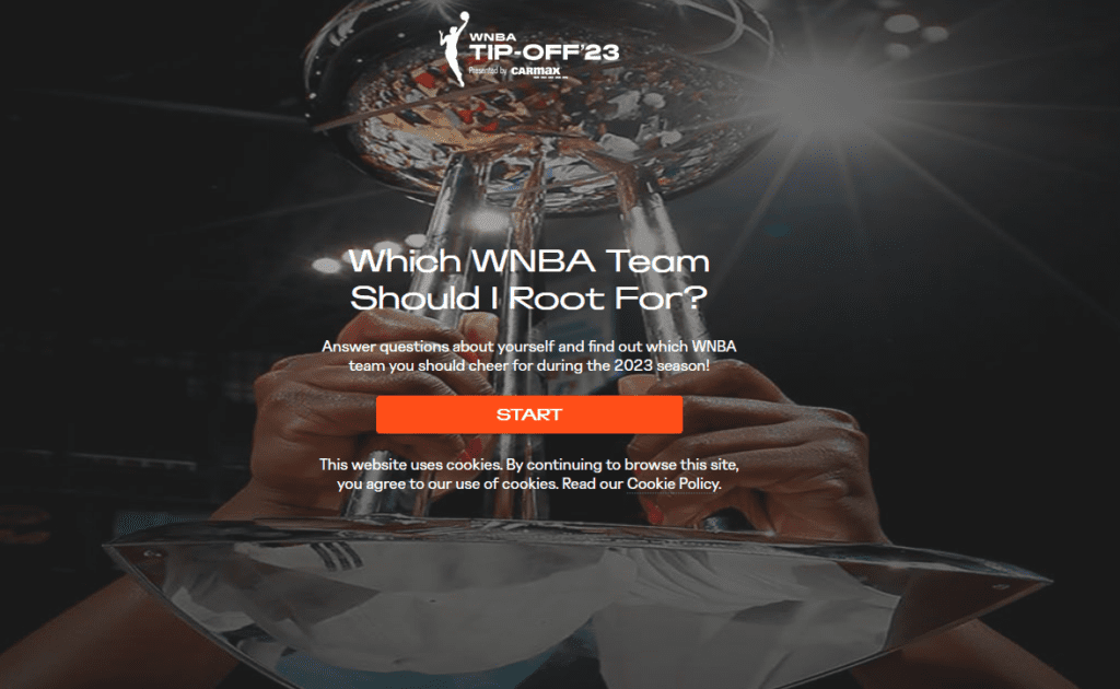
Gamification for interaction
Brands go the distance to keep their audiences engaged. Otherwise, in a competitive space like social media, it’s easy to lose followers. Gamification is one way in which brands try to stay on top when it comes to social media engagement. And WNBA does this well.
The below Tweet, for example, leads you to a landing page where based on a few questions you answer, you are recommended a team to root for. This is a fun way to test your knowledge about the teams and players you love and also to introduce you to new ones.
Stay up to date – topical content to engage the masses
Where there is a trend, there’s an opportunity for marketers. WNBA never forgets that. The reason the WNBA logo and brand have managed to carve their positions in the social media world is that the brand stays up-to-date and posts topical content. Because that’s how you start engaging your audience.
Take the below Instagram post for example. The idea is to join the #MentalHealth discussion on social media on account of Mental Health Awareness Month.
Similarly, when you have posts aligned with trends and trending hashtags, you manage to stay on the top of your customer’s mind.
Find new ways to connect with your audience
The social media landscape is expanding continuously – both in terms of the number of platforms out there and the types of content each platform supports!
And when it comes to effectively utilizing the many social media features to boost engagement, WNBA is a great source of inspiration. The brand does not restrict itself to static Feed posts. The Twitter page of the WNBA, in particular, is filled with instant updates about games and players. It’s a great space for fans to stay up-to-date with game news and highlights from the games.
WNBA also actively initiates conversations through Twitter Spaces to take fans closer to the games they love.
Slam dunk your way to better marketing with Kimp designs
As you can see, the growth in popularity of the WNBA logo and brand did not happen overnight. There was no restricted approach either. Credits go to the WNBA brand’s diversified approach to marketing and the variety of content it continues to bring to its audiences. From consistent designs to effective conversations, a lot goes into the building of a brand and its image.
Need help creating these visuals that lay the foundation of your brand image? Get a Kimp subscription. Start your free 7-day trial now.