Design 101: 7 Of The Best And Worst Sports Logo Designs
From wearing your favorite player’s jersey, to proudly flaunting a hat with your favorite team’s logo, you probably put on some kind of branded gear when you cheer for your team. Maybe you even get fully dressed up in your favorite team’s official merchandise; even when you are not in the actual venue but at home, watching the game with your friends.

That alone says a lot about the power of branding in the world of sports. And when we talk about branding, a good logo design lies at the crux of it all. A sports logo design represents the brand it stands for. It has a story to tell, a team to represent. In the world of sports, a logo puts a face to the name that loyal fans embrace. A symbol that evokes in them a million emotions.
The global sports market is projected to reach $599.9 billion by the year 2025. Saying that “branding is competitive” in this billion-dollar industry is a huge understatement. Every team wants to garner attention. Every sports brand wants to register its name in the minds of fans.
And they all want global penetration. After all, better reach means a bigger fan base. And a bigger fan base means a stronger reputation which brings in the best sponsors. And sponsors and fans together then carry the team on the path towards steady growth.
A sports logo has an unshakeable authority in sports branding. Want to know how to make the most of the logo for your sports brand? In this blog, we’ll tell you all about it. We’ll see why logos are important for sports brands and then take a look at the common traits of popular sports logos. A little later, we’ll also give you some examples of iconic sports logo designs, take a look at what they do, or don’t do, well.
Why logos are important for sports brands
First things first, why do we make such a big deal out of sports logos? Because they have a strong role in a lot of things from building a sports team’s reputation to strengthening the connection the team shares with its fans.
1. A bridge between the players and their fans

The moment your favorite team steps into the arena, even from a back-row seat in a crowded stadium, you can likely identify your favorite player in the team. From the familiar color of the jersey to the logo etched in your mind, a lot of visual cues are behind this instant recognition.
A sports logo, thus, acts as a bridge between the fans and their favorite sports teams. It appears not just on the sports brand’s advertising materials but also on the merchandise that the fans cherish enthusiastically. Like the posters and memorabilia that many fans treasure and keep in their homes.
2. A graphic that tells a story
There are so many teams. And they all have strong players. But why should people cheer for your team? Well they’re a lot more likely to if they know what makes your team special. And your logo can capture this unique trait of your team.
Sports logo designs are often highly symbolic and can even be quite intricate, allowing them to tell interesting stories. What are the ideals your team stands for? Is there a deep and emotional history behind how your team was formed? One effective way that sports brands can create a meaningful and strong emotional connection is to depict the localities they represent in their logos. The strong connection many people feel to the city or state they live in, or grew up in, can instantly be captured by a logo.
3. A visual that stirs up emotions

We often compare branding in the traditional business scenario and in the world of sports. Though there are plenty of similarities these can be two very different things. This is one exemplary industry that capitalizes on the sentiments of its fans. The stronger the emotional connection the team evokes, the better its progress.
A sports logo, therefore, should be something that the fans can easily resonate with. You cannot keep changing it too often. Rebranding can be quite expensive given the penetration of sports brands into a diverse range of markets. So, you should be careful in designing your logo. It should be a symbol that strikes a strong emotional connection. One that stands the test of time.
4. Sports logos are everywhere
Sports logo designs appear on the players’ jerseys. You see them on large billboard ads announcing the games. Signage and advertisements within the stadium. They make an appearance in TV ads, social media pages, and websites of sponsors. Everywhere there is news about the team, the logo pops up. A visual with such a strong presence truly deserves all the attention you can give it.
Kimp Tip: Considering the diverse placements for your logo, you should be careful about the colors and other design elements (like fonts) that you choose. You will be scaling the logo down to fit into small badges or scaling them up to be legible on billboards. So, you should choose elements that look good and trigger the same emotions when printed in different sizes.
Want to create versatile logos that look good everywhere? Try a Kimp Graphics design subscription.
5. Gain the trust of sponsors and fans alike

Sponsors and fans are two very different demographics. However, a sports brand logo has to make a connection with both these groups. Winning the trust of your sponsors is as important as gaining a loyal fan base. And with a well-designed logo, you can achieve both.
A logo that is a true representation of your team’s spirit shows that you have a strong sense of who you are and what you stand for. This is an indispensable trait that most sponsors appreciate. With a logo that makes an impact, you end up imprinting your symbol in the minds of your fans and also securing some long-term sponsorships for your team.
A few common traits in the most popular sports logo designs
- Sports logos often break almost all the common trends in logo design. 76% of brands from various industries make use of just one or two colors in their logos. But sports logos are where you will notice the liveliest color combinations, with more than two colors in most of them.
- This is one industry where you will also notice the biggest diversity in fonts. Serif typefaces and vintage fonts are all quite common. The sans serif typeface for a clean and modern look works well with many other industries. But in the world of sports, it might feel too plain to trigger the level of intense emotions that teams want to evoke.
If you are wondering what type of logo works for sports brands, you should know that the wordmark is not very common in this industry. You will mostly find lettermark, brandmark, and emblem logos. There are a few combination logos as well.
Kimp Tip: A logo might perhaps be the first thing that an audience notices about your team. To convert the audience in an arena into fans, and to truly capture the energy of the players in your team, consider adding a strong personality to your logo. As you will see in the examples listed below, typography and symbolism have a strong role to play here.
Are you looking for a sports brand logo that makes a strong first impression with its unique typography? Set up a call with the Kimp team and find out how easy it is to create one for your brand with an unlimited design subscription.
To understand the wide-ranging logo design trends in the world of sports, let’s take a look at some of the best and worst sports logo designs.
Sports logos from around the world
1. Manchester United

An iconic logo in the world of sports, this one is a classic example of an emblem logo. Back in 1878, there was a football team consisting of railway employees formed as the Newton Heath LYR Football Club. This team was rebranded as Manchester United in the year 1902. But the emblem logo we see today was only introduced in the 1940s.
The color scheme of the logo is inspired by the coat of arms of Manchester. So are the shield and the ship. The ship is also a nod to the fact that Manchester was once on the prime shipping route of England. The iconic red devil symbol at the crux of the logo comes from the team’s nickname given by its former manager Sir Matt Busby. He had suggested the nickname for the team mainly because of the “intimidating” feel it had.
This logo perfectly combines all the visual elements that good sports logo designs are supposed to have. When there is a rich history for your team, make sure that your logo aptly captures it. And the use of elements that instill fear in the minds of your competitors is an added advantage.
2. New York Yankees
The branding logo consisting of the red baseball is a sleek emblem logo that has been in use since 1947. By incorporating a color scheme that any American will easily relate to, this logo makes an instant connection.
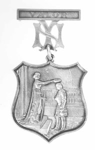
The insignia you find on the jerseys consisting of the NY interlocking lettermark (as in the below image), is inspired by one of the oldest logos of the team which was in use since 1909. It has been the most successful version of the team’s logo and also an instantly recognizable symbol in sports merchandise.

While the team’s logo has evolved over time, it continues to use the iconic monogram in its jerseys and caps mainly because of the history behind the design. It was inspired by the Medal of Valor that was awarded to NYPD’s John McDowell. And to date, the team carries this symbol proudly.

Kimp Tip: Certain details like the heroes a team reveres or the moments that define the team’s spirit make a sports team logo truly memorable. And it is such memorable visual elements that win the hearts of your fans. So, make sure that you use such symbolism everywhere in your branding. This will keep reminding your target audience of the story that makes your sports brand unique.
Wondering how to incorporate such strong visual elements into your logo design? The Kimp team is here to help.
3. Super Bowl

Perhaps the one logo that most American football fans can instantly recognize. Each season of the Super Bowl played since the year 1967 has come with a different logo. Like the Olympic Games, fans get as excited to see each year’s logo as they are to see the games.
Since 2011, the branding strategy has changed and you will see the Vince Lombardi Trophy being incorporated in some form into the season’s logo. They trophy appears along with the signature Roman Numerals to help fans distinguish one season from the other. The use of a common symbol since 2011 has helped build recognition and has helped the Super Bowl evolve as a brand. Everything about the Super Bowl, including the Super Bowl ads, has a fresh new twist to offer fans every season.
4. Olympic Games

As one of the sleekest logos in the world of sports, this one shows that to make a strong impact, you do not need a complicated logo design. Though a minimalistic logo, the Olympics logo packs a lot of symbolism in it.
The five interlocking rings were included to show that this would be an event that brings five continents together. The colors of the rings are from the five most popular colors that were used in national flags at the time the logo was designed. On the whole, this simple logo captures the spirit of unity that the Olympic Games have always been known for.
Having a logo that captures what your brand stands for is a good way to make an impression on your target audience. A fuss-free and unbiased design like this one will be an easy hit even when your brand has to expand or reach new demographics in the audience.
5. Chicago Bulls

This is one of the very few logos in the world of sports that have remained unaltered for decades. The original version was designed by Dean Wessel who created a simple but memorable logo that perfectly goes with the name. The raging expression of the bull and the details like the blood on the horns capture the fierce and spirited nature of the team.
Some of the Least Inspiring Sports Logos Designs
6. Indianapolis Colts

There is nothing technically wrong with this logo design but it is the lack of spirit that some might find to be a bit of a turn-off. If you look at most sports logo designs, they thrill the fans either with typography that has a strong character or with a vibrant color palette. This one lacks both.
However, the horseshoe symbol in the logo is said to be a depiction of determination. And it is an ode to the fact that the team was moved from Dallas to Baltimore, a place where equestrian sports were the most popular in those days. While the influences in the logo design are clear there’s not quite a strong enough story to help new fans relate to the symbol alone.
7. Nashville SC
In a world of intense symbolism and powerful typography styles, Nashville SC’s logo appears a bit unexciting. Another reason why we have added it to our list of the least inspiring logos is that the symbolism is not straightforward.
Notice the horizontal lines on either side of the letter ‘N’ in the logo of this Major League Soccer team? These represent sound waves simply because the team is from a city known mainly for its country music. The relation here is hard to grasp for most soccer fans. And the symbolism is not strong enough to leave an impression.
Boost your sports brand’s image with logo design services from Kimp
Your logo should not just make your team players look good but also be aesthetically appealing when it appears on jerseys and other merchandise that fans will purchase. It should be a design that your fans will proudly show off. Unlike conventional brands, sports brands cannot limit themselves to branding in digital or print media.
From social media branding to all types of outdoor advertisements and print ads, sports teams should make use of every single marketing channel to actually make an impact. So, you need a design that does not shrink or shrivel the meaning or the momentum of your team’s spirit when printed on different surfaces. With Kimp Graphics your logo design job becomes so much simpler. With the advantage of getting unlimited revisions, you can have your sports logo design perfected to suit your brand’s personality. And your dedicated team can also help you handle the graphic design requirements for both print and digital media for the effective promotion of your brand.
Start a free trial to test out a subscription for yourself!
