2023 Logo Design Trends – An Overview For Brands
Another new year means another new window of opportunities for brands. Whether you are planning to launch a new business or looking to revamp things with an existing one, the dawn of a new year gives you a chance to revisit your strategies. Because with a new year comes new trends in marketing and new trends in branding designs. Talk about branding designs, a logo is perhaps the first thing that comes to mind. So, we are here to discuss the 2023 logo design trends.

Based on the logo design trends that made a splash in 2022, and new trends set by popular brands that revamped, we have shortlisted some of the trends to look out for. Hope this list helps spark your imagination and find all the bright ideas for your logo design project ahead.
Logo design – breaking the ground with some quick facts

Year after year marketers rummage through the internet looking for fresh trends in logo designs. They do so to keep up with what their customers are looking for. Because these trends tell what their customers are exposed to every day.
If a big brand rebrands, a lot of critics and consumers talk about the new design – what they like and hate about it. If some aspects of the design get discussed more than others, soon many small brands take after this popular design aspect. That’s how a logo design trend emerges. Given that these trends are often based on how real people perceive the design these are definitely worth looking into.
Combination logos continue to be among the most popular logo types since they have both a symbol and text that simplifies the purpose and make them versatile. And blue is still the most commonly used color. In fact, nearly 40% of Fortune 500 companies use the color blue in their logo.
Knowing these common logo facts will help you understand what the norms in the industry are like. That said, everything about your logo should have something to say about your brand. From the color to the shape and the fonts you choose, everything should have a strong purpose.
With that in mind, let’s move on to the 2023 logo design trends.
2023 logo design trends that brands should know
Before we get to the trends, let’s tell you a little secret – a logo design should be timeless. After all, it’s not the kind of design you change month after month. There are brands that have retained their logo design for decades! So, timelessness is an obligatory trait in a logo. So, taking your inspiration from emerging trends, add a splash of your brand personality to the design. That’s one way to concoct the perfect logo that speaks for your brand.
1. Lowercase fonts

Brands have been moving towards keeping the branding designs more friendly and approachable. Lowercase fonts can do that. That’s why you might notice several family brands as well as brands focusing on kids use lowercase letters in their logo design.
With more and more brands now diversifying their audience and exploring new markets, we are seeing an influx of lowercase logos. So, if you wish to keep your logo design more accessible, and maintain a more casual vibe, then this is one of the most useful 2023 logo design trends for you.
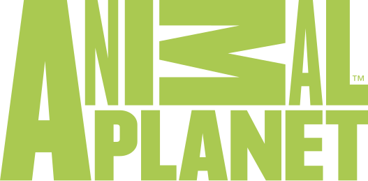
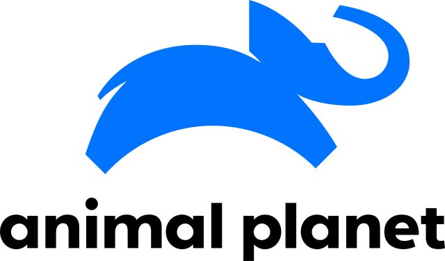
Take Animal Planet for example. The brand underwent a major rebranding in 2018 and the fresh new logo introduced was friendlier, warmer, and more “fun”. It incorporates all lowercase letters in it.
Animal Planet’s old logo
Animal Planet’s new logo
Kimp Tip: When you choose an all-lowercase approach, you need to be double-sure about the font you choose. While aesthetics are important, the functionality of your logo cannot be missed. Choose a legible font where every letter is easily distinguishable from the other. You do not want your customers to be saying your brand name wrong!
2. Decorative monograms
Monograms are simple, versatile and they take up very little space – the perfect combination for a logo design, yes? Perhaps that’s why we see many brands switch to monograms these days. Earlier it was just the luxury fashion brands that needed to embed their monogram into their signature collections. But now monogram logos or lettermarks as you might know them, are popular in many industries.
The French Luxury brand, Balmain Paris, unveiled a new logo incorporating a catchy monogram in 2018.
The monogram in the above logo incorporates both “b” and “p” and is a more memorable design. That’s the takeaway. If you wish to create a simple logo that customers will easily remember and recognize, monogram logos help.
In 2023, we are anticipating that we might see many new brands might be using monogram logos. And decorative ones with fully personalized fonts are the way forward. They make your design timeless. Furthermore, when you can stylize the letters to add more meaning to the design or form a symbol that creates a visual impact, then your monogram looks even better.
Here is an example – notice the beautiful butterfly symbol the letters S and B form. Visual impressions like these make your logo more impactful.

3. The use of gradients in logos
Color is the most prominent element in a logo, an eye-catcher. The color you use in your logo reflects the mood of the logo. That’s why color psychology is one of the first things that most logo designers talk about. We also know how using too many colors can spoil the overall effect. Or worse, make the logo look unprofessional and confusing. So, 75% of top brands use one or two colors in their logos.

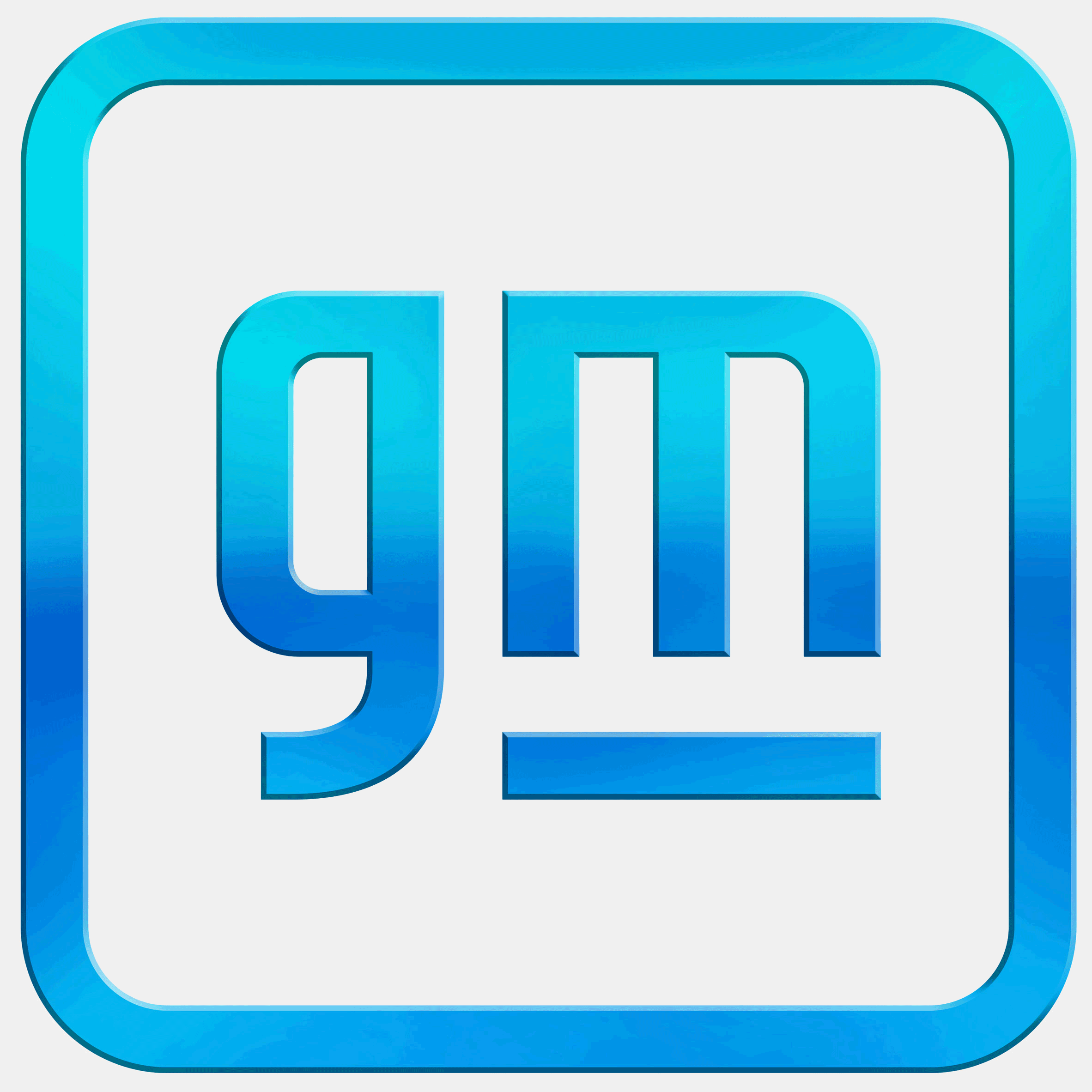
What if you want to use bright colors and reflect an energetic vibe? One way to incorporate colors without too many distracting elements is with the use of gradients. We have seen color gradients steadily emerge in logo designs, take the Instagram logo, for example. So, this is one of the 2023 logo design trends we think many brands might experiment with.
The recent logos of General Motors and GSK plc show how aesthetically appealing color gradient logos can be.
4. Geometric shapes in logos
Geometric designs are safe to work with. And they have strong personalities. That’s one reason why brands have been using them a lot in their branding and marketing. Moreover, geometric shapes are easier to understand and remember too. Brands like Adidas, Volvo, and Microsoft are among the most popular ones to use geometric shapes in logos.
You should also know that logos with geometric shapes do not always have to be rigid and overly professional. Here is a logo design by Kimp that incorporates geometric shapes but maintains a creative flair.

Kimp Tip: The shape of your logo tells a lot about your brand. Some shapes like circles are seen as more friendly and are suitable for brands that aim at community-building. Some shapes like squares are seen as reliable and dependable. We have a blog on logo shapes to help you find the right one for your brand.
5. Playing with the spaces
One thing that differentiates a logo design from other branding and marketing designs is the fact that you only get a small space for logo design. And within this small space, it should make the most impact. That’s when the design looks good even when you scale it up or scale it down.
Therefore, optimal space utilization is the secret to good logo design. But at the same time, you cannot cram up too much information and too many design elements within the available space. That’s why we have been seeing logos making creative use of the negative space between letters or even the space within letters. Did you notice an electric-plug formation in the GE logo we discussed a while ago? Or perhaps the arrow hidden in the FedEx logo.

What do you see in the above logo? The face of a girl or a wrench? Interesting visual elements like the one you see above can be incorporated when you manipulate negative spaces in your favor. That’s one way to create an interesting logo.
6. Raw handwritten and hand-drawn logo designs
Personalization is one way to appeal to your customers. That’s what a handwritten font can do! It makes your logo look more flexible, and also captures the unique identity of your brand. What’s more, it puts an end to the never-ending dispute between serif and sans-serif fonts.

Flexible custom fonts like these make a brand appear less formidable and more connected with the audience. Brands like Walt Disney, Coca-Cola, and Ray Ban all have distinct handwritten scripts in their logo design.
Kimp Tip: Even within the handwritten script font category there are several visual styles. Sketchy rustic ones to elegant fonts – depending on the personality of your brand you can always arrive at a style that works best.
Want to give handwritten fonts a try but don’t know where to start? Sign up for a Kimp subscription.
7. Minimalism in logo design

Brands now know that you do not need too many colors and too many elements to communicate the intended message in a logo. If Google and Apple were to create a design that tells people what these brands offer, they would have the most complicated logo designs.
People are to admire your logo, recognize them instantly and remember them. Not spend minutes trying to decipher them. Too many details make the logo harder to remember and recognize. So, one of the 2023 logo design trends to look out for will be brands switching to more minimalistic logos.
8. Creative use of illustrations
A logo that looks unique from every angle will be the ideal choice. When you have to choose symbols and fonts based on your brand, industry, and target audience, there might be some overlap with your competitors. There is one way to avoid this and create a stunning logo that looks like no other – using illustrations.
We have seen many brands use illustrations pertaining to the industry in their logo designs. Some also have an illustrated mascot adorning their logos. All these help add a visual dimension to the logo and convey a deeper meaning without using too much text.

In the above logo, the illustration helps you understand what the brand does even before you read the brand name. So, an increase in the use of illustrations to customize logos is one of the 2023 logo design trends to keep watch.
Kimp Tip: There are many ways to use illustration in a logo. It can be to show what your brand does, paint a scene to capture the experience, or to give a new perspective to your logo as such. Identify and define the purpose of the illustration clearly and you will be able to find the right illustration style to go in your logo.
Want to try illustrated logos for your brand? Get Kimp.
9. Responsive logo designs
Logos that can adapt to the environment or the surface where they appear are definitely easy to work with. As more and more brands adopt an omnichannel approach they know well that their logos have to appear in a variety of places. Small ones like business cards, large billboards, shareable infographics and ebooks, digital ads and so much more.
In some of these places, the logo has to be the primary focus and in others, it has to be there as a subtle reminder of the brand. So, brands are using responsive logo designs. This is where you have different versions of the logo to use in different places. These versatile shape-shifting logos are such that each variation looks connected to the other. So, among the 2023 logo design trends, this one might probably stick around longer.

10. Layering for a twist
One other design we predict might be part of the 2023 logo design trends is the use of overlays in logo design. Interlocking fonts, text layers overlapping each other or even text overlap on symbols are a few styles to try. Of course, you need to show a clear contrast between the overlays either through size variations, colors, or opacity differences.
With the overlay effect, you can pack more than one element within a small space and create harmony without chaos.

Choose Kimp and adopt the 2023 logo design trends easily
Small businesses spend an estimated $300 to $1300 budget on designing their logo. After all, the one visual that accounts for representing the brand everywhere deserves your time and money. All that we discussed so far show that you need to take logo design seriously. But you should also know that logo design does not always have to be that expensive. When you sign up for an unlimited design service, like Kimp, for example, you get not just logo design but also all other marketing designs for your brand covered in that budget. And to top it off, you also get unlimited revisions. So, you can keep perfecting your logo until you are fully satisfied with the design.
Want to see how a subscription works for your brand? Sign up for a free trial today and request some sample marketing designs for your brand. Once you are satisfied, choose your subscription and start your logo design project right away.


