Designing Fintech & Finance Logos: Tips and Tricks for Success
When given a choice, would you choose a finance company with the fanciest logo or one that represents itself as a credible player in the segment? It’s definitely the latter! See that’s how branding can differ when it comes to the finance sector. While aesthetics are a big deal, accurately representing attributes like security, credibility, and transparency is a bigger deal. This is why designing finance logos is far from straightforward.

But don’t worry, this blog is here to guide you. From tips to design brilliant fintech and finance logos to do’s and don’ts and some examples to better understand these rules, there’s everything you need to get started! So, without further ado, let’s get started, shall we?
Designing Trustworthy Fintech & Finance Logos: 8 Key Strategies & Tips
1. Let your brand values shine
Credibility is a cornerstone when designing finance logos. That’s why using your design to represent your finance company’s brand values can be a great idea to try. But how do you do that? We’ll explain with an example.
Take a look at the logo of the popular multinational investment company UBS. Do you know what the symbols, the 3 keys in the logo mean? Reportedly, they represent the 3 core values of the finance company, “confidence, security, and discretion”.
Additionally, the traditional illustration style of the 3 keys also resonates with the elegant serif font used in the wordmark. Together, these elements unanimously capture a professional tone and a sense of authority both of which are great for finance companies.
By adopting this approach and infusing your core values into your finance logo you are establishing a deeper connection with your audience.
KIMP Tips:
So, how do you implement this strategy?
- Identify your finance company’s core values.
- Ideate the most accurate and easy-to-understand visual representation of these values.
- Keep it simple – you do not want to complicate the design and confuse your customers.
2. Focus on scalability
With the digital forward approach that’s prevalent in the banking sector, you need to craft an identity that shines across all channels. Scalability and versatility are therefore indispensable when it comes to designing finance logos.
Because when your logo is scalable, you achieve a consistent and memorable representation of your brand so as to build trust over time. From your website to your print ads, outdoor campaigns to social media posts, your logo should look equally impactful across all platforms.
The sleek and versatile logo of Block Inc.’s financial services, Square, is a good example.
This logo features 3 concentric squares with excellent contrast and a monochromatic palette for easy reproducibility across platforms and backgrounds. In logo design, squares are seen as a symbol of stability which is a pretty good message to communicate as a finance company.
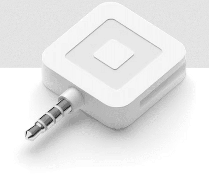
Moreover, what sets this logo apart is its versatile design which makes it easily recognizable wherever it is used. Moreover, the fact that the logo is a 2-dimensional rendition of what the square card reader looks like is an added advantage.
KIMP Tips:
So, how do you create finance logos that are easily scalable and versatile?
- Simplify the design – flat designs like the one used by Square can be a huge benefit.
- Stay away from complex color combinations. If your logo means nothing without its signature colors then you are missing out on a lot. Because on some platforms, on some design backgrounds, you might have to use different color variations of your logo and you do not want your logo to lose its meaning in such instances.
3. Create something that is instantly recognizable
Simple logos are often considered to be good for brand recognition. So, finance logos that can easily be understood, designs that can be remembered and recognized instantly are the ones that help your brand stand out.
Take the Mastercard logo for example. The overlapping circles have been in use for decades with subtle refinements made to the design over the years. The symbol is meant to represent connection – probably the bond the brand shares with its customers. Moreover, circles, in logo design, are often associated with a sense of community therefore helping the brand establish itself as a customer-focused and approachable business.
This simple yet memorable design makes Mastercard stand out among other finance logos. Moreover, the signature red-yellow circles are hard to miss when displayed amid other finance logos on a payment page.
Here’s yet another finance logo that incorporates symbolism to make the design memorable. The symbol effectively communicates the type of financial services the company caters to and the symbolic representation of the name itself for ease of recognition.
KIMP Tips:
What should you keep in mind to create easily recognizable designs?
- Use simple symbols with a strong purpose so that your customers instantly understand the meaning of your logo.
- Ensure that your branding materials, your overall visual identity, and your brand’s tone of voice all align with the mood of your logo color palette.
4. Honor your brand’s heritage
There are a number of factors that people look for when choosing banks – like customer service, lower fees, convenient locations, and so on. But in that list, there’s one other crucial factor – brand reputation! And about 86% of consumers reportedly still consider this as a deciding factor when comparing banks. Therefore, a logo that clearly communicates your brand’s heritage can make a big difference.
This could be about the rich history of your finance company, or its origin story. For example, the popular financial services company, HSBC, was founded by Thomas Sutherland, a Scotsman working in Hong Kong way back in 1865. This perhaps explains why the design of the HSBC logo resembles the Scottish flag, the cross of St Andrew.
As for the color, red, as you probably know, has great significance in Chinese culture and it is the main color of the Hong Kong flag as well. Tying back to the origins both with symbols and colors is a good way to preserve the heritage of the company. That’s a great example of designing finance logos that encapsulate the company’s heritage and build trust.
Tradition and heritage can foster trust which is crucial in the finance industry. So, incorporating visual elements that portray your company’s legacy is one way to create a strong brand in the segment.
KIMP Tips:
When it comes to visual representations, be aware of what works in your industry. For example, educational institutions trying to adopt a similar approach might incorporate coat of arms and other intricate details representing the company’s heritage. However, this might not work for finance companies in the digital landscape. A subtler nod like the modern and minimalistic symbol in the HSBC logo works.
5. Pack a story into your logo
With proper planning, finance logos can be crafted as wonderful storytelling tools. The story of how your brand started, the story of what your brand stands for. Or it could be the story of how your brand aims to connect with your audience or even the story of your brand’s growth.
Aim for the visual representation of this story through symbols and colors along with clear marketing collateral to reiterate the message. This helps communicate your story clearly avoiding any confusion.
A good example of this is the logo of the popular Austrian financial company, Raiffeisen Bank International. The moment you look at this logo, does the symbol attract your attention? You are perhaps curious about the meaning of this peculiar symbol and wish to understand the story behind it.
The use of a gable cross here is inspired by the symbol representing the idea of a protected home – a sense of security.
That explains why you’ll find Raiffeisen Bank International being mentioned in several discussions about finance logos. Because it packs a story in it – a story that initiates conversations. And it depicts the magic that creativity can bring to a finance company’s brand!
KIMP Tips:
Now let’s talk about executing this strategy:
- Identify the meaningful story that can humanize your brand and illustrate this story in a simple and memorable design.
- Add life to your design with colors. In the above example of the Raiffeisen Bank International logo, yellow is not a very common color in the finance sector. It therefore provides differentiation for the brand in the crowded space.
6. Embrace a universal appeal
Digitization has made it easier for finance companies to explore diverse markets and scale at their own pace. So, if your ultimate aim is to reach a wider group of audience and to establish your finance company in several locations, aim for universality in your design.
Instead of choosing symbols that are extremely culturally specific and recognizable only by a select few, opt for a simple decipherable symbol. Take the popular investment bank, Deutsche Bank for example. In their modern and professional logo, the unique symbol is what stands out.
Reportedly, the slash in the logo stands for “consistent growth” and “dynamic development”. This is enclosed in a square which is meant to capture a sense of “security”, a “controlled environment”.
Such simple symbolic representations work in almost all industries. They help build timeless logos that transcend geographic boundaries and connect with a global audience.
KIMP Tips:
Here are a few ways in which you can infuse a universal appeal into finance logos:
- Choose neutral colors without strong cultural associations. In the case of Deutsche Bank, for example, the color blue is quite common and a time-tested one in the finance industry.
- Prioritize clarity and legibility by choosing a minimalistic design and an easily readable font, like the sans-serif font used by Deutsche Bank.
7. Add a hint of sophistication
Sophistication and professionalism can help several finance companies attract potential clients and build trust. Your logo can be used to imbibe these attributes into your brand.
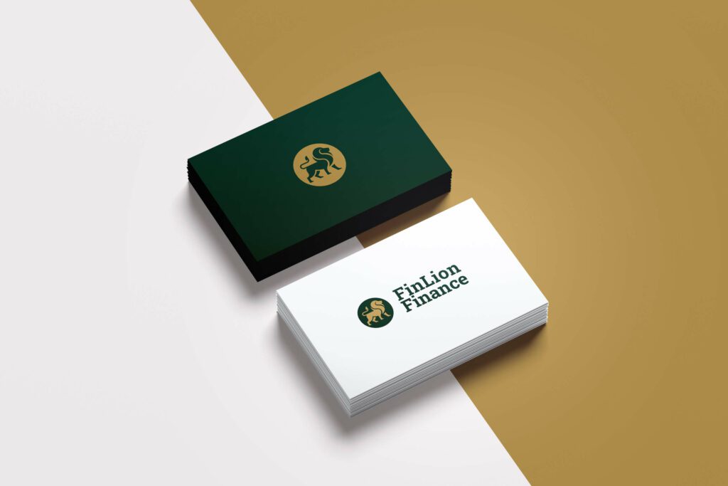
Take the logo design below for example. The design uses a combination of factors to achieve premium looks. The sleek illustration of a lion, a symbol of strength and leadership, is one of the first things you might notice. Then there is the chic traditional serif font. And finally, the unique combination of deep green and gold to convey luxury. Together, they project an image of sophistication.
KIMP Tips:
To achieve this effect:
- Embrace clean minimalistic designs. Because there’s no sophistication in a cluttered and ambiguous brand identity.
- Your logo alone cannot establish the intended personality of your brand. The rest of your branding designs and marketing designs should all cohesively capture this theme.
Looking to work with a dedicated design team that can help create this cohesive identity for your finance company? Get KIMP!
8. Timelessness trumps trends
There are several sectors where customers welcome change and embrace constant growth and evolution. However, when it comes to finance, not many consumers might be willing to work with a brand that’s constantly changing its identity. They like transacting with a familiar symbol.
Therefore, aim for timelessness when designing finance logos. This can help nurture a sense of stability and dependability – precisely what customers expect from finance companies.
The logo of the popular Canadian financial services company, Toronto-Dominion Bank is a great example of timeless designs. It is a straightforward lettermark logo, a monogram that resonates with the essence of the brand.
With a clear visual balance and an organized layout, this logo is also easy to relate to the brand. Given that the bank is all about delivering convenience in banking, the simple no-fuss design resonates with the brand.
KIMP Tips:
If you wish to create a timeless design for your finance company, here a few things to remember:
- Clear wordmark and lettermark logos like the above example are fool-proof ways to create something that stands the test of time.
- Establish easy symbolic and color-based connections within your industry. Like the color green in the above example and its connection to finance. By choosing colors that connect with your industry rather than choosing colors based on trends, you create a timeless design.
Design Elegant Finance Logos With KIMP
With all these tips in mind, you probably have drafted an outline of what your finance company’s logo should look like. Wondering how to make these ideas come to life? You need a designated design team and the flexibility of unlimited revisions. An unlimited design service like KIMP covers all that and more.
Eager to explore the benefits? Register now for a free trial!


