The New Pepsi Logo 2023: A Quick Look At The Rebranding
Guess who’s turning 125 this year? The beloved cola brand, Pepsi! And how is the brand celebrating its 125th anniversary? With an all-new brand identity. Pepsi recently unveiled its new logo and we’re loving it!
Rebranding is a big step. And brands that take this step have a million questions. What if customers do not recognize the new logo? What if the new design earns harsh criticisms on social media? And what if the brand’s identity is lost with the refreshed look? Wading through these what if’s brands need to make a calculative move. And that’s exactly what Pepsi is doing.
In fact, the brand has been planning a rebranding campaign for a few years now. Considering that the previous Pepsi logo became an object of mockery, the rebranding decision of the brand is a welcome move.
The logo has not been globally released yet but people are already talking about the new Pepsi logo 2023. Want to know more about the design and the story behind the rebranding? Find all your answers right here.
- When is the new Pepsi logo hitting the market?
- Pepsi logo evolution – lessons in brand experiments
- Pepsi new logo 2023 – an overview of the design
- Proof of the potential of nostalgia in marketing
- Market research – the secret tool behind the redesign
- How the Pepsi logo redefines the unspoken bond between Pepsi and music
- The road ahead for Pepsi
When is the new Pepsi logo hitting the market?
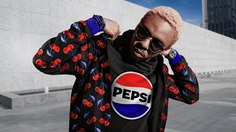
By the end of March 2023, Pepsi announced a new logo and a new visual identity. The brand also released a rebranding trailer on its YouTube channel highlighting the energetic new logo.
This is Pepsi’s first major rebrand in 14 years. The current Pepsi logo was introduced in 2008 and nothing much has changed since then.
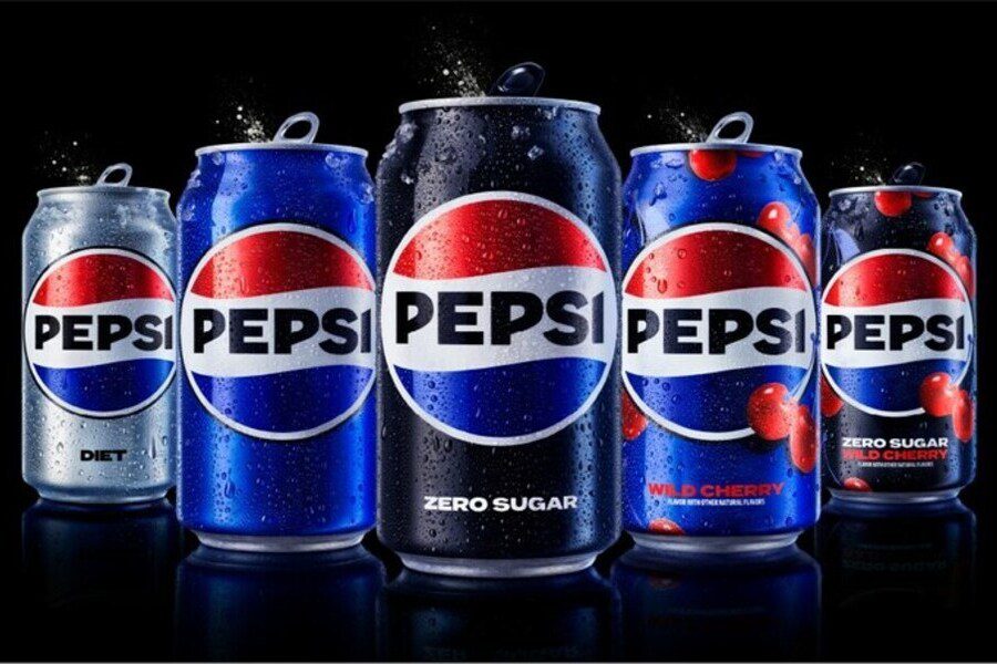
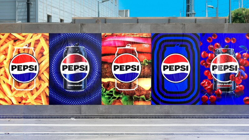
The new Pepsi logo 2023 is all set to reach the North American audience in Fall 2023. But the rest of the world has to wait until 2024 to see the refreshed logo in the Pepsi merchandise. The brand also released a few versions of the logo appearing on trucks, in outdoor ads, and on the signature Pepsi cans. This is a great way to introduce customers to the new Pepsi logo 2023 and give an overview of what to expect in terms of the marketing designs and packaging.
To understand why critics and consumers have been showering love on the new Pepsi logo 2023 and to better perceive the thought process that went into this redesign, let’s take a quick look at the Pepsi logo evolution.
Pepsi logo evolution – lessons in brand experiments
The old wordmark versions
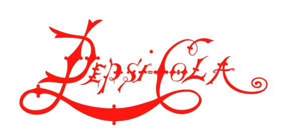
About 5 years after its launch as Brad’s Drink, the Pepsi Cola brand was born in 1898. The first Pepsi logo was very much different from the combination mark we see today. The 1898 Pepsi logo was an ornate wordmark. If the logo reminds you of the Coca-Cola logo, you’re not alone.
Well, not the most legible font. Yet the logo worked back then. But in just 5 years from there, the brand switched to a simpler font that looked cleaner and easier to read on the beverage packs. But it continued with the wordmark version which was pretty common those days.
Introduction of the signature color scheme
Today we associate the color red with Coca-Cola and the combination of “red and blue” with Pepsi. This signature color combination was introduced in the year 1962. The colors came from the colors of the US flag that was imprinted on the Pepsi bottle caps from the 1950s.
The 1962 Pepsi logo was also the first one where the “Cola” was dropped from the brand name.
Introduction of the Pepsi globe
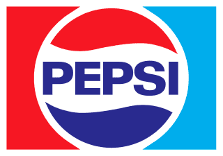
Branding does not happen overnight. It is a slow and steady process of building the brand one block at a time. One brand element at a time. When you think of Pepsi, the red-blue color scheme and the Pepsi globe are perhaps the two most memorable brand elements you recall. It was the 1973 logo that introduced the signature Pepsi globe in the design.
Moving the wordmark outside
One of the major changes that the Pepsi logo reflected was moving the wordmark outside of the Pepsi globe. The 1991 logo introduced this trend.
Though this was a major change in the design the brand still retained its identity by maintaining the color scheme and the globe, which by then became an identifier of the brand. In the years that followed, most of the logo design updates included repositioning the brand name and introduction of a skeuomorphic version (3D version of the logo).
The 2008 version of the Pepsi logo
In 2008 Pepsi had a major rebrand and this time around several things changed in the logo. For starters, the decades-old trend of 3D design was given up and Pepsi went for a flat design. This was the time when digital designs became critical components in marketing. And several brands found flat designs to be more convenient and versatile to fit both in print and digital designs.
Another major change was the switch to the all-caps sans-serif font. The shift was meant to focus on a more contemporary approach.
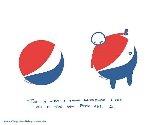
But the highlight of this logo update was the minor change to the Pepsi globe. This part of the design was not perceived as intended. The globe was rotated to accommodate a white central band meant to represent a smile. However, the internet was flooded with jokes surrounding this new Pepsi globe design.
The brand did not change much but it appears like rebranding plans were in progress in the background. And now the new Pepsi logo 2023 has been announced.
Pepsi new logo 2023 – an overview of the design
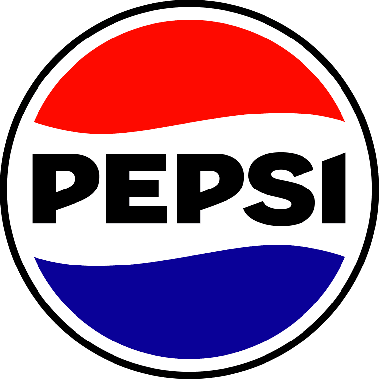
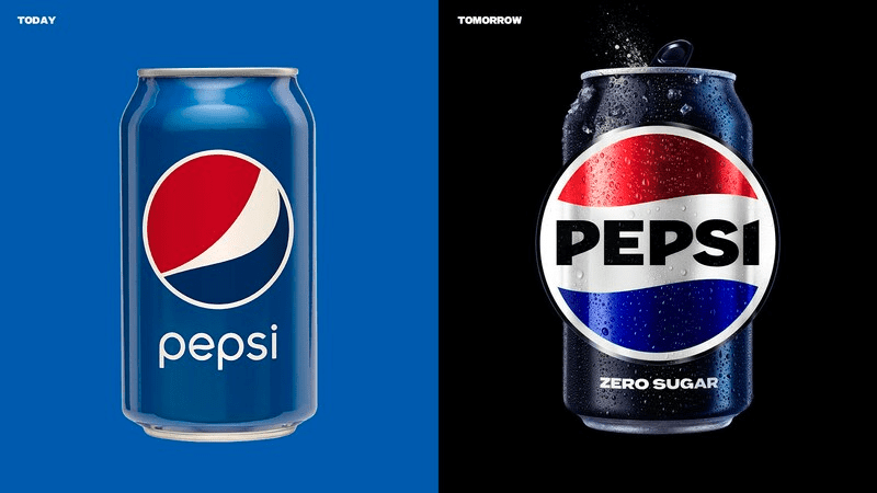
The new Pepsi logo 2023 is a drastic leap from the old one. The Pepsi old logo vs new comparison shows that the design has been updated in every aspect. But the logo looks a lot like a modern take on the 1973 version that introduced the globe with the centered brand name.
Let’s look at the standout aspects of the new Pepsi logo.
An upgraded globe with bold typography
The most noticeable change in the new Pepsi logo is that the brand name which has been displayed in one corner or below the globe for a few decades has again moved to the center. The logo prioritizes the brand name and puts it front and center in the design.
Another aspect that is a direct contrast with the previous logo is the use of uppercase fonts in the new logo. This looks like a bolder statement in comparison with the lowercase brand name in the previous version.
Additionally, the line width of the font is also thicker and more striking. And this is meant to be representative of the brand’s “unapologetic mindset”.
When talking about the rebranding, Mauro Porcini, chief design officer of PepsiCo told USA TODAY that the new design is meant to represent “great energy and confidence and boldness”. And with the updated colors and fonts we do agree that it does.
If you look at the Pepsi logo history, the globe has grown to be a distinguishable element. The brand’s decision of retaining this well-recognized trait is a wise one. Moreover, the “smile” detail which received some backlash online has been dropped for the cleaner classic version. With this, the brand is bringing back the symmetry in its logo which makes it even more aesthetically appealing.
The electrifying color scheme
Another noticeable element in the new Pepsi logo 2023 is the color scheme. The brand has updated its colors without changing them drastically. You’ll notice that the blue in the new logo is much more saturated and bolder than that in the old logo.
While the previous logo went with muted colors for a more modern and timeless approach, the new colors are full of energy.
Another little detail is the addition of the black border to the logo. In fact, there’s an increase in the use of black in this logo including the brand name which appeared in blue in the older versions of the Pepsi logo.
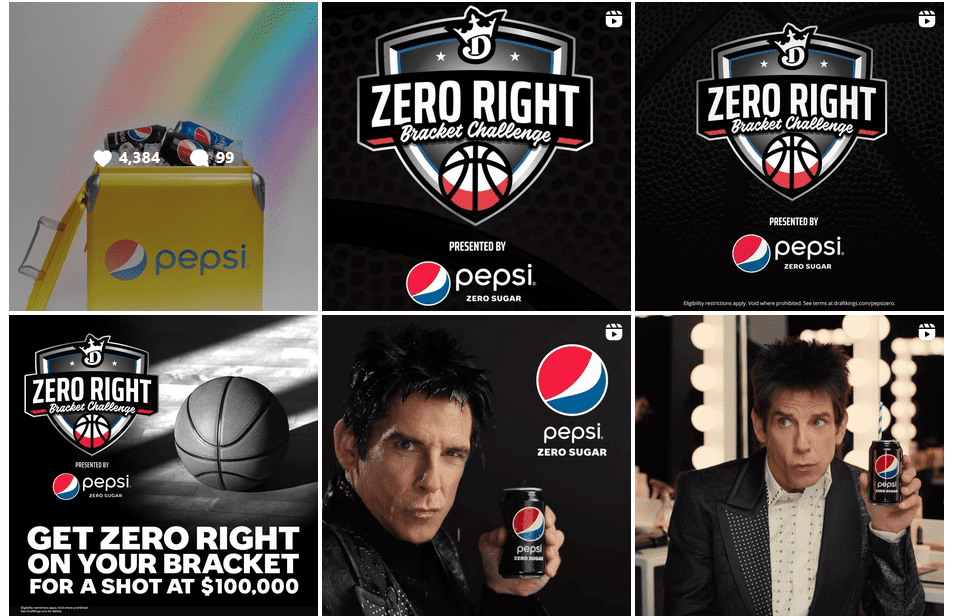
Pepsi has recently been donning a black aesthetic quite often with its steps to push Pepsi Zero Sugar. Consequently, the new logo is likely to go perfectly well with this new aesthetic.
Kimp Tip: When you make some big changes to your logo, there’s a chance of your existing customers not recognizing the new design or not liking it as much as the old one. To minimize the possibilities of these reactions, identify and retain the most crucial elements of your logo design. It could be the colors or the fonts or an emblem or symbol that people instantly associate with your brand.
Want to redesign your logo without losing your brand identity? Work with the Kimp team!
Proof of the potential of nostalgia in marketing
While the younger generation might find the new Pepsi logo 2023 to be a fresh new change from the previous one, the older generation that has been enjoying the cola for decades might experience a sense of nostalgia. That’s because the logo is a major tribute to the brand’s history.
As we discussed a while ago, the 2023 logo looks a lot like the 1973 Pepsi logo including the use of uppercase letters, bold typography, and the brand name appearing at the center. Considering that this was the first iconic globe logo and that it had a pretty good response from its customers, the new one has a good chance of working out.
In fact, the overall styling of the logo, the use of saturated colors, and other aspects show a marriage between the old and the new. A hint of vintage optimized for the future generation makes the new logo special. This redesign is also proof of the recent trend of using retro designs in branding and marketing.
On top of that, the benefit of using such nostalgic ideas and switching back to old successful formulas is that you open up the possibilities of bringing back lost customers. For brands like Pepsi where the customer-brand relationships survive for decades, such nostalgic rebrands can work wonders.
Kimp Tip: When you are struggling to finalize a theme or a visual style for your brand, consider your target audience. In the case of Pepsi, data shows that a majority of the consumers are aged 65+ and therefore, a style that resonates with them will definitely make a difference to the brand.
Market research – the secret tool behind the redesign
When a global brand comes up with a new logo you don’t often see unanimous positive responses. People either resist the change or make jokes and memes out of it. Opening to mixed reviews is a norm in rebranding. But in the case of the new Pepsi logo 2023, a majority of the reviews have been positive. Do you know why? It’s because of the one secret tool that Pepsi used this time – market research.
To come up with a rebranding strategy, Pepsi asked consumers to sketch the brand’s logo. Most versions drawn by customers had the brand name at the center.
When Mauro Porcini spoke to CNN about the new logo, he explained how the brand decided to embrace the insights from its customers. The brand prioritized customer opinions while finalizing the logo design. And the new Pepsi logo is a result of this market research. You can never go wrong when you listen to your customers. That’s one of the reasons behind the many positive reviews the new logo has earned.
How the Pepsi logo redefines the unspoken bond between Pepsi and music
Another idea that Pepsi is incorporating to help its new logo gain momentum is aligning the design and visuals with the brand’s connection with music.
Different brands have different communication languages and music has been one for Pepsi. From featuring celebrities in the world of music to efforts like the Pepsi Music Lab, there are many ways in which this bond between Pepsi and music was established.
The trailer for the Pepsi logo unveiling takes cues from this brand identity and features a pulsating logo and hip background music to capture the energy. The animations and transitions in the trailer are also in line with the theme. These little details put together help build excitement over the new logo.
The road ahead for Pepsi
It’s been hardly a month since the release of the new Pepsi logo. The brand has a long road ahead. For now, it’s only the online audience that has been exposed to the logo. Once the new packaging is ready and once the customer touch-points like Pepsi fountains and coolers feature the refreshed logo a wider outlook on the response to the logo will be available. But considering the strong foundation on which the new design has been built, there are fewer chances of the idea missing the mark. So, what do you think of the new Pepsi logo?
Are you planning a rebranding campaign for your brand? Need help redesigning your logo and creating graphics to promote the new design? One Kimp subscription covers it all.
Register now for a free 7-day trial.

