
Retro Designs – The Charm of Old School In New Age Marketing
Year after year, you see retro trends popping up everywhere. You see retro designs in the world of fashion, interior design, and without a doubt, marketing too! But why are we so attached to the old?

When there are so many new design trends and futuristic styles available, why do brands adopt retro designs in marketing? You see them in the form of pop-art ads, neon sign-styled logos, vintage neutrals in marketing graphics and so much more. Do you think it is worth trying this trend? How can you use retro graphics in marketing while also staying on-brand? We have all the answers right here.
Let’s Address Some Basic Questions First
What exactly are retro designs?
We often use this term in a broad sense. Retro designs are when you adopt aesthetics from the 50s or even 70s in your current-day designs. Some styles even date back to the 1800 and draw inspiration from the art aesthetics of those periods. Art Nouveau style is one such example. We’ll take a brief look at some popular vintage styles a little later in this blog.
Irrespective of the style you choose, to give your design a retro makeover, you need to make fine adjustments. This could be in the form of color palettes that look vintage or even illustration styles or fonts that replicate the old-school charm in modern designs.
But how do you know if a design is retro?
When you look at an image with a sepia filter applied, do you instantly recognize that it is meant to look old-fashioned? Or even look at all the “retro” or “vintage” themed filters in your photo editing apps. Adding a slightly grainy texture, minor distortions, and of course manipulating the colors are some ways in which designs are made to look like they are from the past.
Can you only use retro designs if you are targeting millennials and baby boomers?
That’s a very crucial question to ponder. Because you cannot use any random design trend without evaluating whether the trend will work with your target customers! It’s not enough if you like the design. You want the actual people who interact with your brand to like the design.
So, yes, do retro styles work with all demographics and people from different generations? Short answer: yes.
There is a common misconception that retro graphics are effective mainly for brands targeting baby boomers. But the truth is retro designs have different effects on different generations.
- For baby boomers, these are designs that were trending when they were young. Naturally, the style tends to make them feel nostalgic. And nostalgia has a huge value in marketing. When you evoke strong emotions in your customers you are engaging them productively. Nostalgia is one such emotion.
- For the millennials, these are designs that their parents must have often spoken about. Millennials are also likely to have been introduced to the visual trends from the 60s and 70s through old photographs from their parents. For them, these vintage styles feel like a way to connect with their previous generation. So, retro designs work with them as well.
- And finally, the GenZers. Most brands only adopt futuristic trends to appeal to them. While this is a good idea, retro designs help you stand out. Have you seen the awe with which GenZers eye old gadgets like a VCR? Getting a taste of the old can be pretty exciting and the GenZers are all in for all things exciting. The fact that you see a lot of TikTok trends re-introducing the Y2K fashion is proof enough!
In short, retro designs ring a bell with almost all types of audiences.
Vintage Styles That Designers Love to Explore
Retro design, as you can see, covers a broad spectrum of visual styles. But which among them are actually suitable to use in graphic design? Let’s find out. We’ll tell you about some of the most popular vintage styles you might see in marketing designs.
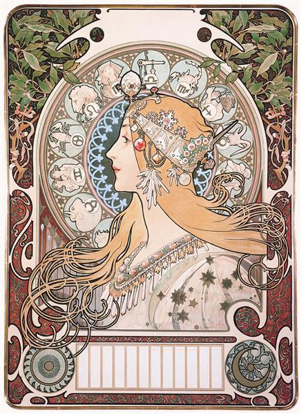
1. Art Nouveau
Art Nouveau was pretty popular in art, and architecture in the period between 1890 and 1910. Ornate arches, ethnic motifs, floral and leaf-shaped embellishments and a whole lot of other little details characterize the Art Nouveau style in design. If you are looking for something grand with a vintage vibe, then Art Nouveau might be your style.
2. Psychedelia
Psychedelia is a more recent style from the 1960s. As the name indicates, this one is all about strong cognitive stimulation with the use of bright contrasting colors and a surrealistic theme. If you want to transport your target audience into a world of fantasy through your marketing designs, then psychedelic styles might help. This is the style where intuitive repetition, optical illusions, and other heavy designs work.
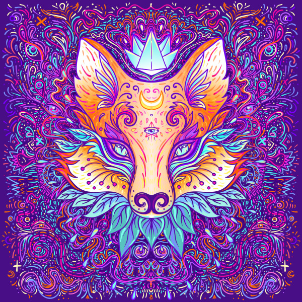
Remember that there are plenty of details and great depth in your designs. Sometimes this can be overwhelming too. So, use this style with caution. This might not be a suitable style for traditional or conservative brands or even brands that are trying to promote themselves in the luxury segment.
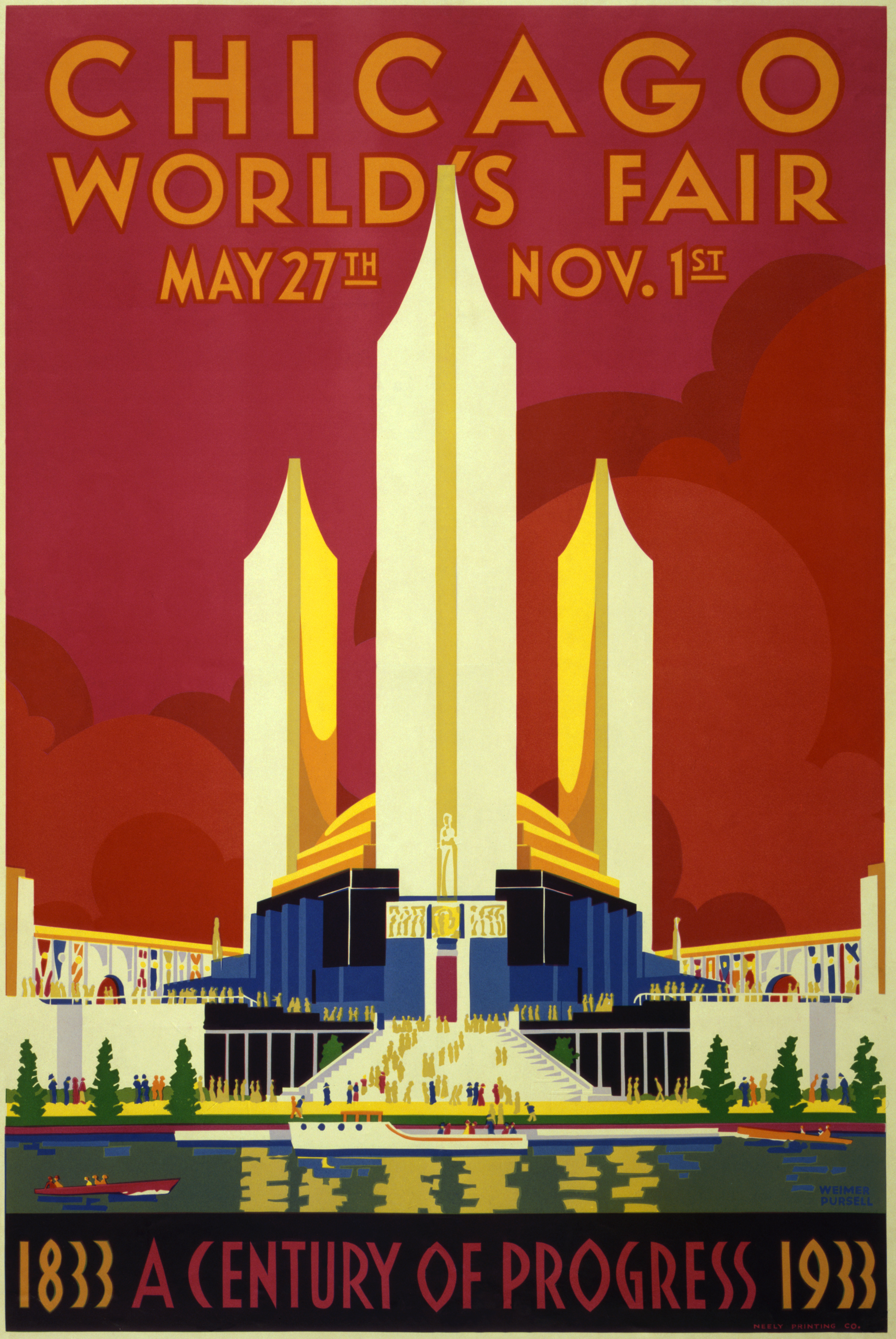
3. Art Deco
Art Deco style was popular in the pre-World War I era. It balances the decorative style of Art Nouveau but uses geometric shapes mostly. Art Nouveau, on the other hand, relies mostly on organic shapes. But yes, you might also see some modern versions of the Art Deco styles incorporating bold curves and colors. If you want to promote a modern brand in the luxury segment, then Art Deco might be a great choice.
There are more styles like pop art, pixelated designs, and others that capture the charm of marketing and designs from a few decades ago. The key is to identify the right vintage style that works for your brand and your products.
Using Retro Designs in Marketing – 7 Ideas to Inspire
Having gone over the basics of retro designs, now let’s get into the actual topic – using them in marketing. How to use them, where to use them, what are the big brands that already use them, and everything else you want to hear!
1. When bringing back old products
One of the most relevant places where you can use retro designs in marketing will be when you plan to bring back an old product. This could have been a trendsetter that put your brand on the marketing map. You can switch to vintage styles for promoting the comeback of the bestseller from the past.
Nintendo did this when it relaunched the iconic gaming console, NES Classic Edition back in 2016. Its introductory video had all the vintage vibes any old Nintendo fan would appreciate.
2. Go retro while rebranding
Burger King rebranded recently and its new logo looks quite similar to the classic logo from 1969.
Part of the recent rebranding was because of the brand’s idea to switch back to cleaner and simpler ingredients as they were in the past. So, the new logo perfectly captures this. And since flat designs are quite the trend now, this retro design works for Burger King.
With the retro logo come retro fonts and colors on the packaging design and a lot of retro illustration styles on its social media designs too.
Kimp Tip: When you rebrand, you should be sure that your brand identity design does not deviate entirely from what you had earlier. If that happens, customers will not recognize your brand. The key is to rebrand without losing your customers.
Need help creating all the designs for your rebranding campaign? Choose a Kimp subscription.
3. Vintage branding works for some brands
And when we talk about branding designs, the logo is perhaps the first thing that comes to mind. Vintage styles work well in logos. Retro logos have an air of sophistication about them.

Retro designs work in branding because there is a not-so-secret connection between retro and luxury. We see how brands like Gucci feature a lot of retro collections regularly.
Kimp Tip: If you are using retro designs to capture the concept of luxury for a modern brand, use simpler design elements and aim for a minimalistic look. Avoid psychedelic designs and go for styles like Art Deco or Art Nouveau.
Here is a packaging design by Kimp that captures a subtle blend of retro and modern.

These ideas work especially for brands that have a rich history but have evolved to suit the modern generations.
4. Use retro themes in event marketing
If you are looking for a theme for your upcoming event, retro can be a good option. Retro themes are suitable both for virtual and offline events. From the flyers and posters for marketing the event to print banners adorning the venue, everything can be given a retro makeover.

With one Kimp Graphics subscription, you can take care of all the print and digital designs for promoting your event. Sign up today.
5. Retro designs make you stand out on social media
On social media, you need strong aesthetics to make people stop scrolling and pay attention to your brand, to your posts. With most brands using modern and futuristic designs, when you use retro designs, your posts are sure to stand out. If you have themed posts on your page, you can use retro for one of your themes. For example, if you do “Throwback Thursdays” retro designs feel very relevant!
Even Instagram uses retro designs like sunburst patterns and bright colors on its official page.
6. Vintage works well in comic-style illustrations
If you want to create conversational posts or if you need comic-styled designs for a particular campaign, then this is one place where you can use retro designs.

Capturing the essence of retro through illustrations is pretty simple and quite effective too. Designs like the one you see above are sure to take users down memory lane. As you see in the above case, you can use this style of illustration when you wish to stand out in a crowded market. And when the product in focus makes a pretty cliched hero image in the design. In such cases, a retro touch sets your brand apart.
7. Vintage vibes in traditional marketing tools
Retro designs work well both in digital and print. But to enjoy the magic of retro, print designs are your best friends. If your brand uses traditional marketing tools like postcards for direct mail marketing, then you have a great opportunity to explore retro styles. Here is a postcard design by Kimp that uses a simple retro pattern to make a great first impression.

Summing Up Retro Designs for You
As you can see from the above examples, you can use retro designs almost everywhere from emails to digital ads, and social media to print ads. The key is to identify the right occasion to use these styles. Here are a few places where this style feels relevant:
- When you look back at an old product
- While creating a throwback post
- When you conduct a retro-themed event
- While paying tribute to a historic personality
- When you want to capture your brand’s heritage
And how can you capture a retro mood?
- Using comic-styled illustrations
- Playing with textures and patterns
- Using bright and bold colors or muted neutrals and earthy colors
- Incorporating fancy fonts
- Using decorative vintage accents for bordering and framing elements
- Using vintage elements like a movie reel or even illustrations of gadgets from the past
Your creativity is your limit here. You can use retro graphic designs in so many ways and still keep your marketing designs fully relevant to your brand.
Create Retro Designs With Kimp
With Kimp subscriptions, you get unlimited designs and unlimited revisions. So, if you have a retro theme in mind, be it for branding or regular promotions, the Kimp team will help you execute them. And if you do not like the design you can tweak them to your liking no matter how many iterations it takes. And since you get unlimited designs, you can always add your other marketing designs besides the retro-styled graphics while staying on-brand every time.
Want to try Kimp subscriptions? Sign up now for your free trial.