How To Create Brand Guidelines That Get You The Right Designs
Your brand is the biggest asset that you have. And as your business expands and scales, your customers and potential customers will increasingly interact with it. So how do youc consistently present your brand in ways that reinforce its value? You start with a set of brand guidelines.

In order to get the graphic designs you need, you need to be able to share the look and feel of your brand with every designer you work with. It takes quite a bit of research, trial, and error to create brand guidelines that work every time. But the payoff is worth it.
So what are brand guidelines?
Brand guidelines can also be known as a brand guide, style guide, brand identity book, or brand toolkit. It’s a document that outlines your brand identity and also lays out the standards of your brand. Some brands opt to focus very much on graphic design in their brand books. And others will also include messaging guidelines. For a more comprehensive approach, some brands will include an overview of their company too.
When you create brand guidelines be sure to think about which components are most important for you to include. Some of the things that could be part of a brand book are:
- Your logo in all its variations.
- Your color palette, and a complementary palette if you have one.
- Typography guidelines and preferences.
- Your imagery and examples of appropriate and inappropriate images for your brand.
- The tone of voice for the brand.
Why it’s important to create brand guidelines
Consistent designs
In order for a brand to be a brand it needs to have a consistent look, feel or tone. And in each and every design created for a brand this look, feel or tone needs to be embodied. This is the only way to create a particular experience of your brand for your customers. And to come across as polished and professional in your attention to detail.
Regardless of the size of the design or the particular placement, with brand guidelines, there are always ways to achieve this. Without them run the risk of confusing your customers and losing their attention. Just imagine if you have wildly different color schemes and imagery in each of your creatives. The result will be that your customers don’t recognize your brand when they see it. And they will be less likely to form relationships with you as well.
Guidelines to maintain your standards
Of course, you may know everything that there is to be known about your brand. But are you the one who is going to be designing every single one of your creatives? And how about new team members who join your company and work on your different campaigns. Do they have a way to know the ins and outs of how your brand should be represented?
When you create brand guidelines you create a set of rules about how the visual elements of your brand need to be used. And how your customer experience needs to be. This in turn means that no matter which of your team members is requesting designs, or which designer is working on them, your outputs will always represent your brand. And that will contribute towards a unified customer experience.
Increasing brand awareness
Are there certain brands that you are loyal to? Ones that you think of first when you need to make a purchase? Regardless of what they sell, chances are you can imagine different aspects of their branding easily. From their packaging to the colors they use to their logo and maybe even a tagline. All of these things add up to what’s known as brand awareness. It’s not just knowing your name. It’s about everything that represents it.
When you create brand guidelines and maintain consistency in your designs, your customers will start to see the correlation between how you create value, and how you present your brand. With enough repetition and reinforcement as awareness of your brand increases, it can also lead to awareness of your competitors decreasing. While this is the long game, you definitely can’t be sped up by jumping all over the place with your branding. When you create brand guidelines, stick to them as consistently as possible. And if you make changes to it, make those changes across the board as well.
Generating more brand value
As we’ve briefly mentioned, consistent branding makes your brand come across as polished and professional. Not to mention reliable. Your commitment to your branding will help your customers be drawn to you and feel inclined to remember and engage with you. And when they eventually purchase and draw value from your product, service, or customer service, they’ll also begin to associate value with the brand itself. And in order to achieve all this, you’ve got to create brand guidelines.
What to include when you create brand guidelines
Before you get to actually creating your guidelines, you should know about the components that go into it. Remember though, not all brand guidelines are the same. And yours can change according to what your requirements are. That said, they do generally have the same structure. There are three main areas that need to be covered in your brand book.
Section 01: About your brand
- This will usually have the mission, vision, and values of the brand.
- It will also include a description of who your target audience is.
- Depending on your goals this section can be quite brief or very lengthy. People will often skim through or even skip this section. Even though it could provide important details and offer valuable context. So if you need your team and your designers to pay particular attention to your “about section”, make sure you keep it interesting!
Section 02: Your visual guidelines
- Logo or logos – specify the color, different types of placement, size and proportions, and variations. You should also have some examples of logo misuse so that it’s clear how your logo should be used.
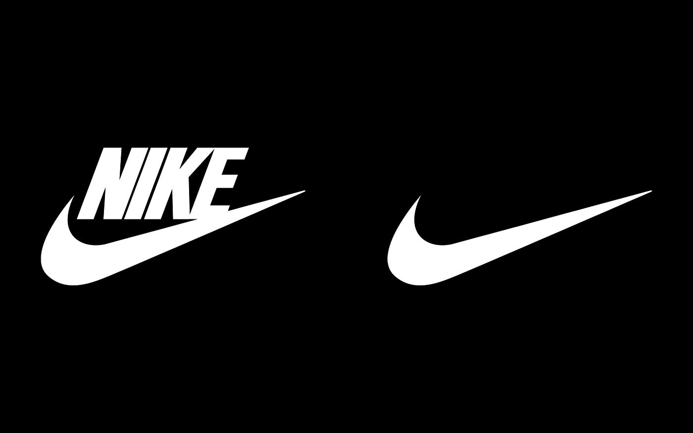
- Brandmark (this refers to the visual part of your logo – e.g. Nike’s swoosh as seen above) – specify the color, and guidelines for how it should be used.
- Tagline – specify any details around typography as well as guidelines about when it and where it should be used.
- Colors – you want to provide as much detail as possible here. So go beyond your primary color palette, and include details of secondary colors as well, along with their codes. You should also note the proportions in which the colors should be used.
- Typography – include the details of the particular fonts and weights that you’d like used in your designs. Be sure to specify if particular fonts, sizes, or weights should be used in certain designs. And the same for headlines, subheadings, and body text.
- Imagery – be sure to give guidelines for the types of images that should be used and guidelines for photography as well if you’ll be organizing photoshoots. Provide as many examples as you can to make sure that the different types of images and use cases are clear.
- Other preferences – if you like certain icons, backgrounds, textures, elements, or patterns, provide examples of them and outline how they should be used.
Section 03 – Your messaging guidelines (optional)
- Tone of voice – what are the types of emotions that you’re trying to convey as a brand. Describe this and also provide examples.
- Formatting – do you follow certain conventions when it comes to grammar or formatting? Specify those in this section. This can be anything from abbreviations, to numbers (1 vs one), sentence case or capitalization, acronyms and so forth.
- Style – specify the style that needs to be used in your messaging. This could mean short and simple sentences or intricate and detailed ones. And it can also mean details of whether messaging should be technical and formal or casual.
- Channel specifications – provide details as to the structure and style to follow for each of your marketing channels. This could include email, blogs, social media, and ads for example.
- Languages – if you’re a global brand and have marketing creatives in different languages, be sure to include these details. You may also want to create a variation on your guidelines for each language.
Tips to help you create your brand guidelines
Alright, now look at the ways in which you can create your guidelines, so that you can get exactly the designs that you need. All of this will help you create that all-important and consistent customer experience. Make sure to look at the examples included as well, so that you can see why they work so well.
How your logo should look
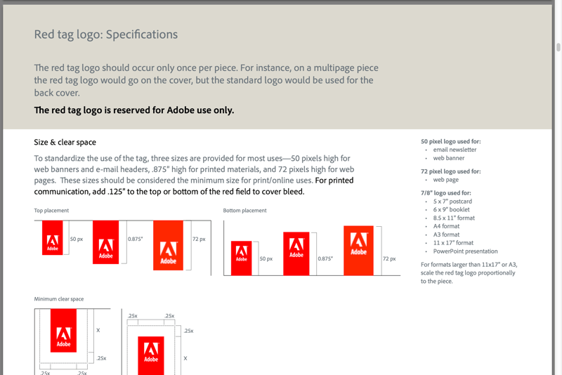
It takes hard work and can take many iterations to come up with a great logo. After spending all that time and energy you need to make sure that it’s used in ways that make it look great. In the section of your brand guidelines that focuses on your logo be sure to display all of the versions of your logo that have been approved. And include details of how it should or shouldn’t be used. This means including guidelines for placements and alterations (if any are permitted). In the example below, Adobe outlines this very clearly.
Your color palettes
Your brand’s color palettes (both your primary and secondary palettes) play a significant role in helping your brand achieve consistency. How they are used will define how your audience views and values your brand.
Most brands will choose a maximum of four colors as part of their primary palette. Generally, these colors will follow from the colors of the logo.
In the example above Love to Ride (an online cycling community) clearly displays the primary and secondary colors that they use. This is a brand that is very colorful, and doesn’t incorporate much text. So their brand book represents the same.
Heineken is another brand that specifies their color palette with meticulous attention to detail. They have chosen a color which is light for backgrounds and a color which is darker for their text. They then have a neutral hue as well and one more color that will give all their design components a striking appearance that stands out.
When it comes to outlining the details of your brand colors, be sure to specify how colors should be used in your text and various design elements. You should also be very specific about the colors to be used for things like patterns and backgrounds. And include these details:
- The commonly used names of each of your colors.
- Your color values (CMYK or RGB, for print and digital respectively, and HEX or PANTONE names and numbers).
Your typography preferences
Along the same lines as the details you provide about your colors, you need to provide precise guidelines for your typography as well. Specify the fonts to be used for your print design and for your digital designs. And within each of these large categories, specify the fonts to be used for particular types of print or digital designs.
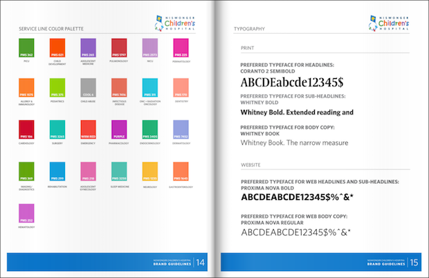
When you create a brand book your typography section also needs to include details about what’s acceptable or not for your brand. You should also talk about any additional rules to be followed for things like styling, use of color and size. To keep things simple, and make a brand memorable, most will stick to one or maybe two primary typefaces. They will then also have a complementary typeface and a selection of substitute typefaces. Check out the example below form I Love NY. It provides a very clear outline on the typefaces to be used for its brand.
Your brand’s tone of voice
Your brand’s tone of voice also needs to stay consistent across all of your marketing channels. Even if it varies slightly across different formats and placements, there should be a clear consistency. Your brand’s tone of voice needs to be in line with, and reinforce, your brand persona. And even more than that it needs to be aligned with your mission, vision and the values that you embody. It should also connect with your target audience.
In this section of your brand guidelines, outline the words that you want your brand to be associated with vs the words you do not. Think of adjectives for this exercise. Having these words in mind as points of reference, you’ll then be able to decide on the messaging that represents your brand persona and speaks to your target audience. In the brand book below from Macaroni Grill, they’ve focused on the word ‘crave’. They use it as an acronym to come up with keywords for the brand that all tie back to the idea of craving food. On the particular page, we see below the “A” from “crave” aligns with the page heading “Amore Famiglia”.
Your brand’s imagery
Earlier in this blog we spoke about sharing guidelines for imagery and examples as well. Here we’ll elaborate a bit more. In the section of your brand guidelines about imagery, you’ll want to mention whether your brand uses photography, illustrations or prefers other styles of graphics. And you should also mention how and when they are to be used.
Details on alterations are important as well. Specify how much images can be edited and if there are certain filters which should be applied. You’ll also want to include information like whether your images need to maintain a certain orientation or composition.
And to give your designers, and team, the best chance at representing your brand, share as much inspo as you can from brands you aspire to be like. To really take a deep dive into this area, you can try a moodboard as well to share images that evoke the moods you want your brand to.
How can you enforce all this effectively?
After you have developed all these rules, you need to make sure that they are followed. Make your brand guidelines easily accessible to every one of your team members and your designers too. And communicate changes to it in a timely and clear way. A well-thought-out set of brand guidelines will help you create consistency and cohesion for your brand. And while it can seem like it places a lot of constraints on the creative process, it’s these constraints that will inspire innovation.
Need a hand with your graphic designs or video designs? Share your preferences, and let Kimp take care of the rest.


