Web Design Trends 2024: Your Guide To Get Ready for the New Year
Did you know that the first-ever website debuted more than 31 years ago? And over these three decades, web design has evolved drastically. First, there was only text. Later icons and images were added. Today we live in times when websites welcome visitors with interactive animations, scroll-based transitions and so much more.
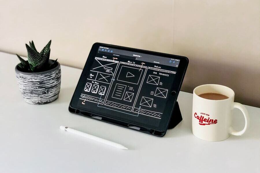
This evolution has only been possible because every year there has been a rush of new web design trends. Without them, we’d probably still be in the age of text-only websites. Simplifying user efforts and creating an immersive and memorable experience have been some of the main drivers of these web design trends. Technological changes and cultural cues are the other driving factors.
Considering the present market landscape, cultural dynamics, and ongoing design experiments by brands, what awaits us in terms of web design trends in 2024? Let’s explore!
- 8 Anticipated Web Design Trends 2024
- 1. Y2K Aesthetics – When Nostalgia Meets Modern Design
- 2. The Rise of Oversized Text
- 3. Gradients – Tapping Into Seamless Color Blends
- 4. Bento Grids For an Organized Harmony
- 5. Microinteractions – Integrate Delightful Details
- 6. Tap Into The Flexibility of Fluid Layouts
- 7. Parallax Scrolling to Create Unforgettable Experiences
- 8. AI-Powered Transformations
- Elevate Your Web Design With KIMP
8 Anticipated Web Design Trends 2024
1. Y2K Aesthetics – When Nostalgia Meets Modern Design
Nostalgia has been making waves across diverse domains like fashion and graphic design over the past few years. In particular, there have been a lot of Y2K-inspired trends. What’s so special about the Y2K era? It marked a time when people were accepting the uncertainty that came with a new millennium. The responses were different and therefore the era saw some sensational trends. Trends like never before. Trends that made history!
The current generation seems to have a particular fondness for this era. And we think that this fondness might be the reason why Y2K aesthetics is among the top web design trends 2024.
In terms of aesthetics, 20 years is a long time and therefore there’s a hint of nostalgia that comes with this trend. At the same time, the rebellious designs back then carry with them a subtle modernity. So, if you can create websites that marry old and new, then you manage to align with this trend.
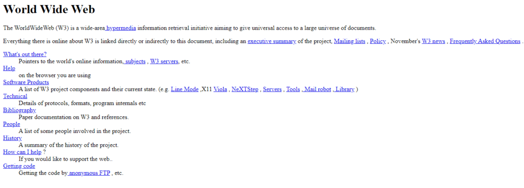
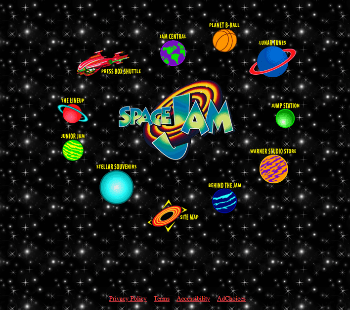
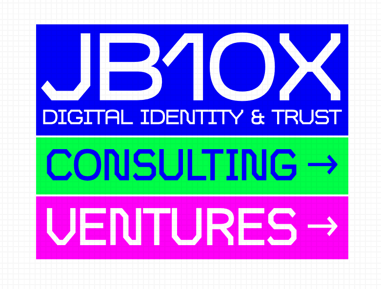
To understand this better, we’ll give you an example. The first image below is the website of the popular live-action movie Space Jam from 1996 – the Y2K era. The second image is the current website of JB10X, a RegTech consultancy. Can you see how the JB10X website has beautifully rendered the Y2K style?
KIMP Tips:
In short, to achieve Y2K aesthetics here are a few things you can do:
- Choose a bold and vivid color palette.
- Add glitch effects and pixelated elements.
- Experiment with playful typography.
2. The Rise of Oversized Text
Why do we think that big text might be big among the web design trends 2024? Because oversized text grabs attention immediately. Which is kind of a big deal consdiering the current state of the crowded internet realm.
Moreover, there are strong signals pointing to the possible fading of the line between minimalism and maximalism in the coming years. Consequently, bold text on simple interfaces might work well too!
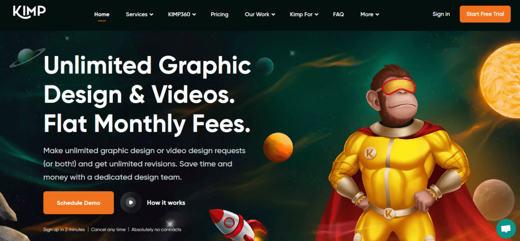
Take a look at the big bold text appearing on the KIMP home page in the screenshot below. This ensures that even a first time visitor will instantly understand what KIMP is about. That’s the imapct of oversized text in web design.
Oversized fonts work particularly well in hero text. Besides, you can also use them to create catchy headings and subheadings within the page. In short, oversized fonts can help define your website’s hierarchy even when there is a lot of information on the page.
KIMP Tips:
When you use oversized fonts in web design, here are a few things to remember:
- Do not overuse big fonts – use them only in key areas. Otherwise, you might overwhelm the users.
- Choose an aesthetically pleasing font that aligns with your brand’s signature visual theme.
- Compare the appearance of your website’s oversized text section on different screens to avoid disproportionate aesthetics.
3. Gradients – Tapping Into Seamless Color Blends
Gradients have been in trend in graphic design and web design in particular, for a long time now. Because they provide a seamless way to blend colors and boost the aesthetics of a website. So, this is one of the most popularly anticipated web design trends 2024.
The best part about using gradients is that by playing with the colors and the intensity of blends you can easily create an understated design or a bold one as required.
KIMP Tips:
Let’s now look at a few tips to make gradients work in your website design:
- Even with gradients, it’s pivotal to pay attention to color harmonies for a pleasant blend.
- When you have gradient backgrounds, use bold solid fonts in place of fonts with intricate strokes for maximum impact and visibility.
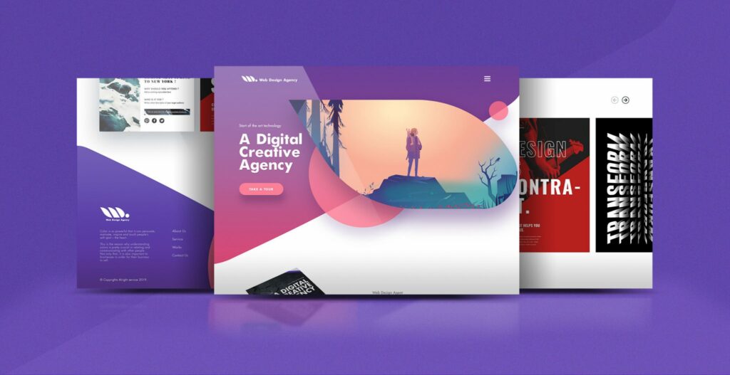
- To make elements like images and text stand out, choose contrasting colors (white and black work in several cases). And add shape overlays to separate elements and result in a more immersive design. Like the one below!
4. Bento Grids For an Organized Harmony
If you are familiar with Japanese Bento boxes, you might instantly understand what Bento grids are. These are website layouts where different-sized boxes segregate information and bring order to the aesthetics of the page.
The kind of harmony that this layout brings is one of the reasons why we think this is one of the web design trends 2024 to look forward to.
Similar to the modular compartments in Bento boxes, Bento grids in web design let you customize the sizes of the boxes so as to organize elements in the most meaningful fashion.
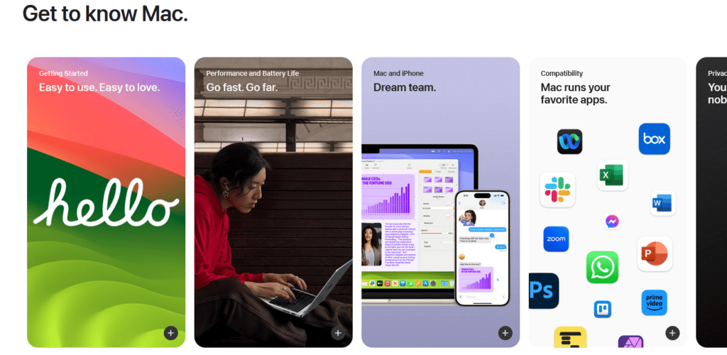
Apple’s website is one of the well-known examples of Bento grid layouts.
KIMP Tips:
While Bento grids can create structure and order, sometimes, they mess with the hierarchy. Because with several boxes that appear similar, users do not know which information to look at first. So, use equal-sized Bento boxes only in places where all elements have the same priority, as in the case of the “Get to know Mac” section on the Apple website.
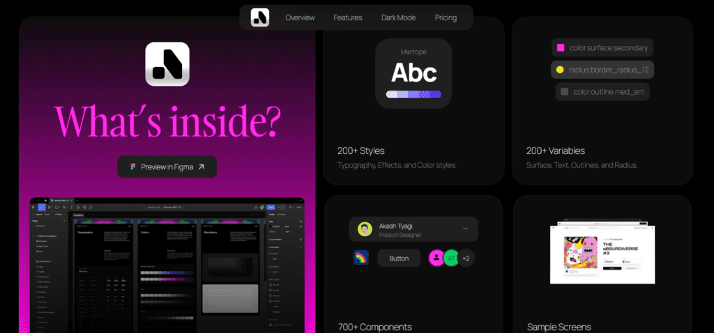
An effective way to add contrast is with colors. The below website does that well.
5. Microinteractions – Integrate Delightful Details
Microinteractions are not a new concept in web design however, we see more and more brands incorporate them recently. Hence this might be one of the most interesting web design trends 2024 to explore.
Microinteractions are all about subtle responses to user’s gestures and other interactions with the website. They work well because they make the interaction feel mutual. Moreover, they boost engagement and retain users longer, whn executed well.
Take a look at the pointer transition in the below example. Simple yet intuitive. Subtle interactions like these are enough to take users by surprise and convince them to stay and explore a little longer.
Sometimes, microinteractions also help improve the usability of the website and ensure that the user’s attention is directed in the intended direction.
KIMP Tips:
Planning to use microinteractions in your web design? Then here are a few things to remember:
- Pick meaningful feedback rather than adding too many transitions and animations.
- Stay away from flashy animations that can cause a visual strain or even confuse the users.
- Choose transitions that naturally align with the visual theme of the website.
- Test for the effectiveness of the chosen response across various screens to ensure consistency and prevent lags.
6. Tap Into The Flexibility of Fluid Layouts
You come across a website when browsing on your smartphone. You decide to access more information on your desktop computer and expect to pick up from where you left off. But then when you visit the desktop version of the website, it looks totally different. Would you be happy with the experience? Of course not! That tells enough about the need for fluid layouts.
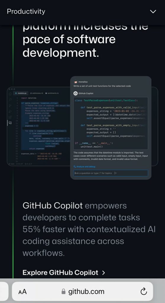
Given that more than half of website traffic (56.2%) comes from mobile devices, optimizing for mobile is a mandatory requirement in web design. Brands used to choose fixed layouts where the elements are displayed compressed or with separate mobile versions of their websites. However, these do not deliver consistency and are not user-friendly. That’s why fluid layouts in web design are becoming more and more popular. Hence this is likely to be one of the most popular web design trends 2024.
With fluid layouts your website displays aesthetically and delivers the intended information effectively across various screen sizes and resolutions.
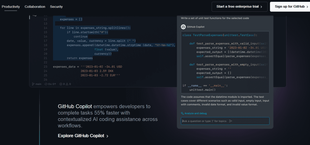
Take a look at the desktop version and mobile version of the GitHub version in the below images. As can be seen, the elements dynamically adapt to different screen sizes for a seamless experience.
KIMP Tips:
Use easily scalable images on your website for a seamless interface. This way your visuals are crisp and impactful on all screens.
Need help designing mobile-optimized websites for your brand? Get KIMP!
7. Parallax Scrolling to Create Unforgettable Experiences
Parallax scrolling adds layers and depth to web design by separating the foreground and background transitions. The varying speeds of transitions in these result in an engaging and unique experience.
On the Webflow website, the below page takes users on a journey through the history of the web. The page users parallax scrolling for immersive storytelling.
This is one of the most creative among the anticipated web design trends 2024. Especially for websites that prioritize storytelling, as seen in the above example.
KIMP Tips:
Let’s now talk about some tips to keep in mind when including parallax scrolling your website design:
- While parallax scrolling is an interesting idea, it might not be essential in all contexts. Use it only when you think it would enhance your website’s interface and the narrative.
- Pick subtle animations that do not startle the users and ensure that users have full control over the scrolling pace.
- Complex parallax scrolling throughout your website can overwhelm the users. So, use parallax scrolling on specific pages where you need to introduce an element of intrigue, like for product reveals or even to weave a connection between product features.
8. AI-Powered Transformations
One of the most likely web design trends 2024 is the widespread use of AI-powered transformations.
AI helps enhance several aspects of web design – from design enhancement to content creation and layout optimization. On the whole, AI can help improve the efficiency of the website and personalize user experience thus boosting conversions. That’s why we think that this is one deserves a special mention in our list of web design trends 2024.
One of the most straightforward applications is the integration of AI-powered chatbots. Consdiering that round-the-clock customer service is becoming pivotal in web experiences, AI chatbots with their natural language processing and human-sounding responses might become a widespread trend.
The second is to generate specific assets or the whole design for websites. In fact, data shows that about 58% of web designers rely on AI tools for generating imagery and other media for websites and about 50% of them create entire web page designs using AI.
The third most popular application to explore will be the use of AI to optimize the designs by continuously auditing user experience and tracking performance so as to identify and address any gaps in web design instantly.
Finally, there are AI-powered website builders. These simplify website building for beginners and help them design their websites in minutes.
Elevate Your Web Design With KIMP
To sum up, there are several new ideas to explore when it comes to web design trends 2024. But the real question is will all of them benefit your brand? Because not all of them might suit your brand’s unique identity. Some of them might clash with your current brand image. But yes, they might benefit your brand if you are planning a rebrand.
So, it is crucial to understand the trend and its relevance to your brand before giving your website a makeover. It’s worth noting that frequently changing the aesthetics of your website disrupts the consistency of user experience. Therefore, it’s important to strike the right balance. This ensures that your website not only stays visually appealing but also aligns seamlessly with your brand narrative.
While navigating these trends, collaborating with professional web designers makes a big difference. Because professional designers are always on top of industry trends and can therefore interpret these trends and tailor them to suit your brand cohesively.
What if you could take care of all your web design requirements and marketing and branding design requirements in the same place, at a flat monthly fee? Sounds convenient right? That’s what a KIMP subscription gets you! So sign up for a free 7-day trial now!

