Design Principles: How Contrast In Design Makes An Impact
You know we throw the terms “Good design”, “Bad design”, or just even “design” very lightly. But when we truly dig into it, we realize that there is a lot that goes into creating these designs. The importance of design is only growing as most of our social and professional interactions are happening on social media and other virtual platforms.

From news consumption to entertainment, personal work to professional research, we consume content increasingly for our daily lives. And design makes consuming content easier than ever. In the crowded content space, design helps consumers and creators in absorbing and dissipating knowledge.
One of the design principles truly pivotal to this knowledge exchange is the contrast in design. The contrast in design is the technique of varying the primary characteristics of the design elements such as color, text, images, and layout to highlight the dissimilarity between them.
You have seen this in many designs already. Have you ever noticed how on social media ads, one line of text is bigger than the other? This is how contrast in design helps designers to show which line of text is more important than the other.
There are many positives to having contrast in design for your marketing and advertising designs, in particular. In this blog by Kimp, we will explore this very important design principle for you in detail.
Let’s get started.
Why do we need Contrast in design?
For marketers and brands, the motivation to learn about the principle of design can be sparse. This is because more often than not, the articles and blogs fail to connect the principle with the impact on the design’s effectiveness.
From our previous blogs on designs and good design vs bad design, we know that design has a purpose in every marketing campaign. The purpose can be to engage the audience, entertain the audience, raise awareness, or serve as a tool for all these in the bigger picture.
What every brand manager and marketer needs to know about using contrast in designs is that it helps you achieve all of your marketing goals.
Yes, your design is much more effective with contrast doing the job for you.
This is all very correct and very vague again, isn’t it? So let’s break it down point by point and analyze the impact of contrast in design.
1. Aesthetic pleasure
We are sure that all of us here know and acknowledge that design is a valuable medium of communication from a brand to its target audience. But there is one small catch. The average attention span is on a steady decline for the last few decades and currently stands at a measly 8 seconds. So you need a medium that can intrigue and manage to hold your customers’ attention for a longer time. And that is where design helps you.
Specifically, contrasting elements in a design give consumers a lot to explore and understand within a design. A design with contrasting shapes and colors aesthetically arranged can pull in a larger audience than a similar arrangement without contrast.
2. Visual Hierarchy
Building off the attention span statistic again, let us assume that your design is easy to consume and customers need less than 10 seconds to view it. But how do you know that customers’ takeaway from that piece of communication was what you intended them to?
Did they notice the special announcement? Was the CTA able to catch their eye? You will never have to worry about these if you can create a visual hierarchy using contrast in your design.
The Gestalt principles of design tell us that each design has a figure and ground setting. The subject is usually the figure and the other elements around become the group. How do you differentiate it? Using contrast in design, of course.
Yes, our human brain is wired to spot contrasts and attach meaning to them. We will always scan from bigger to smaller, and that is what we call visual hierarchy. By varying the typeface, color, shape, and size of your text you can control what the customer sees first and last.
3. Symbolism play
We spoke of how giving different sizes to a similar element can aid in the visual hierarchy, aka the visual flow in a design for a customer. But there is another hidden advantage to it. When you have certain elements in a bigger size than other elements, you are symbolically telling customers what is more important than the other.
You can use this method to bring out other instances of symbolism too. For example, if you employ sustainability in a particular function in your business, you can highlight that detail alone with the color green. This contrast with the other elements in the design will tell customers that there is a hidden and important meaning in this message.
4. Improve user experience
Beyond creating an engaging and aesthetically pleasing design that is easy to read, using contrast in design makes the customers’ role very easy. Consider this for a minute. When you go to the supermarket, does it not help you that each thing has a specific color, shape, and size? This way your brain knows what to look for and makes the process quick and easy. How would it be if apples and oranges looked the same? You will spend an inordinate amount of time looking for a simple object and become frustrated in the process.
Similarly, presenting different pieces of information in different styles and forms makes it easier for the brain to process it. Customers know how to look for a headline and the bottom line because they have such contrasts in them.
Setting the background and the focus element in contrasting settings also makes a design accessible for many differently abled folks.
Overall, you need contrast in your web design, social media design, poster designs, app design, and so on for a pleasant user experience.
Contrast in Design and Similarity: What’s the connection?
Whenever you look up contrast in design, you will notice that people often speak of similarity as well. And this can confuse because, at the outset, these two are extremely opposing characteristics. So are they related in this context? If so, how?
First off, let us understand what similarity in design accomplishes. Like contrast in design separates one element from the other, using similar design styles for a group of elements makes the customer feel they all have a singular role.
So if you want to attribute a group of text to a similar notion, you will have to use the same font, color, and styling.
Moving on, let us address the question: Why is similarity important when you are employing contrast in your design?
This is for a simple reason for your message to be coherent to the customer, some elements will have to carry similar design styles. If everything is contrasting and popping out, there will be no central element for the customer to focus on.
Bringing our figure and background analogy again, while contrast in design allows you to separate the figure from the background, using similarity in design helps you group objects into the background. Picking things with a common theme and grouping them can make it easy to comprehend the message for consumers.
5 Types of contrast in design
We have been detailing the impact of utilizing contrast in design for quite some time now in this blog. Now that we know that in detail, let us move on to understanding how you can actually use it in your designs.
Given how important contrast in design is, it helps that there are multiple ways one can choose to employ it in their marketing and advertising designs. You can choose to adopt just one type or go for a combination of more than one based on what the design intent is.
To make your discussions with your design team easier, the Kimp team brings you a list of types of contrast in design and how they can help you.
So with no further ado, let’s jump right in.
1. Contrast in Color

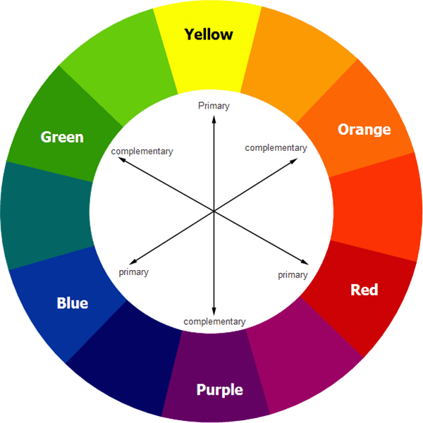
In graphic design and marketing, color is very important. The theories of color psychology detail how consumers associate different meanings to each color and that helps them understand a brand’s message better. But beyond this too, color has a specific role in creating contrast in design.
From the multitude of color options a designer has at their disposal, they can pick several combinations that will bring division, contrast, and visual hierarchy to the design.
There are many ways to do this :
- Varying the color of the background of certain sections to show that they belong to different categories
- Using distinctly different colors for the background and foreground to make the message pop
- Use contrasting colors in line with color psychology to signify the distinct intents of two pieces of information.
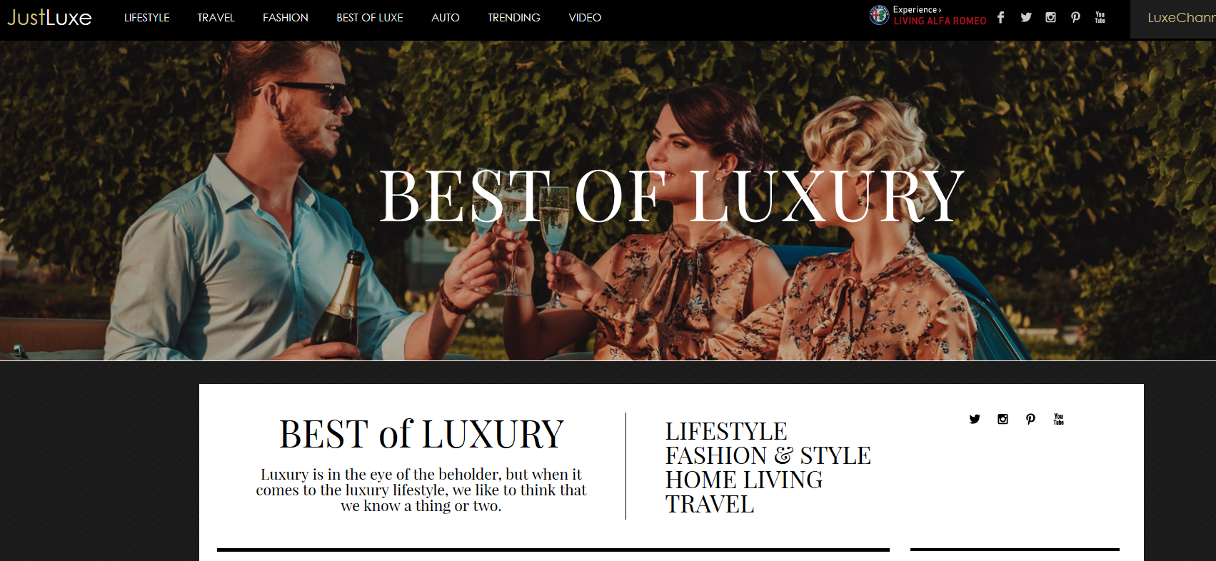
In the first example below, we see how just juxtaposing a white color foreground on the darker background made the design even more effective. Imagine just the white foreground text in comparison to understand the complete impact.

In this example, the impact of creating contrast in design via color is evident because it gives a break in the dark color design, improving the readability of the design. And your eyes instantly go to the white color text, improving sales.
Kimp Tip: When you are employing contrast in design via color, it is important to pick the right color combinations. Too contrasting can be unpleasant to view, while too subtle may lose the purpose. You must also optimize for different screens, mediums, and dark modes if need be.
Given how complicated this can be, we suggest working with the Kimp Graphics or Kimp Video team to pick the best color contrast design for you.
2. Contrast in Size

After color, if there is one characteristic that stands out in any design, it is size. Our brain is very visual, and it can interpret changes in sizes and shapes before it can even read text. Children too can understand big/small in the developmental years itself. So, employing size to bring out the contrast in design is a great technique.
The best part of this technique is that it is quite easy to execute and comprehend. In a design, some elements have a higher importance in the overall scheme of things while some do not. But how do you communicate that to customers? With the variation and contrast in size, of course.
Now, this does not mean that this applies to blocks of texts alone. You can use it in several ways. For example, if an image is the most important part of your design, the size of the accompanying text must be considerably lesser than that of the image.
In this example, you can see that the brand considers the video to the most important element of this landing page and wants the focus to be on it. Hence, it is the biggest block.

Kimp Tip: When you create a design with a contrasting size-based principle, remember to optimize the design for mobile screens. If a particular design element does not fit on the screen because of its size, then the whole point will become moot.
Looking to create something similar for your brand too? Book a call with the Kimp Graphics team today!
3. Contrast in Shape and Form

Next in line for showing contrast in design are shape and form. Are you familiar with flowcharts? Designers and planning managers often use these pictograms to detail the flow of a process, an algorithm, and so on. What is so interesting about this is that in a flowchart, each function such as process, decision, or question has a specific shape assigned by it. People can understand what the step is about just by the shape.
Contrast in shape can also work the same way if you employ these in combination with the similarity principle. Yes, grouping shapes with similar characteristics and messages can help consumers read a design quite easily.
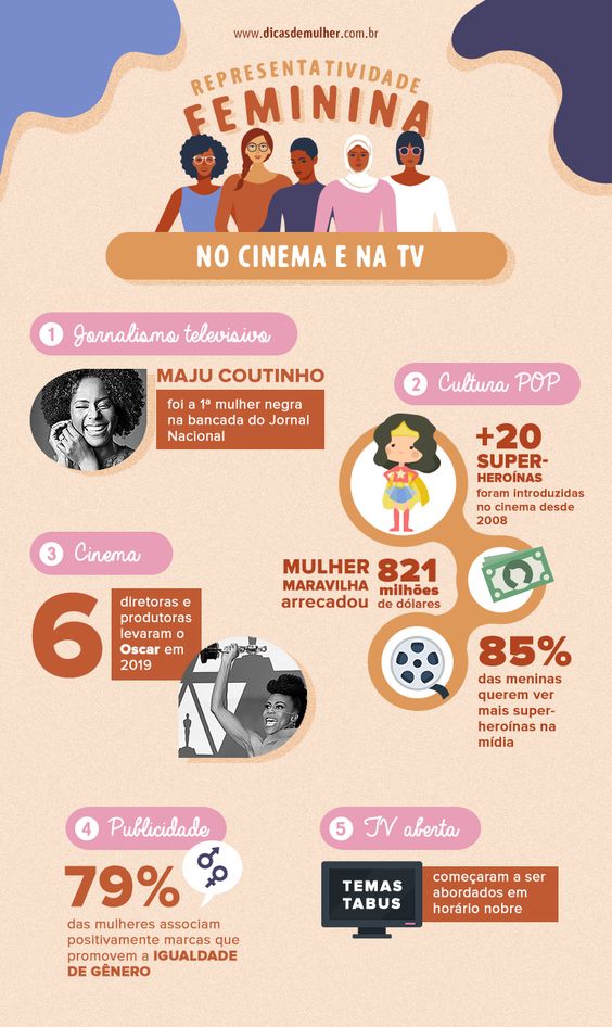
In this example too, the shapes of the text boxes vary, but those with similar characteristics remain the same. This brings contrast and uniformity to the design, making it pleasant and engaging. The usage of varying shapes also makes it aesthetic because of the contrast.
Kimp Tip: If you do not want to confine yourself to regular shapes, you can explore blobs and other forms too for bringing contrast in design. As long as it brings in visual flow, adds meaning to the message, and is engaging for viewing, the sky is your limit.
4. Contrast in Position

What do you think of when we utter the word “Contrast”? Something out of the box, out of line, and opposite to what one would expect, right? Our next type of contrast fits in that box like a glove.
Contrast in position breeds curiosity, intrigue, and wonder in the eyes of the consumer. It also helps you set the tone for brand personality, product features, and more by using symbolism in your design. A helpful tool in the contrast world, it can be a little tricky to understand or employ. But it is not impossible.
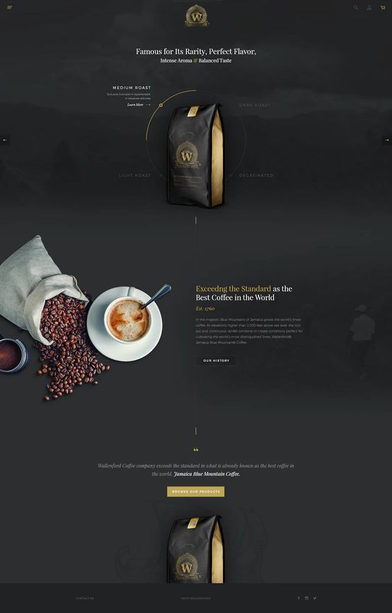
Consider this example below, it is a very simple linear design. Not much contrast in size, color, or even shape. But just by moving the coffee cup, the effectiveness of the design has reached the next level. Customers’ eyes will be immediately drawn to the cup and then eventually the text next to it. Mission accomplished.
Source: Pinterest
Notice how the design also has a contrast in color to make the first three words stand out. Now, this is how you combine two or more contrast types in a single design.
5. Contrast in Typography

Last but not least, will be the technique of leveraging contrast with typography in your design. Color and font have a very significant role in the success of a design. And they both connect with the consumers on a psychological level. Like color psychology, font psychology too tells customers about the traits of the brand and the emotion behind a message.
You can bring out the contrast in the tone of your text by using different font styles in the messaging. Building visual hierarchy also becomes easier with contrast in typography.
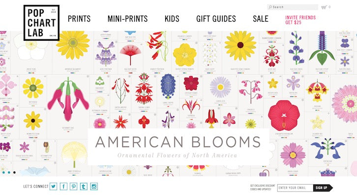
Consider this example. It is a web page that is full of colorful patterns and hardly any text. But the two lines of text that exist on this page have contrast in them. Yes, notice closely how the last line “Ornamental flowers of North America” is in a completely different font. This is to show the nature of the product the brand is pitching and to fully connect with its vibe to the audience.
Leverage Contrast in Design with Kimp
Design principles may sound like something only designers need to worry about. But when you work in the field of marketing, any design knowledge can prove helpful. Besides, it helps you appreciate your designs and your peers’ designs better. This will only result in you creating better output as time goes on.
All said and done, arriving at the right contrast in design can be taxing. And it needs many iterations and experiments. Not to worry because we have the best solution for you.
Kimp’s unlimited graphic design (Kimp Graphics) and video design service (Kimp Video) offers unlimited design requests, revisions, and more at a flat monthly fee. Now experimentation is affordable and accessible.
So sign up for the free trial now.
