The Golden Ratio In Design And Why It Matters To Your Brand
Do you know what our DNA and Salvador Dali’s The Sacrament of the Last Supper have in common with brands like Pepsi? They are examples of the golden ratio in design. The golden ratio is a mathematical ratio that can be used to create visually pleasing results. And it’s not just a matter of man-made results – the golden ratio can be found all throughout nature and even the human body.
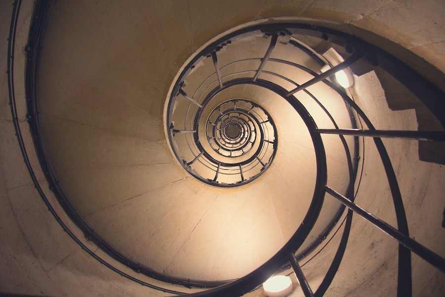
When you use the golden ratio in design, it results in compositions that are naturally pleasing to the human eye. Which is exactly how you want your target audience to feel about your branding. And that is why we’re going to do a deep dive into the golden ratio in design in this blog.
What exactly is the golden ratio?
Two quantities are said to form the golden ratio, if their ratio is the same as the ratio of their sum, to the larger quantity out of the two. Too complicated? Take a look at the figure below that simplifies it.

The golden ratio is also known as the divine proportion, Phi, and by a few other names. Centuries ago, several observant and curious souls began observing the amazing patterns that occurred in nature all around them. The leaf arrangements in plants, the patterns in the petals of a flower, how the barcets of a pine cone are arranged so flawlessly, and even the scales in a pineapple. They noticed that these all had the exact same pattern. The said pattern goes as 1,2,3,5,8,13,21,34 and so on.
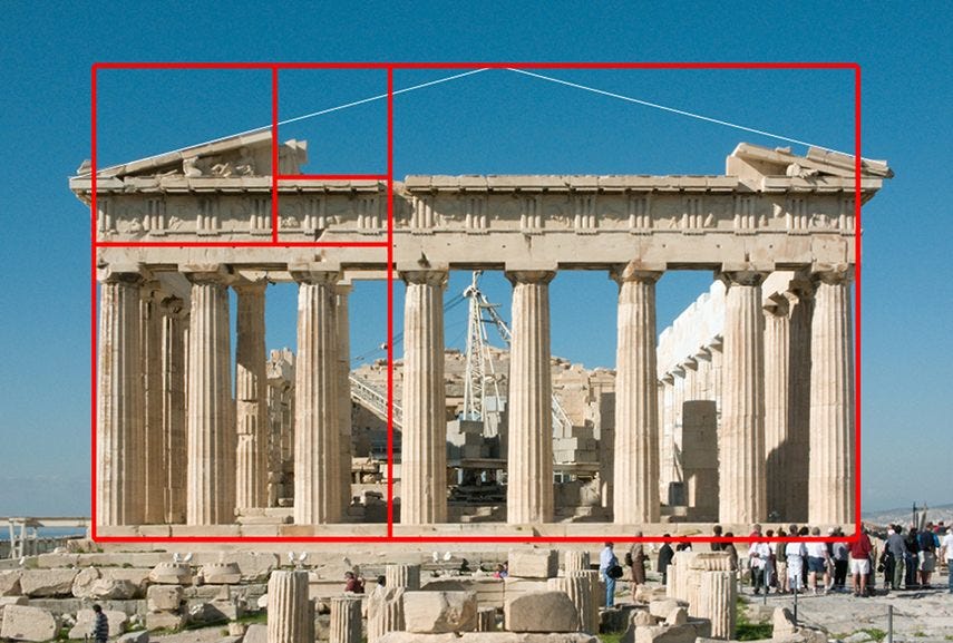
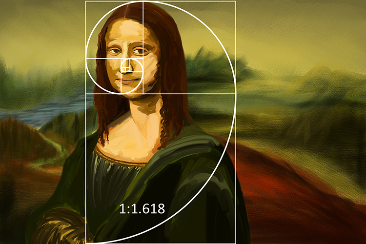
The pattern came to be known as the Fibonacci sequence. When you start to calculate the ratio of one fibonacci number with the number before it, the answer you will always get is 1.61803. This in turn is rounded up to 3 decimal places to get the golden ratio. As it was pleasing to the human eye naturally, this proportion was then incorporated into many different types of artwork. Everything from the Mona Lisa, to sculptures, photography, and architecture became examples of the golden ratio in design.
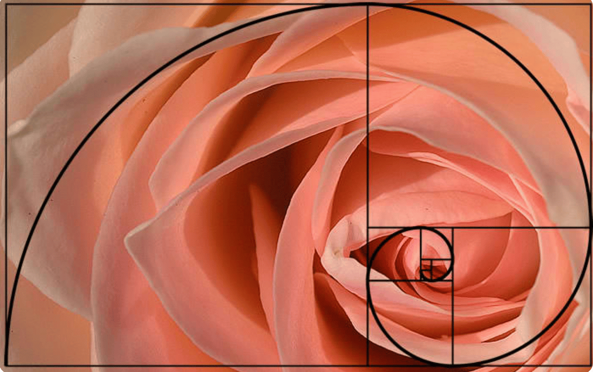
Some other examples of the golden ratio can be found in hurricanes, snail shells, the human face (those that align closest with the ratio are said to be the most beautiful), The Creation of Adam by Michelangelo, and even in the patterns in flower petals.
The significance of the golden ratio in design
The golden ratio is important to consider when creating marketing materials, business cards, magazine covers, websites, and even posters, just to name a few. Let’s take a look at how you can use it in design effectively.
Using the golden ratio in design
Shapes that carry the golden ratio
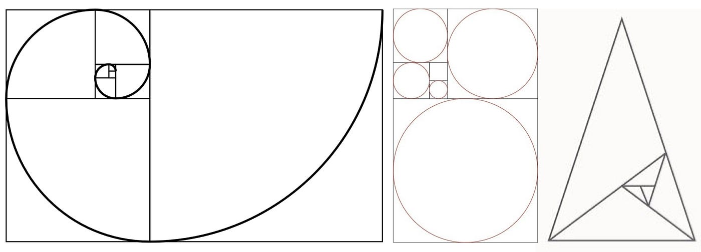
The shapes that align with the golden ratio have had the word golden added as a signifier. They are golden rectangles, golden circles, golden spirals, and golden triangles. When brought together correctly, these shapes can make design elements that cannot be ignored.
The golden ratio in typography
When any design is created with text in it, you should always think about the hierarchy of the typography. It is a best practice in design. And to this end, you can use the golden ratio to guide you on how to size your font(s).
Let us say, for example, that you need to figure out the hierarchy for your most important text (A), your somewhat important text (B), and your not very important text (C). If the smallest font size is 10px then you can multiply that by 1.618 to get an approximate guide for the font sizes that will need to be larger.
The golden ratio in composing images
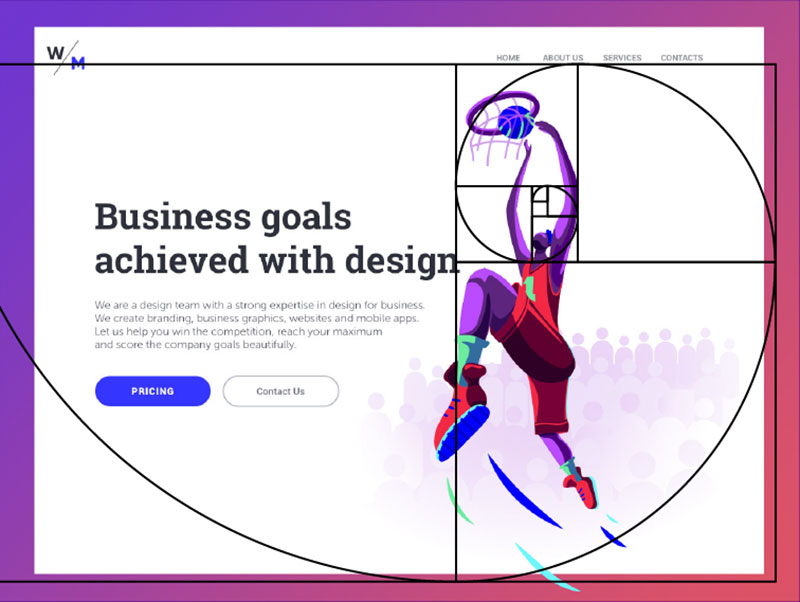
To get your designs done quickly, without sacrificing quality, ask your designer to overlay your design with the golden spiral. They’ll then be able to see the exact positioning of the various elements and decide if they do actually come together in harmony. The focal points of a design can also be worked out using the golden spiral. This means that using the golden ratio in design could help you find out how to place a headline so that it gets the most attention, for instance. If the design needs more energy, this technique can also help to see which elements need to be shifted around.
The golden ratio in logos
A well thought out logo is very important to your brand. When done right, it becomes the most easily identified element in your branding. And plays a huge role in keeping you top of mind for your target audience. This is why the golden ratio should not be ignored in logo design. It will help to draw the eye of customers in an instant and help them connect with your brand as well.
Some of the biggest and most successful brands in the world like Pepsi, Twitter and Apple actually have their logos aligning with the golden ratio. When a logo is being designed, designers can even think of the Fibonacci sequence as a series of circles. The circles can then be rearranged to form the grid as the foundation of the design of the logo. This is what has been shown in the example above, where you can see how the logo has been placed into the circles.
The golden ratio in choosing layouts
Fitting a bunch of different elements into a design, in a way that looks cohesive is a tough job. Especially when it comes to landing pages or your website. The golden ratio however, can help save the day! It can be used to decide the dimensions that are needed in a layout, and where each of the elements involved will be placed. A very easy way to start this would be to set the dimensions according to 1:1.618 from the get get. And then to use that framework going forward. This would be the most practical approach where you can use the basic 960 pixels width and then divide it by 1.618. The answer that you get here, will be the height of the design.
The golden ratio and content on the web
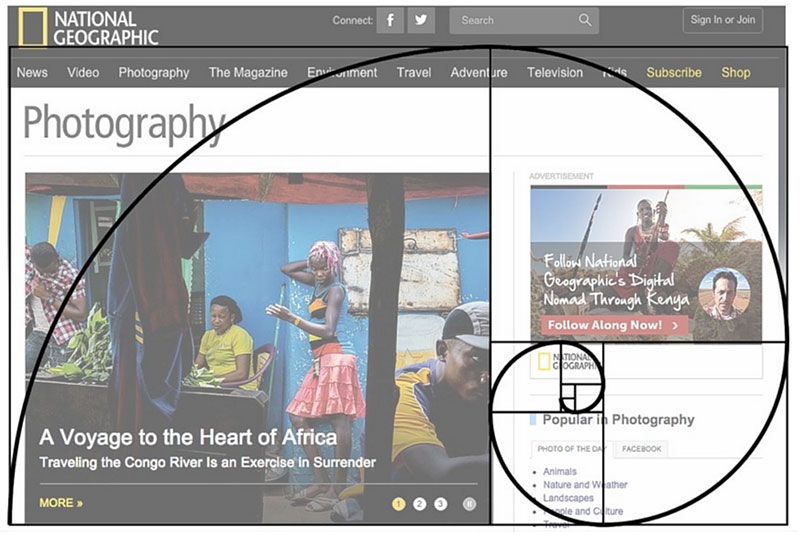
The golden ratio can also be used to determine how columns of text are arranged. While you may have minimal text on your landing pages, this will come into play for your websites. For instance, a page with a narrow column of text to the right, and wider block of text on the left not only attracts the viewer’s eye. It also highlights the most important information. For a site with a pixel width of 960, this means the right-hand column should be 367 pixels wide and the left-hand should be 593 pixels.
Your layout may not allow for an exact golden ratio, but as long as you get as close as possible to the 1:1.61 ratio, you’ll reap the benefits of incorporating the golden ratio.
The other benefit of this strategy is that it helps readers to navigate the different types of content that you include (e.g. video, photographic, and text-based content). And this is why you’ll find examples of this layout on many popular sites (e.g. Fast Company, BuzzFeed).
Spacing out your elements with the golden ratio
The importance of white or negative space is something that we have stressed, in all of our design blogs. It allows for the elements in a design to breathe and not look cluttered. That said, we also know that it is not always a straightforward thing to figure out how to do. Figuring out where and how to leave this negative space can get tricky.
If you do use the golden ratio though, you will definitely have a good starting point. And since trying to figure this out without having a reference point can be very time consuming, let’s avoid that at all costs. Just have a look at the example above. You can see how the squares are used to decide where there needs to be negative space.
Using the golden ratio to crop images
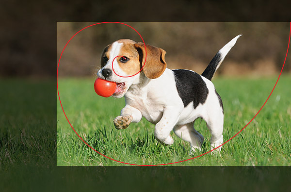
One of the simplest ways in which you can incorporate the golden ratio into your designs, is to have your images cropped according to it. You need not do this for every single image that you have, but if you do feel like a specific image is important and needs to be highlighted, ask your design if they can crop it into a golden rectangle. You can also implement this technique when you are taking pictures. The golden spiral can be used as a guide for how the image is composed.
One of the simplest ways in which you can incorporate the golden ratio into your designs, is to have your images cropped according to it. You need not do this for every single image that you have, but if you do feel like a specific image is important and needs to be highlighted, ask your design if they can crop it into a golden rectangle. You can also implement this technique when you are taking pictures. The golden spiral can be used as a guide for how the image is composed.
What is the rule of thirds?
This principle is similar to the golden ratio and easier to implement. Although this does mean that your results won’t be quite as precise as the ratio, and pleasing to the eye. The rule of thirds involves a grid that has nine parts. Each part will be of equal size according to the rule. We encourage you to focus on the intersection of the lines or along the lines themselves. This will get you the result of having a balanced photograph or design.
In the case of photography, if you were to place graph paper over your viewfinder you will see how the objects you are shooting align with the rectangles and squares on the page. These intersections are what will serve as guidelines for where you should position the primary and secondary elements of interest in the photograph.
There are also some exceptions to the rule. For example, if you are doing straight on headshots, it is best to center the face on the screen and forget the grid lines.
The golden ratio and magazine cover designs
Magazine covers are a great example of how effective the golden ratio in design is. Just check out the Complex magazine cover above that features Solange Knowles. This design uses the golden ratio to determine the proportion of positive and negative spaces correctly. We can see this in how the top of her nose and nearly her forehead, are angled upwards. And how her nose and eye are aligned. The result is an image that is balanced and naturally more appealing to the human eye. Since magazine covers are what will attract readers to buy the issue, including the golden ratio in the designs is very important. And you can equate that to any number of marketing materials that act as your initial touchpoints with your audience.
Tools that can help you use the golden ratio in design
Getting used to implementing the golden ratio rule in designs can be challenging at first. So here are some tools that could be of use when you think about getting your designs done.
PhiMatrix
This is an overlay software that works together well with the editing tool that your designer is using. It is not a plug-in and is more of a transparent digital template, that can be placed on top of the design that’s being done. It works well with both Windows and Mac as well as with a whole array of apps.
GRT Calculator
GRT Calculatore will help in deciding font size and width of content easily. It gives a designer the ability to try different versions of fonts on-screen.
Focus
If you want a design done on a WordPress, Focus is your go-to tool. This is a WP theme that is completely focused on the golden ratio. It also has many other must-have features for the ideal modern-day website.
Phi Calculator
This is an awesome Mac widget that will help designers out, if they are comfortable enough to calculate the ratio. It allows for the calculation of the Phi. And it will provide the information needed about orientation and the shape of the boxes.
Golden Mean Calipers
Want a design done on paper or canvas and still want the golden ratio used? This tool can help you get that done. It is used all over the world by artists, and designers to get the perfect dash of artistic balance. And it especially helps with any compositions of the human body.
A final word on the golden ratio in design
There is a big reason why the golden ratio is so important to design. It really does bring out the most aesthetically appealing side of any element, or composition. The golden ratio is also everywhere around you. It is even on the lines of your palms! You don’t have to use the golden ratio in every single design that you want to get done. Sometimes your particular needs, the format and/or all the elements you need to include just won’t allow it.
But incorporating it wherever possible, is a guaranteed way to attract the attention of the customer. The resultant changes will be rather subtle, but they will take a design from being ‘meh’ to ‘amazing!’. After all, the Mona Lisa never lost her appeal, now did she?

