Typography & Font Trends: The 10 Most Popular For 2022
The smallest things make the biggest impact. And one place this is always true is the selection of typography and font in graphic design and videos for marketing and advertising.
Design aims to bring your audience closer to you, and font and typography choices make a big difference to this.

While we spend a lot of time on color, imagery, design format, and overall style, font cinches the game in the end. Whenever you spend a lot of time looking at your design and wonder what is missing – the answer is usually around the font.
Design enthusiasts are quite vocal about good and bad font choices, and they have every right to be. Font choices make the difference between a legible and unreadable piece of content. Surely, you don’t want to trend for the wrong thing, so choose your font with care.
As we head into 2022, the typography and font trends demand a look-over to prepare for what is coming. These font trends do not come out of the blue. They are the result of all the good and bad content experiences audiences and designers have had to date.
Understanding them can help you make the right choice for your design projects in the coming year.
In this blog by Kimp, we analyze the most popular typography and font trends of 2022 and tell us how to use them in your designs too.
So, with no further ado, let’s get started.
The top 10 Most Popular Font Trends for 2022
What is in store for the font trends in 2022? Is it a new era in the offing, and can we expect some popular classics to continue?
Well, branding expert Matteo Bologna believes that custom fonts that work as an extension of a brand’s visual identity will dominate the year significantly. These can mean the difference between standing out in a competitive market or losing oneself in the crowd.
But that’s not all. There is a lot more in store, and we explore those in this section. Let’s dive right in.
1) Geometric Fonts
In graphic design, geometric shapes are significant in pattern design, visual hierarchy, and an overall design itself. Likewise, geometric fonts are gaining popularity among the font trends of 2022.
Geometric fonts are those that designers customized from popular shapes like circles, squares, and triangles to create unique fonts. These fonts represent balance and simplistic designs, but with a unique twist.
You can also feel a human touch in these custom geometric fonts more so than the traditional serif and sans-serif fonts. In the world of bold typography, fonts that come with rounded edges and proportional sizes can help you attract your target audience.
Most of these fonts belong to the Sans-Serif typeface and work best on digital applications. But you can also work with your design team to create custom fonts inspired by these geometric fonts.
Now, how do you understand if these fonts are right for your brand?
As we mentioned in our previous guide, rounded fonts, especially in the Sans-serif typeface provide an outlook of a modern, chic, and young-generation friendly brand. If these brand personality descriptions match your brand, then go for it.
Kimp Tip: Sometimes experimenting is the only way to understand if a particular font is working for your brand. And if you have geometric elements in your logo or brand identity, you can create fonts from those for a stronger visual identity.
Looking for a team to work on custom geometric fonts for your brand? Sign up for Kimp Graphics today!
2) Inclusive Fonts
Inclusivity gained a lot of traction in the marketing world in the past year. And we expect it to be a major theme in the 2022 font trends too. Especially since readability determines whether a design works, or is inclusive, or not.
Many of your readers and followers on the internet have reading difficulties, vision impairments, and use screen readers for help. Your font design must not be a hindrance for those screen readers. So design using standardized fonts with design variations that the screen reader can understand and interpret with ease.
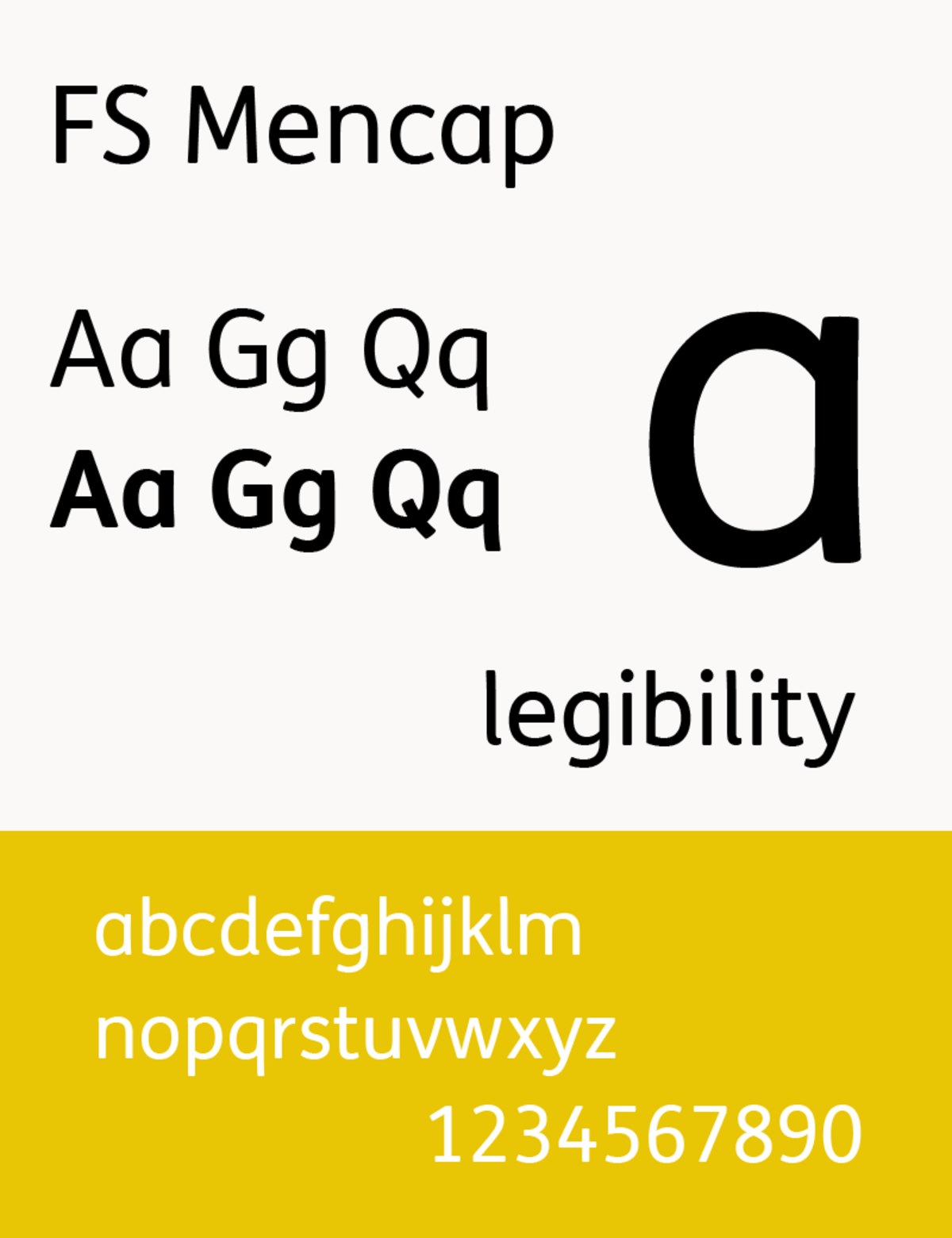
Consider this custom font FS Me that designers have developed to make reading easy for people with vision impairments. This looks like your average font with rounded faces and clean lines but comes with the added benefit of improved readability.
Adopting fonts like these can give your brand’s identity a major boost in the market.
Kimp Tip: Inclusivity is a fairly new trend, and brands working in the market for some decades now may not have the best font in place. But this does not mean change is not possible. With the right design team, you can tweak your brand’s font to be easy to read for all audiences.
All you need is a design team that can balance your old and new brand identity. We suggest signing up for a Kimp Graphics subscription to give your branding a quick makeover.
3) Contemporary Serif Fonts
Modern graphic design is slowly finding its bearings amidst the love for nostalgia and vintage styles. And that is showing in the font trends of 2022 as well with the advance of contemporary fonts. We see a growth in contemporary fonts especially when it comes to sans-serif fonts. The inspiration from tradition and the addition of the new age trends have truly made it an exciting trend.
Most of these fonts are a modern take on erstwhile vintage fonts to make them suitable for the current times. They are a brilliant choice for headline texts and prominent headings to catch the audience’s attention.
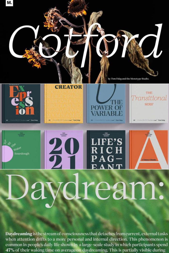
Some popular custom contemporary serif fonts include Cotford, NewParis, Sagona, and FS Ostro. These fonts come in many variations, and you can use them across all print designs.
These font styles are the most apt for brands who wish to project a mix of modern and traditional ideologies. Being print-friendly fonts, we recommend them for your print and OOH (out-of-home) advertising strategies.
4) Designer Graphic Fonts
You have heard of script fonts and display fonts. We specifically use these fonts as per graphic design requirements to emphasize your messaging. They hold the potential to be the central element in your designs and also play an important role in bringing out the best of your designs.
We know most of these fonts for their edgy behavior, bold strokes, and the multitude of designs they come in to make a lasting impression on the audience.
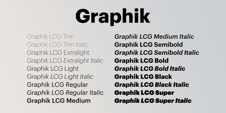

Consider the examples above. Both are designer graphic fonts, and it is quite impossible to compare one with the other. While the former is extremely close to an everyday font, Santi Rey will make you sit up and notice in a jiffy.
The lesson to take from these examples is that designer graphic fonts can be anything you want them to be. You must decide based on your brand’s visual identity and the medium you choose for your messaging.
Kimp Tip: Jumping on trends just because everyone is doing it is never the right choice. But some trends are good to adopt to please the audience. So, while you can switch to an edgy and experimental font like a designer graphic font for your advertising, we suggest not switching branding fonts so quickly.
5) Italics
The experts are calling it one of the font trends no one saw coming. Yes, we are talking about the growing prominence of Italics styling in web and print fonts over the past couple of years. While many consider this style old-fashioned, brands that have dabbled in this styling seem to prove just the opposite.
What everyone must understand is that words have a voice and their design’s job is to provide tonal variations. So emphasizing some words in a sentence plays a significant role in driving attention to the text and adds visual flow to the design. And we have all grown up with the Italics known for underlying importance.
We expect this trend to go strong for many years to come and work best across digital and print mediums. So, feel free to bring in Italics for your website pages, landing pages, posters, billboards, and social media posts as well.
Kimp Tip: This font trend combines really with the upcoming trends as well. You can use color, weightage variation, and outlines in combination with italics for a louder emphasis. The beauty of it is that it can be as subtle or bold as you wish it to be.
6) Handwritten Fonts
2022 will be the third year when the world is still living under the COVID-19 pandemic to some extent. And that has made everyone value human contact and company a little more than usual. Anything that has a human touch will find approval from customers.
Also, brands have the challenge of making their visual identity feel familiar and friendly for their target audience from a distance. In the midst of the pandemic it’s hard to get up close and personal. And what better way to do this than leverage the latest font trends in 2022 aka handwritten fonts.
Handwritten fonts appeal to younger generations and especially the female population as they project a friendly and trustworthy face of the brand. These fonts can make any product or industry seem harmless and cutesy.
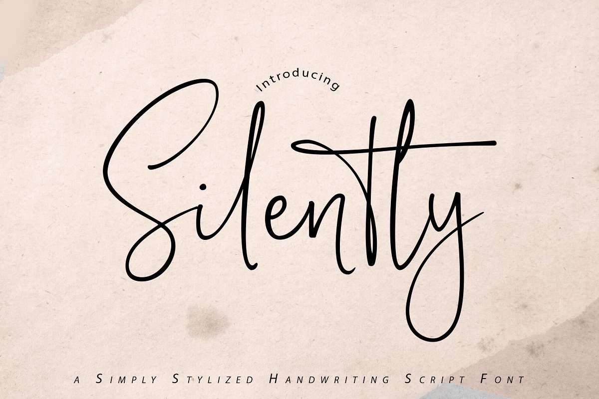
You have all the freedom to customize this font in as much of scripty, doodle-y, or straight fashion as you wish it to be. And that can work brilliantly for your brand because you can switch fonts without hampering your visual identity.
Kimp Tip: Experiment with handwritten fonts in terms of sizes, styles, and weightage to pick the one that works best in each design. These fonts work best for writing your brand names and captivating text on packaging design, social media, and more rather than long-form texts.
7) Color Fonts
Black has been a cool color for fonts since time immemorial. And black and white is the default combination that everyone designs fonts with. But what we are seeing now is an emerging new font trend in 2022 of using colored fonts extensively in branding and marketing.
These colors are usually the brand colors to promote brand identity and spread brand awareness in the market. But you can always switch colors in your marketing and advertising designs. The only difference is that you must base these colors close to your brand identity and base them on dominating principles of color psychology and visual hierarchy.
Sound complicated? Don’t worry, with a Kimp Graphics subscription, you can create unique styles and sample them out before going live.
But there is one particular section of the font trends of 2022 that we want to mention here and that is the use of gradient color fonts. Yes, the usage of gradient color to show horizontal visual hierarchy in a line of text is gaining prominence over the past few years.
Using this design style also helps you highlight a particular word, line, or phrase in your marketing designs.
Kimp Tip: If you want to experiment with gradient color fonts, we recommend sticking to just one color family and keeping the rest of the text in black and white or subtler colors for emphasis. Choosing brand colors for the gradient can be a complete masterstroke too.
8) Animated Typography
The next addition to the font trends of 2022 has been brewing for some time now. Video content is the most shared of all content forms, GIFs are this generation’s mode of communication, and subtle animations have overtaken our landing pages. So of course this would happen to our fonts too!
And that is why animated typography is what we will discuss next. We don’t mean that you have a single fixed animation style for your branded fonts but make it a part of your brand style guideline itself.
Subtle animations that make sense for your brand and enhance your brand’s identity are what you need. Try extending these to your marketing channels such as social media, email marketing, and advertisements slowly but steadily. You may not see it as an enormous value add, but for the audience, it gives them a break from the monotony of static fonts.

In this logo, Open View opens with its abbreviated form and then reveals the whole name. This makes sense for the brand and also brings a fresh style to an otherwise overdone aesthetic.
Kimp Tip: Animated typography is best for design assets where you need to hold the audiences’ attention. So this means using them in landing pages, social media stories, and newsletters can benefit you.
9) Cutouts and Overlay
An homage to a yesteryear graphic design style, the next font trend of 2022 is the revival of the cutout trend in fonts. Basically, the cutout style is exactly how it sounds.
Mimicking the paper cutouts we used to make in school, this font allows you to peep behind the font and see what the background layer is. A fan favorite for creating cinematic posters and graphic designs, you can use it on websites and landing pages as well.
Similar to outline fonts, these fonts do not carry any fill or colors in them and rather rely on the background to add style to them.
These fonts are extremely interesting from the visual perspective and can help you hold your audiences’ attention for a longer period. Especially if your brand personality lends itself to a designer and sophisticated style, we recommend using this effect with no hesitation at all.
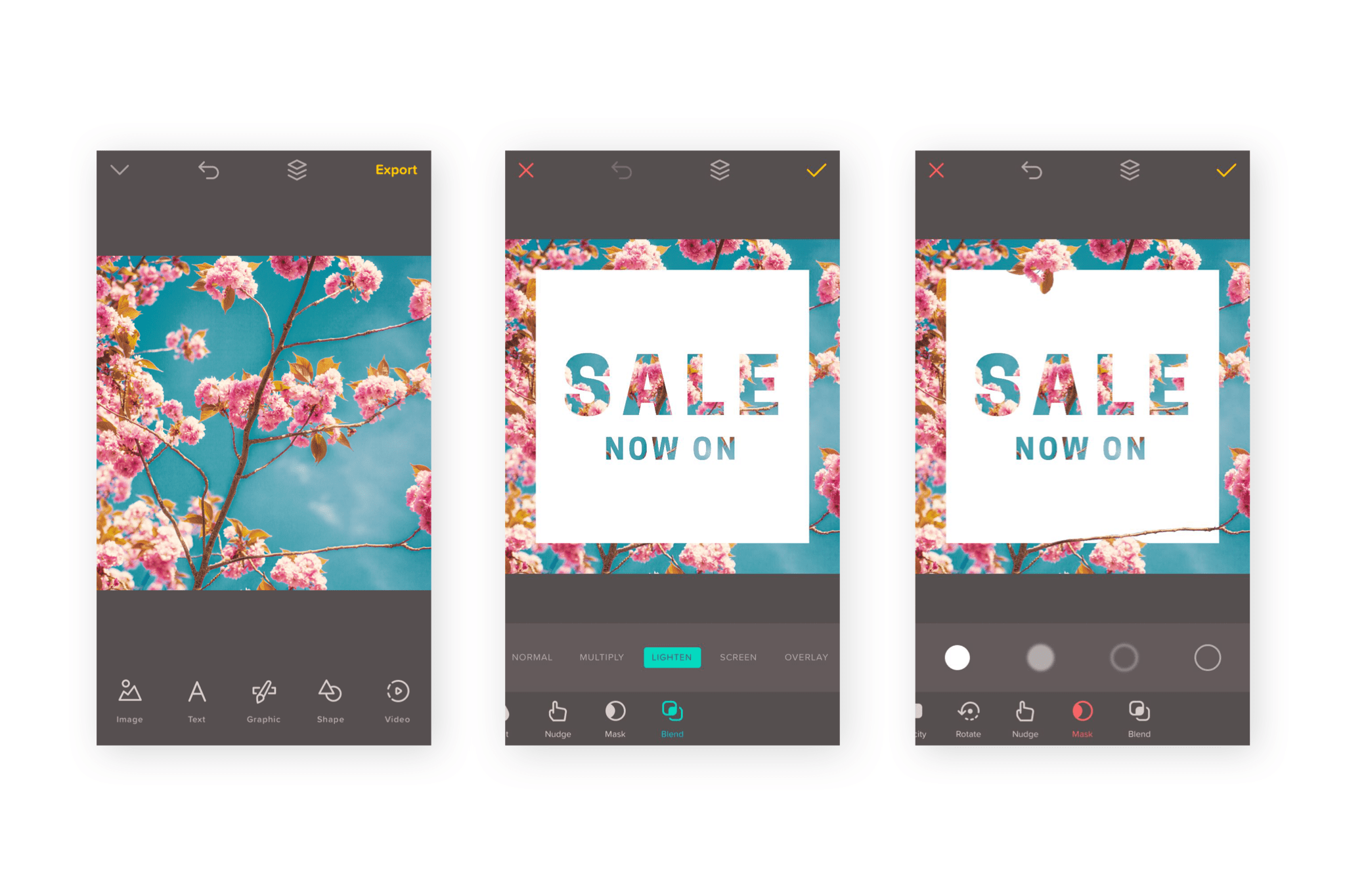
As you can see from the example above, cut-out fonts look very artsy and pleasing when used the right way.
Kimp Tip: Since the background is as important as the font selection here, we recommend creating a brand style guide especially for this font trend in action. Create guidelines on what image to pair with what font to send the right message across and attract the right target audience for your brand.
10) Serif & Sans-Serif Font Combos
The olden days of keeping serif and sans-serif separate are long gone. Designers are working extensively to ensure that there are font styles within these families that they can use across web and print designs. While this battle is still on, the next addition to the font trends of 2022 is trying something even braver.
Designers have adopted serif and sans-serif fonts together in the same creative style. This means that this is a huge win for people struggling with establishing visual hierarchy. It can happen easily with this trend in tow.
Using these styles next to each other clearly distinguishes the texts and adds a very interesting layer to the overall design.
Kimp Tip: Pairing these two fonts can be tricky, and a lot of other design elements will determine if the result was a success or not. But varying the placement, weightage, and styling of these fonts can help you arrive at that perfect font pairing you want for your brand.
Experiment and Ace the Font Trends of 2022 with Kimp
Font choices can be a bit too complicated, right? So many choices, so many decisions, and so much experimentation before you can finally settle on the right ones.
Now, this is not something you can take lightly for your brand. We have spoken about how important fonts can be for your brand’s marketing and branding success, and we mean every word of it.
So choose a design team that can understand the weight of this decision and works on delivering only the best for you. And we can confidently say that the Kimp Graphics and Kimp Video teams are the ones you’ve been waiting for.
We offer unlimited design services with unlimited design requests, revisions and users, for unlimited brand buckets, across a ton of design categories.
So sign up for the free trial now and start exploring today!
