How To Use Symbolism To Create Powerful Brand Designs
We live in a visual world, and our brains perceive images faster than text. It is probably why there are cave paintings rather than words. Images are the simplest form of communication.
Imagine this. You are in a foreign country, and you barely know any words in their language. A typical tourist, you know a handful of words but do not know how to say any of them.

If you need help, directions, or even food – how do you communicate? You try to use sign language if it was 30 years ago.
Today, all you have to do is pull a picture off the internet that conveys your need and show it to a passerby. They will instantly understand and guide you ahead, hopefully using pictures and signs themselves.
Inspired by this unifying nature of images, humans started communicating using symbols in signs, books, and communication mediums very early on.
And today, symbolism can still help you connect with your target audience quickly. And it can also help you create powerful brand designs that leave a lasting impression.
Visual identity is a key component of building brand awareness and recall ability. And symbols fit perfectly into the scheme of things as a must-have tool.
Before we go any further and decipher how exactly symbolism and branding fit together, let’s understand symbolism a little better.
Decoding Symbolism
There is no one version of how symbolism originated and became a salient feature of human communication mediums. But studies have traced back to early cave paintings as some of the first examples of symbolism. So, since humans began existing in civilizations, they used symbols as a tool to depict complicated concepts and describe an ideal in detail.
The usage of symbols to express an idea with more depth is what makes up the premise of symbolism. It exists across all art forms, such as literature, prose, poetry, and, of course, design. An interesting fact about symbols is that you must know the context and background of each to arrive at the correct interpretation.
The same symbols mean different things to people across cultures, generations, and locations, to name a few.
But when you use them the right way with no ambiguity in the messaging, symbols can help you convey your thoughts in a very precise manner. And this is just one reason why designers and marketers love the usage of symbols in branding designs.

Why use symbolism in branding and marketing for your business?
Yes, symbolism is a great medium of communication. And it solves a lot of problems when it comes to complicated concepts where words alone don’t work too well. But why do people emphasize the usage of symbols in branding designs?
Does it go beyond having just a visual element in your design?
Well, actually it does. Symbols play a very meaningful and essential role in making your branding designs memorable:
- When you use symbols in your logo, packaging, web design, or app design – you seize the opportunity to communicate to a wide audience. Symbols hold the power to cross language and international borders with ease. You can build a memorable and relatable brand by incorporating symbols.
- Some symbols, such as the stop sign, recycling sign, and the pedestrian crossing, are part of our subconscious. We will never forget those because we see them so often, and know their meaning immediately. This is why brands spend a lot of money to create brand awareness and build a visual identity that is easy to remember. With symbols, you tick off all those boxes.
- Along with building brand awareness, every business wants to be unique and have an identity that is extremely distinct from its counterparts. While names, words, and even products can be similar, you can use symbols and pictorial representations of your brand’s personality to ensure you stick out from the crowd.
- Symbols create a lot of instant emotional recall among customers. They make it easier to understand your values, product, and USP. It is the fastest way to form a connection and communicate your ideas in an extremely engaging manner.

Choosing the right Symbol(s) for your Brand designs
So now you know what symbolism is and how using it in your brand identity can elevate your chances of success. Knowing how to choose the right symbol for your designs is the next essential step for the success of your branding.
But we have also mentioned that symbols are very context-based. And if you don’t do your research well, you may end up sending out an extremely different message than you meant to.
So how do you choose the right symbol and symbolism principles for your brand designs? As one of the top-rated unlimited graphic design services, we work on branding and marketing materials for businesses every day.
And so the Kimp team has outlined the process of choosing the right symbol for your all branding needs below:
- Define your brand: To accurately represent your brand for your target audience via symbolism, you must understand it in depth. Start by defining your branding principles, values, messaging, and brand personality.
- Pay attention to the context: You must understand the context in which people use the symbols you are considering across generations, cultures, and international borders. Eliminate all possibilities of misunderstanding to avoid any controversies. You want all connections to be positive when it comes to brand awareness for your business.
- KISS: Standard design rules apply here, too. A primary motive of using symbolism in your logo design is to make it memorable, easy to understand and communicate well. So, always “Keep It Simple Stupid”. Over-complication never leads to anything good.
- Consider your audience: All the heroic design work in your branding is immaterial if it does not connect with the target audience. So, you must make that the focus of your symbolism. Analyze your target audience’s behaviors, your industry, and what symbols your audience may interact with before settling on one(s) for your brand. This makes your design more approachable and effective.

Leveraging symbols for Powerful Brand Designs
Brand designs are not a single identity. There are a lot of physical and intangible elements that come together to create your brand identity’s visual counterpart. The good news is that symbols work great across these elements.
In this section, let’s check out how you can use symbols in various branding designs:
Logo Design
Out of all the branding elements, all marketers and designers will tell you that your logo design matters a lot. Customers form first impressions quickly, and most of the time, they do it based on your logo design. Using symbols in logo design makes it easy for them to perceive the meaning and story behind a logo design more easily.
Our minds have already formed associations between the most common symbols we see in our everyday life and their corresponding meaning. This means that you don’t have to spend time and resources explaining the design or the story behind it to your customers. The symbolic representation does it for you.
Some innovative ways of using symbols in/as custom logo design for your business are:
- Combining different symbols to arrive at a meaningful and unique logo design.
- Using a combination of letters and symbols to design a multi-faceted logo. You can then use the symbol component as a standalone logo too.
You can choose from a range of nature, animal, floral, natural elements, and mythological symbols to incorporate in your logo design.

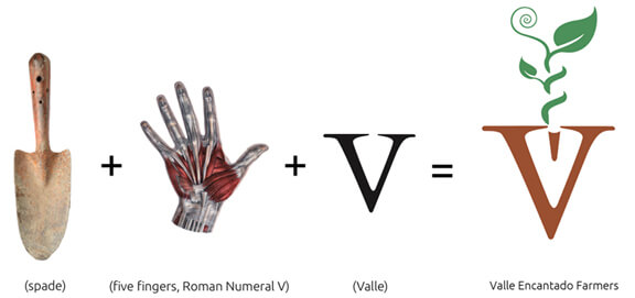
Above is an example of using the brand’s product, values, and name to create a meaningful combination of symbols that functions as the logo too.
Kimp Tip: Incorporating symbols in your logo designs can instantly elevate the result. Even if you choose to select a word-based logo design such as letterform, you can still use symbols to make it more effective. You can also get the letters in your brand name designed in a way that depicts symbols that relate to your business.
Package Design
After the logo design, the next touchpoint between your brand and customers might be the physical products they interact with. This is especially true for retail brands. And with the wildly popular trend of unboxing, packaging design is important for ecommerce stores too.
Packaging design is a great medium for your businesses to convey its ideas, brand values, and USPs to the customer in the last bid for a sale.
Packaging design, more often than not, makes the difference between attention and disinterest as a potential customer considers their options. Using symbols here again cuts down on the time you need to get your message across.
Besides brand-related symbols, you can also convey product information, safety standards, important announcements, and updates via symbols in your packaging designs. By using symbols as a tool for information transfer, you can reduce the clutter and present a well-designed and attractive package to your customers.
Sometimes, the shape of the package itself becomes a symbol. For example, Coca-cola spent years perfecting the bottle shape and ended up copyrighting it. The curved bottle represents the soft drink across cultures and countries today.
Similarly, you can design the shape and style of the package itself to mean something to your target audience. You may also have noticed how Valentines’ day chocolates always come in a heart-shaped box to pull people in. The chocolates are the same as what you’d purchase year-round, but the package design is symbolic of the holiday that’s all about love.
Kimp Tip: You have all the room in the world to innovate and experiment with symbols in packaging design. So don’t limit yourself. Brands use graphic design, logos, or even custom illustrations to add value to their packaging. You can also leverage symbols to separate one product from the other like Cadburys’ does with the heart-shaped box.
Web-based Designs
For an online business or a small business with a digital footprint, branding extends beyond logo, packaging, or storefront signs. Their digital presence also plays a heavy role in branding. And symbols play quite an important role here, too.
If you think the retail space is competitive, imagine how it feels to run a business among the billions of others doing so on the internet. With attention spans constantly on the decrease and scrolling becoming a pastime, businesses need every advantage they can get.
In a crowded space, symbols on websites, apps, and social networks can help you convey your message in the quickest way possible. It also means that you build a library of visual elements in your customers’ brains so that brand recall becomes so much easier.
You can use icons, images, illustrations, geometrical symbols, and popular logos to convey your idea. Brands today are replacing most of their text with such symbols to improve the readability of content on their social platforms.
Using common symbols in web design can increase readability and enhance user experience.
Kimp Tip: When you have a presence across physical locations and the web, you need some unifying elements to provide a consistent branding experience for your audience. This means you have to use the symbols in your logo across all platforms. So, ensure you instruct your designer(s) to deliver a design you can use in print and on the web. Read our guide on print and web logo designs for more details.
Enhance your brand design using Symbolism and Kimp
By now, you know that having a visual element in your branding is crucial to its success. And if you want to pick the most effective of them, give symbolism a try. We know a picture speaks a thousand words, but picking the right symbols for your brand designs ensures there is no miscommunication.
For a consistent branding design, you need a design team well-versed in all areas of branding design such as logos, package design, landing pages, custom illustration, merchandise, and mascot design too.
Kimp provides unlimited design services for both graphic design and video design at a very competitive price. You get unlimited requests, revisions, and a dedicated design team to fulfill all your requests.
Sign up for the free trial to test the service out for yourself!
