Why Designing With Geometric Shapes Is So Powerful
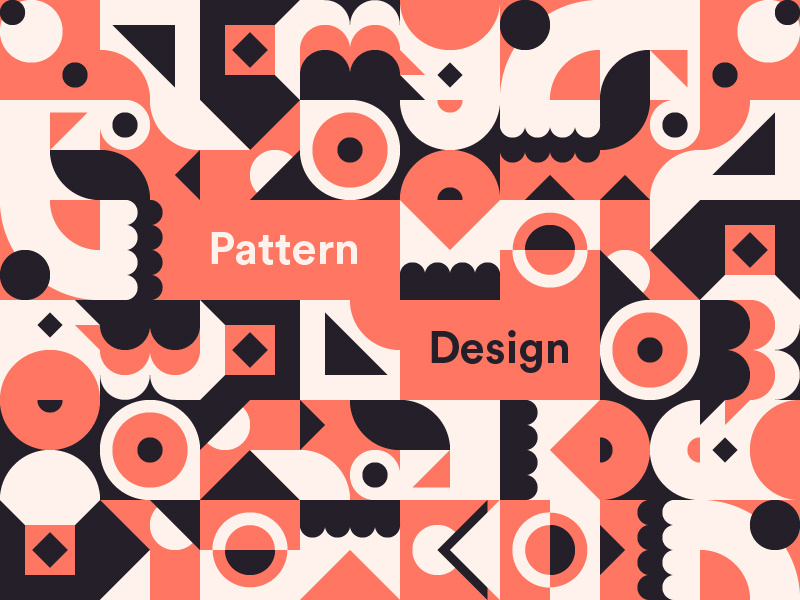
Shapes can be powerful tools to convey messages and share stories. So it’s not uncommon to see brands of all kinds designing with geometric shapes. Unlike many other elements, geometric shapes weren’t created by people. They already existed in nature. And we simply observed and replicated.

Angeles Arrien, cultural anthropologist says that there are five universal geometric shapes. The circle, intersecting lines, the triangle, spiral and square. And we can find examples of them all around us. With geometry so deeply embedded in nature, it is no surprise that designing with geometric shapes can lead to impactful marketing creatives.
Consider for a moment that the success of your storytelling strategy, or marketing plan, depends on how your audience perceives it. So your best bet would be to use powerful imagery and elements that they feel connected to. This is why the shapes that are used in your designs, can influence the success of the design itself.
If the shapes that you pick speak for the values and the persona of your brand, then your designs will not just gain attention. They will also become a part of your brand identity in the minds of your customers.
The different types of shapes
Geometric shapes are one of the three basic types of shapes that are used in design. And they’re the most commonly used ones too (think squares, circles and triangles).
The other two types of shapes are organic and abstract. Organic shapes represent objects that exist in the natural world. And abstract shapes represent people and the everyday objects we encounter. They are simplified versions – like stick figures.
Designing with geometric shapes
The shapes that are used in your designs can help communicate the qualities of your brand to your customers immediately. And reinforce them too. Let’s take logos for example. When you incorporate certain shapes into your logo, you can convey a sense of strength or stability (think squares and rectangles). Or continuity (think circles and ovals). And this representation can be carried forward into every bit of your branding and marketing. Geometric shapes can be used in pretty much any aspect of your branding such as the graphic designs, interiors of your store, the environmental features in your outlet, and your product and packaging design.
So with that bit of a primer in mind, let’s take a look at why you might want to consider designing with specific geometric shapes.

What different shapes have to say
Circles and ovals
The circle is known as a matriarchal shape from which all other shapes originate, and this applies to nature as well. For instance, we call it ‘the circle of life.’ From cells to the shape of the planet, the circle is all about continuation. When used in designs and logos, circles depict the many different elements that add up to a whole. To this end, a lot of government agencies, non-profits, collectives and groups, use circles in their designs and logos.
Circles and ovals send out a very optimistic emotion that ties in with the concepts of protection and harmony. They are used to symbolize commitment, love, unity and community. In general, any shape that has curved lines is thought to suggest feminine energy. And alternatively, shapes with straight lines are thought to represent masculine energy.
Circles and ovals also have no beginning or end. So, they are associated with a very free idea of movement and can also represent energy and power. They also appear complete and graceful, because of the curved lines that they have. The brand archetypes of the innocent, the caregiver and the everyman are depicted very effectively with circles.
And while circles and ovals may not be used as much in designs as angled shapes, they do tend to gain more attention than the straight lined ones.
Squares and rectangles
Squares and rectangles speak of stability. This is the biggest reason why the rectangle is one of the most frequently used shapes in design. The shape evokes trust and it depicts honesty, stability and a sense of being solid.
Square and rectangles also suggest a sense of being perfectly calculated, and balanced because of their angles and straight lines. They also reinforce ideas of conformity, rationality and practicality.
They are not flashy shapes, and they certainly are not tools that instantly grab attention. This can make them seem downright boring when they are used in subtle or conventional ways. But designers can always find a way to make them interesting by giving them a bit of ‘flair’. This may come in the form color, contrast, hierarchy or negative space.
When it comes to websites, square and rectangles play a unique role in the grid pattern commonly used in web design. Our eyes can register these shapes easily and that is why a lot of the text that you see in any design, will align with these shapes. In a spiritual context, the square means earthbound according to Buddhism. And, if a square is placed within a circle, it represents the connection between the human and the divine.
Spirals
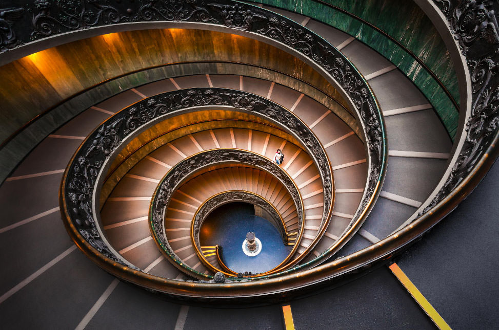
Spirals are all about creating a visual representation of cyclical time in space. They create a sense of consistency but represent new beginnings with the new cycle that emerges with each rotation.
We find a lot of spiral shapes in nature. Ever pick up a seashell while enjoying a stroll on the beach? There’s a spiral in its shape. And for that matter, spirals are present in everything from the shell of a snail to the dispersion of stars in a galaxy.
Even water draining or wind picking up the dirt can take the form of a spiral. As such, this shape gestures to evolution and growth, the circle of life and of course the seasons and times that come and go.
Spirals are thought to represent a feminine energy because of their curved nature. And they can be used in very creative ways in designs.
They can be shown to be moving in a clockwise or anti-clockwise direction, are open, limitless, and free-flowing. It is also a shape that can appear to carry on for eternity, leading it to be linked to a sense of mystery. And this can be used effectively by brands that want to pique the interest of their customers.
Triangles
If you want to step away from a more conventional design style that uses squares and rectangles, give triangles a try. Since they can be arranged in many different ways, they allow your designer the freedom to create more dynamic designs.
Based on their positioning, triangles can have many different meanings. When they point upwards, they represent stability and power. When they point down, they can represent instability. The triangle, when it is upright, is also thought to be a masculine shape at its core. And when it is inverted, it represents a feminine shape.
In the spiritual realm, a triangle speaks of the union of the body, the mind and the spirit. In the world of graphic design, triangles that are smaller in size can be used within a collage to create a mosaic pattern or to add an interlocking style to a design. This can bring about a sense of unity.
And skinny triangles are often used in place of arrows and pointers to guide the eye of the viewer. The bigger the triangle, the more it can take away from other elements of your design so be mindful to incorporate them in more subtle ways.
If you want to convey a message that your brand is one that is moving forward, consider incorporating triangles that are pointing to the right. Or triangles which are pointing upward from their base. With the many different types of meanings that can be derived from triangles, you’ll want to harness the most powerful and positive (pointing to the right or upwards).
Pentagons, hexagons and octagons
These are polygon shapes that have more than 5, 6 or 8 sides to them. Of the polygon shapes, they’re the most commonly used as they’re the most versatile to design with. They are also shapes that many of us see during our day-to-day activities. As a result of this we often associate certain shapes with certain symbols. Just think of how often you think of a stop sign if you see an octagon – especially a red one!
You could think about using these polygon shapes in a few ways. You could use them to insert text inside of, and organize information (think infographics) or you could also incorporate them through negative space (as cut outs in the design).
These techniques can come in handy in a wide range of designs including blog posts or header images, Instagram graphics, Pinterest pins or even presentation slides and YouTube thumbnails.
Working with any of these polygon shapes can give your designs a refreshing twist from working with the likes of squares and rectangles. But when you’re designing with geometric shapes, polygons or otherwise, be sure you’re clear on their associations and meanings so that you can choose those that best represent your brand.
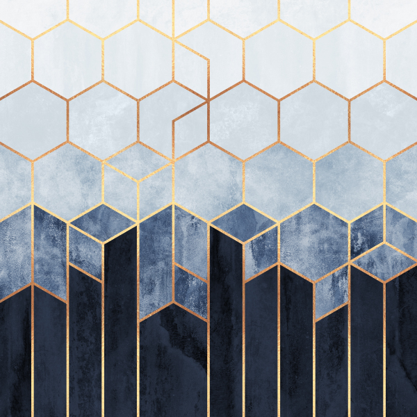
In addition, polygon shapes can also be used as puzzle pieces so that they end up as components of a much larger picture. For example, with hexagons and analogous colors, you can get a design done that resembles a beehive. Pentagons and octagons can help you get a similar design done, but they could be composed in horizontal, vertical or diagonal directions. And all three of these shapes can be broken down into smaller geometric shapes like triangles to create the effect of a visually circular motion.
The five pointed star
Stars have always been seen as symbols of excellence. For example, five star hotels, generals or even flag designs are all a testament to this. Leonardo Da Vinci’s infamous Vitruvian Man is a masterpiece that is based on the structure of the five pointed star and the human anatomy.
Stars are given so much importance, that even the most popular celebrities are called stars! This is without a doubt, a shape that you can use for a universally understood positive connotation. So if you have a discount or a promotion that you’re offering, or want to share positive reviews from your customers, be sure to incorporate a star or a few in your designs.
Tips for designing with geometric shapes
Looking to get a unique design done, that consists of geometric shapes and catchy colors? Then it’s important that you keep a few best practices in mind:
- Always consider the meanings associated with the colors and shapes you want to use. Every element you choose should reinforce your brand.
- Try and mix up some geometric shapes with abstract ones as well as organic shapes. This will give you a creative design that will certainly catch the eye of the customer. But bear in mind that the smaller your design, the less elements you should be trying to incorporate. What works for a landing page, won’t necessarily work for a social media post.
Designing with geometric shapes is powerful
Designing with geometrical shapes can make your designs clear, powerful and cohesive. But too much of a good thing doesn’t work as well as using just enough. So choose a particular shape that aligns with your brand identity and use it consistently across all of your marketing creatives. At the end of the day, for customers to be able to identify that the designs you promote are from your brand, consistency is key.


