The Essential Guide to Using Negative Space in Design
When designing for your brand, do you feel the urge to cram every detail into your design? Perhaps terrified of missing that crucial first impression? well, you’re not alone. But what if there was a secret ingredient that could enhance your message instead of burying it? Yes, we’re talking about negative space. That often-overlooked detail which plays a vital role in creating a clear, impactful design!
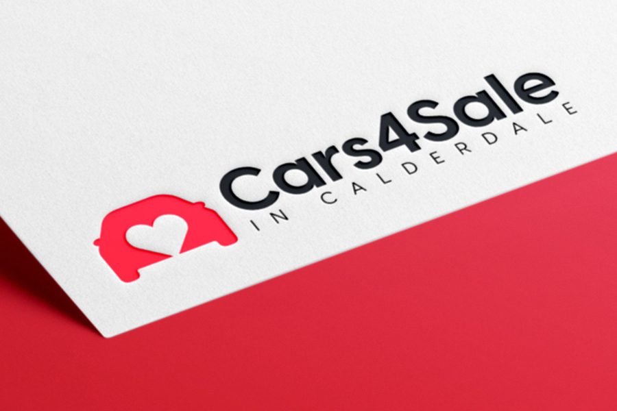
But what role does negative space or white space truly play in design? How can you manipulate white spaces to add your creative flair and take your designs from ordinary to extraordinary? Get ready to uncover the answers to these questions and more!
- Negative Space Explained
- The Power of Less: The Benefits of Negative Space
- Practical Tips for Using Negative Space in Design
- 1. Choose the right proportion of negative vs. positive space
- 2. Experiment with the placement of elements
- 3. Carve out relatable symbols/shapes
- 4. To keep it minimalistic, use passive negative spaces
- 5. Combine elements for layered interpretations
- 6. Enhance negative space with diverse design elements
- Tap Into the Power of Negative Space in Design With KIMP
Negative Space Explained
Negative space or white space is the empty space in any design. It is your best friend when it comes to creating clutter-free designs.
Superficially, negative space looks like the blank spots in the design. However, this often acts as the binding force holding the whole design together. The catalyst that ensures clear and effective comprehension of your message! In short, negative space is an indispensable element in design.
Therefore, a good design has the perfect balance of positive space (space occupied by various elements) and negative space.
But sometimes, white space can also become the eye-grabbing detail in your design. It can become that secret sauce adding an extra layer of meaning and intrigue to your design.
To explain this better, let’s take the Rubin Vase design. The iconic Rubin Vase design is one of the oldest known optical illusions. An illustrated version of this can also precisely capture the essence of negative space in design. The below image depicts this idea.
In this image, the negative space forms the silhouette of two faces facing each other, while the positive space depicts a white vase in the center. The beauty lies in the fact that you can perceive both the vase and the faces simultaneously. This highlights the power of white space to create multiple interpretations and add depth to a design.
Understanding the categories of negative spaces is pivotal to achieving such creative interpretations:
- Active vs. Passive – Active negative space is intentionally created within elements whereas passive negative space naturally arises between elements in design.
- Micro vs. Macro – Micro space refers to the tiny gaps between letters or buttons, while macro space includes the larger areas surrounding design components.
The Power of Less: The Benefits of Negative Space
1. Eliminate clutter
In most designs there are several elements fighting for attention – the text, icons, photos, illustrations, etc. While each of these details might have very specific roles to play in the design you cannot let them overwhelm users. Negative space is what helps you ensure that your design does not look too busy and overwhelming.
Take the below design for example. There is the brand logo, imagery, contact details, the name of the service being promoted, and the QR code. The balanced use of white space around each of these elements is what creates harmony in this design. This is what eliminates visual clutter and ensures the clear communication of the message.

2. Amplify your message
What if your design has a single key element that’s meant to be in the spotlight? That’s when white space can be that uplifting factor. The essential detail that makes this core element stand out and get noticed.
For instance, in the below design, the illustration and the accompanying copy are meant to be the sole elements of focus. Expanding the space surrounding these elements ensures that the magnitude of these elements is evident.

3. Establish a clear hierarchy
When there are multiple elements in a design, it’s important to establish a clear hierarchy or a pathway for your audience to maneuver through. This ensures that they navigate in the right direction and eventually reach the CTA. And by the time they reach the CTA, they have obtained all the information they were looking for and therefore are more willing to take the next step!
For example, in the design below, all three elements have equal weight visually. This is evident because there’s ample negative space around each one. If the white space here wasn’t balanced, one element might grab more attention than the others, breaking the clear path you want viewers to follow.

4. Enhance visual appeal
Does it feel like your design is missing something? Perhaps you are looking for an element that can add to the visual intrigue of your design? And you want to do this without complicating your design! That’s where negative space can be a boon.
For this, you need a creative use of white space, like shapes or cutouts within elements. This can add a layer of intrigue and invite viewers to explore the design further. The below design shows how this can be done. The rabbit-shaped cutout sparks curiosity and makes the design memorable. It helps transform a simple wordmark logo into something unique.

5. Add a touch of sophistication
When you are aiming for elegance and sophistication in your design, negative space often becomes a must-have. Moreover, white space is often associated with high-end brands and minimalistic aesthetics. By incorporating it strategically, you can create a design that feels exclusive and luxurious.
No wonder it works beautifully in designs for luxury brands like Rolex, for example. The below design generously integrates white space to keep up with the elegant aesthetics the brand is known for.
6. Foster tranquility
Sometimes, your design is meant to foster a sense of calm and that’s when negative space can be a valuable element in your design. This is partly because white space provides rest for the eyes, creating a more relaxing experience. Moreover, vast white spaces creates a sense of openness which further translates to serenity.
For example, the below design follows a self-care theme. The color palette and ample negative space together contribute to a calming atmosphere.

7. Leverage creative storytelling
Negative space gives you the scope to create relatable stories without complicating the design. By strategically using white space within or around elements, you can encourage viewers to construct the narrative. This subtle approach can be quite impactful.
In the below design, the traditional approach would have been to incorporate an elaborate illustration of a Christmas scene. However, packing the narrative into the negative space within the bauble makes the design more intriguing and unique.

8. Reduce visual strain
Several of the benefits we discussed so far are good to have in design. However, there are also some essential reasons why you should strategically plan the negative space in your design. Because, as we mentioned earlier, the stability of the design comes crumbling down when you do not use white space in the right places and in the right volumes.
For example, without the right amount of white spaces, the legibility of text in your design can be impacted. Without white space, the design looks disorganized and difficult to process.
Therefore, you need enough white space to reduce visual strain. Especially when it comes to text-heavy designs and designs carrying a lot of information like the below brochure for example.

Now that we’ve explored the power of negative space, let’s delve into practical tips to unlock its potential in your designs.
Practical Tips for Using Negative Space in Design
1. Choose the right proportion of negative vs. positive space
The magic of good design lies in finding the perfect balance between negative space and positive space in your design. Too much white space can cause your design to feel empty and directionless. On the other hand, too little white space can create a cluttered and overwhelming experience.
So, the amount of white space you use in your design should be intentional.
Take the below billboard created for the promotion of iPad mini. Most Apple ads have ample white space. However, this one in particular uses quite a lot of white space particularly to show scale. To show that the device in the advertisement is smaller than the rest in the segment. The clear purpose behind the proportion of negative vs. positive space in this design makes the design effective.
2. Experiment with the placement of elements
When it comes to manipulating the size and shape of negative space components in the design, experimenting with the placement of letters and other design elements is one way to do it.
Let’s quickly jump to an example to understand this idea better.
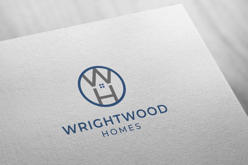
The above logo design intentionally creates a usable negative space of the intended shape by placing the letters “W” and “H” one above the other instead of aligning them next to each other. Such planned placement of text characters and other design elements helps make the most of white space in your design.
Need help designing negative space logos like this one for your brand? Get KIMP!
3. Carve out relatable symbols/shapes
When you carve out negative spaces of particular shapes in a design, choose to create easily recognizable and meaningful shapes. This makes it easier to understand that there is an intentional white space detail in the design.
Besides, such intentional meaningful shapes also help add a layer of meaning to your design and subtly convey a message or narrative. For example, the below design incorporates a lightning bolt symbol in the white space between the letters in the lettermark so as to relate back to the fact that it is an energy company.

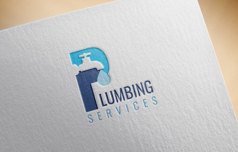
KIMP Tip: Wondering how to identity these meaningful and relevant symbols to create in the negative space of your design? Take cues from your products and services. Getting literal makes your logo simple and instantly recognizable. Like the tap symbol in the below logo for a plumbing service.
4. To keep it minimalistic, use passive negative spaces
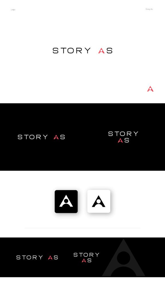
What if you want to amplify the message in your logo by adding a visual component but do not wish to steer away from the minimalistic theme running in the design? Make clever use of passive negative spaces like those between letters, the counters, eyes, and apertures within characters. This way you do not alter the size of the design or its simplicity. And yet you manage to add more depth to the design.
The below logo design seamlessly blends the human silhouette into the counter and aperture of the letter “A”.
Yet another example is the logo design here. This one replaces the traditional counter in the letter “D” with the imagery of a graph to resonate with the finance industry the brand belongs to.

KIMP Tip: When blending symbols into characters, prioritize readability. The additional detail you add should not make the characters unrecognizable.
5. Combine elements for layered interpretations
One of the best uses of negative space will be to create overlapping elements for a more impactful visual narrative. Strategically overlap positive elements to create white space shapes within the gaps.
The foreground elements will appear more prominent, while those revealed in the white space become secondary, adding layers of information. The below logo does that by creating a second symbol within the first one, by creating white space.

6. Enhance negative space with diverse design elements
We’ve been talking about treating negative space as an influential design element rather than just a void. But this is not possible if you do not combine white space with other design elements like colors.
For example, for the negative space to work, you need to choose contrasting colors between positive and negative space elements. Otherwise, the white space and the details you create in it go unnoticed.
Furthermore, if you are looking to play with the perception of the negative space, use colors, textures, and patterns to your advantage. For example, the below design uses a vibrant color palette to ensure that the ample negative space used does not represent sophistication. Because here the theme the design is going for is more on the playful side and the colors help establish that.

Tap Into the Power of Negative Space in Design With KIMP
To conclude, there are many techniques and considerations for leveraging negative space effectively. From boosting clarity and focus to enhancing aesthetics and storytelling, the benefits of negative space in design are undeniable.
Remember, mastering negative space takes practice and experimentation. Don’t be afraid to explore different techniques and find what works best for your design goals. Ready to unlock the full potential of negative space and create stunning designs? Sign up for KIMP today!
Or register now for a free 7-day trial!


