Abstract Logos Uncovered: Conveying Your Brand’s Story Without Words
Have you ever looked at a logo and thought, ‘There’s more to this than meets the eye?’ That’s the power of an abstract logo – a design that goes beyond the literal, sparking curiosity and leaving a lasting impression. Sure, a straightforward visual representation of what the brand offers might get the job done. But will it create that “wow” factor that helps your brand stand out? Probably not! That’s why several brands choose abstract logos.
But here’s the thing: abstract logos can feel tricky. You want a design that sparks curiosity and draws viewers in, but not one so cryptic it leaves them scratching their heads. It’s more like a balancing act between intrigue and obscurity. That sweet spot is where you should be when designing abstract logos and this blog will tell you how.
But first, let’s talk about some of the benefits of abstract logos in branding.
- The Key Benefits of Deploying Abstract Logos in Branding
- 10 Actionable Tips for Designing Effective Abstract Logos
- 1. Weave a memorable narrative into the design
- 2. Align the design with the brand’s spirit
- 3. Create a visually stable design
- 4. Experiment with various visual representations
- 5. Find a way to tie back to your products or services
- 6. Identify relevant color palettes to add more meaning to abstract logos
- 7. Less is more in abstract logos
- 8. Design with a purpose – layer it with meaning
- 9. Make the most of negative spaces
- 10. Ensure versatility
- Tap Into the Power of Abstract Logos With KIMP
The Key Benefits of Deploying Abstract Logos in Branding
Abstract logos are those that incorporate a visual element without giving away the message too easily. Abstract logos are often confused with brandmarks or pictorial logos. However, the one key difference is that a brandmark logo might use an easily recognizable image – a direct illustration of a real-world object. On the other hand, an abstract logo can be a non-representational element or a combination of two or more objects. Or they could also be creative manipulations of some real-world objects.
- Abstract logos are unique – they are visual elements created from scratch, for your brand. Therefore, it’s hard to mimic an abstract logo. And there’s no need to worry about appearing too similar to your competitor.
- Given the purpose-driven representation in an abstract logo, they are often adaptable and can be made to work in various scenarios of your brand’s marketing efforts, when designed well.
- Since abstract logos tap into the nuances of design like colors and shapes to create something with a deeper meaning, they foster an emotional connection with the audience.
- Abstract logos are often like works of art. They are open to interpretation. They encourage your customers to pitch in and comprehend the meaning behind the design. This interaction helps them connect with your brand at a more personal level.
To make the most of these benefits, you need a concrete plan for a thoughtfully designed abstract logo. Let’s talk about a few effective tips to get there!
10 Actionable Tips for Designing Effective Abstract Logos
1. Weave a memorable narrative into the design
One of the best ways to ensure that abstraction works in your favor instead of confusing your audience is to seamlessly weave a relatable story into your design. Every curve, every color, and every element in your design should have a strong purpose. And together they should tell a story your customers can easily relate to.
Take Airbnb’s Bélo for example. At first, it looks like a random squiggle. But the brand’s explanation behind the birth of this symbol makes it so much more meaningful.
Once you know the story and the abstract symbol together you remember the brand more easily! That’s the power of infusing a strong story into abstract logo design.
KIMP Tips:
- When integrating your brand’s unique story into your abstract logo do not overcomplicate the design.
- Think metaphorically. But also include a clear video or image that tells the story in a more descriptive manner. This helps new customers understand the purpose of your abstract logo and its deeper meaning.
2. Align the design with the brand’s spirit
Do you want customers to associate your brand with luxury? Or perhaps vibrant energy? A forward-thinking approach? Use your logo to capture this brand spirit. Or as they call it – your brand’s “vibe”. Abstract logos designed from this perspective vibe with the right audience.
Take Nike for example. The Swoosh does not directly represent the brand name or the products they cater to. However, it resonates with the brand spirit. The brand wishes to connect with people who value their fitness, personal achievement, and a drive to push their limits. Hence their abstract Swoosh logo represents a sense of movement and energy.
KIMP Tips:
- Identify elements that visually resonate with your target audience. This helps you create visual elements that evoke the right emotions.
- Do not create something too generic. While the Swoosh worked for Nike, not many brands can pull off a simple symbol without a touch of personalization.
3. Create a visually stable design
A designer might tell you how important it is to focus on design principles like visual balance and hierarchy, especially in crucial designs like logos. This is because, when you pay attention to these principles, you have a visually stable design, one that looks well-put-together and not unprofessional.
Visual balance, for example, can create a sense of harmony and make your design aesthetically appealing. Take the Adidas Trefoil for example. This unique abstract logo has a perfect symmetrical balance that enhances its aesthetic appeal.
On the other hand, the current Adidas logo with 3 stripes, plays with visual balance creatively to create something that looks stable and solid!
KIMP Tips:
- While symmetrical balance is one of the most common pratices, there are other kinds of balance like the asymmetrical balance that the Adidas stripes logo uses. Identify what works best for your design.
- Symmetrical logos do not always have to be rigid and without dynamism.
4. Experiment with various visual representations
Abstract logos can also be creative manipulations of recognizable symbols. These could be unconventional illustration styles or unique takes on familiar symbols that are relevant to your brand.
Take the below logo for example. The design focuses on the “Insights” component and uses a unique depiction of the human brain to represent the brand.

KIMP Tips:
- When creating abstract logos from existing symbols, research existing designs that push the boundaries of visual representation for inspiration. Combine two or more symbols to create something unique.
- From the illustration style to the overall mood of your design ensure that every little detail aligns with your brand’s traits.
5. Find a way to tie back to your products or services
An abstract logo needs a symbol that’s not too direct. However, you can find metaphorical connections or clever design elements that subtly reference what your brand caters to.
Take the Spotify logo for example. As such the 3 arcs are pretty basic and do not communicate any solid message on their own. However, if you connect them to the brand and look at them as sound waves, the logo takes a whole new meaning, doesn’t it?
Here the brand uses a unique abstract symbol to evoke the meaning of “sound” or “music” without using traditional symbols like a musical note.
Similarly, identify deeper connections to your products or services. These can often be elements that only your target audience understands. That’s even better!
KIMP Tips:
- Tap into the power of visual metaphors. Can you use shapes or visual elements that hint at what your brand does without being overly literal?
- Don’t introduce a connection forcefully. In the case of Spotify’s logo, the moment you think of the connection, you feel that the logo makes sense. That’s how natural the connection between your abstract logo and your company’s offerings should be.
6. Identify relevant color palettes to add more meaning to abstract logos
When using abstract symbols to deliver a strong message, choosing the right colors makes your job simpler. It helps set the tone of your design and ensures that the design appeals to the right audience.
Because color psychology is more influential than you think! Without the right color, your abstract logo design might end up blurring your message.
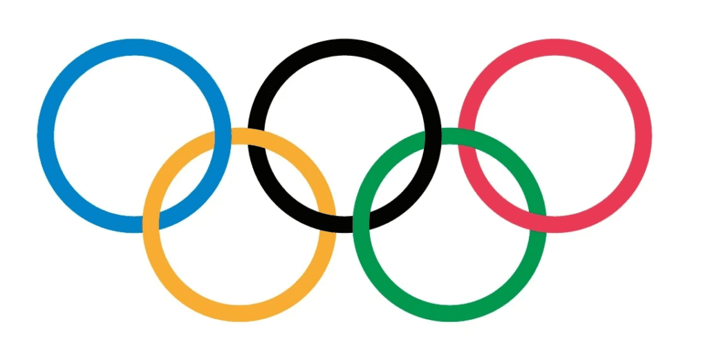
Take the logo of the Olympic Games for example. Superficially, they are just 5 circles. But the diverse colors in the logo and the way the circles are interconnected beautifully communicate the universality of the logo – the diversity and unity in it. While the logo might appear in monochromatic versions in some places, the real depth of the design pops when all the colors are present. That’s the power of colors in abstract logos.
KIMP Tips:
- If you are aiming for a clean cohesive look, stick with a simple color palette.
- Identify colors that resonate with your brand’s personality. If your brand were a person, if that person were a color, what would that color be? Answer that question and then you have the perfect brand color to add to your logo!
7. Less is more in abstract logos
Minimalism is an underrated strength in logo design. Some of the best logos around the world, the well-recognized ones, are simple. This is because when you choose to go minimalistic, you are trimming off any excess details that can lead to ambiguity.
Take the below design for example. Modern, elegant, and most importantly, minimalistic. Designs like this one are both versatile and memorable.
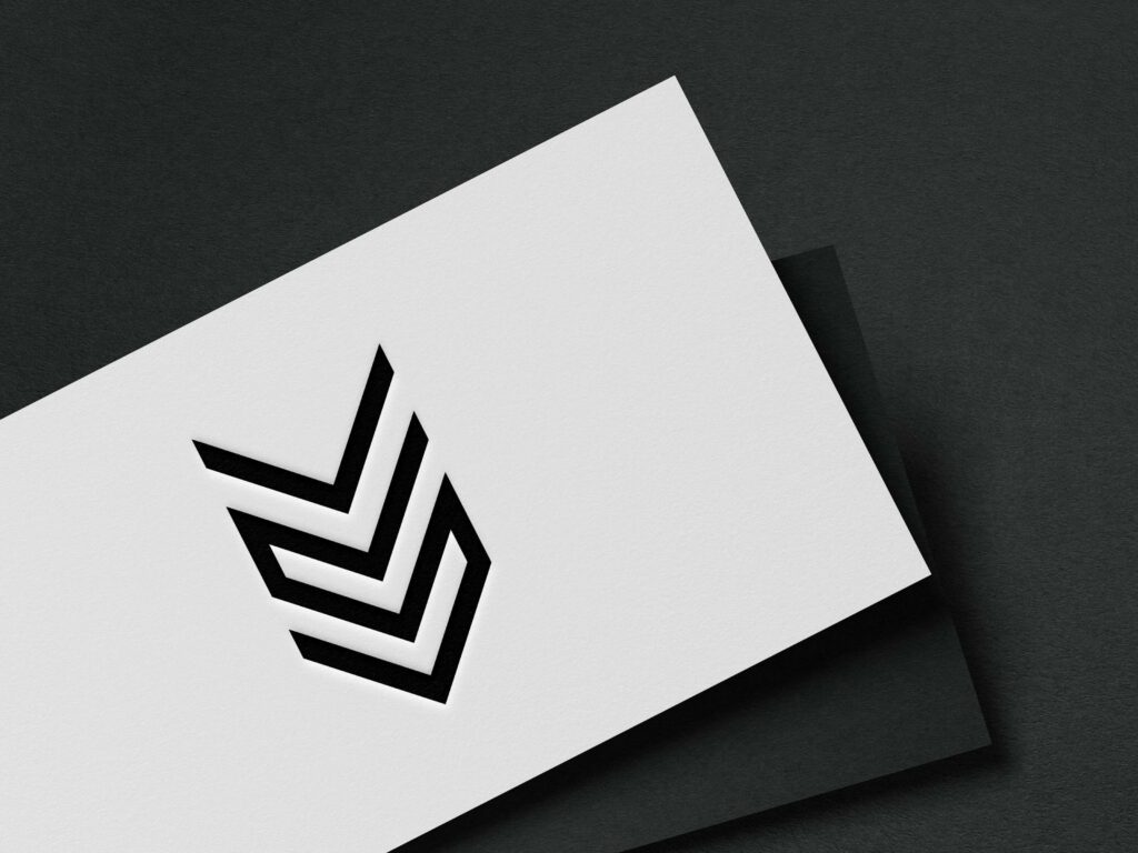
Most importantly, minimalistic logos are easier to scale. On a small business card or a massive billboard – minimalistic abstract logos communicate their message clearly and effectively.
KIMP Tips:
- Even the simplest design can look noisy when you add too many colors. So, pick a limited color palette to make minimalism work in abstract logos.
- Minimalism does not have to mean boring. Add a creative twist – a surprise factor that breaks the monotony and makes the logo easier to remember and recall. Like the bite taken out of the apple in the Apple logo!
8. Design with a purpose – layer it with meaning
What if you could make the abstract symbols in your logo work in multiple ways? Take the below logo for example. At first glance, it looks like a unique abstract shape that adorns the logo. But look closely and you’ll realize that the symbols also form the letters “C” & “H” therefore qualifying the design for a monogram as well!
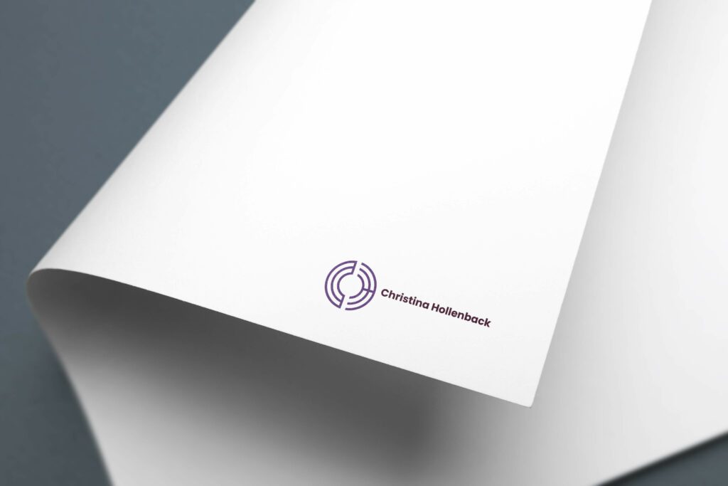
Now that’s an interesting use of space don’t you agree? You have a unique abstract logo that also doubles up as a monogram which is perfect for a personal brand!
Similarly, when designing abstract logos, layer your design with hidden meanings. This creates a sense of intrigue and encourages viewers to engage with the design while also helping your brand stand out.
KIMP Tips:
- Ensure that you do not compromise on legibility for the sake of aesthetics.
- Avoid intricate details when combining different interpretations. You do not want a complicated design!
9. Make the most of negative spaces
Negative space can be a powerful tool in logo design. Because manipulating the negative space lets you add an extra layer of meaning without taking up extra space.
The abstract symbol in the below logo depicts how you can add or remove negative space to add a unique twist to your design. This design achieves it by creating negative space within the gear symbol. And this negative space resembles the letter R for the brand name and the pipes in the design represent plumbing. So, together the negative space created add extra depth to the design.
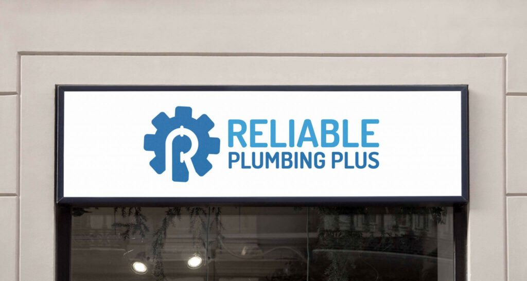
Logo design by KIMP
KIMP Tips:
- Experiment with different negative space elements by adding symbols or letters relevant to your brand.
- Do not overcrowd the design by adding too many elements in the available negative space or by creating so much negative space that the foundational shape is not clear.
10. Ensure versatility
When designing abstract logos, ensure that you consider the versatility of your design. In the digital landscape, in an era where print is also still relevant, your logo will appear in different versions on different surfaces.
It’s not just about scaling the design up and down. It is about morphing it into different versions when animating your logo for social media or your website. It’s also about seamlessly adapting to the application.
Take the Slack logo for example. The unique abstract logo effortlessly moves and communicates the intended message in the below video.
KIMP Tips:
- Clear layouts and well-defined shapes ensure that your logo looks good even when animated.
- Avoid complicated elements that can get lost when your logo appears on different backgrounds.
Tap Into the Power of Abstract Logos With KIMP
As you can see, abstract logos provide you with a stunning way to represent your brand. They help your brand cut through the noise and make a statement. And they also help establish your brand’s unique personality. However, to tap into these benefits without creating something cryptic and confusing, working with professional designers might be a good decision.
A cost-effective way to gain access to a dedicated design team that can take care of all your branding and marketing designs in addition to logo design will be an unlimited design subscription – like KIMP!
Register now for a free 7-day trial!


