Ecommerce Packaging: Creating Memorability With Canva Designs
Sometimes even brilliant products go unnoticed in the ecommerce space. Sometimes, it is the packaging design to blame. After all, for businesses desperately battling for customer attention, packaging design isn’t just another box to tick – it’s the secret weapon that grabs eyeballs and leaves a lasting impact.
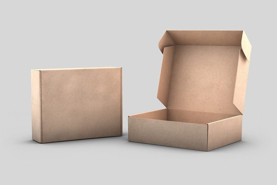
“What is in a box,” you ask. On Instagram, the hashtag #unboxing has more than 4.39 billion posts. And there’s a steady trend for the search term “unboxing video” on TikTok and YouTube.
If you observe all these trending unboxing content, they mostly feature exciting packaging designs. Uninspiring boxes almost never make it to social media. That’s a good proof of the need for unique ecommerce packaging. Let’s explore the possibilities together! Shall we?
We’ll also look into some quick and useful tips to enhance your Canva designs for your packaging and label design projects.
Alright, let’s tackle the burning question first: Do you really need to break a sweat over crafting a one-of-a-kind packaging design for your ecommerce brand? Can’t a standard box that simply safeguards the contents get the job done? Let’s find out.
- Reasons why you need to strive for a unique packaging design for ecommerce
- Creating better ecommerce packaging + tips for Canva designs
- 1. Go beyond the outer packaging
- 2. Be mindful of the material you choose
- 3. Know where your design goes
- 4. Consider the size of the box and the dimensions of the design
- 5. Make a list of the must-have elements in the packaging design
- 6. Pick the right colors and fonts for your packaging
- 7. Visualizing your design
- Make the most of Canva designs for ecommerce packaging with KIMP
Reasons why you need to strive for a unique packaging design for ecommerce
1. Brand differentiation
The ecommerce industry is booming, set to skyrocket to $6.3 trillion in 2023 and an astonishing $8.1 trillion by 2026. This explosive growth is a clear sign of intense competition in the online realm.
In such a fiercely competitive landscape, brand differentiation is crucial for ecommerce businesses. That’s where unique packaging design comes to the rescue. By capturing attention and leaving a lasting impression, your packaging design sets your brand apart from the crowd. With billions of online transactions happening, make sure your packaging speaks volumes about your business.
2. Brand awareness
When your ecommerce packaging is unique, it attracts attention and gets some social media shares as well. Now if that happens, it means better visibility for your brand. And therefore that would be a measurable step toward increasing brand awareness
3. Creative positive brand image
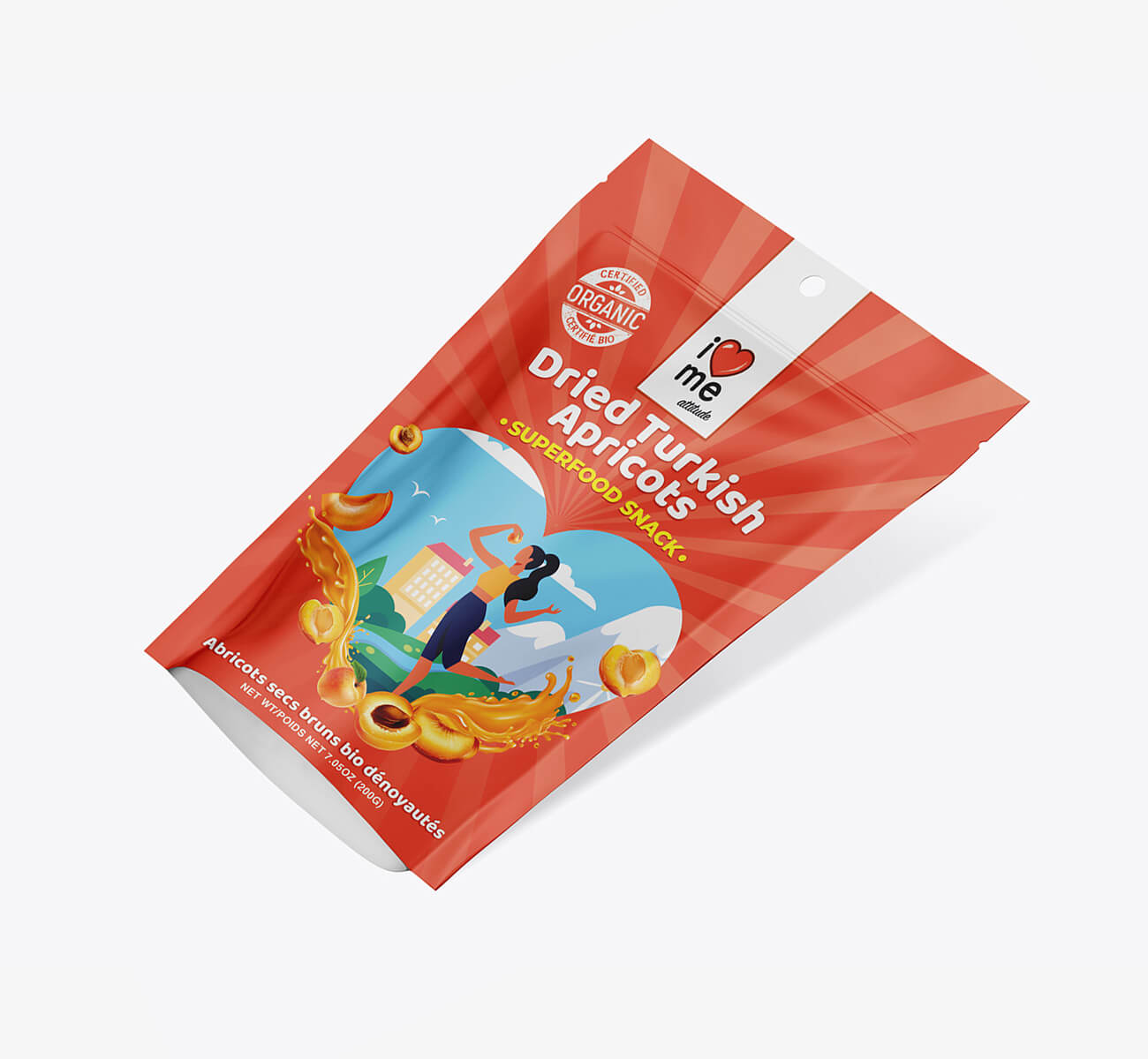
Moreover, unique ecommerce packaging does not just help people instantly recognize your brand but also remember it better. This is possible because a unique and sensible packaging that is also easy to handle creates a positive brand image.
After all, creating excitement about your brand is easier when you use exciting packaging designs in place of boring boxes. It shows customers that you are truly invested in your brand and in making every step of the experience better for them.
All of these factors stand testimony to the critical role that packaging design plays in ecommerce branding. Having spoken about the why, let’s get to the how. How do you create stunning ecommerce packaging that puts your brand on the map?
Creating better ecommerce packaging + tips for Canva designs
If you have created Canva designs yourself, you know how easy it is to quickly put your ideas together. Packaging is not exactly a category that you will find on Canva. But as you know packaging design is all about designing in the right dimensions and choosing the most suitable layouts, orientation, and colors depending on the surface where the design is going to get printed. So, you can easily start with a blank canvas of custom dimensions and work your way up.
Or if you are only planning to design labels, then you are in luck because the Canva labels assortment is a great place, to begin with. Whether you are designing for direct print on packaging or standard labels, here are some design tips you might like:
1. Go beyond the outer packaging
The outer packaging design and material are definitely essential details to focus on. But they are not the only details to think about.
Think of the best unboxing experience you have had. It could have been a small home decor item or a large kitchen appliance. Make a list of all things you remember about this experience. In addition to the aesthetically appealing and durable outer packaging, what other factors caught your attention?
- Was it the unique shape of the box and the use of just the right amount of packaging materials?
- Or maybe the use of appropriate fillers to protect the product?
- Was it a personalized packaging insert that encourage you to take the next step?
Once you have this list you will have a concrete set of items to work on for your ecommerce packaging design project. With that in your hand, let’s get to the next step – identifying the right outer packaging material.
2. Be mindful of the material you choose
In fact, this is the one factor that determines whether you need to get your designs printed directly on the surface or get a label. Because even the most stunning design will not make much of an impact when not executed correctly. We’ll give you a few examples.
Cardboard
Cardboard ecommerce packaging is versatile and comes with excellent printing capabilities. By choosing the right base colors you can make your design pop.
Glass/plastic
For glass and plastic packaging, the graphics are mostly printed on a label. In some cases, there is transparent base material used and in such cases, the label should be mindful of the aesthetics of the contents as well. The choice of colors for the label design, for example, depends on the color of the product.
Metal
Metal ecommerce packaging can be tricky to work with. This is another situation where you will be using labels rather than directly printing on the surface. But the factor to pay attention to will be the light reflective surfaces on which the label will be applied. How will this light reflection affect your design? Similarly, think twice before using glittery graphics, shiny textures, the use of shimmery colors like gold and silver. Because combined with the light reflective surfaces that the labels go on, these could cause a lot of eye strain.
Eco-friendly materials
When you are using eco-friendly materials for packaging, the idea is to make a responsible step forward. And a minimalistic design might not always align with an eco-conscious ideology. Therefore, a more minimalistic design that captures the commitment to sustainability will be a good choice.
3. Know where your design goes
In the case of ecommerce packaging, if it is the design for the outer box, consider the shipping tape positioning, the shipping label, and other elements that will go on the box. For this reason, you cannot clutter the surface with too many design elements. A simple design with your brand elements like the logo taking center stage will get the job done.
If this will be an inner box placed in a mailing envelope, you can make the most of the available space. This is where your design can cover the whole surface. And in this case, you will be designing each side separately ensuring that there is a smooth-flowing design on the whole.
4. Consider the size of the box and the dimensions of the design
The chosen box should not be too big for the product or too small. Designing around your product is the best way to optimally package it without using too much or too little packaging material. While the latter fails to protect the product the former disappoints customers as they see excess packaging as a non-eco-friendly approach.
Once you have chosen the right box size for the product, you need to identify the right size for your design. Will it cover the whole box or appear centered or in a prominent corner? Depending on this, find the optimum size for your design based on the outer box size.
Creating Canva designs of custom sizes is easy. Select the “Custom Size” option when you create your design and key in your preferred dimensions.
In the case of designs to be printed over rectangular ecommerce packaging boxes, you will be creating two or three different files since there are three different pairs of surfaces to tackle.
KIMP Tip: Deciding the design dimension and placement so as to make the maximum impact can be challenging for non-designers. That’s where a team of professional Canva designers and their experience in handling product packaging design projects can be of help.
5. Make a list of the must-have elements in the packaging design
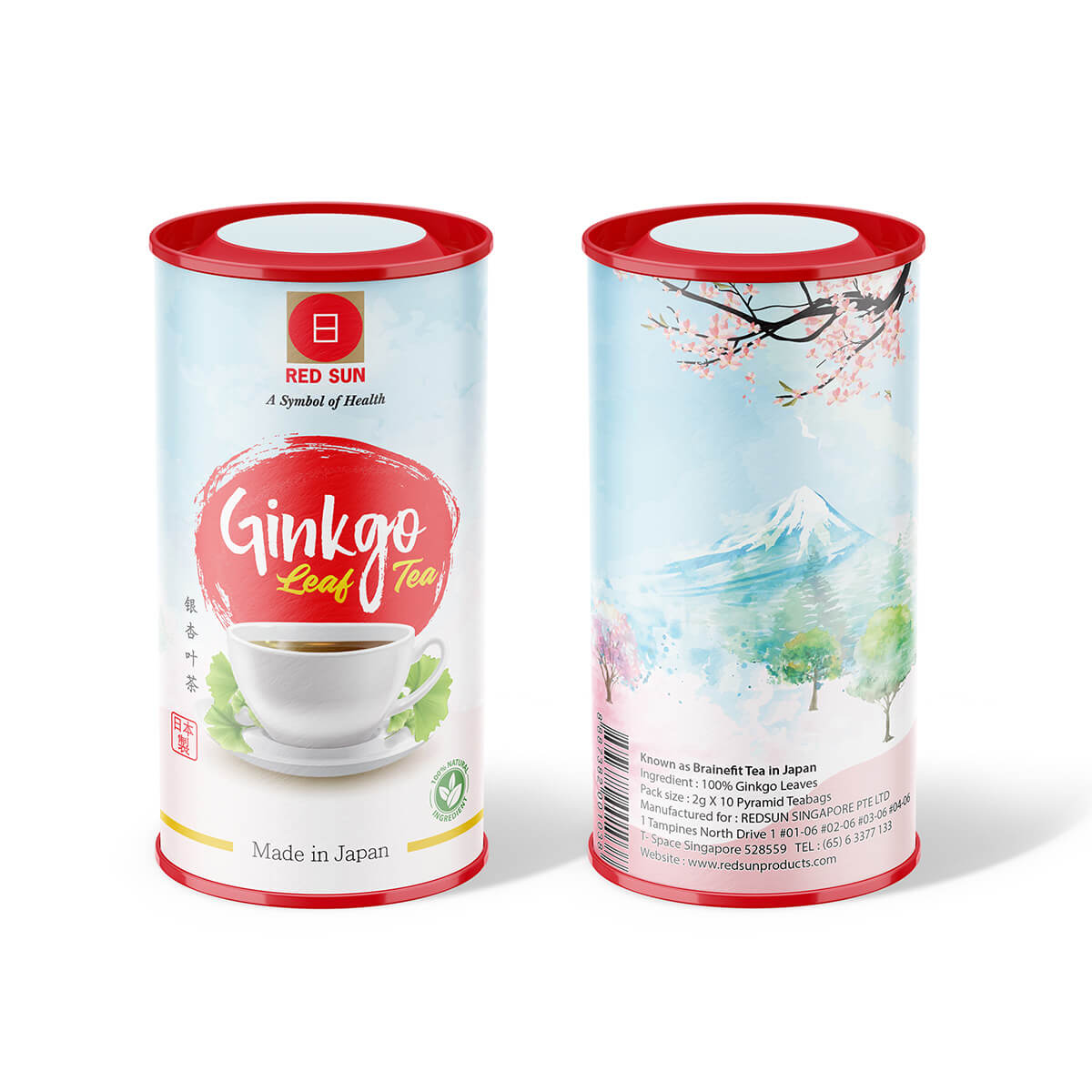
Your ecommerce packaging design is a powerful brand asset, but it shouldn’t be overloaded with everything about your brand. Instead, focus on making it customer-centric and user-friendly. Use the packaging to introduce the product and create a memorable, concise impression of your brand. To do this, make a list of the must-have elements in your packaging design:
On the outer packaging box
- Brand name
- Brand logo
- Brand Tagline
On individual packaging for products
- All the above brand elements
- Product name
- Product photo/illustrations
- Product description/usage instructions
- Disclaimers (if any)
- Company information
- Contact details
- Barcode
Armed with your list, finding the perfect presentation for your design becomes a breeze. With the information and packaging dimensions in mind, you can effortlessly determine where to utilize text and visuals for effective message communication.
This list also makes it easier to sift through the Canva templates for labels and find the layout that suits your requirement. In the below assortment from Canva labels, notice that some are detailed layouts with a place for everything while others are basic branded labels.
6. Pick the right colors and fonts for your packaging
Colors
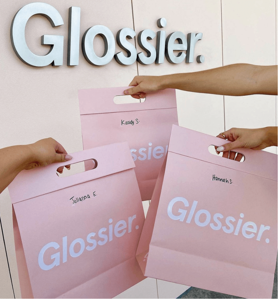
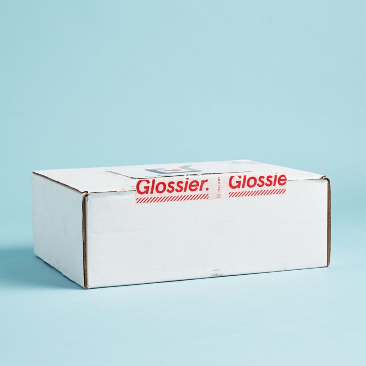
In some cases, you only need to prioritize brand colors but in others, the chosen colors should reflect the product. The colors you choose should have specific roles to play. For example, while most Glossier products are shipped in packaging boxes in pinks and pastels, some limited edition bundles use minimal white and black designs.
When designing for plastic and glass packaging where the product color is visible on the outside, the colors you choose for your ecommerce packaging design should complement or contrast with the color of the product and create a harmonious combination.
Notice how the below packaging label incorporates colors that go well with the product color.
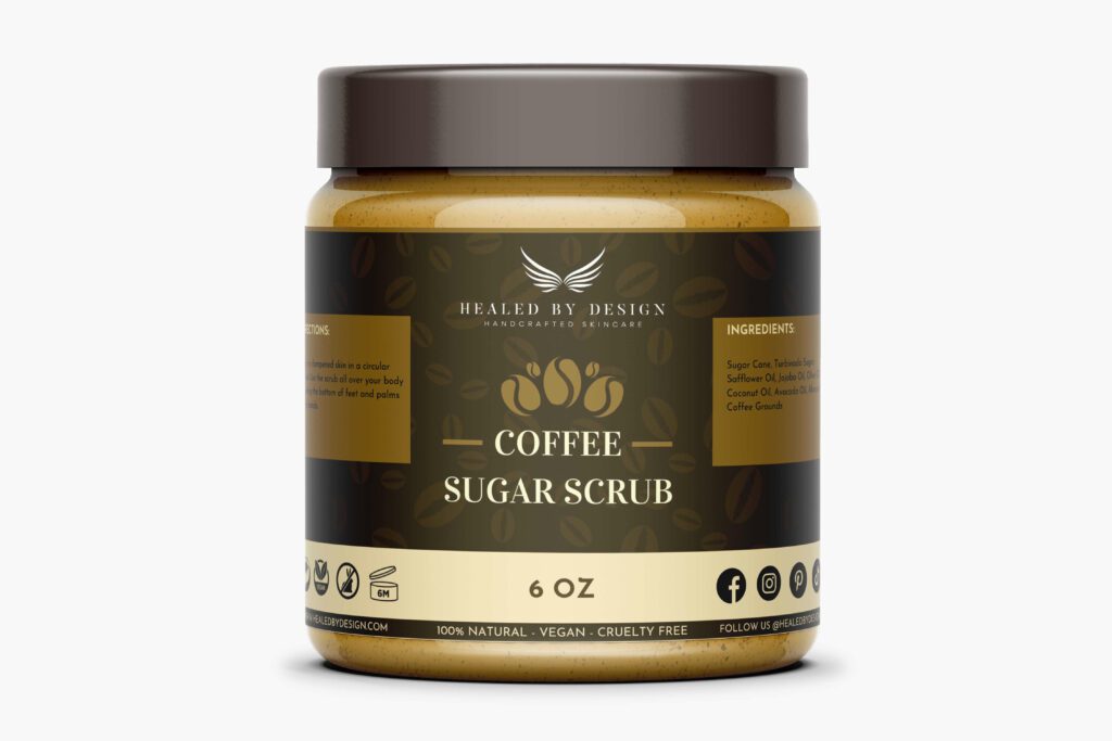
KIMP Tip: While you focus on brand identity and product relevance for your colors, also consider contrast because it affects the legibility of text and differentiation of various elements in the ecommerce packaging. Canva’s library of color palettes is a great place to look for inspiration.
Fonts
The main attribute to prioritize will be the legibility of these fonts. This ensures that the message on the packaging is clear and easy to read.
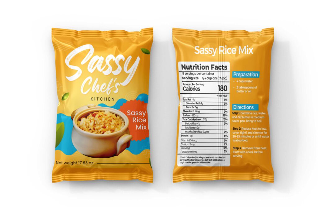
Then comes the aesthetics. Use only one or two different fonts in one design and ensure consistency throughout. If the fonts and their styling on the front side of the box look different from that on the back side, the design looks clumsy.
If you are unsure if the chosen fonts look good together, experiment with the font pairs recommended by Canva, and then you can swap them for your own. For example, the below design uses a legible sans-serif font to keep the entire text easy to read.
7. Visualizing your design
Translating digital masterpieces to tangible packaging can be challenging. Designs that captivate on screens may fall short in the physical realm. But don’t worry! Here are the steps you can take to ensure a smooth transition from digital to print:
The first step is to plan your design mockups. Canva’s Smart Mockups app is a decent option to begin with. You can apply your image directly to one of the available mockups to get an idea. But there are a limited number of mockups and you might not get a panoramic view of the design.
The other option which is more dependable will be working with a professional design team for all your product and packaging design mockups or using a mockup designing tool where you get a 360-degree view of your design. This helps you tweak your design on the whole or specific aspects like the positioning of the various elements.
Another little detail to remember will be to save your design in the right format and color profile. Professional designers use CMYK for print designs. On Canva, you can also use the PDF Print option to save your design provided your mockup tool allows PDF input. Otherwise, opt for a standard image file with crop marks and bleed marks.
Make the most of Canva designs for ecommerce packaging with KIMP
At every stage of your journey, you’ll come to appreciate the invaluable assistance of professional designers when it comes to crucial brand designs like packaging. These designs begin as 2D concepts on digital screens but ultimately end as impactful, three-dimensional printed packaging. Therefore, even the slightest misstep during this transition can have significant consequences.
Considering that your ecommerce packaging acts as a representative of your brand, taking risks is simply not an option. That’s precisely why collaborating with professionals who specialize in refining Canva designs for packaging can ensure a seamless process.
Want to know how a KIMP subscription can take your Canva designs to the next level? Book a call with the KIMP team today.

