
E-commerce Branding: Crafting a Memorable Logo & Brand for Your Online Business
Looking for e-commerce branding inspiration? You’re in the right place. Today, we’re diving into the world of e-commerce logos.
But there’s more to successful e-commerce branding than just a great logo. To stand out in the competitive digital marketplace, you need a holistic approach. So, this blog delves into the branding strategies of top-tier ecommerce brands, examining their logos and overall brand identity.

From global giants to niche players we’ve shortlisted a variety of e-commerce companies. Let’s explore how these brands have built compelling narratives through their logo and brand identity and connected with their target audience.
8 Popular E-commerce Brands: Logo Design & Branding Tips to Take Away From Them
1. Amazon

Talk about the art of subtlety in e-commerce branding, Amazon is perhaps the first name that pops into your mind. Their logo demonstrates that to communicate a strong message you do not always need too many complicated details.
Their wordmark logo complemented by the single orange arrow is the epitome of simplicity in branding. The arrow directed from “A” to “Z” is a subtle nod to the brand’s extensive catalog. Their promise of delivering everything from A to Z.
Moreover, Amazon’s commitment to customer satisfaction is subtly embedded in their branding. The smile in their logo isn’t just a graphic element; it’s a reflection of their customer-centric approach. Every interaction, from browsing to purchasing to delivery, is designed to leave the customer satisfied and happy, reinforcing the ‘smile’ concept visually and experientially.
In addition to their logo, they use a consistent color scheme of black, white, and orange, along with the blue for Prime which is evident across their website, app, and packaging. This consistency helps reinforce the brand’s identity and makes the brand instantly recognizable.
So much so that spotting that curved arrow on a packaging box leads to instant brand recall.

KIMP Tip: Less is more in e-commerce branding. Therefore stick to a simple design and consider the symbolism behind your design and ensure it aligns with your overall brand message.
2. eBay

eBay’s logo and branding are testaments to the effectiveness of a vibrant brand identity in the world of e-commerce. The cheerful color palette reflects the joy of shopping.
To maintain a friendly and approachable demeanor which is very much essential for an e-commerce brand, eBay uses all lowercase letters in the logo similar to Amazon.
The four colors used in the logo are a critical component of the eBay brand identity and they consistently appear across their ads, websites, and other designs.
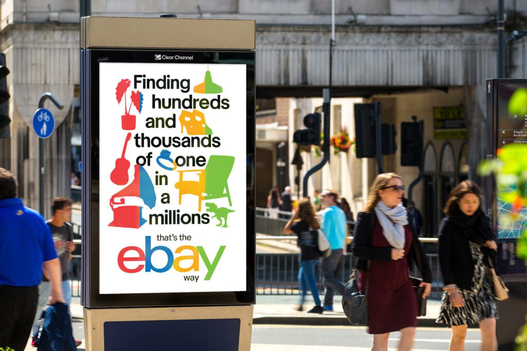
In short, the eBay logo and brand exemplify the use of a strong color palette to reinforce the identity in e-commerce branding.
As you can see in the above ad or even in the commercial below, the brand’s tone of voice is cheerful aligning with the vibrant color palette.
On another note, eBay’s branding goes beyond just the logo and colors. They have successfully created a community-driven platform where buyers and sellers can interact, fostering a sense of trust and reliability. This approach is reflected in their user-friendly website design and customer service, which are crucial in building long-term relationships with users.
Finally, eBay’s brand colors are also relevant to their emphasis on inclusivity and diversity. By featuring diverse groups of people in their advertisements and creating campaigns that resonate with a wide audience, eBay promotes a sense of community and belonging justifying this approach.
KIMP Tip: Instead of traditional kerning, the eBay logo uses reduced kerning making the letters appear slightly overlapping one another. This adds visual intrigue to the logo.
3. Best Buy
Considering how competitive and volatile the e-commerce market is, staying relevant is a crucial part of e-commerce branding, and there’s no better brand to illustrate that than Best Buy.
Yellow has been part of the Best Buy brand identity for decades. This bright and cheerful color not only captures attention but also evokes feelings of optimism and affordability, which are key to Best Buy’s brand promise.
The price tag symbol is another critical component of their identity. It serves as a visual shorthand for value and savings, reinforcing the brand’s focus on providing great deals and discounts.
Now, about the one thing that makes the Best Buy brand unique. Their 2018 rebranding established that the brand is serious about modernization, about keeping up with the times.
The recent Best Buy commercial featuring their holographic mascot, spokeshologram, toughens the brand’s stance in embracing new technology.
KIMP Tip: If you are taking cues from Best Buy for your e-commerce branding strategies, then it’s about identifying a clear purpose for your brand and then consistently aligning your brand elements with this purpose. Best Buy has positioned itself as a valuable partner for tech-savvy consumers. So, what would you like to position your e-commerce company as? Ensure that your logo, tagline, and tone of voice all support this idea.
4. Depop
Depop, a renowned London-based e-commerce company demonstrates the approach of creating a brand identity resonant with the target audience. By leveraging a deep understanding of the cultural and stylistic preferences of Gen Z and young millennials, Depop has successfully carved out a unique niche in the competitive e-commerce market.
Their bold logo is also a bold statement of individuality and rebellion against norms. The oversized, sans-serif typeface is a deliberate departure from traditional logo design, mirroring the platform’s core value of non-conformity. This reverberates the spirit of Gen Z and young millennials that the brand targets.
Depop’s success in e-commerce branding also lies in their ability to cultivate a strong sense of community and belonging among their users. Their overall brand identity is built around the mantra, “We the Unfollowers”. This is their way of staying relevant to the generation seeking to define their own style and identity.
KIMP Tip: Depop’s successful branding is a testament to the power of authenticity and community building. Their approach highlights the importance of not just creating a brand, but fostering a movement that users feel a part of. Moreover, it is also proof that e-commerce branding feels incomplete without a clear understanding of your target audience and their values and aspirations.
5. Zalando
The German e-commerce retailer Zalando has a logo that’s artistic and fashionable, fitting for a brand in the fashion segment. The sleek design of the logo encapsulates the brand’s dedication to offering trendy and stylish clothing, making it immediately appealing to fashion-conscious consumers.
Similar to brands like Amazon and Best Buy, Zalando’s brand identity is built on one solid color and a unique logomark. Some sources speculate that the signature orange logomark representing this brand is perhaps derived from the design of a stiletto heel. While there is no concrete story defined behind the symbol, it holds a special place in the brand’s identity.

Zalando’s logo complements its brand identity by reflecting the brand’s modern and fashion-forward image. The clean, minimalist design aligns with the platform’s focus on creating a seamless shopping experience. The logo’s simplicity allows it to adapt to various marketing channels and touchpoints without losing its impact. This also comes from their use of a single color that ensures that the meaning and impact of the logo are not lost in diverse applications.
KIMP Tip: Zalando’s minimalist approach has allowed the brand to focus on their core message: fashion. So, identify a visual style that suits your brand’s personality and stick with it.
6. Pinduoduo
One other way to approach e-commerce branding is to pack layers of meaning or a clear visual narrative in your logo and other brand elements. The heart with the assortment of products illustrated in their logomark effectively captures their diverse catalog. And the brand color red captures the excitement of shopping.
The Pinduoduo brand is built on three core principles – “Benefit All, People First and being More Open.” The red heart in their logomark goes well with these principles and their objective of putting “people first”. The symbol also aligns with their community-focused approach in branding.
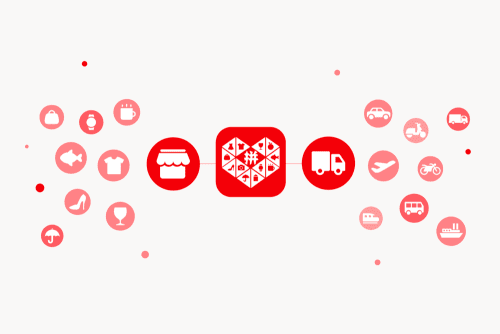
KIMP Tip: The other connection between the heart symbol and the Pinduoduo brand is that the brand is about group buying and social e-commerce. The symbol accurately represents a sense of community. In short, the Pinduoduo brand’s identity exemplifies how packing multiple layers of meaning into your logo and other brand elements can create a memorable brand.
7. AliExpress

AliExpress’ logo is a simple yet effective wordmark. The typography is modern and clean, reflecting the platform’s focus on efficiency and user-friendliness.
AliExpress’ recent logo redesign incorporates a distinctive yellow checkmark, symbolizing trust, reliability, and quality assurance. The checkmark is integrated seamlessly into the wordmark, creating a modern and memorable visual identity. Moreover, it blends into the wordmark without taking up additional space thus amplifying the impact without complicating the design.
Another vital element of the AliExpress brand is their recently introduced brand ambassador, Ayi.
Firstly, their core color palette keeps things fresh and unique helping the brand stand out in a competitive space. Their fun new mascot builds on this vibrant personality of the brand. As depicted in the video, the color and traits of the mascot complement the logo.
KIMP Tip: AliExpress’ brand identity is a reminder that mascots can humanize a brand and can therefore be valuable entities in e-commerce branding. In fact, mascots can create a more relatable and memorable brand image, making it easier to build a loyal customer base.
So, now is a good time to start working on your brand mascot and consistently incorporate it into your branding.
Need help designing a mascot for your e-commerce brand? Get KIMP!
8. JD.com
JD.com, one of the most popular Chinese e-commerce companies is another example of the effectiveness of mascots in e-commerce branding.
JD.com’s logo features an illustrated dog. This playful mascot, named Joy, is a symbol of loyalty and trustworthiness. Their mascot reinforces their focus on customer satisfaction and building lasting relationships with users.
The brand positions itself as a reliable source of high-quality products, offering a wide range of authentic items across various categories. Their vision is “Being the Most Trusted Company in the World”. And one of the best ways to build trust is to break any barriers and seem approachable.
The friendly and expressive mascot and the effective use of it across the ads from JD.com make the brand a friendly face, one that’s trustworthy.

KIMP Tip: Whether it is a mascot or a logomark, any pictorial element you choose to represent your brand should be a precise representation of what makes your brand unique. About what you strive for. In the case of JD.com, it’s about winning trust. So what is it for your brand?
Create a Memorable Brand Identity For Your E-commerce Brand With KIMP
A well-crafted e-commerce logo is more than just a pretty picture; it’s a visual representation of your brand’s essence. It should resonate with your target audience, evoke the right emotions, and complement your overall branding strategy. Now the question is, how do you design such an impactful logo that elevates your e-commerce branding strategy? By working with a professional design team that understands your brand and translates your ideas into clear and memorable designs. That’s what you get when you sign up for a KIMP subscription.
So, are you ready to take your e-commerce brand to the next level? Register for a free 7-day trial and experience the unlimited design service difference.