Social Media Branding: Create A Social Media Style Guide
Lisa runs a small business and wants to take it up a notch. Fortunately, sales have been good, and she can finally hire someone to take over marketing. However, there is one roadblock she cannot cross.
Any intern or social media manager she hires is constantly asking her for inputs and approvals. Half her days go into tweaking and approving the social media content.

Also, she wants to outsource content marketing and design to focus on business expansion. But, she does not want to end up hand-holding that team too.
She is now wondering, is there a system that can solve these issues for her? She is really excited about the business expansion, but these things are major pain points.
What Lisa needs right now is a social media style guide. A document that details what her social media strategy is and the steps her team needs to follow to stick to it.
If you are in the same position as Lisa, you have come to the right place. Business expansion, hiring teams, and delegating work are all exciting things for everyone. And with a social media style guide, it will become even easier.
Before we explain how to create the style guide, let us take a moment to clarify what it is.
Style Guides: Social Media Branding vs Brand Style Guides
Branding is important for every business, irrespective of the industry or scale. It sets you apart, defines who you are, and gives customers an identity to relate to. Consistency makes your branding designs successful. But how do you achieve consistency? By taking everything on and double-checking for life?
What if we told you there is an easier way? Yes, style guides.
For a business to survive today in this competitive and judgmental world, they need two style guides:
- Brand style guide
- Social media style guide
A brand style guide has all the details that pertain to your business’s branding and how one can represent that in any placement. This applies to marketing, advertising (print and digital), and any social mention whatsoever.
A social media style guide is a document that talks about how to represent your brand on social media specifically. Given how important social media marketing is to a brand’s growth today, this is an indispensable tool in your kitty.
This document will ideally be a subset of your brand style guide to ensure that your social media branding is an extension of your brand persona and maintains consistency. You cannot have one without the other.
If you are looking for ideas and inspiration for your brand style guide, feel free to check out our previous blogs on those topics.
This blog by Kimp will specifically handle the creation of a social media branding style guide with exclusive design tips from the team.
So let’s dive right in.
Social Media Branding: Getting Started the right way
Social media branding. Are you hearing this for the first time and wondering why you need this when you already have branding in place? It’s a fair question, and we would like to point out a few facts to answer this:
- Social media marketing is a major lead generation tool for most businesses today.
- With over 10 popular social media platforms turning business-friendly, every brand needs to establish a presence on at least a few.
- Each social media platform has a unique audience base, content style, and metric to track.
Social media branding can help you define who you are on each social media platform so that you can ace your marketing campaigns.
So how do you start?
- Start by defining your target audience on all social media platforms. Keep this handy because your social media designs and language depend on this information.
- Once you have the information on your target audience, let’s get around to defining your brand personality across all platforms. Are you fun, sincere, or edgy and playful?
- Follow that up with your social media strategy, including long-term goals, short-term goals, budgets, and resource information. This will help you choose your primary and secondary marketing channels.
- Organize your branding and design assets to see how to showcase them on social media. If you have a brand style guide, start there and supplement it with the relevant info on social media marketing.
With these in place, let’s move on to designing your social media branding style guide.
7 steps to designing a Social Media Branding style guide
You know what you need for your social media marketing. You also know what you want to say on social media. The struggle is translating all of this cohesively on a document so that your team can follow it seamlessly. We emphasize seamlessly because the internet is always on the lookout for inconsistencies, and you don’t want to be on that list.
So here is your step-by-step guide to creating the most comprehensive and visually accurate social media branding guide.
Excited? Us too. Let’s go!
1) Visualize your brand personality
Remember when we told you to define your brand personality for your social media presence. You might have words like fun, smart, witty, serious, or professional written down. But is that enough? You can express a fun personality in many ways. Adding emojis, using bright colors, pop art, or GIFs – they are all valid forms of expression.
As a brand, pick a few and ensure it remains consistent across platforms. That is why we recommend visualizing your brand personality. This includes:
- The brand colors that are pivotal to your identity
- The font styles you choose for profile pictures, posts, cover images, and so on
- The language you use to communicate and engage on social media.
By visualizing your brand personality, you make it easier for everyone on the team to follow it without confusion. Wondering how popular brands represent their brand personality visually? Check out our guide here.
Kimp Tip: The colors you pick to display your brand personality will be a part of everything you produce for social media, so think strategically and pick the right palette.
If you need any assistance in bringing your brand personality to life, the Kimp Graphics team is always happy to assist. Just sign up for a subscription and you’ll get to work with an experienced design team.
2) Choose a brand voice and tone
This is very important because let’s face it, the internet is not kind to those who make mistakes. And when you are trying to communicate from behind a screen, the job is 10x harder. Your brand voice and tone you adopt must paint the right picture of your brand’s personality and must be something your audience can relate to.
For example, if your primary target audience is a group of professionals, then a professional tone makes sense outright. No matter what your message is, they will expect this tone.
While defining the brand voice and tone, it is important to note:
- the specific phrases that are important for your branding
- using inclusive language (non-gendered pronouns, for example)
- the emotions you want to evoke
Do you want customers to feel happy or thoughtful when they read your content? Can you include emojis and icons or not?
You must also define your brand voice for instances such as:
- Engaging with happy customers and reposting UGC (user-generated content)
- Responding to disgruntled customers
- Responding to comments on content
Include all these details to achieve consistent social media branding.
3) Branding display styles
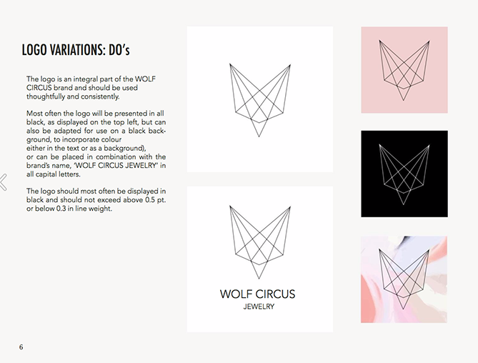
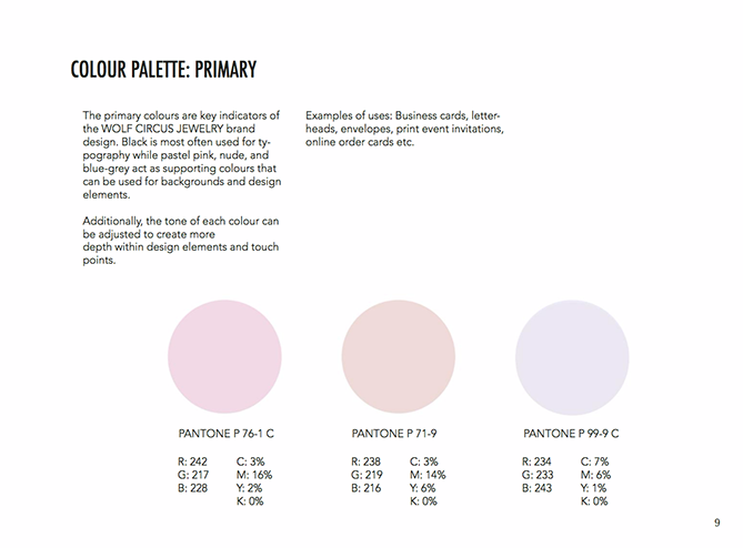
What is social media branding without including the details on displaying your most prominent branding design assets? Of course, your design team knows to include the logo and brand name on all posts – but do they know how? Have you discussed the positioning, background color, or styling? What are the color codes for your branding colors?
These details are essential to creating a comprehensive social media style guide. Creating mockups ensures that even if your manager is not in for the week, the team can pick it up and keep the show running.
Social media is extremely visual, and people remember images far more than they remember text. So, visual consistency is the key to your success here. Ensure that your style guide has all it needs to make that happen.
Kimp Tip: If your branding design primarily has a print-friendly color, ensure that the design team looks up the appropriate color code for its digital counterpart. You want your digital visual identity to match that of your offline one.
4) Pick your social media aesthetic
Aesthetic is a word that has got a new life, thanks to social media. While it is about appreciating the beauty of art, Instagram creators have made it their own. And brands cannot shy away from this trend.
Having a social media aesthetic is a means to connect with your audience. People judge you by the cover on social media, so picking an aesthetically pleasing one is the core principle behind having a brand aesthetic.
Beyond a color palette or a design style, a social media aesthetic is a form of expression. What do you want your customers to feel when they visit your profile? Warm and fuzzy, political, activated or restless – a lot of it depends on the aesthetic you choose.
While this was primarily an Instagram necessity, we see it extending to Pinterest, Snapchat, and TikTok too – so pick one and stick to it as part of your social media branding.
Kimp Tip: Design a mood board of your favorite social media profiles and tell your design team what you like the best in each. This, with the notes on brand personality, will help them come up with an exclusive social media aesthetic for you. You can then include it in your social media style guide.

5) Formulate visual guidelines
You can consider this step to be an extension of the previous section on picking a social media aesthetic. Formulating visual guidelines helps you stick to the aesthetic and your brand’s visual identity with no compromise.
So what should you include in these visual guidelines?
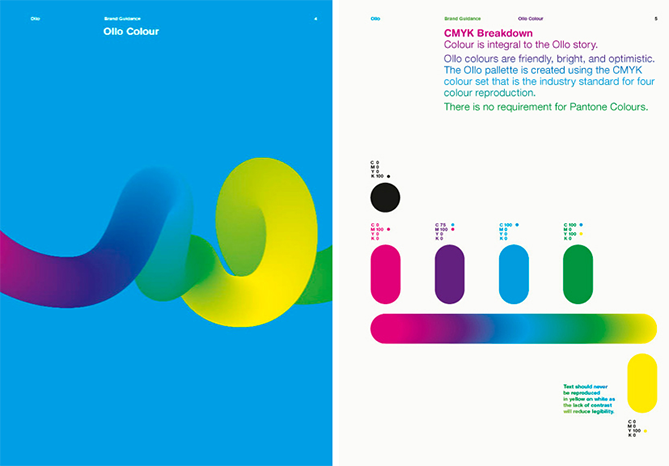
- What are the image styles you want to share on social media – are they minimalistic, contemporary, Pop Art based, vintage-themed, and so on. Pick a few examples and include them in the guide.
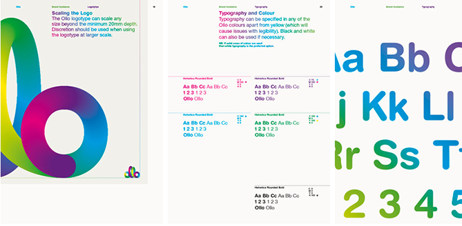
- What are the colors and fonts you use on social media? Where and how?
- Does your brand have an illustration system? If yes, how can you use illustrations and doodles on social media content? Explain use cases and guidelines.
- What are the inclusive and accessibility practices? This can be inclusive imagery, closed captions on all posts, alt text on images, and so on.
Having these in writing with visual representation makes consistency a walk in the park. There is no ambiguity, leaving very little room for error.
If you are not sure what design styles work for you, we strongly recommend trying out a few variations before you go live with any campaign.
And if you are looking for a team to get this done, then Kimp can help. With our Kimp Graphics + Kimp Video unlimited design subscriptions, you can get unlimited requests and revisions for a flat monthly fee.
6) Media types and styling
While this may fall under social media aesthetic and visual guidelines, this deserves a specific section. Yes, we are talking about the media selection for your social media marketing campaigns. Many brands have a video-only or quote-only aesthetic, but having a mix of static and motion graphics content is always a good idea.
So in your social media branding style guide, you must detail:
- The media content you currently share/wish to share – is it images, Quotes, videos, GIFs, illustrations, and more?
- How do they figure in your social media aesthetic? For example, if you have a checkerboard aesthetic, what is the video and images position?
- What is the styling of this media content? Create a style guide for each media type with color choices, background choices, image guidelines, and more for clarity.
No matter what content you are sharing, it is important to stay consistent. So, pick a similar color palette and treatment style for all your media types.
Kimp Tip: To achieve consistent design styles across media types, you need a team that can handle them all. That way, your GIFs and images will look the same, and customers can spot them a mile away.
With a Kimp Graphics + Video subscription, you can get every design you need from the same team and ensure consistency.

7) Consistency in variety: Cross channel social media guide styles
Brands today need a multichannel approach to ensure that they maximize exposure to their target audience. This also means implementing a cross-channel marketing strategy for a seamless user experience.
But this also poses a problem for brands while styling their social media branding.
In cross-channel marketing, you have a presence on multiple channels. The specifications and target audience profiles on each channel are different. Hence, the designs will vary. How do you ensure the right design goes on the right channel?
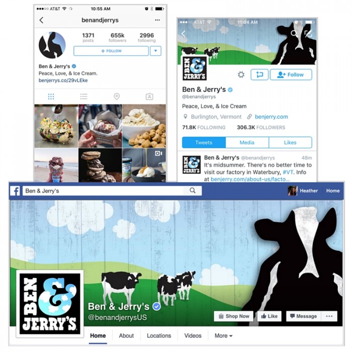
With consistent display pictures, cover images, and mockups for each channel’s content in your social media style guide, you can solve this problem. This way, your social media manager can keep a tab on what you post, and customers get a seamless experience.
Win-win.
Create a stunning social media style guide with Kimp
A social media style guide may sound like a laborious process, but it will all be worth it when it reaps rewards in terms of followers and revenue. And a detailed visual guide can also make life easier for you and your team.
Investing in a style guide is now easier than ever with Kimp’s unlimited graphic design and video design subscriptions. Unlimited revisions, design requests across a ton of different categories, and unlimited brand buckets for marketing agencies – we have it all.
So why wait?
Sign up for the free trial now.
