Instagram Aesthetic: How To Create One For Your Brand
Your Instagram aesthetic is the very first thing that your customers will respond to and notice when they come across your profile. It consists of the colors, the layout, the overall feeling, and tone that your brand’s profile is creating. And when these things come together they can guarantee you a new follower. Or simply push them away.

When you have a great Instagram aesthetic, it will make your profile easier on the eyes. It will also improve brand awareness and recognition. And in turn the success of your business overall.
An Instagram aesthetic has the unique ability to communicate your brand’s personality in a snapshot. And this will help consumers recognize your content in a sea of others’ on their feed! So let’s jump in and find out how you can create a fantastic aesthetic for your brand.
How can you build a successful and cohesive Instagram aesthetic?
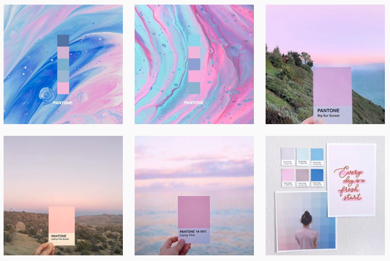
When you first start thinking about how to create an Instagram aesthetic, you need to research and find out what resonates with your brand (and audience) best. Should it be colorful? Black and white? Include dark images? You will also need to consider what kind of images or Instagram Reels ideas you will be posting. A mood board for these ideas will provide you with a consistent reference point. You can use platforms like Pinterest to create mood boards.
It can also help to do a social media audit to take stock of which of your posts have been engaging your audience best.
How should you create your mood board?
When you do get into it, be sure to include a wide range of colors, patterns, and textures. You can also include some quotes – these are handy not just as examples of the type of post, but also as references for the types of fonts you’ll use. Your mood board should be a complete visualization of what you would like to represent and what you would like your brand to encompass.
Don’t fall into the trap of simply sticking with one type of content. When you have a color palette that is cohesive, you can actually include an assortment of textures, themes, and typefaces.
How to edit a photo for your feed on Instagram
When you get to editing images for your feed, remember that to create an Instagram aesthetic your image edits should be consistent. You can actually achieve this by choosing the same filter for your images. To give your imagery a more consistent look, tools like Adobe Lightroom are helpful.
Maintain the balance on your feed
A big part of going from random posts to an Instagram aesthetic is the balance that is created. Once you have edited your images, you also need to pay attention to how they will look when they are arranged next to each other. It is very important that you create a sense of balance on the feed, so that it makes sense to those who visit your page. It will also ensure the feed does not look cluttered. The people who visit your feed should be able to move through it with ease. And focusing on the big picture will help with that.
A good way to go about this would be to place busy images next to ones that have a more minimalistic design. You can mix up the images that you use to sell your products with user generated content, trivia, lifestyle related content and others. You can also try out grid images (when you split an image into multiple, consecutive posts) to create statements with unique focal points.
Maintaining consistency when you create an Instagram aesthetic
It’s not just about your feed, it’s about your Instagram Stories too! Having Instagram Stories that are cohesive, will help you build your brand and also keep your customers coming back for more. To achieve this, make sure you’re using the same color palette, fonts and effects throughout.
Brands today are focusing on creating well-designed Stories that will stand out from the competition and will make people want to check them out, without just swiping by.
One way to achieve this for your brand is to get some great templates designed. This way you can quickly update the pre-designed layouts with graphics, texts and/or animations for new content. And you can do all this while maintaining your Instagram aesthetic. If there is a clear difference between your feed and your Stories, you are missing out on the chance to let new audiences get to know your brand. You will also reduce the chances of creating a strong and lasting impression.
Keep things scheduled
Plan ahead or plan to fail. We hate to break it to you but if you don’t schedule your content and map out how your content will appear, you won’t have much of a chance to create an Instagram aesthetic that is cohesive. As part of your planning and scheduling process you’ll want to create and edit your content, and also play around with different layouts to see which posts look best next to each other.
Maintaining a scheduling strategy will also help make sure that your content is being published on a regular basis. This is really important when you are focusing on getting new followers. If the new visitors on your Instagram profile know what they can look forward to from your feed and Stories, the chances of them becoming followers are higher. And even if you can’t figure out Instagram’s ever-changing algorithm, no worries. Just by virtue of knowing you regularly post content, your followers will come looking to see what’s new on your profile.
Now that we’ve looked at how to create an Instagram aesthetic, and what to factor in, let’s get some inspiration from accounts that are doing it well!
Instagram aesthetic examples and how you can use them
Maintaining that color palette
The feed above is from Recess, a brand that sells sparkling water. They have made their product attractive and enticing, with the feed that they have created. They maintain a humorous brand voice and embody that in the posts that they put up.
The color palette on their Feed consists of lavender, pinks, rose,, and light shades of tangerine. These colors are meticulously selected to mirror the vibrant and eye-catching hues found in their product packaging. This intentional alignment ensures a cohesive Instagram aesthetic that seamlessly integrates with their overall branding designs.
Additionally, they seem to be consistently sharing illustrations, creative shots of their products and text posts. The key takeaway here is that you should not simply stick to one type of post or content. With the color palette being consistent, you give yourself the creative liberty to share different types of content and themes.
A photo-focused aesthetic
The below image is a snapshot of the Instagram grid of the renowned luxury fashion brand, Dior.
Notice that there is not the slightest deviation in the visual style on the grid. The brand relies completely on high-quality photos as the focal point on their Instagram page. There are no illustrations or text posts to interrupt the immersive visual experience.
When adopting this style of Instagram aesthetic, ensure that the photos are well-composed, sharp, and professionally captured to showcase the subject in the best possible way. There should also be a consistent editing style or filter applied to maintain a cohesive look throughout the feed. This helps in creating a recognizable visual identity.
Bold and bright
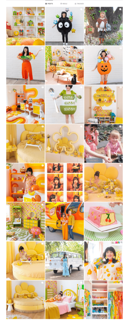
The below image is a snapshot of the Instagram aesthetic created by Sam Ushiro, a popular Industrial Designer and Stylist.
In this aesthetic approach, vibrant and lively hues take center stage, creating a visually stunning feed that instantly grabs attention. Bold and bright themes for Instagram aesthetics can include either photo-focused grids like the one above or those that feature unique illustration styles.
In both these cases, applying consistent editing styles and subject framing enhances the cohesiveness of the grid.
Black and white aesthetic
Our next example is a black-and-white aesthetic from the Instagram page of Co–Star, an American astrological social networking service.
The domination of the black-and-white combination here feels relevant for two reasons:
- The combination aligns with the monochromatic brand colors of Co–Star.
- As you can see, the grid features mainly text-based posts. The minimalistic monochrome theme here throws the spotlight on the information conveyed without distractions.
KIMP Tip: When executing black-and-white styles like this one, be sure to choose strong and legible fonts that add character to your posts.
To sum up – the features that you can focus on when you create an Instagram aesthetic are:
- Fonts
- Colors
- Filters
- Image editing
- Visual styles
- Grid layouts
- Similar stories
- Similar subjects
You don’t necessarily need to limit yourself to just these options. But they’ll give you a great starting point. And if you’re working with a good designer (we might know a few 😉 ), you’ll be able to come up with endless variations to keep your feed looking great. Whether you’re going it alone, or working with a team, we’ve got some tools you can use for experimenting and inspiration.
What tools can help you create an Instagram aesthetic?
Filmm
This tool allows you to add filters to videos. It includes authentic film textures, VHS distortions and light effects. You can also add music to your clips if needed. The filters in this tool have been curated with aesthetics in mind. And there are a large number of effects that are regularly added.
You can also add dimensions to your Instagram Stories which happens to be what it is used most commonly for. It can also help you split your Story into 15 second parts as needed. It is a free download and has over 100 filters as well as effects. You can purchase more if needed, or simply subscribe to get everything you need for one fee. Available on iOS and Google Play.
Lightroom
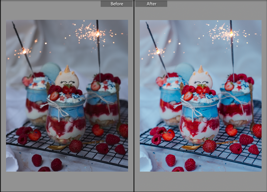
This is a tool that was dedicated to professional photographers, but now it is available for anyone to use. Lightroom presets will speed up the process of creating your posts. These presets are editing actions that have been saved in a file that can be categorized according to your projects. The software allows you to edit in batches so that you save time. And maintain the consistency of your aesthetic. The image below is an example of a before and after of an image edited with Lightroom. The software is available for use on desktop and mobile devices!

Prequel
This is a video and photo editing tool that will allow you to maintain high quality in your Stories. The tool has many filters and effects like Filmm but are different in terms of colors and styles. You can trim your videos and even adjust the speed for short videos using this. The app also comes with a built-in camera and tools to help with editing your images and videos. The filters and effects are not separate on Prequel which means that you cannot add them as layers. So you’ll want to decide what vibe you want and then design. Prequel is free to download and grants unlimited access to all of its features on iOS and Google Play.
The most important takeaways for creating an Instagram aesthetic
Experiment from time to time, but be consistent with the aesthetics you choose. Your aesthetic on Instagram will define your brand’s social media presence. And it will evolve over time. Especially as you discover new options and tools. Just be sure to stick to a particular aesthetic for long enough to establish consistent branding on your feed. If you jump around every few posts, you won’t have a clear aesthetic. It’ll just be a hot mess. ?
So be creative and strategic. Take inspiration from aesthetics you love, and create a unique take for your brand. In time you will find the perfect sweet spot that gets you your traffic!
Need help creating great designs for your Instagram aesthetic? Check out KIMP’s unlimited graphic design service.


