Fall Color Palettes: Must-Have Inspiration and Design Tips
If you have been on the internet recently, you know that the world is ruled by aesthetics. All conversations regarding design and brands start and end with that small word. And more often than not, these aesthetics are more about colors than anything else. That is one of the biggest reasons why color-toned filters are a rage on most social media platforms and come inbuilt with most smartphone cameras.

Since colors are so valuable to consumers, it has become extremely important in marketing and brand messaging too. Just like fashion and interior decor, seasonal color trends have started gaining attention in this industry too. Marketers and graphic designers are now very conscious of the colors they use in a design.
And as seasons change, the color trends change too.
So as the fall and holiday marketing season looms ahead, we take a look at the must-have fall color palettes for 2023.
Come with us on this journey of color trends that will dominate your screen for the next few months.
Importance of Fall color palette trends in Marketing
Trends hold a special place in marketing. It gives us a direction to move in and helps us understand what the prevailing consumer sentiment is. While everyone may not follow these trends, they are a good indication of how to model marketing communication. If you know what to expect, things become a lot easier.
That is why every year in December, the community waits with bated breath to know what the Pantone color of the year is. Sure, it is mainly for architects and fashion designers for product development, but using that color in marketing and packaging design brings great results too.
Among all color trends, the fall color palette trend has to be our favorite. Fall in itself is a very picturesque season. Most consumer memories around this season center around the colors, the aroma, and the activities that take place during this season. All of these are good triggers to build a holiday marketing campaign around.
Straight on cue, Pantone recently released their fall colors of the season and that is definitely an interesting lineup. The colors of the season are an eclectic mix of bright hues with neutrals to balance them out. 2023’s fall aesthetic has something for everyone and that is great news for the marketing world.
Brands do not have to be conflicted about choosing colors that may not work with their brand identity and they have a wide range to choose the shade from, to appease their target audience as well.
Given the distinct array of colors, the Kimp team brings you a selection of fall color palettes that you can build your designs from. Working with a color palette provides better options than just relying on one color, so here is a collection for inspiration.
Let’s get into it.
Fall Color Palettes – Inspiration
While most blogs and reports tell you what the fall colors for 2023 are, we want to go a step ahead because we understand that marketing designs need balance. And using trending colors becomes a challenge if they do not implicitly work with your brand style guide.
With the fall color palettes in this section, creating designs for your brand’s holiday marketing and fall-related campaigns will be a breeze.
1. Vibrants to boost your designs
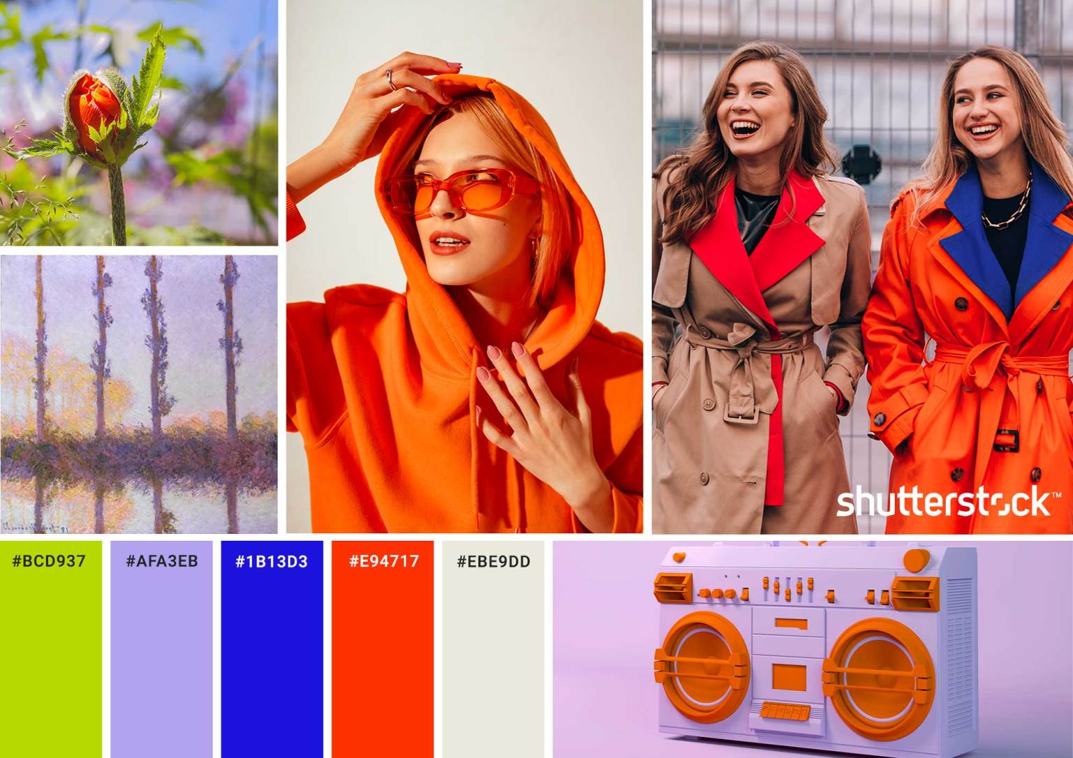
Typically, fall colors are very vibrant – think of your typical orange shades courtesy of the ever-famous pumpkin and fall leaves. This year the Pantone fall colors feature a lot of bright colors that you can leverage in your designs. But additionally, we expect a lot of other vibrant shades such as yellow, blue, lilac, and green to take center stage as well.
Now, vibrant colors can be hard to work with unless your design language for the brand skews towards Pop Art and a maximalist style.
The good news is that the vibrants in fashion this season are quite easy to pair with most colors so building a fall color palette can be challenging but fun for 2023.
When you are looking to work with these vibrant shades, we implore you to look at nature and understand how these colors exist in nature itself. This makes it easy and appealing to the eye when used in designs as well. Some color palette options that we consider to be good for this season based on some naturally occurring color combinations are:
- Orange and greens
- Orange and blues
- Yellow and blues
- Lilac and platinum shades
Kimp Tip: Even if your brand aesthetic or brand style guide does not typically allow for an extensive use of vibrant colors, try to create a fall marketing only guide to incorporate these. These are the colors of the season and exploring the color palette can be good for your brand too.
Connect with the Kimp Graphics team to see how the fall color palette looks in action. With our unlimited graphic design service, exploring does not come at a cost.
2. The Greens of the world
In another ode to the fall season, we expect the fall color palette with dominating greens to take over most designs in 2023. Green is synonymous with nature and also with prosperity and freshness. It is always a good color to use in your marketing designs.
Of course, there are a lot of greens in the world, and not every color is in vogue right now. So what colors should you use to ensure that your designs are in line with the aesthetic people care about right now?
Let us take a look at some of the green shades that must be part of your fall color palette :

- Olive Green and Brown color combination
Seeking inspiration from the world outside during the fall season, we completely recommend the olive green and brown colors for your fall color palette. This color combination works well with almost all other colors. And this makes the combination ideal to adopt within the guidelines of your branding guidelines.
Since green and brown are nature-related colors, you cannot miss the fall aesthetic with this combination.
- Emerald green and gray tones
As much as the dark colors are in trend right now, pairing them with subtle shades only makes them better. With fall color palettes, it is as much about balance as it is about using the trending color. So, work with a color palette that is made up of jewel tones like emerald green with gray tones such as silver, bluish gray, and eggshell white.
- Greens and burgundy
If your branding guideline does not really vibe with a grayish color tone, we have another option for you. Accentuate your greens with a bold and powerful color like burgundy. It will give character to the design and make anyone notice within a single glance.
3. Neutrals and dark color palette
What if you could build a palette that was interesting, engaging and composed mostly of contrasting colors? In the social media age, that would be the most ideal solution. And we know how important social media can be especially in fall marketing campaigns. So here is a fall color palette that is an intersection of dark colors with their neutral counterparts.
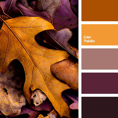
- Since vibrant colors are trending, we feel that combining dark blue hues with the earthy tones of rust can create an impactful color combination. Blue is the most common color we see in branding, so this color palette can be used by brands of all sizes and industries.
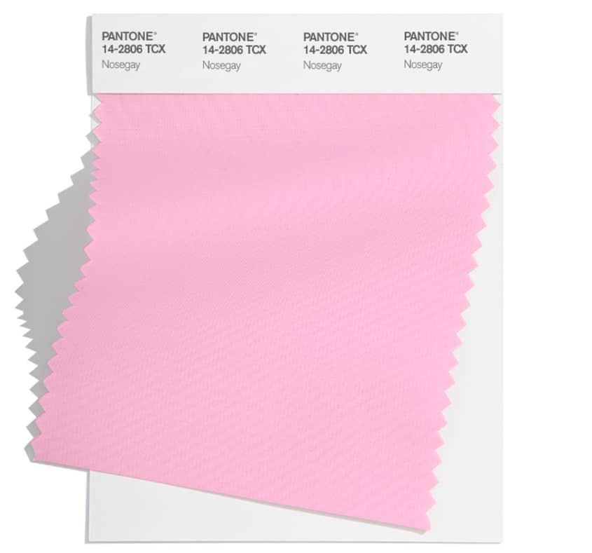
- Pink is a very targeted color and appeals to a diverse audience. Using this color in your branding and marketing can be highly effective. Pink is also a color that we expect to see a lot in the fall season of 2023, so we suggest using this vibrant color with grayish tones to provide a balanced look to your designs. This means you can use all shades of pink such as hot pink, plum, lilac, and more with varying shades of gray as your branding permits you to.
4. The purple palette
Fall colors such as rust, pumpkin orange, green, and brown work really well with purple. So, building a palette around these colors can help you attract the Gen Z and Millennial audience effectively.
The purple palette is ideal for social media communications, packaging designs, and aesthetic building too.
When done well, it can be an effective tool to boost your marketing efforts.
Some color combinations that work well with the Purple palette for your fall marketing efforts include :
- Very Peri and Platinum
- Purple and burgundy
- Purple and green
- Lilac and yellow
So if these colors exist in your brand’s visual identity, it is time to adopt purple as part of your fall color palette.
How to design with Fall Color Palettes – Design Tips
Too many options can be disconcerting. We know that this blog talks about 4 major color palettes and 10+ color combinations. Each one is better than the previous. So how do you choose the color palette and color combination that works the best for your brand? Is there a process to make the selection easier?
There is, and here is a quick outline of it from the Kimp team.
Before we begin, it is important to understand that these guidelines are from a marketing design point of view and may vary if you choose to apply them to other industries.
1. Understand brand identity
One of the major purposes of using fall color palettes in your designs is to improve brand awareness and accelerate the emotional connection between the brand and the customer. You can also succeed in this venture if your brand identity continues to shine despite the new colors in town.
To do so, define your brand’s visual identity clearly including the major brand colors, the overall brand personality, and the design style you wish to adopt for your branded communications.
This makes it easier to choose the color that will complement your intrinsic brand identity.
2. Choose one color that works well with your brand identity for anchoring
To ensure that your brand identity and the incoming fall color palette work well, we have a step-by-step process.
Before you understand what color combination works for your brand, choose a central color or color scheme for your fall marketing efforts. Once you choose the anchor color and the overall design style you can work on choosing a few possible palette options and color combinations.
Finally, choose the palette and color combination that fits well with your brand identity, aesthetic, and the anchor color you have chosen for your marketing campaigns.
3. Less is more
The conundrum of too many color palette choices is real. So it is completely natural to feel yourself being swayed by more than one color palette, but we strongly recommend sticking to just one palette.
Consistency is important to ensure customers can recognize your brand and remember the visual identity for a longer period. And that comes only by adopting a streamlined, minimalist, and singular fall color palette. If you do want to bring variation, experiment with color combinations within the same color palette.
Design a stunning fall color palette for your marketing campaigns with Kimp
Beyond the fall color palette collection, if there is one takeaway from this blog, it is that fall marketing soon is going to be visually charged as much as possible. Since color is at the forefront of discussion already, it is time to work with a design team that can create a unique design language for your brand.
With the Kimp Graphics and Kimp Video team, you can experiment to your heart’s content and explore different design formats to see how it all fits together. Our unlimited design service subscriptions enable you to create multiple designs with unlimited revisions for a flat monthly fee and no hidden charges.
Sign up now!


