Animated Logos: Why Your Brand Has To Have One Now
Logo designs are very crucial to a brand’s growth, correct? It is unimaginable to launch a business of any scale without a logo. In fact, most business launch plans begin with logo designs.
But is just a logo design enough? Not quite. If you are planning to launch a business, aim for the sky. Attract customers from the get-go and build a recall value for your brand. Make it unmissable.

Now that is all great talk, isn’t it? But, how do you do this? Everyone has a logo, and with each new brand seems to come a logo that tops the last. So, how do you ensure you stand out instantly?
Well, we have two words for you: Animated Logos. Yes, with just a little movement your logo can be 100x better. Animated logos have been around for some time, albeit only a variation or something special in a particular marketing medium.
But the future holds so much more for motion graphics and animation. Having an animated logo and designing a logo that works well with animations is a decision every brand must take.
Now you must be wondering what exactly is so special about animated logos? What are the practical applications, and how to include them in your branding plans?
That and much more awaits you in this blog by Kimp. So, get ready for a whole lot of knowledge coming your way. Let’s go.
Animated Logo design vs. Static Logo design
Brands have been working on branding with static logo designs for a long time now. And they work well, no doubt. So why this sudden push for animated logo designs? What is it about animated logos that make it a must-have, as per every design trend prediction, for 2022?
Well, you must know that video is fast becoming the most popular form of content on the internet. That is also why animated logos are finding a stronger form of approval among audiences.
The internet is full of content, and it takes a lot of effort to stand out. Animation adds that extra charm to your logo so that it can edge out the competition. But that is not all. There are many branding-related benefits to having an animated logo vs. a static logo.
Stand out from the competition.
Imagine that you are presenting at an investor summit. There is a digital display of all the companies taking part, and the board has just the brand’s logo. Now, across the many rows and columns, what can you do to ensure that you stand out? Often, these displays contribute heavily to the first impression an investor or customer has of your brand.
Want to tell them you are not just another brand in a sea of others? And that there is something special in you? Then we suggest starting with an animated logo design that can convey this instantly.
Get faster brand recall.
We have repeatedly heard that the brain remembers visuals better than text. This has been a recurring topic in our blogs too, advocating for visual identity and visual marketing. But what we must also know is that motion registers much more than static images can. Because there is a little more data associated with the design for the brain.
This and the stellar first impression an animated logo design delivers makes it a brilliant investment for brand recall.
Evoke the right emotions.
Can you tell a story with no words? Well sure, videos can be effective to this end. But wha if you’re looking to quickly convey what your brand brings to the table. A marketing video might be too heavy and elaborate. So what is the next best thing? Animated logo designs that can be great storytellers within just a few seconds.
Say you’re a brand that focuses on creating clean, healthy meals. Imagine the animation of a green salad turning into your brand’s name. Or the O in your name turning into an orange. In just a few frames you’ll be able to share who you are and the energy you bring to the table.
With the range of motion they deal with, animated logos grab user attention and make them instantly feel something. Take an animated Nike logo for instance Customers feel the energy and adventurous sense immediately.
Get a great marketing asset.
Today brands can successfully generate leads via marketing without an active sales team. Design has a big role to play. And not just in static design. Animations can elevate a great logo design so that it brings out the right response to your marketing and advertising campaigns. In other words, an animated logo can get the full potential out of your logo.
But why are animated logo designs so special in this context? Well, motion graphics are becoming more and more significant in marketing, and what better to tap into that than through an animated logo. It also shows that you are in sync with the latest trends and understand what the future holds in content marketing.
Get future-ready.
Now, there may be an argument as to the applicability of animated logo designs since they cannot work on paper or other physical displays. But your audience is increasingly spending most, if not all their time, engaging with digital content. Even in OOH advertising, digital billboards have taken a giant lead.
Hence our counter-argument is that animated logo designs make your branding future-ready so that when your audience is 100% online, you are ready.
Animated logos work great on social media, ecommerce sites, websites, advertising banners, video introductions, newsletter signatures, video end cards, GIFs, and much more.
What more do you need? It is virtually effective everywhere.
So, finally, the answer to why choose an animated logo and is it really worth it is here. What next? Well, we will not leave you hanging without telling you how to incorporate animated logos into your brand.
Scroll down to see more on this.
5 Animated logo design ideas for your brand
Animation may sound pretty basic. Come on, it is a trend that originated in the 90s so what can be new to it? Well, a lot more than one can imagine. When the Kimp team started developing animated logo designs for our customers, we could see the potential it holds. Animation is an easy, lightweight, and attractive method to bring out your brand story via animation.
Animated logos can also be pretty aesthetically pleasing, hence reeling in the younger generation based on the design you choose.
So here is a list of top animated logo design ideas for your brand to experiment and continue its branding with.
Let’s dive right in.
1) Rotating logo
This is probably the most common animation logo design that we can think of. When we think of animation, especially in logos, circular motions and rotations come instantly to mind. And there is a good reason for it too. Our brains love patterns and symmetrical motions. Not to mention that in a rotating logo, there is a constant presence of a design element on the screen.
As this animated logo design for McDonald & Associates PayPal shows us, a rotating logo design is sometimes the easiest but most effective way of conveying your story. In this logo, we’re introduced to the brand colors and elements of the symbol in the logo before we see the name emerge. This creates a sense of curiosity and engagement before the big reveal.
Kimp Tip: Rotating logos works the best when you have circular or symmetrical elements in your design. And the best thing about this logo design is that you can be as minimalistic or as loud as you choose to be.
The rotating elements can always add some balance to the design. But choose colors and typography wisely so that it is pleasant to watch and not too cluttered or confusing.
Work with the Kimp Video team to get the best rotating logo for your brand.
2) Hide and reveal
Do you remember creating presentations in school or college? Did you also love the slide transition as much as we did? If your answer is yes to both these questions, then you will love the next animated logo design idea. It is the classic hide and reveal animation.
This one is for a brand that has a fun brand personality and believes that its customers will enjoy a little subtle gotcha movement. It is also for the brand that is very regal and professional to do a very theatrical reveal of its logo for its audience. This animated logo design style can work for brands of all sizes and personalities.
If you have a wordmark logo with just your name, this animation can definitely jazz it up and give it much more charm. If you are looking for a light animation to use across digital mediums, this does that too.
Kimp Tip: Hide and reveal animation logo designs are quite simplistic and difficult to cram a lot of meaning into it. While you can work on some symbolism, dragging it out to tell a story can negate the attraction of this logo design. So think carefully and choose wisely.
Kimp Tip: Hide and reveal animation logo designs are quite simplistic and difficult to cram a lot of meaning into it. While you can work on some symbolism, dragging it out to tell a story can negate the attraction of this logo design. So think carefully and choose wisely.
If you want to look at some mockups and design ideas before finalizing your animated logo, sign up for a Kimp Video unlimited video design subscription. And get your animated logo designed with unlimited revisions for a flat fee.
3) Transformation
Next comes the most-awaited and most popular animated logo design idea. That is the transformation style. Typically, in this logo design, one object on-screen transforms into another and another until finally, the logo pops out. This is an engaging and gamified style of logo animation since it keeps people guessing for a long time.
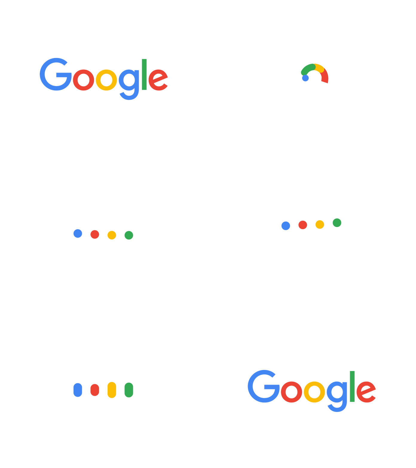
Check out this latest logo animation from Google. The company interchangeably uses the letter G and the whole Wordmark logo of its name “Google”. As a bridge between both and to raise brand awareness, the brand has this fun animation in place. The traditional buffering dots appear before transforming into the two logos.

Transformation logo design ideas give you scope to convey your brand’s story without uttering a word. Leveraging the power of visuals and their value in brand recall, we strongly recommend this logo design type.
Kimp Tip: Notice how the animation logo of Google has distinct elements but a unifying factor with the color. Consistency and connection between the various designs in your animated logo are key to their success.
4) 3D Animation
This might be the world of flat designs and minimalism, but sometimes bold design can do wonders. And that is exactly why we are featuring 3D animation as one of the top animated logo design ideas for you to explore.
The love for all things immersive and 3D is one reason why people miss going to the theaters during the pandemic. Extrapolating the same sentiment, there is a lot of emotional and intrigue value to 3D animated logos. It connects with the audience deeply and can immensely help in brand recall.
But what is it that takes a 3D animated logo from good to great?
Well, for starters, 3D animation is good, but you need to have some relevance in choosing this animation for your logo design. Often we choose designs to be trendy, forgetting that customers are looking for meaning and value in our designs.
Kimp Tip: It is a pretty common practice for a 3D animated logo to have a soundtrack accompanying it. While it is a great feature (like Netflix’s Tudum), pick something simple and evergreen so that animation has space to shine.
With a Kimp Video subscription, you don’t just get access to unlimited design requests and revisions, we also source stock audio for you!
5) Hand-Drawn
Illustrations are always a major hit in branding and marketing design. We have seen how brands like Etsy, Casper, and Slack have switched from stock images to custom illustrations to connect with the audience. Hand-drawn or custom illustrations also work really well in logo designs. It is a very personal and unique way of representing your brand.
But what if you could take it up a notch? What if customers can see the illustration come alive and understand the true meaning of your logo? Sounds great, right? That is exactly what our hand-drawn animated logo design achieves.
It is like building your logo from scratch and telling your brand story via this animation to your audience. Now they know why the logo design looks the way it is. And what do people do when they come across a cool behind-the-scenes story? They share!

Kimp Tip: Custom illustration is a tremendous leap for a logo design in a world where brandmark and wordmarks still work well. But this leap will take you far ahead, more than you can imagine. And this logo can be the foundation for your brand to develop an illustration system that best represents your values.
Whatever style you pick for your animated logos, the potential is immense to explore and design an animated logo that truly works for you.
Design Animated logos for your brand with Kimp
Whenever a new logo design trend comes in, everyone, including us, is quite skeptical. We have seen so many design trends pass us by adding no value to a business. But we strongly agree that animated logo designs are a great value add to any brand. The benefits they bring to the table far outweigh the investment they invovle.
And with Kimp Graphics and Kimp Video unlimited design services, this investment is also quite affordable. Along with your logo, you can develop your entire branding design style at no additional cost.
Our subscriptions come at a flat monthly fee with unlimited requests, revisions, and a wide design services. If you want to understand how it works, just sign up for a free trial.
