How To Build A Strong Visual Identity For Your Brand
Have you ever experienced this? You are watching a movie or a new sitcom, and you spot a familiar face. Their work, accomplishments, and even associations with other actors come to mind. Sometimes, you can even visualize their other movies. But, the name remains elusive and keeps nagging you.

You are not alone. Our brain is wired to remember faces and images rather than names.
In the marketing world, this translates to putting an attractive face to your brand name. You can do this by creating a strong visual identity for your business.
Give your audience an image they can’t get out of their head, and boom – you have the brand awareness game at its peak.
What is Visual Identity?
Visual identity, like the name suggests, is all the visual elements that are part of your brand identity. Everything right from your marketing graphics, interior design (if you have a storefront), imagery to the color palette and fonts you use constitutes your visual identity.
Everything a customer sees and associates with your brand must bring them closer to your brand and establish an emotional bond. But, if you want to take up real estate in your customers’ brains, you have to create a significant and consistent impact.
Consistency in visual identity can be achieved by creating a brand style guide for your business in the founding stages itself – and sticking to it! This will ensure that the customer encounters a consistent brand at different stages of interaction with your business.
For more on this, check Kimp’s blog on brand style guides.
“You must start from what you know and believe strongly, and let your brand evolve from a core, unwavering understanding of your mission. Even if it’s just your name in a simple typeface, you can build from there,”
– Ben Matthews, Director of Design at Adobe Spark
Why do you need a Visual Identity?
Consider this scenario: You are in the supermarket and pass the chips section. You never shop for chips here because they don’t carry your favorite brand. But, you spot a familiar color and pivot. You would know that color from anywhere, and you can now almost taste the flavor.
You spot the shade and zone right in. That’s the power of visual identity.
Similarly, imagine you are scrolling through Instagram. After a while, you are barely noticing the content when you do a double-take. You saw a mascot that looked familiar. You go back, and sure enough, it’s your favorite clothing store with a new Instagram post.
It is the strong visual identity game of these brands that made you notice them.

Source: Pepsi
Without a strong visual identity aiding brand recall, the companies would have had to:
- Invest more heavily in promotional activities in the store and Instagram to attract attention
- Connect with existing customers through more posts and campaigns to announce a new market expansion (offline + online)
Strong Visual Identity allows businesses to:
- Work on their visual merchandising game and make package design a part of their sales strategy
- Create Aesthetic and consistent Social Media feeds across different platforms
- Unify offline and online promotional activities under a single identity
We are sure that by now the burning question in your mind is how to build a strong visual identity for your brand.
We’re going to get to that soon. But first, an important pit stop.
How are Branding, Brand Identity, and Visual Identity all linked?
These are all words and concepts you will have to navigate when you work on marketing solutions for your business.
So, how are they linked, and how do they work with each other?
Here is how it works.
If you want to make your business recognizable and relatable to customers, you have to carry out a branding exercise. Essentially, branding as a process positions your business in the market as a unique, valuable, and strong player in that industry.
What you build via this process is called a brand. Your brand is what customers think of you, it’s your standing and reputation in the market.
Brand Identity comprises the elements or assets (tangible, emotional, written, spoken, design) you use to create the said brand for your business. It goes much beyond a logo, color palette, name, content creation, and content tone. This includes how the customers feel about you, their interaction with you, and the overall value you generate.
The visual part of this brand identity, which includes things like your logo, graphic design, and images, is your visual identity. In other words, it is what customers visualize when they think of your business.
The Visual Identity Kit

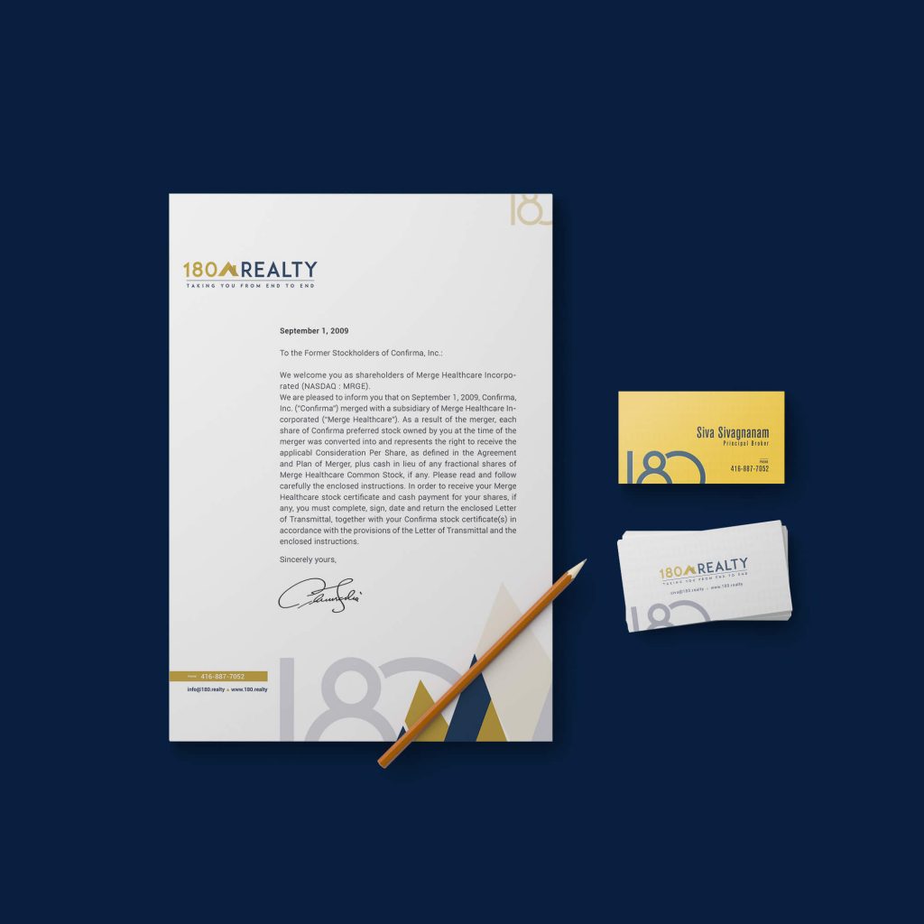
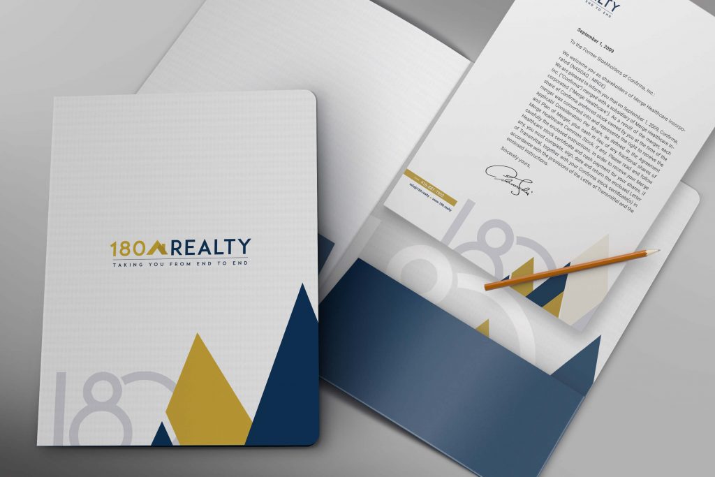
Source: Branded Stationery Design by Kimp.
Now, let’s get down to business. You have understood the value of building a brand, raising brand awareness, and want your business to have a strong visual identity.
What are your next steps?
The first step is to understand what really makes up a visual identity. Marketing terms can be confusing, and before you can approach a design team with a clear design brief, you must know what you want.
When you approach Kimp for a visual identity project, our design team works with you to create what we like to call a Visual Identity kit.
Similar to a brand style guide, but exclusively for design elements.
A visual identity kit contains:
Graphic Designs
Graphic designs in your visual identity kit form a consistent foundation upon which you’ll build your brand and marketing campaigns. This includes a logo, advertisement templates, and social media profile templates.
Out of all these, the logo is easily the most important. The logo sets the tone for the overall brand image and everything follows from it.
Depending on which platforms and marketing channels you’ll be using most often, and how you’d like your identity to vary accordingly, you can have visual identity kits for each set up. This will help anyone managing your brand understand how each of these elements (logo, social media templates, and banners) should be used across different platforms such as Youtube, Instagram, Facebook, Twitter, Pinterest, and your website.
Color Palette
What are the colors in your logo? What are your brand colors (this can include a primary and secondary palette)? Are they consistent across platforms? Everything from color meanings and the hexadecimal for different platform usage is recorded in a visual identity kit.

Imagery
What’s the tone and mood of the imagery in your brand identity? Do you have a mascot represented everywhere? Do you have platform-specific image guidelines? Everything right from your product stock images, logo, product-in-use images, and illustrations, if any, are part of the kit.
Typography
All fonts, font styles, and sizes with clear specifications usage-wise are important to maintain brand consistency. Ensure you choose a font that works well across platforms and suits the overall imagery style you have selected.


Physical Assets
Not all design elements are for social media platforms. Small businesses with physical stores have other physical assets that are part of the visual identity of the brand. Take Starbucks’ green apron model, for example, or the cap worn by McDonald’s’ employees. These are part of your visual identity and are part of the kit.
Source: Starbucks Stories
Creating a consistent and impactful Visual Identity – Tips & Tricks
1) Take cues for Visual Identity from Brand Identity
The rule of good marketing is always to have the visual identity that reinforces your Brand Identity. Brand identity is your north light, and visual identity elements such as logo, graphics, font, and imagery should aim to replicate the message via design.
Visual identity is a silent messenger of your brand and not the other way around.
So, before deciding on the font, logo, color, and graphic style, ask yourself:
- Would my brand be better represented in color or B/W? If color, how should the tones be – warm, cold, or neutral?
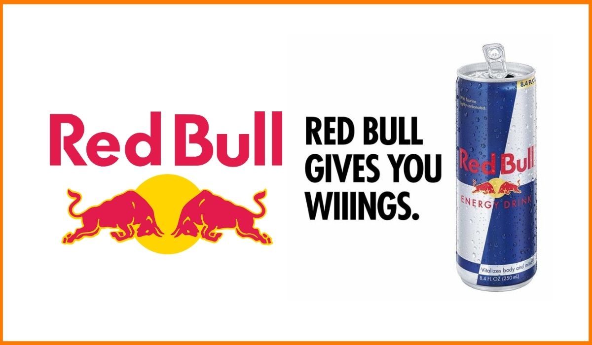
- What emotion do I want to invoke in my customers? For example, Redbull aims to invoke a sense of adventure and energy hence the bright red color and the bull imagery.
- Would this style be effective with my demographic and ideal customer persona?
You can only answer these questions effectively when your branding strategy and brand identity have been framed. So, work on the brand identity before moving to the visual identity design.

Source: StartupTalky
2) Let the design weave a story
When you look at your visual identity kit, it must weave a story for you. The story of your brand. The playful mascot or the professional font is there for a reason. To connect with the customer and tell them what to expect from the brand.
Storytelling is a very effective way of communication, hence, the visual identity cannot be just about stand-alone elements. It has to be a story with connected elements and unifying themes across all design elements to share the narrative you want customers to know.
3) Simplicity Wins
The KISS rule wins, always. And by that we mean Keep It Simple Silly. As they say, cliches are cliches for a reason. They work.
Keeping your visual identity clutter-free and simple has many advantages. One, you avoid the chance of the message getting lost in over-powering visuals. Second, it is easier for the customer to remember a minimalistic design easily. You don’t want to overwhelm them with a busy design with too many details.
To achieve brand awareness, brand recognition and recall are very important steps. Simple, clean messaging makes them possible.
A simplistic design is also easy to replicate across platforms, store outlets, and marketing campaigns. There are fewer elements to manipulate, hence, consistency is guaranteed.
4) Unity in Diversity
There has been a lot of mention of consistency in every branding handbook. Consistency is vital to make a lasting impression on your customer and cement the narrative you require. But, consistency also brings in the risk of monotony and repetition.
A business usually has different verticals, product lines, and service offerings. Your visual identity must seek to design a unifying theme with small differentiating factors to break the monotony.
These small differentiating design elements also help create a micro-brand identity for the different verticals, without breaking away from the original brand identity. So for example, you could use the same colors, elements and types of imagery to market to different audiences. The variation may be that you tweak your logo to represent a specific line of products or value being offered. Or that the images represent certain use cases, unique to that vertical.
Your visual identity has to achieve unity in this diversity.
5) Platform-specific Identity
If you want your visual identity to be strong and effective, then you have to think far. As a business owner, you have to work with your design team to ensure yur design elements are versatile and can be used across different mediums.
Designers will tell you that each platform has its own guidelines, and it is best to tweak the identity a little for maximum impact. They are correct.
Visual identity must be customized for social media platforms such as Instagram, Facebook, Twitter, and YouTube, to name a few.
The identity you use on your website, web store and/or physical store will allow you some more creative freedom than the constraints of third-party platforms. But the golden rule remains the same – you must follow a unifying theme so that consumers can recognize your brand at a glance.
“Your visual identity can mature with a symbol or icon later. And maybe sometimes, it’s good to give your brand some time to resonate, find its path forward, and understand where your end goal is.”
– Ben Matthews, Director of Design at Adobe Spark
The role of Good designers in creating a Strong Visual Identity
We hope the importance of creating a strong visual identity is quite clear now. As is the complexity in the process of creating one.
Your design team is the leader of this process. And as your visual identity is crucial for your brand, it is important to choose a professional and skilled design team.
You can establish a Brand Identity with your customer experience solutions, products, and services. But all this will be for nothing if your designers are not able to communicate that identity to your customers in visually compelling ways.
Kimp – The Design Expert you need
By choosing Kimp for your design needs, especially significant designs like visual identity, you choose a team known for professionalism and consistency. And one that’s invested in your success. Your brand presence is our ROI.
That’s why we match each of our clients up with a dedicated design team from Kimp, giving them the opportunity to work with a team that will get to know their brand. And deliver design solutions that elevate it in their market or niche.
Join businesses and brands around the world in choosing a business that puts customers first always. Choose Kimp.
Sign up for the free trial today.
