Year of Purple: How 2022’s It Color Is Influencing Design
Everyone follows the color of the year announcements. Some agree, some don’t, but almost everyone wants to know what it is. Even if you don’t explicitly look for Pantone’s announcement, you still know this information.
That is because it is everywhere. Right from your favorite fashion blogger to interior designers, to popular marketing campaigns, the most popular colors often appear.

Humans have a very primal connection to colors, as seen in color psychology. And our varied reactions to different color palettes clearly shows us this. So it is completely understandable that the color of the year is almost always a reflection of what is currently trending and the prevailing mood of the world.
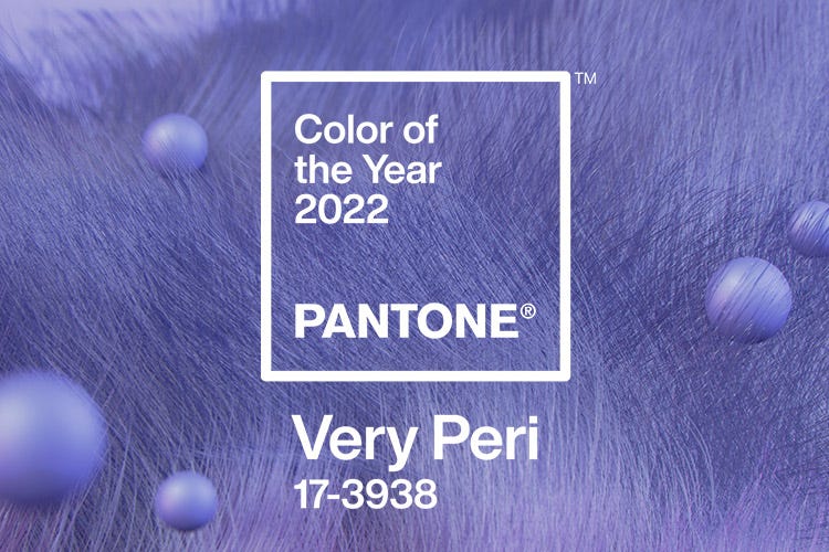
So what is the color of the year for 2022? Well, the popular color institute Pantone synthesized its own color for 2022 and named it Very Peri. And recently, the trend-spotting firm WGSN has named Orchid Flower – a color with a purple hue as 2022’s color.
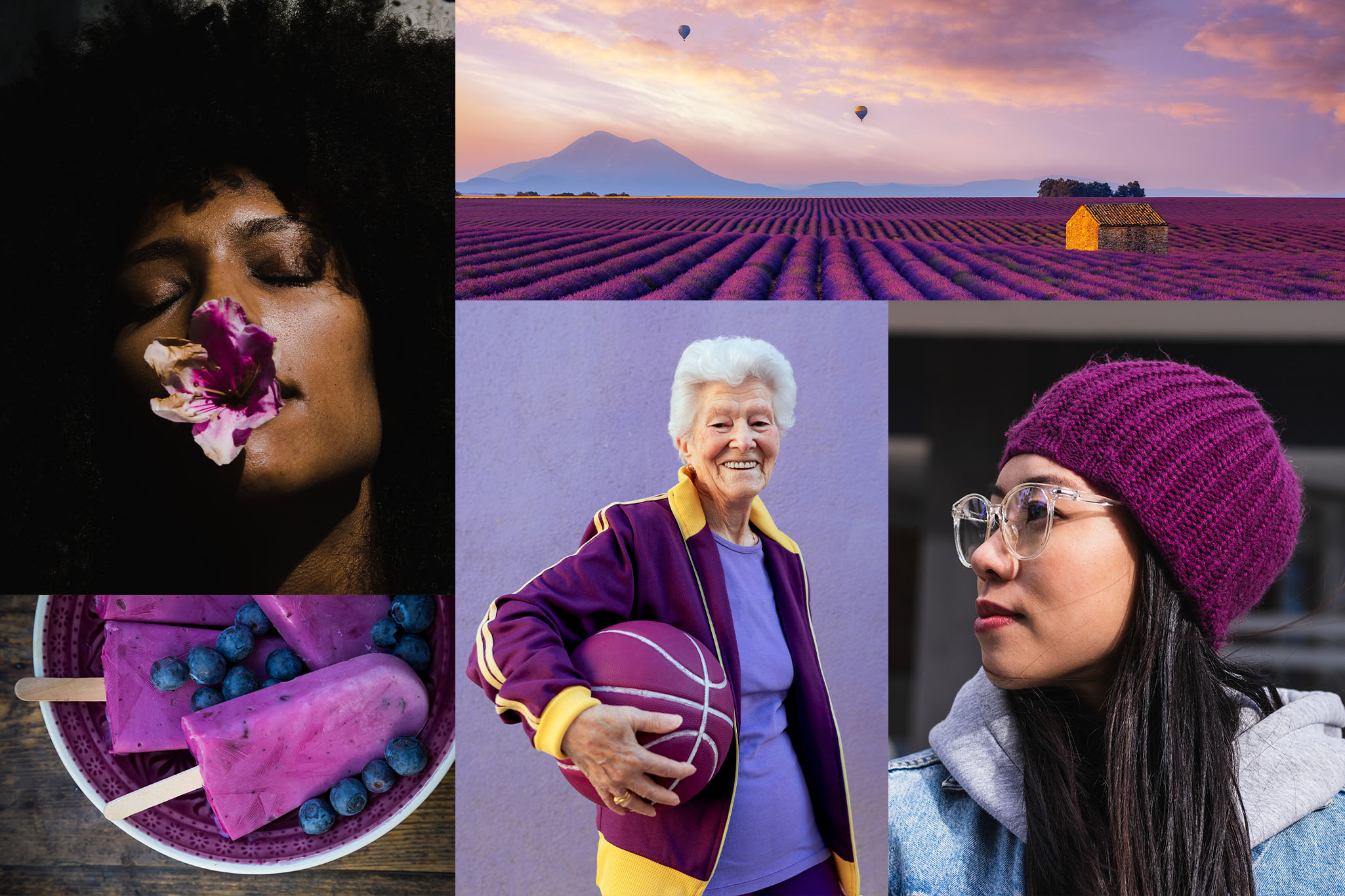
Seeing all this and more, Kimp strongly feels that 2022 is definitely the year of Purple. Being a graphic and video design company, we are excited to explore purple in marketing and design.
Why is 2022 the year of Purple?
When Pantone came up with a custom color, a periwinkle blue, it’s red undertones, and bright hue impressed everyone. Shutterstock’s color trends also had a violet color, and now WGSN has declared the Orchid flower to be the color to watch out for.
What’s the similarity in these? Well, they are all variations of the color Purple.
Not just this, if you scroll through Instagram, Pinterest, or even Twitter – you will see that this is a dominant color across home decor, tech accessories, marketing campaigns, and whatnot. It can be because it is a welcome change after eons of seeing Pink dominate our screens and fashion products. Some also consider purple to be a perfect extension of our world’s current socio-economic state.
Some popular campaigns in 2021 and early 2022 that led us to believe that 2022 is the year of Purple are:
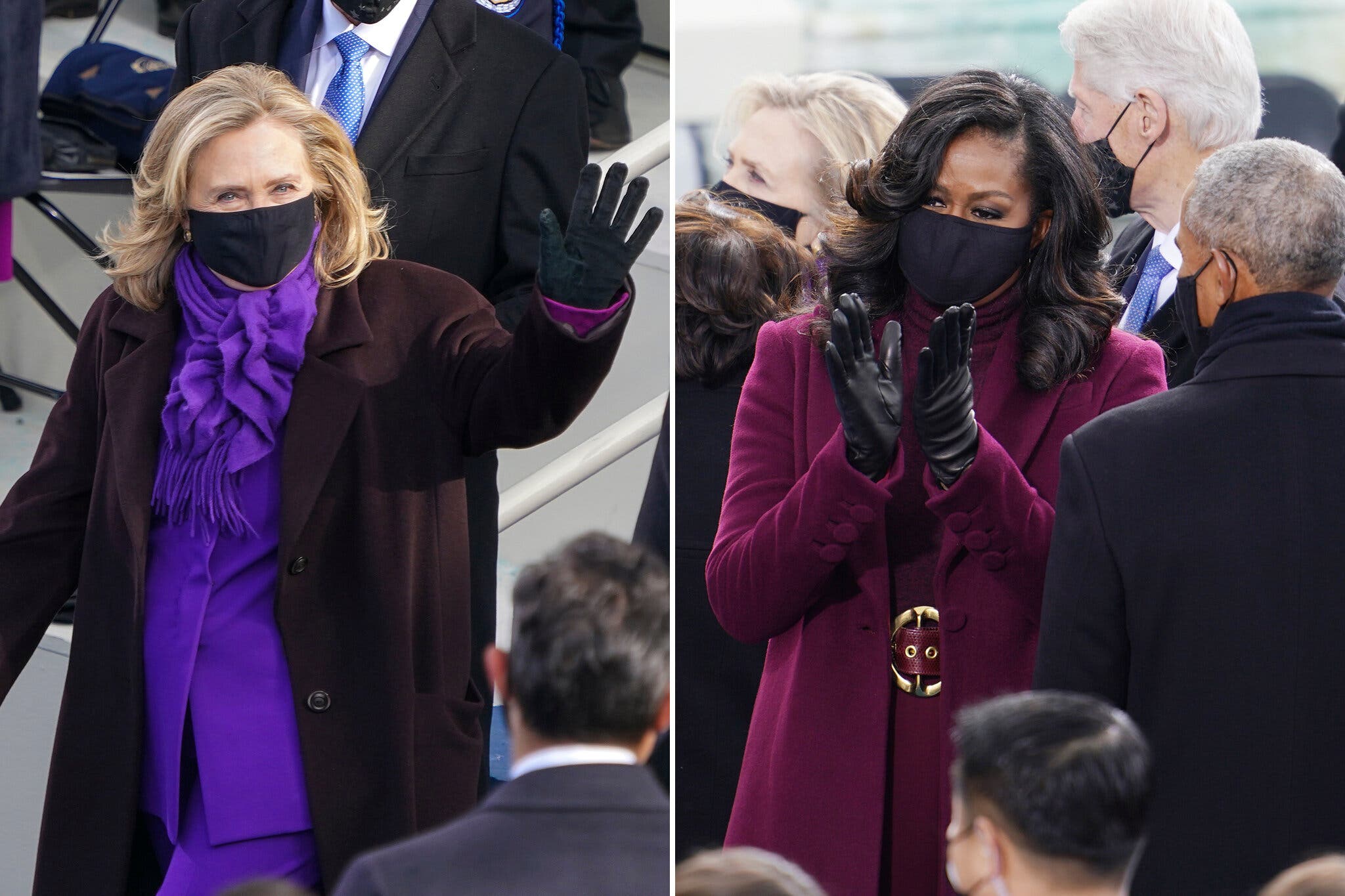
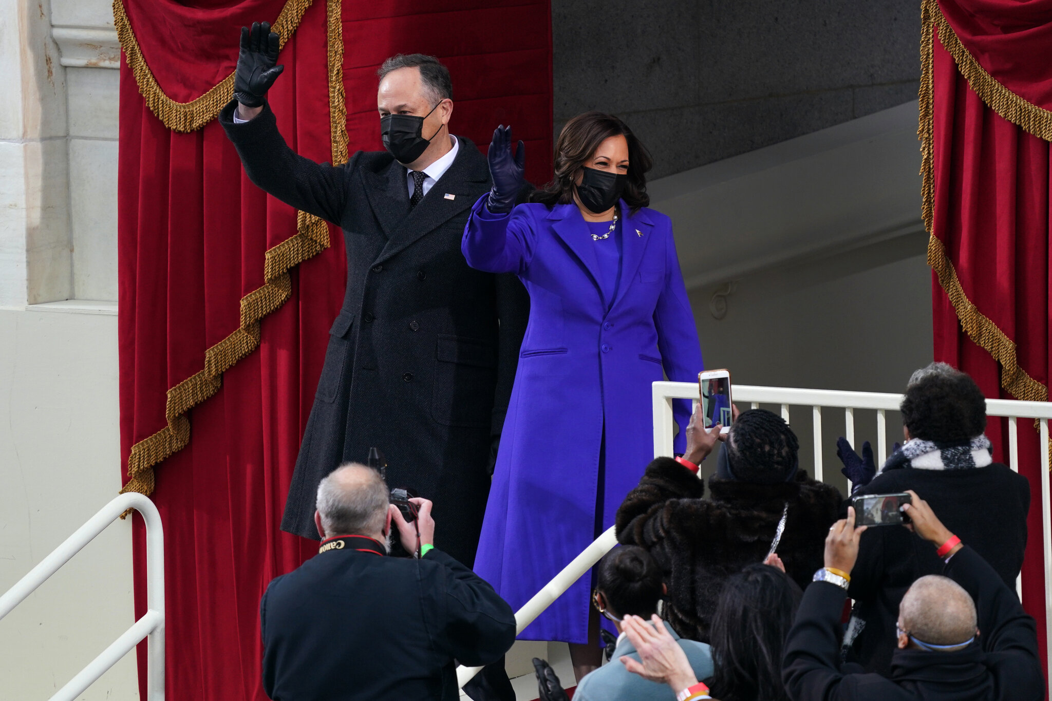
1) The Biden Inauguration
Okay, we know this is not a marketing campaign, but it is too good to miss. The Biden Inauguration was special for many reasons, but for us, it was the explosion of the color Purple that cinched the deal. While people heavily credited the union of colors from both the political parties for this, that truly set the ball rolling for Purple.
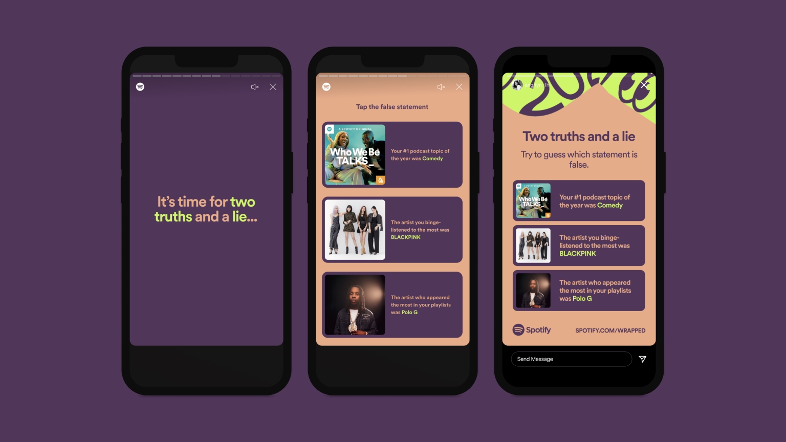
2) Spotify Wrapped 2021
We have said it before, and we will say it again. Spotify Wrapped is one of our favorite campaigns, and the 2021 version did not disappoint. This year’s design was spectacular as always. But the thing to note here is that it came with heavy usage of Purple shades.
3) McDonald’s Saweetie Meal
An unexpected addition to this list is this campaign in question from McDonald’s. Who here doesn’t know McDonald’s? But the brand has a very established branding style that all of us recognize everywhere. For them to take a detour and launch a campaign in a color palette that Gen Z and Millennials have come to love was a surprising but refreshing change. And guess what color featured prominent in that palette?
Why is Purple 2022’s It Color?
You may now think that it is just us, and we are seeing Purple wherever we go. Well, the backing of two major companies notwithstanding, we strongly believe that there are ample reasons for the color to become popular.
Which brings us back to this question – why Purple?
Well, the reasoning behind Pantone’s color of the year was that it was an ode to the digital-centric world we live in and the evolution of Metaverse. And WGSN strongly believes that this color will bring in serenity, positivity, and calm in the times of uncertainty that we live in.
But we have a few more reasons for you to consider. Outside of these speculations, the color Purple and its neighboring shades hold some significance in color psychology and other spheres of the world too.
Luxury and Innovation
There was a time when purple dye was scarce. Only the people who belonged to the rich and royal classes could afford to wear, use, and display items in this color. Hence, historically, this color has a connection to luxury and specialized products. And this tradition continues to date. Brands that want to signify elegance and luxury leverage this property of purple in design.
In today’s context, Purple has become a sought-after color after years of neglect, so any brand that uses it today is thinking outside the box. This connection with innovation with an element of luxury has made it quite popular among the masses.
Gen Z and Millennial appeal
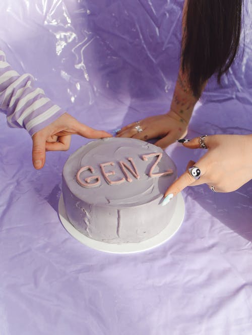
Ever since the 2016 color of the year turned up as the Rose Quartz, millennial pink has come into existence. It is a color that designers and design agencies consider to most appeal to Millennials based on their fashion and decor choices. And from there, the reign of the pastel shades began.
But recently, owing to the K-Pop explosion and natural evolution of Millennial Pink into darker shades, Millennials, and Gen Z have moved on to shades of purple. Since they make up a majority of consumers with buying power, brands too have adopted this color to appeal to this demographic.
Equality
Last but not the least, society has changed a lot in the last few years. Social inequality and justice are now in the limelight more than ever. What this means to the current generation is that they want to grow up in a fair and equal society. The color purple has a long history of associating with some of the most powerful movements of our generation, right from the Women’s rights movement, the LGBTQIA+ pride flag, and the gender equality movement, to name a few.
This positive association has made it a preferred color for many individuals worldwide.
The many shades of Purple
Did you know that technically the color purple doesn’t exist? It’s actually a combination of red and blue waves that we see in the spectrum of light When we think we see purple, it’s just how our brains are interpreting the overlap of red and blue. Maybe that is what makes this color so special and unique.
In the trend world too, there is more than one shade of purple in the limelight. So before we go any further in telling you how to leverage this glorious color in marketing and design, let’s take a look at the many shades of Purple.
Very Peri
This color came into existence only at the end of 2021 when Pantone launched it as a custom color. An ode to our digital life, the color has undertones of the red we see on our screens every day. People all over the world love this color, and we are already seeing an explosion of this across many campaigns.
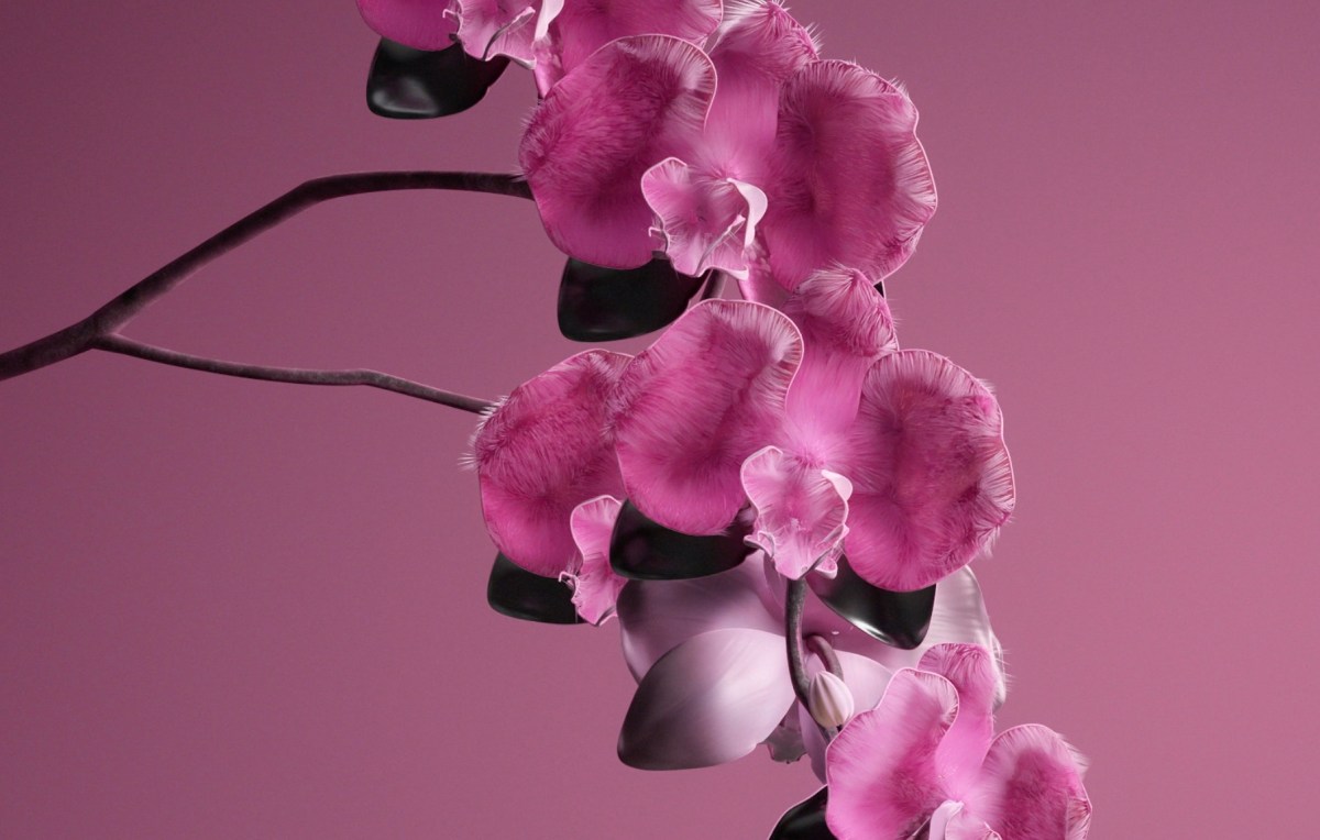
Orchid Flower
This is a vivid purple that everyone knows the Orchid flower for. WGSN believes that this color has what it takes to appeal to a wider audience and deliver what the world needs now. A little excitement, serenity, and calm.
Velvet Violet
This was one of Shutterstock’s color trends for 2022 and we think that the company has got it bang on. This color is as purple as it comes, and the mention of texture is an inspired touch from Shutterstock. Velvet piles on the luxury that many of us have come to expect from Purple shades.
Ultra Violet (2018 color of the year)
Pantone thought ahead in 2018 and declared Ultra Violet to be its color of the year in 2018. The team felt that this color was riveting, in touch with the times, and had a futuristic potential in the years to come. They were right, weren’t they?

Millennial Lavender
You know Millennial pink and how popular it’s been. But did you know that another color (lavender) started rising in prominence because of it? Designers and decorators have even dubbed it Millennial lavender. The general consensus is that after a period of looking at pink and neutrals, people wanted something invigorating but not too far from pink. Enter Millennial lavender.

Now that we have seen the variety Purple can offer, let’s see how you can use it in your marketing campaigns. And if you need some help applying these ideas to your campaigns, you can of course sign up for a Kimp Graphics subscription, and our team will help you out.
The Role of Purple in Marketing and Design
Not using such a popular color in your marketing and branding design in 2022 will be a huge wasted opportunity. Imagine if you can amass huge impressions, reach, and favor in your target audience – and new audiences!- just by using a particular color? Why not?
We do understand the apprehension and challenges in adopting a new color. So this section brings you curated advice by Kimp on how to leverage purple in your designs without diluting your brand’s visual identity.
How Purple works in Branding
By the looks of it, Purple is here to stay. And even if the trend changes, Purple has been a popular color for branding for quite some time now. So if your brand personality connects with ideas of luxury, elegance, and innovation, we say go for it. Embrace the purple color for your branding designs.
Ways to add Purple to your brand:
- Your logo design. It is the face of your brand, and if you want to attract this Purple-loving audience, you must be bold. Take the plunge and work on a logo design that features Purple in some way. We strongly recommend Very Peri and Orchid Flower for logos as they work brilliantly with other colors too.
- Your brand colors. If you feel that your logo design wouldn’t look great in Purple, you can still include it in your brand’s visual identity palette to connect with your customers.
- Want a more temporary way to add purple into the mix? Purple is a brilliant color to use across your websites, ecommerce stores, and even social media aesthetics. They are an extension of your physical branding and must have the same vibe you choose for your stores. Also, Very Peri is for the digital world, so it works brilliantly. Velvet Violet and Orchid flower are some good choices too.
Kimp Tip: Draft a brand persona and customer persona before you choose the shade of Purple that will become a part of your brand’s visual identity. Each of these shades has a strong following and knowing your audience will help you choose right. You can also run marketing experiments with focus groups and mockups to see what works.
Wondering how to implement these plans? Sign up for the Kimp Graphics subscription, and our team will dish out as many mockups as you want for a flat fee.


Marketing Campaigns with a touch of Purple
If you are a brand with an existing visual identity in place, and that is working for you, we do not recommend switching it up to follow a trend. Instead, what you can do is adopt this color as your marketing campaign’s primary color. That way, you are following the trend but still keeping your branding safe.
Right from physical store promotions, billboards, email marketing, to digital ads, Purple is a color that works brilliantly. It is a cheerful color and signifies innovation and energy to customers. It also projects a very modern image of your brand – all good things that can bring Gen Z and Millennial customers to your doors.
Kimp Tip: While all shades of purple look good on screens and print, you have to check their compatibility with your existing brand style guide. If they don’t work together, this is not a sustainable color strategy, so check before you proceed.
Sometimes, a color may look great in static graphics but not so much in motion graphics. Solve these issues with our Kimp Graphics + Video unlimited design subscription and experiment away.

Packaging & Purple
What is that one design that intersects branding and marketing? Packaging design. It is also one of the most underrated channels for raising brand awareness and emotional connection with customers. Unboxing culture has made packaging design more important than ever. So if not anywhere else, this is the place to bring Purple in for your brand.
Purple can be very engaging in print, and we recommend the Millennial lavender for a softer touch and the Velvet violet for a bold outlook.
Product packaging often follows color trends, and Samsung and Apple’s colored cases for their phones every year is a prime example.
Kimp Tip: If your packaging design is simplistic and you worry that purple may be too much of a change, we suggest including doodles and custom illustrations for a color pop theme. The best thing about Purple is that it goes well with almost all design themes – minimalism to Color Pop so you can experiment away.
Wondering how illustrations help packaging design? Check out Kimp’s guide here.
Playstation launched controllers in Purple shades in 2021, following the trend explosion.
Add some Purple to your 2022 designs with Kimp
When we spotted the trend of Purple dominating our screens, we got excited. But in the process of working on this blog, the evidence completely sold us on the power of Purple in 2022. We hope it did the same for you.
Now Purple can seem like a very out-there color and can be a challenge to weave into your existing identity, or even set up branding with. But it is possible, as we can see from the popular examples in this blog. And the Kimp team is more than happy to help you with it.
Our graphic design (Kimp Graphics) and video design (Kimp Video) subscriptions offer unlimited design requests and revisions for an unlimited number of brands for marketing agencies to explore. We also offer our clients over a hundred design categories at a flat monthly fee. So pick a subscription and get designing today.
You can also sign up for the free trial now to understand how we work before committing to a subscription.
So why wait? Paint the town purple today!
