Typography Tips To Help You Improve Your Designs
The way you incorporate typography tips into your designs can either make or break them. But this doesn’t mean you should shy away from it. There are so many ways in which you can play with typography with the help of a designer.

It can help you bring out or reinforce your brand personality, align your design with certain ideas, or inspire certain emotions. All this through adjusting the sizing of your type, the spacing between letters (kerning), or how a block of text is tightened or loosened up (tracking) to name a few examples of typography.
So what is typography?
Before we dive into typography tips, let’s take a step back. What is typography? It’s the art of how you (or your designers) arrange your type. Whether it’s for a print or digital design, a custom illustration, or a website, typography plays a role in how your audience understands your messaging and perceives your brand.
Through typography, designers can create a particular experience of your brand. And it serves two main purposes. The first is ensuring that text is legible. The second is appealing to and attracting a very specific audience. In order to achieve both it’s important to understand the rules of typography. So that they can be used or broken in ways that produce beautiful results.
What is the difference between a typeface and a font?
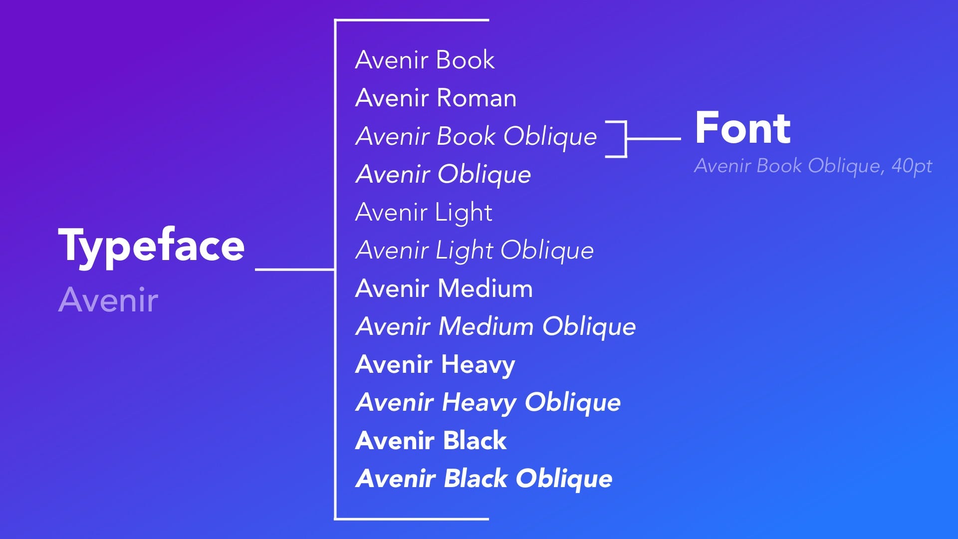
These two terms are often used as though they are interchangeable even though they’re not. Typefaces are collections of fonts. For example, Helvetica is a typeface. Meanwhile a font refers to a particular style or a particular weight from a typeface family. Within the Helvetica typeface family Helvetica Light would be a font.
What are the categories of type?
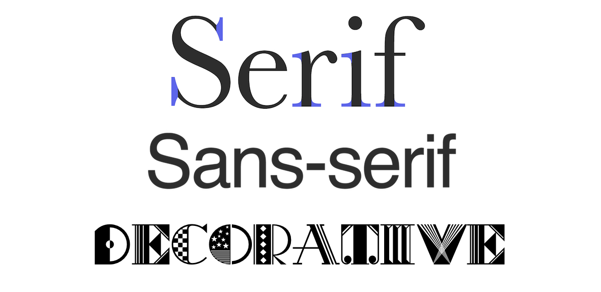
Each and every single font will belong to one of three categories of typefaces. They are serif, sans serif and decorative typefaces. Decorative typefaces are also known as display typefaces.
What are the different categories of type?
Each and every single font will belong to one of three categories of typefaces. They are serif, sans serif and decorative typefaces. Decorative typefaces are also known as display typefaces.
Serif fonts
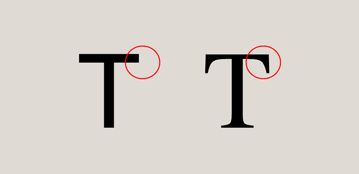
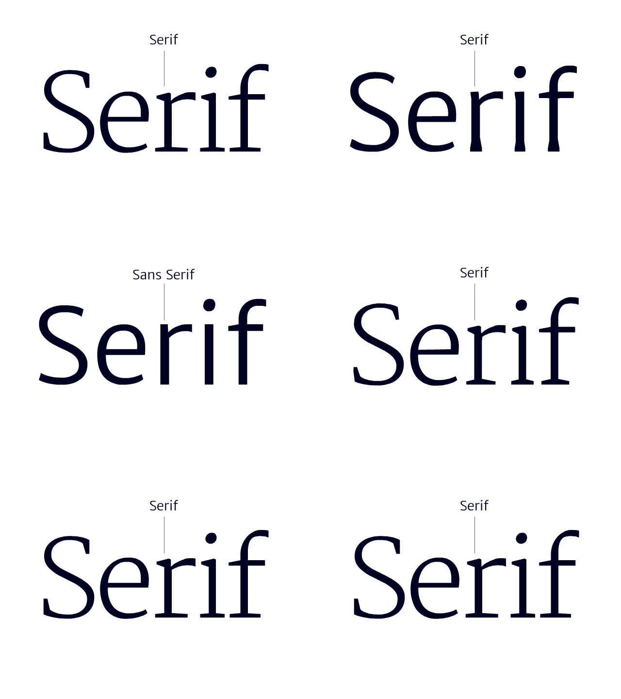
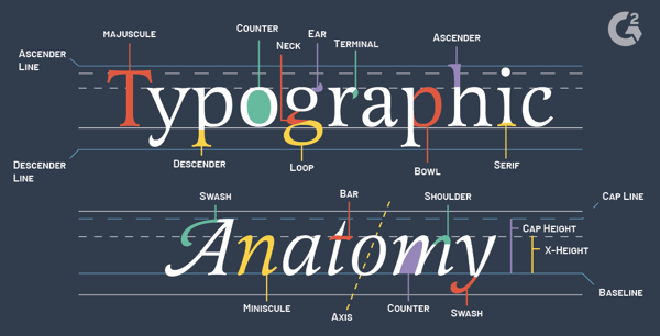
These fonts are characterized by the “feet” at the bottom of their letters. These small lines or strokes join the end of larger strokes to create the letters of a more formal and traditional typeface. Tradition doesn’t mean that there isn’t a bit of variation, though. You’ll often see slight tweaks when you compare one serif to another. Serifs are commonly used in print, for newspapers, books, and magazines for example. Times New Roman is probably the most well-known example of the serif typeface. One of the advantages of using serifs is how much customization they offer. They’ll often include italics whereas sans serifs do not.
Sans serif typefaces
The “sans” in sans serifs is the French term for “without”. So these are typefaces without the little lines/strokes. Often used for headlines, these typefaces are bold and modern. Arial is an example of a sans serif typeface that is commonly used. It’s essentially a sans serif take on Helvetica.
Decorative typefaces
Titles and headlines are what you’ll find decorative typefaces are most often used for. While they are good for adding some flair to your design and getting attention, you’ll want to steer clear when it comes to body copy. When used for body copy, decorative typefaces impact legibility, making the messaging on your designs difficult to read. Decorative typefaces include slab serifs and scripts.
The core elements of typography
There are a ton of different elements of typography. And below we’ll take you the ones that will be used the most in your designs.
Leading
The spacing between the lines of your text is referred to as leading. Measured from baseline to baseline, leading can enhance the legibility of the text in your designs when used correctly. Ultimately you want your designer to find that sweet spot between having too little space, or too much space between the lines of text.
Tracking
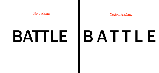
Tracking is all about spacing over a range of different characters. Negative tracking creates the effect of tight and compact looking words. Meanwhile increased tracking creates the effect of white space or air in between the characters of your text. Like leading, how tracking is used in your designs will depend on your typefaces. It’ll also depend on what you’re having a design created for. Will it be a document that’s read up close? Or a billboard seen from quite a distance? A rule of thumb to ensure legibility is that titles with capitalized letters should have increased tracking while lower case and italicized fonts require negative tracking.
Kerning
Kerning is all about the spacing between the individual letters in your designs. And while it often doesn’t come into play for large amounts of body copy, it is very important for logos and headlines. So it’s something you definitely need to consider for your ad designs.
While it might not be something your customers notice in fine print, you can bet they’ll notice awkward spacing the larger your type is. There isn’t an exact science to kerning. It just takes experience and a trained eye for your designer to recognize when there isn’t the right amount of space between the letters in your designs. And to adjust accordingly.
Alignment
In general, left aligning your body copy paragraphs is the way to go. It makes your messaging easier to read as our eyes are used to reading text from left to right. If you decide to opt for a different type of alignment, like justified, just be sure to have your designer make changes to the tracking as needed. Justified alignment usually results in some awkward looking spacing by default.
Typography tips to enhance your designs
Alright. Now that you have a solid background in typography terminology, let’s look at some more tips to help you enhance your designs.
Always use a high quality font
Fonts are the most important building block of your typography and your design overall. In order to help your designer select a great font, or fonts, for your design, you’ll want to consider a few things. What exactly do you want to achieve with your design? Do you want to grab the attention of your audience? Inform them? Maybe a bit of both? Well let your designer know your goals and which text is supposed to do what (i.e. headline vs description).
You’ll also want to think about your audience and how they will take your design in. Factor in their preferences and what works best on print or digital. And finally consider readability (how easily a typeface can be read) and legibility (how easily you can make out the letters).
Know how to pair typefaces
Or work with your designer to figure this out. If you don’t have a set of brand guidelines that specifies which fonts are to be used in which placements, you can still work with your designer to figure this out.
Determining the right typefaces to use in your designs doesn’t just come down to how they look individually. When you’re using more than one, they’ve got to pair well. If the right fonts are matched, the result can have quite an impact. It can also create visual hierarchy and help the audience understand your offers and calls to action. A few approaches that work well here are:
- Using typefaces which contrast. Like serifs and sans serifs.
- Trying fonts in the same family or typeface.
- Check if the ‘x’ height of the fonts you wish to pair match up.
If you want to play around with font pairings yourself or provide some inspiration to your designer check out Typewolf, Typ.io or FontPair.
Add hierarchy with your typography
To add hierarchy through your typography there are 3 commonly used approaches. First off you can have your text sized to represent your messaging in the order of most to least important. This means that the message you need your audience to read first, should be the largest. And then any secondary or tertiary messages will be relatively smaller sizes.
Space is all very effective for establishing hierarchy. Think about how you see headlines displayed. Yes they can be large and bold, pulling focus through that alone. But you’ll also notice when you look at different examples that there’s often quite a bit of space around them to indicate that they are the main focus.
Colors are another tool for establishing hierarchy with your typography. Vibrant or bold colors can be used for the text that you want your audience to be drawn to immediately. And then you can opt for less attention-grabbing tints of the same color or other less vibrant colors for your secondary messaging.
Pay attention to paragraphs too
Paragraph typesetting is really important and will impact how your design is perceived. Headlines and subheadings often get a lot of attention. But how the body copy is formatted plays a big role in the overall attractiveness of a design. Here are a few things you’ll want to consider about your paragraphs:
- Messy edges. Left alignment or right alignment can look great but sometimes leave edges that look messy. Ask your designer to shift words to the previous line or next line as needed to avoid this.
- Splits and windows. Sometimes the arrangement of your text can mean that some words get hyphenated and look awkward, or that a stray word appears at the end of your paragraphs. Try to be flexible and give your designer alternative words or phrasing as needed to work around this.
- Adjusting justified text. Justified alignment is commonly used for the inner pages of multi-page designs but requires considerably more time to adjust the spacing of.
To make sure that your typography works as you intend it to, try uploading your digital designs or printing out your print designs. You’ll then be able to provide your designer with more specific guidance if something doesn’t work well.
Typography errors to avoid
Just like there are best practices when it comes to typography tips, there are also mistakes that need to be avoided. Knowing these can really help improve the quality of your designs.
Don’t just rule out classic typefaces
Chances are when it comes to design or typography tips you’ve heard certain rules of thumb. Like “avoid classic typefaces because they’re too commonly used”. Try to dig a little deeper any time someone shares an idea like that with you.
Classics are called classics because they just can’t be beat in some scenarios. Typography is not exempt from this rule. There are serifs and san serifs that are tried, tested and remain true over even the most contemporary fonts. Serifs that fall into this category include Caslon, Bosoni and Fournier. And sans serifs that are solid choices for many designs include Avenir, Futura and Gill Sans.
So be sure to chat with your designer about your font options and what your goals are for your design. Don’t just insist that classic typefaces are avoided at all costs.
Kern right-side-up and upside-down
When adjusting the spaces between individual characters in your text aka kerning, it’s important to consider all angles. By kerning upside down as well, your design will look better and have more of a symmetrical feel.
If a design doesn’t quite feel right, in terms of the spacing between the letters, try rotating it to see if there’s a feeling of symmetry. In some cases you might have a certain amount of text that has to be placed in a certain way, due to your design’s specs. Or there might be a ton of other elements that need to be included. And the result is that effective kerning isn’t possible. Be sure to let your designer know if there’s any flexibility in the amount of text or other elements that need to be included.
Avoid typefaces that lack range in weights
Choosing typefaces that have a variety of weights goes a long when you’re trying to format large amounts of text. Otherwise your content will become a meaningless blur. If you’re just establishing your brand, and anticipate that you’ll need a wide range of designs that include varying amounts of text, be sure to let your designer know this. This will help them choose typefaces that will work well to represent your brand consistently no matter the design.
Choose legibility over style please
Some typefaces and fonts look really cool. But remember there’s a particular way that they’re being used and context matters. If your design will be in a different format, or involve more or less text, different colors, and so on, chances are your design is going to come out looking bad if you insist on a typeface or font that just doesn’t work. An alternative approach here is to let your designer know what you liked about a particular typeface or font and ask them how that effect or feeling can be brought to your design. A different approach might very well work for you and still allow you to have clarity and impact.
Keep these typography tips in mind
Creating beautiful typography as part of your designs can be a tricky process and requires much practice. But it’s well worth the effort to collaborate with your designer on this. Start off by looking at brands whose designs you love and pay close attention to their typography. What works or what doesn’t? Can you make it out? Or perhaps you can identify how it makes you feel or the ideas it makes you think of. Share these preferences with your designers, and try experimenting a bit together. Keep an eye on your metrics, and gather feedback from your audience. In time you’ll know exactly which typography tips resonate best with your customers.

