Mastering Ecommerce Logo Design: A Comprehensive Guide for 2023
In a world where shopping is no longer confined to physical stores, the allure of on-the-go retail has captivated consumers of all ages. As a result, the ecommerce landscape has experienced an unstoppable surge. However, it was the disruptive force of the COVID-19 pandemic that propelled this industry to unprecedented heights, leaving no doubt that the era of ecommerce has firmly taken hold. The natural consequence? An impressive influx of new ecommerce brands emerging on the global stage.
But what does this mean for an ecommerce business? It signifies a relentless battleground of competition amidst an insatiable demand. To navigate this fierce landscape successfully, it is imperative to forge a robust and unmistakable brand identity. Amidst the myriad steps required to fortify your brand, there is one that reigns supreme—a pivotal step that can make or break your online presence: designing the perfect ecommerce logo.
In this blog, we’ll delve into the world of ecommerce logo design and present to you a few easy strategies to keep in mind when you design one for your business. These are tips based on what works in the world of ecommerce and based on brands that have tried and tested out various ideas in this industry.
Reasons why ecommerce logo design and branding are important
In the ever-expanding realm of eommerce, the significance of logo design is undeniable. But what makes a robust ecommerce logo and a captivating branding strategy especially vital for online businesses? Let’s talk about the reasons behind the allure:
- In 2023, a staggering 218.8 million online shoppers are projected to roam the virtual aisles of the United States. This explosive growth in the ecommerce industry demands attention, and your logo holds the key to standing out in this captivating landscape.
- The tech-savvy shoppers today do not make rash decisions most of the time. About 81% of them only place an order after thorough online research about the products and brands they choose. And when they do their research, if your brand stands out, if it appears more authoritative than the others in your industry, then there is a good chance that customers will choose you even amidst all the competition. Your ecommerce logo can underscore the strength of your brand in this step.
- Studies show that emotionally connected customers have 306% higher lifetime value than others. For strong emotional bonds between brands and consumers, brands need to have a strong brand identity. And this is not complete without a logo that conveys the brand’s story and evokes all the right emotions.
Want to leverage all these benefits with a creative ecommerce logo for your business? Here are some tips you might like.
Ecommerce logo design – 6 tips to begin with
1. Identify the apt ecommerce logo design type
Identifying the right type of logo for your ecommerce brand is the crucial first step. Based on the elements incorporated, logos can be of several types like wordmarks, lettermarks, brandmarks, combination marks, emblem logos, and more.
The amount of space your ecommerce logo design takes up and the mood it evokes are among the many things that vary based on the type of logo you choose. For example, lettermark logo designs can be compact while brandmark logos with simple icons are easy to remember. Combination mark logos combine both symbols and text and therefore are versatile.
Comparing these differences, choose the right type of logo for your business and you’re halfway there.
2. Simple is stunning and scalable too!
Simplicity is a great strength, especially for an ecommerce logo design. Because you need instant recognition in a crowded market and memorability so that consumers keep coming back to you.
Additionally, online retailers are always expanding their scope. Both in terms of the locations you cater to and the kinds of products that customers can find on your ecommerce site, things keep changing. But with every new product line you introduce you cannot redesign your logo. Therefore, a simpler design that resonates with your brand’s personality works best.
Take the Amazon logo for example. It does not have specific symbols to talk about particular products or categories. It only uses a simple arrow going from the letter “a” to the letter “z” signifying subtly that the ecommerce store caters to all kinds of products.
Such subtle messaging without compromising the simplicity of the design can make your ecommerce logo easy to remember and scalable too.
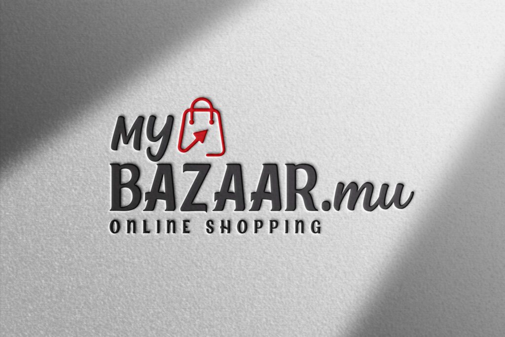
KIMP Tip: Prioritizing simplicity, several ecommerce logos are either lettermark logos or wordmark logos. But when you do choose to use symbols for a unique touch, ensure that you choose something more versatile and relevant to diverse product categories. Like a shopping bag, shopping cart, etc.
A creatively illustrated version of these symbols instantly tells customers what your brand is about. The below logo is a good example to show how you can use these symbols to convey the idea.
3. Add a visual hook
Just now we spoke about using symbols to add an element of interest to an ecommerce logo. Let’s explore some more ideas for this. Because when you add a visual hook to your design, you are creating a simple visual reminder for your brand. By visually stimulating your audience you are making it easier for them to remember your brand.
Take the Alibaba logo for example. The unique symbol in the logo is perhaps one thing that immediately draws your attention. It piques the observer’s interest and motivates you to explore the design and try to figure out what it is about. That’s when you notice the smiling face embedded in the negative space within the letter ‘a’. This layered design makes the logo an interesting brand expression.
What happens when you get a customer to observe your logo and understand its meaning? You are getting them to interact with the logo at first glance. This increases the chances of the user remembering your logo for longer. It results in better brand recall in the long run.
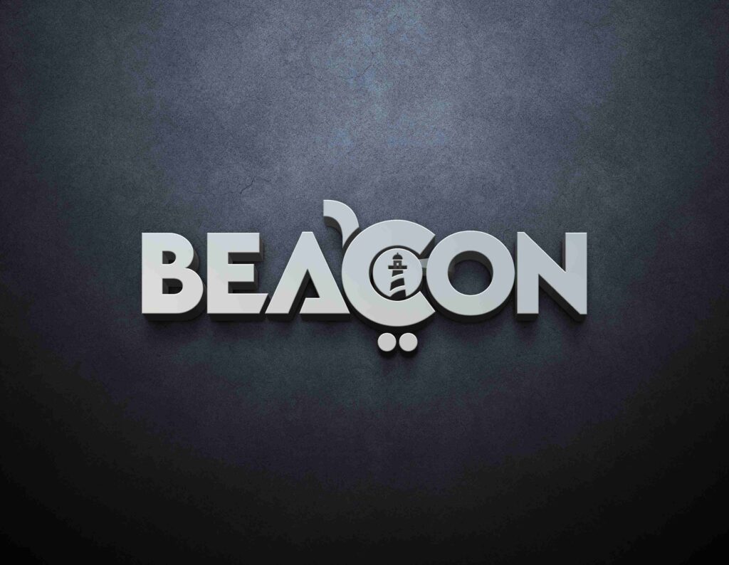
KIMP Tip: You do not always have to add an extra symbol and expand the real estate of your logo in order to add a visual hook. Observe the negative space in your logo, the spaces between and within characters in the logo. These are impactful zones where you can add a hint of brand messaging.
The below logo, for example, integrates a shopping cart symbol by creatively manipulating the letter C. This little detail acts as a visual hook in this logo.
4. Pay attention to the versatility of your logo
Like memorability and simplicity, versatility is another crucial aspect when it comes to an ecommerce logo. This part helps when you are shortlisting the best logo ideas or comparing your available options to pick the best one.
When we talk about versatility, we mean the ability of the logo to adapt well and stand out on various surfaces and designs that represent your brand. You do not just need a good-looking logo. You need one that preserves the looks of your brand no matter where you place it digitally or in print.
A design that looks great on a small screen but does not have that much of an impact when scaled up and printed on a billboard or a design that looks fine on print but does not have the same effect when scaled down and used on a web ad are both not beneficial to a brand. Well, this is true not just for ecommerce businesses but for businesses in almost all industries for that matter. But it particularly matters to ecommerce retailers because they prioritize both print and digital marketing designs in order to stay localized or go global as and when required.
KIMP Tip: To gain a better perspective of your logo design and to be sure that it is versatile, you can always use mockups to position your logo virtually on various surfaces. This helps you make changes to the design so that it is equally impactful on various media. This way you can fine-tune your ecommerce logo design before printing it out.
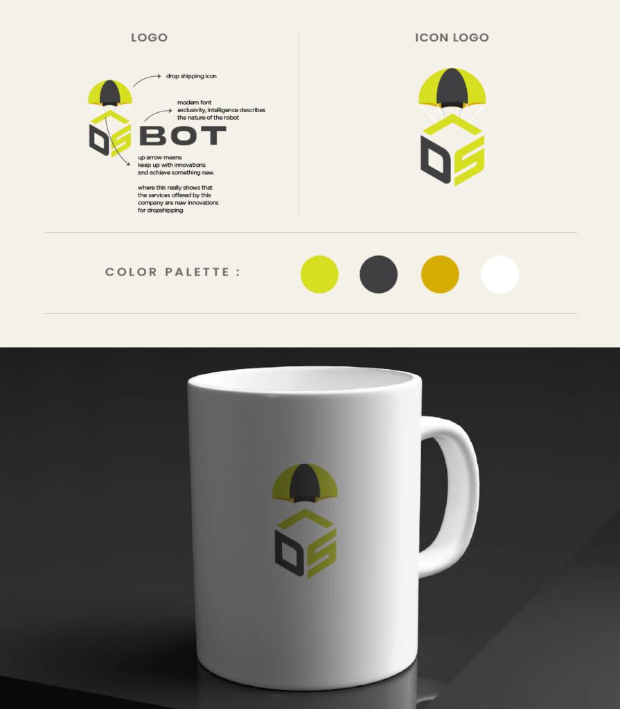
Did you know that your KIMP subscription also comes with mockup designs and unlimited revisions? Makes the logo design process so much simpler!
5. Colors can make or break your ecommerce logo design
The right color for an ecommerce business depends on the industry as well as your target audience. For example, while a lively and fun color palette might work well for direct-to-consumer ecommerce stores, professional colors like blue or black might feel like a safer alternative for B2B companies.
Take eBay, for example. The company deals with consumer-to-consumer transactions. As a result, it needs to appear more approachable. It needs a color palette that makes shopping feel more fun. The vibrant brand colors of eBay help achieve these results. The fun color scheme makes the overall experience feel more cheerful.
On the other hand, W. W. Grainger, Inc., an industrial supply company is a popular name in the B2B ecommerce segment. The brand uses a red and black color scheme along with an elegant serif typeface both of which feel more suitable to the B2B segment.
Keep this in mind when you are confused about choosing the right colors for your ecommerce logo.
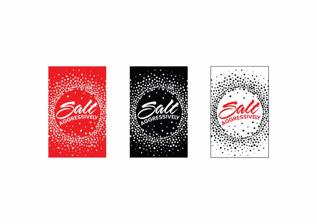
KIMP Tip: Remember the versatility factor we discussed earlier? To accommodate this when choosing colors, work with designs that look good in all color variations. Because even when you have a specific set of brand colors, you might be using variations of the logo on various surfaces depending on the context, the background color, and other factors.
An ecommerce logo design that looks equally impressive in its many color variations is the best option in the long run. The below logo is one such design. Notice how the theme of the logo still looks similar even when the colors change.
6. Typography considerations for an ecommerce logo
Irrespective of the type of logo you choose for your brand, typography can set the right mood or make your logo appear weak and forgettable.
When it is just one or two characters, as in a lettermark or monogram logo, the shape, and alignment of these characters define your logo’s personality. When it is a whole bunch of characters as in a wordmark logo, the font you choose determines how easily customers can read the name of your brand.
Summing up both these aspects, you need typography that captures the theme of your logo (to represent your brand’s unique personality) and also makes the logo easier to understand. Both of these are important for your target audience to get introduced to your ecommerce brand as well as to remember it with every transaction they make.

Additionally, the font you choose for your ecommerce logo also determines how versatile your logo is (the right font ensures that your logo is easier to read no matter where you use it). It also helps create an impression when you experiment with colors based on the application. In short, for your design to work you need the right fonts!
Create catchy ecommerce logos with KIMP
A lot of thought goes into crafting an ecommerce logo. After all, it is that one visual element that carries the weight of your brand on its shoulders. And sometimes you only get one chance to impress potential customers and your logo manages to leverage this chance effectively.
But yes, for that to happen, you need a design that reflects what your brand really is about and also connects with your audience. A professional design team that supports unlimited revisions to perfect your logo design is just what you need.
Register now and start your free 7-day trial!


