Everything You Need To Know About Hero Image Design
Hero images are the large images, or a series of images that are displayed, prominently on a homepage and sometimes used in email designs. They actually play a very important role for all businesses’, so it’s important to know a thing or two about hero image design.

Why should you have a Hero image?
- It can help you build up your brand and tell your brand story. You can use this imagery to give information about the story behind your brand.
- You can also use it to answer the most asked questions that your customers have or address an issue that is time sensitive.
- Hero images can also be used to let your customers know about the value proposition of your brand.
- If you have an important announcement to make, like for example, a sale that will be happening soon, this can help. This is a great idea for the emails that you will send out too.
- Hero images can be used to feature a product or a complete product line.
What should be included in a hero image design?
There are three main elements that you need to have in your hero image design to make it the perfect one for your brand. It will actually act as a call to action image if executed correctly.
- The image itself should feature high resolution photography, eye catching graphic design or images. The image resolution will be listed so that you know what size the images should be.
- You should also have a short, concise and powerful content that can be added on the image. This should immediately drive the message home.
- All hero images need to feature a very powerful call-to-action text or button. Some good examples would be “Shop Now”, “Learn More”, “Read Our Story” or “Buy Now”.
Best practices for creating Hero images
Use high quality images
It is really important that your images are of high quality whether they are on a website or in an email. Because of the size of computer and smartphone screens today, customers can easily tell if your hero image design looks fuzzy or pixelated. If you want to avoid these issues, you can always resize your images by reducing them in size. But never increase the size. As soon as you do, your image will become pixelated.
When it comes to the height and width of the hero image, it will depend upon the particular layout you have. Maybe you want your hero image to take up the complete width of the page? If so, use VW or VH (which means the full width or height of the viewport area).
You should also make sure that you customize any stock images you use, and that the background is not overly busy, especially if you are adding text. Using color contrast through overlays and scrims, is also a great way to bring clarity to the text and the background. For example, note the white text in the image given below.
Loading times for the images
When you are using high quality images, the loading times play a critical role. When loading time climbs from 0.4 to 0.9 seconds, it brings traffic down by 20%. So some of the best practices you should follow to avoid this are:
- Resizing the image yourself and not letting the browser automatically do it.
- Compressing the image you chose using Photoshop. You can also use compressing tools meant specifically for this.
- Try and work with both PNG and JPG images to see which type works best without increasing the loading time.
Demonstration to drive appeal
Your hero images design should show the audience what you are selling exactly as it is. For example if you want to sell customized umbrellas, you can showcase an image of people in the rain using them.
If your image is indicating a slogan or telling customers about a sale, make sure that there is only a small amount of copy used. Another important thing to note is that captions under your images will be read 300% more than the body copy. So let that give you an idea about how accurate, compatible, and targeted your caption should be to the hero image.
Another tactic you can try is to use a series of hero banners, rather than a single image, that combines high-quality imagery with a strong and compelling call to action.
Maintain relevance
Your hero image is like an introduction to your message. It will help your customers understand what they can expect from the rest of your email or your website. If the image fails to clearly convey your message, it also fails to deliver value to the customer.
It would also be a complete waste of the space that you have used up for the design. Even more dangerous is, if the image does not correspond with the customer’s preconception of the product or the service. It will then just be confusing.
In order to maintain relevance, you will need to consider the following:
- Is the image used a visualization of your target keyword?
- Does your image give clarity on the purpose of your website or email?
- Is the flow of the page or the email, leading all the way to the call to action, being supported by the image used?
- How much credibility and authenticity does the image bring to your brand?
- Are the benefits and the relevance enhanced by the image?
- Does the image trigger emotions that will compel customers to take that call to action?
- Can your image portray the customer as the hero after they have acquired the product or the service?
Putting emphasis on the call to action
Earlier on, we pointed out that having the call to action on your hero image design is important. Now, let’s look at what you can do to immediately draw attention to it. For instance, your call to action should not be competing with the image. However it should really stand out. The example below is the perfect combo of delivering a relevant and emotional message while maintaining the weight of the call to action button in proportion to the overall image. The use of color here is also very important.
To make sure that the CTA stands out you can perform a blur test on the image. This will help you see whether or not the eye of the customer will be drawn to where you need it to go. You simply need to take a screenshot of the site or the email design, and then apply a blur effect on it using Adobe XD. Once the image is blurred, see what draws your eye. Don’t like what you see? It’s time to revise then.
Showcase real people, not ‘real fake’ people
If you’re going to include people in your hero image design, showcase images of real people who represent your brand. Steer clear of stock imagery that just shows a professional-looking person with a wide smile staring at the screen. These images are a dime a dozen and just come across as meaningless and fake. Usability tests that have been carried out show that such images are just decorative, and that they do not add any real value. It could also take positives away from the user experience.
Consider using illustrations that have a personal feel to it
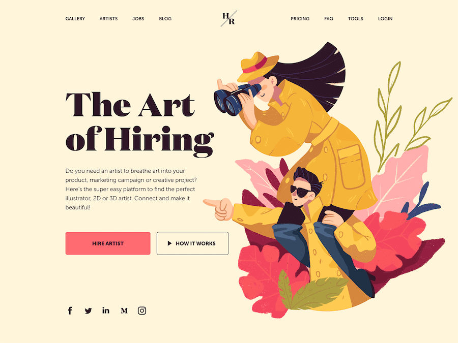
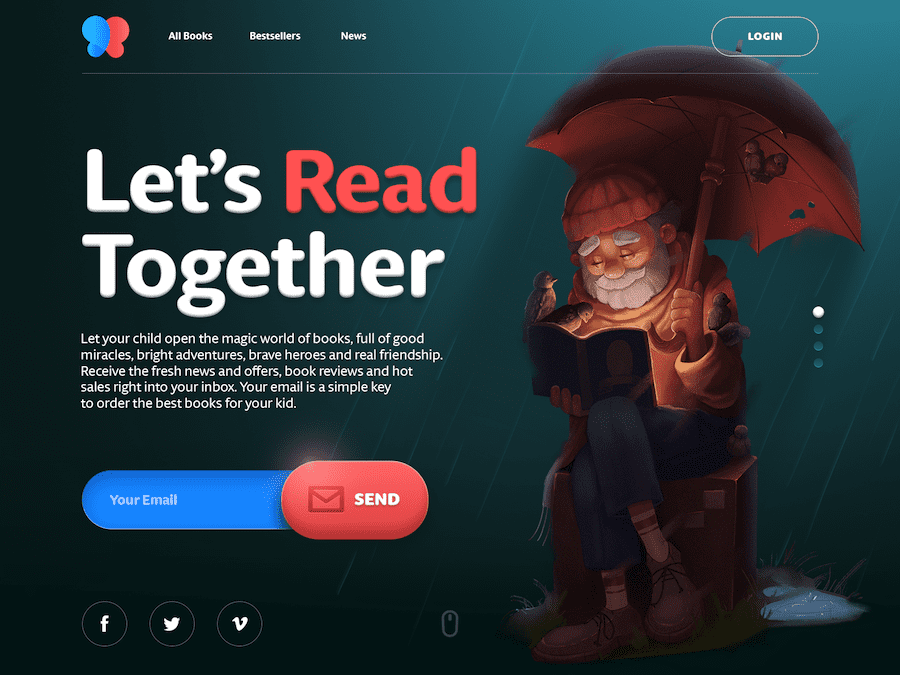
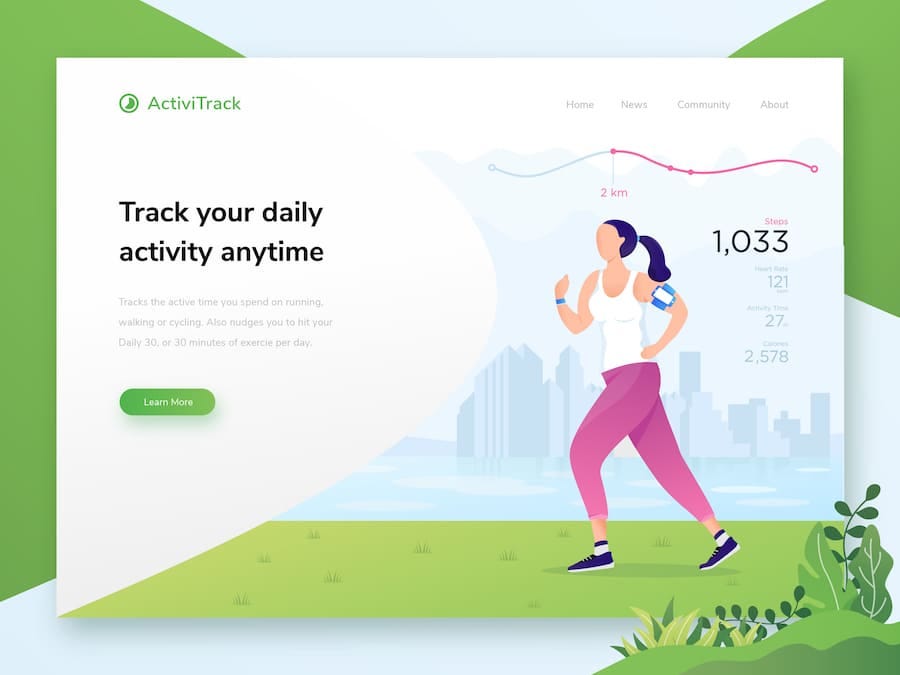
Illustrations are also becoming a popular choice for hero image design. If you can add that personal touch to an illustration, they can actually bring a lot of personality to your image. Using illustrations will give you better control over the technical and content related aspects of the image since you can customize them as much as you would like. In fact, if you want to have better brand recall, consider customized illustrations for your hero image.
For an illustration to be functional, it should be easily recognizable. The message that it sends out should be seen similarly no matter who the user is. If there is more than one illustration, they should all have consistency. In other words, it needs to look like the same person created all the illustrations.
If you need a hand with your hero image designs, a dedicated Kimp Team is always ready to help. ?
Awesome hero images for inspiration
Now that you know the basics, here are some great examples of Hero images that work really well.
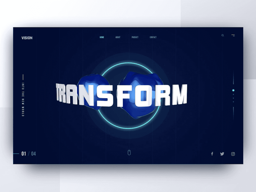
This image uses a 3D concept. It also has a sharp and attractive background with great functionality.
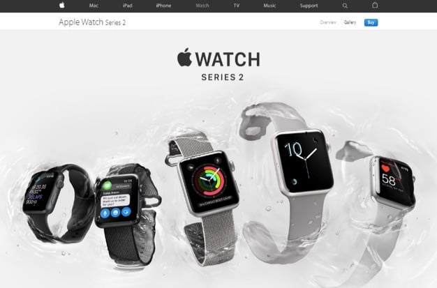
Apple, as we all know, is a brand that is all about its design. As such, it makes perfect sense for them to showcase their products on their hero images – with style.
Spotify really makes an impact here through their use of beautiful color contrast that plays well to make that offer really pop. In addition, users can also scroll through multiple hero images instead of just the one.
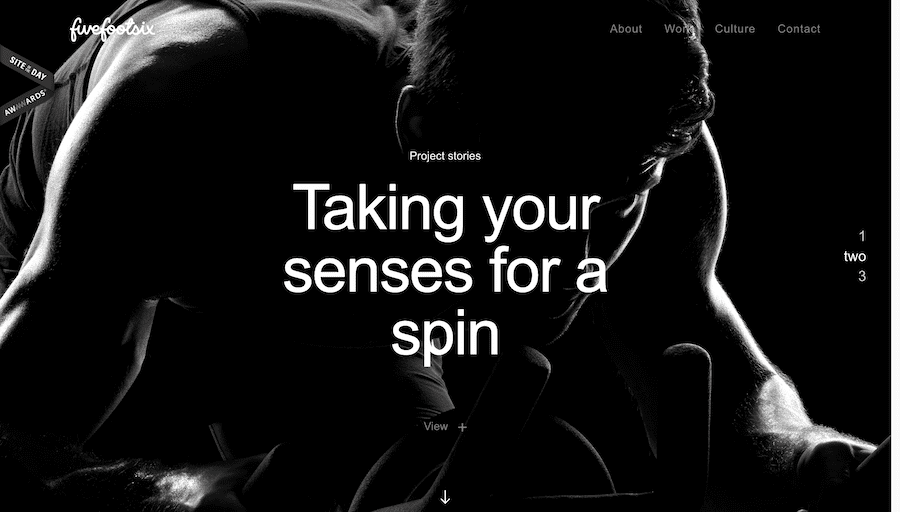
This hero image design from the brand Fivefootsix is a full black screen that has a highlighted slogan which is placed right in the centre. The nature of this design and the text placement immediately draws your eye to it.
Be a hero and get your Hero image design right
Creating a great hero image design is very important. Not only will it help you project your brand personality and create awareness, it will help you with increasing sales too! You should also think about how often you would like to change your hero image design so that people who are repeatedly visiting your website page feel that there is something new for them to check out. With emails, make sure that your images are catchy enough to make the reader browse through and not hit that delete button.
When it comes to your design, make your image clear, powerful, carefully thought out, and unique. The main goal here is that your customer should feel drawn to the image and they should feel compelled to read through what you have to say.
