The Pantone Color Of The Year: PANTONE 17-3938 Very Peri
Every year-end comes with many Year-In-Review reports, Wrapped moments, and trend roundups. But there is one news piece that keeps every designer and marketer on the edge of the seats from the time December begins.
And yes, that is the color of the Pantone Color Of The Year announcement.

A two-decade-old tradition, the color of the year is usually a culmination of the trends and events of the past year. And a nod to the expectations we have for the coming year. But it’s not just the announcement in and of itself that’s exciting. It’s all the possibilities that will be brought to life by professionals in interior design, fashion, retail, and graphic design.
Color has always been a topic that everyone has strong opinions about. It triggers powerful emotions in everyone and makes them connect to the content/design/product they are interacting with.
And the color of the year gets a lot of buzz, so it makes sense to cash in on that. But how you use that color matters a lot too.
To use the Pantone color of the year in the right context, you need to understand why it was chosen and what it is intended to mean.
And that is why Kimp is sharing this exclusive blog for brands and marketers who want to hop on this trend but lack the insights to do so.
So with no further ado, let’s jump right in.
Very Peri: Pantone Color of the Year
Right off the bat, the name of the color might perplex you. If you keep yourself updated on these color trends, your social media is full of the color’s name and Pantone’s recent announcement. And if you think that you have never heard of this color before, you are absolutely right. There is nothing wrong with your memory because this is a brand new color, hot off the fresh minds of Pantone’s team.
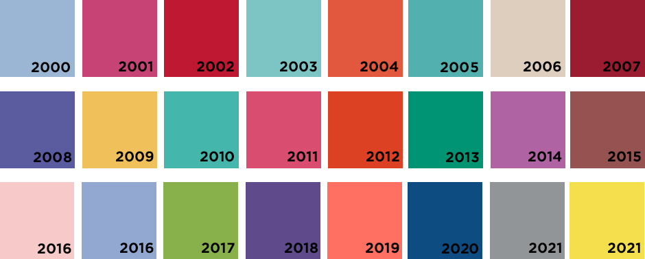
Pantone’s color of the year has a legacy going back to 2000, and the firm has always chosen colors from its wide palette that reflects the world’s trends. But there were some changes after the COVID-19 pandemic became a reality. Last year, the brand chose two colors, and this year they created a color.
Very Peri, short for Periwinkle blue, is not your typical blue or violet shade. The color takes its name from its flower namesake. But Very Peri has a subtle red undertone that you can only notice in high resolution.
The company feels that this color is the perfect ode to the changing times we live in. If you look closely, you will notice that this shade of blue/purple/violet has been everywhere for the past year. Fashion shows, games, automobiles, or interior trends – this was in a lot of places. Shutterstock’s 2022 color trends featured a violet too. Coincidence? We think not, given how Pantone’s color of the year is a culmination of all these occurrences.
In other words it’s not just about where we’re going, it’s about where we’ve been.
Very Peri: Why did Pantone choose to create a custom color for 2022?
If you look at popular graphic design trends or digital marketing trends, you will notice that the experts have been advocating for custom fonts, custom colors, and custom illustrations. Basically, original graphic design is a hot favorite right now.
Is that why Pantone created a new color for its color of the year 2022?
According to the firm, the color holds a mirror to the mood of the world and creates hues that people can relate to. Laurie Pressman, Vice President of the Pantone Color Institute tells us that, “The decision mirrors the adaptation of a society that’s rapidly shifting its own practices in the face of COVID, embracing everything from remote work to grocery delivery as a way of living that has seemingly changed overnight.”
Blue is a dependable color and red brings the right amount of energy and vigor, according to her.
Another reason for picking this color clearly has to be the growing influence of Metaverse and the merging boundaries of the real and virtual world. This color suits a Zoom background, a shop interior, and graphic design in marketing with equal perfection.
And to prove this, Pantone has a collaboration with Microsoft launching wallpapers, palettes, and Teams camera filters for users to add this color to their everyday life.
Not just that, there is a digital artwork for the digital unveiling of the color along with the traditional swatch.
Pantone is clearly invested in bringing the Metaverse to the next stage!
The Significance and Impact of the Pantone Color of the year
It is honestly very astounding how big the announcement of Pantone Color of the Year has become. While it has been around for the last 20 years, this movement only gained momentum in the past few years. Every year for the last 5 years, the Pantone color of the year has impacted the allied industries.
In fact, after the creation of the Pantone color matching system in 1963, this is hands-down the biggest achievement of the Pantone color institute.
Graphic design and marketing creatives over the past few years have reflected the declared Pantone colors of the year. While this is something we can expect, the impact goes further. The colors have seized imaginations and propelled consumerism in more ways than one.
They have even had a significant impact on product sales and marketing campaign success.
Let us consider a very popular example of this. Apple unveiled its new iPhone with multiple color cases as an alternative to the otherwise luxury smartphone in 2018. Pantone’s color of the year for 2019 was coral. And lo-and-behold, Apple’s iPhone XR became its bestseller, with coral being a very popular version.
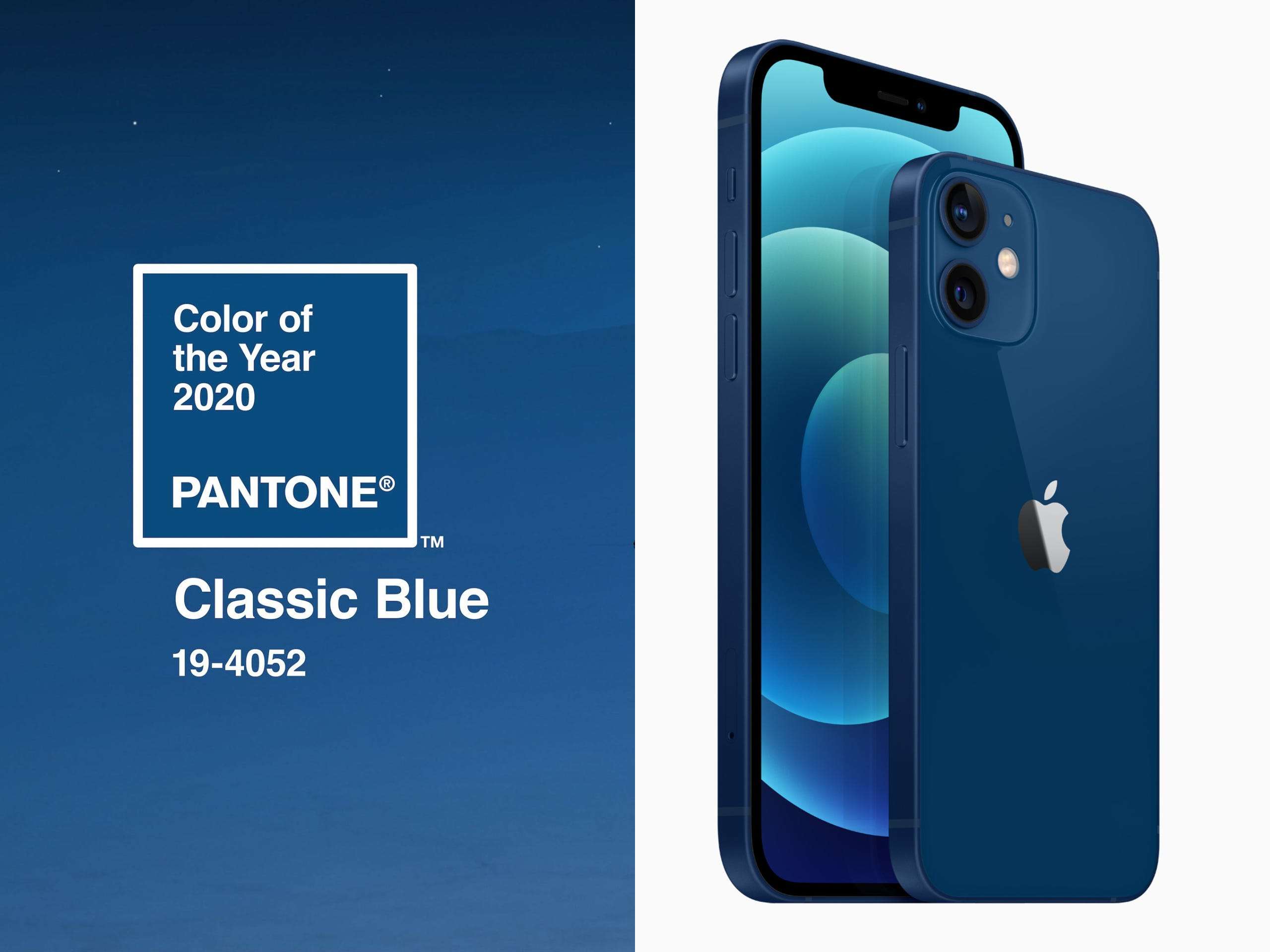
The same happened in 2020. Pantone announced 2020’s color of the year to be Classic blue. And what do you know? The next iPhone series from the smartphone giant featured this color extensively in its collection. To date, the phone’s most popular color is Classic blue.
Leveraging the Pantone Color of the Year in Marketing
Now before we go any further, let us be clear on one thing – we do not recommend just blindly trend hopping based on Color of the Year (COTY) trends each year. It’s important to update your marketing effort while staying true to your brand’s visual identity.
And Pantone’s COTY does make this relatively easy. Pantone’s color of the year is always a reflection of society and social trends. It features colors that are already a part of our everyday experiences (virtual or otherwise), so the reception is generally pretty positive.
So should you revamp your marketing campaigns completely? Make it all Very Peri? Well, not exactly. You do not want to thrust this color into your customers’ faces just because it is the color of the year. Integrate it seamlessly in your brand’s style guidelines. Or add it into the occasional campaign or design, only if you feel it is the right choice for your brand aesthetically.
And if you do choose to embrace Very Peri for your 2022 marketing campaigns, here are a few ideas from the Kimp Team, just for you.
Let’s dive right in.
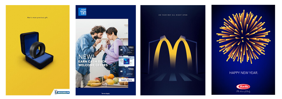
1) Play on the color palettes from Pantone
As we mentioned in our introductory section, you have to integrate Very Peri into your designs subtly so that you do not overwhelm the customer. Now, thankfully, this year, the color is a shade that goes well with almost all tones, right from vibrant colors, neutrals, to more reserved colors like black, gray, and so on.
When Pantone announced the color of the year, they also unveiled color palette suggestions to use Very Peri in different contexts.
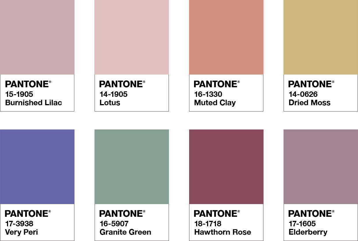
The “Balancing Act” palette above is great when you want balance in your design between the warm and cool tones.
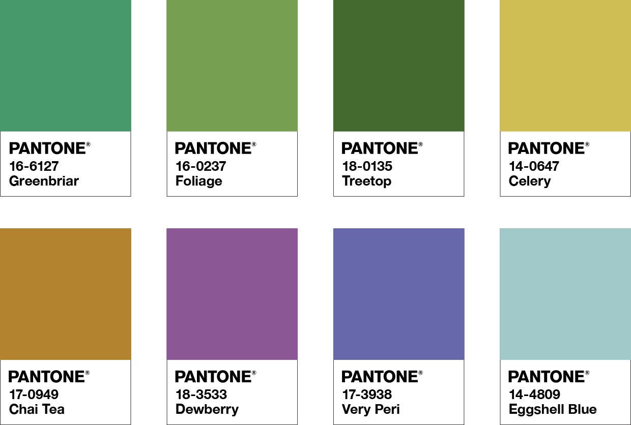
The “Wellspring” palette embraces the vibrancy of the color (Very Peri) and helps you choose equally earthy and nourishing colors to pair it with.
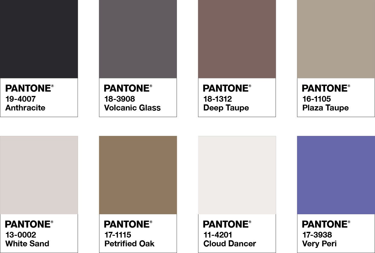
The “Star Of The Show” palette helps you make Very Peri shine and pair it with the most elegant shades of black, brown, and white.
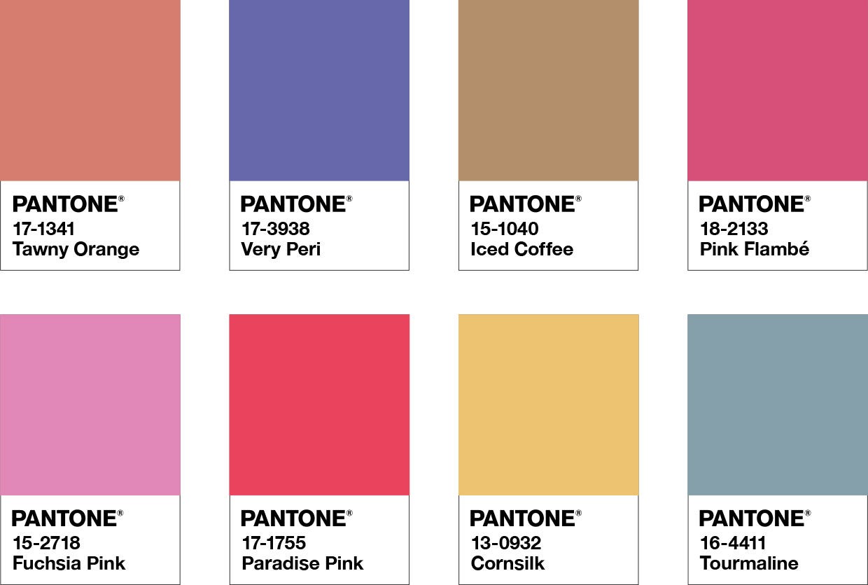
Our personal favorite, the “Amusements” palette. Color pop and Retro color trends are currently very popular and this palette helps you combine those trends and Very Peri in the best way.
Based on your brand style guideline and brand personality, you can pick the design style and palette you wish to proceed with.
Once you pick the color palette, you can implement it across all marketing channels, including but not limited to newsletters, social media, website, landing pages, OOH (out-of-home) advertisements, and in-store designs.
Kimp Tip: These color palettes are only suggestions from the Pantone Color Institute. You can always work with a design team at Kimp Graphics to explore ahead and create brand new combinations to impress your customers. And with our unlimited graphic design services, you can experiment all you want for a flat fee.
2) Using Very Peri on the web
As you likely know the Pantone Matching System aka PMS was created specifically for print. So as with the case with print designs that use CMYK, you won’t get an exact match when you try to use the equivalent of Very Peri online.
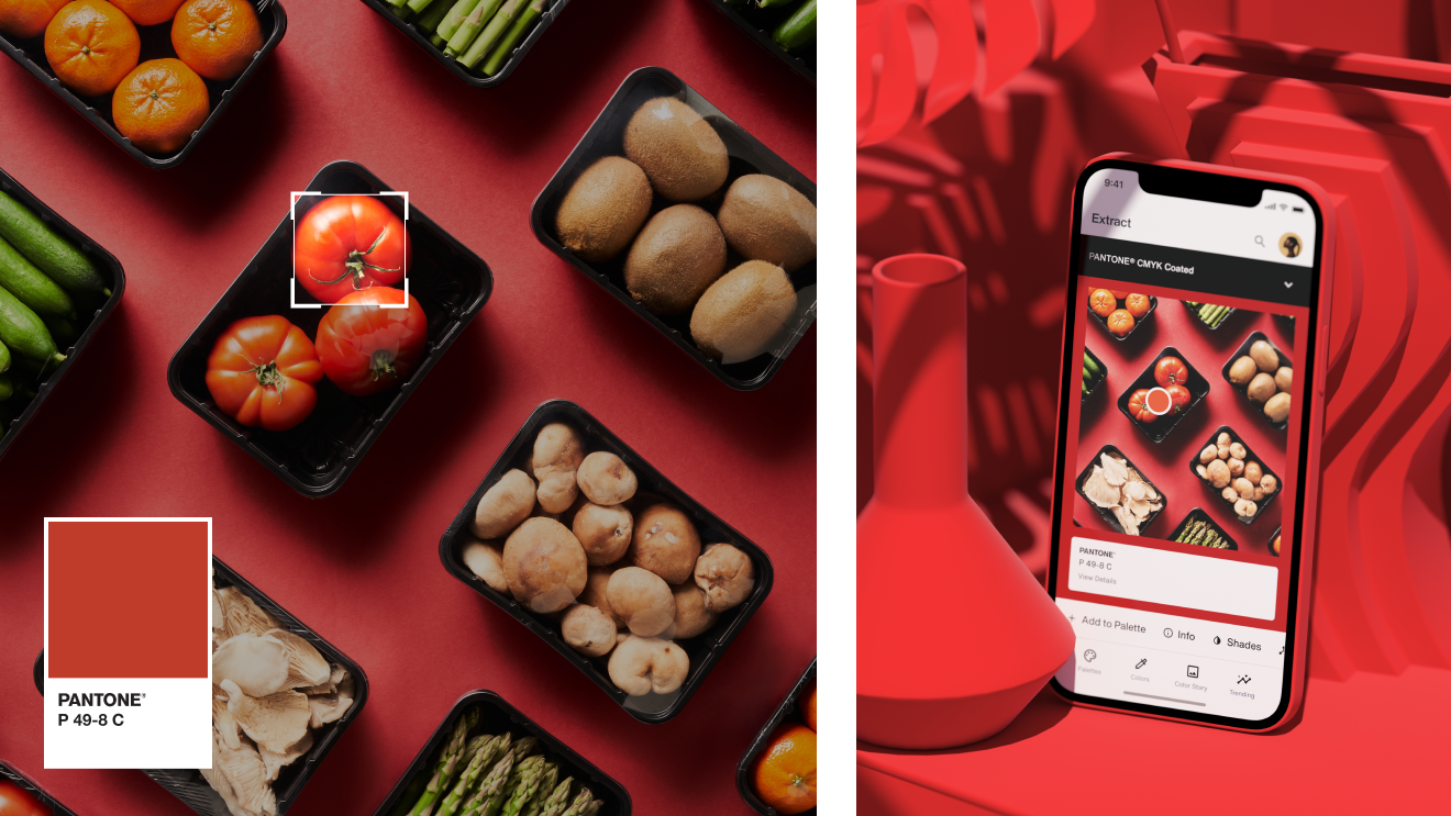
But Pantone hasn’t left all of us digital marketing enthusiasts in the lurch. They’ve come up with Pantone Connect for figuring out how to use the Pantone Colors of the Year online. And this means that you can keep that all-important consistency in your visual identity.
You just have to know the PMS number for the color that you’re trying to find the equivalent of. You type that in and you’ll be able to get the equivalent (more or less) RGB, CMYK, Hex, L*a*b color codes.
3) Embody the spirit of Pantone’s 2022 COTY
Using the COTY in your marketing campaigns does not just mean using the color in your designs. We discussed that this COTY results from the world’s trends, moods, and current happenings. And, as always, color has a spirit of its own. For a successful Pantone COTY-inspired marketing campaign, you must capture that spirit too.
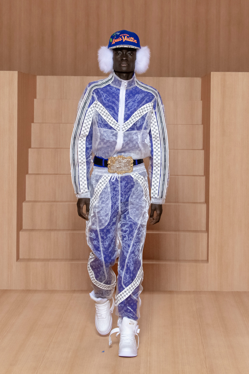
Some believe that Pantone’s color of the year for 2022 is Y2K all over. For the uninitiated, Y2K was a period after the year 2000 where the color trends were full of bright hues and shiny surfaces. Recently, Y2K fashion has been making a comeback, and this color reveal by Pantone sort of seals the deal.
So, if you want to create campaigns that center on Pantone’s 2022 COTY, consider choosing a retro design, Pop Art, or 90s design style for best results.
Source: Fast Company
Kimp Tip: Very Peri can be a tricky color to design with, even without the challenges of the retro or Y2K framework. You want to be as loud or reserved as your brand’s visual identity allows you to be. And choose carefully to stay on the good side of history.
If this feels too complicated, remember that a Kimp Graphics free trial is just a click away.
4) Understand COTY and color psychology
Color psychology is a well-established theory on the relationship between color and human emotions. Subsequent researchers have also shown us that color has a direct impact on the purchasing behavior of customers.
Understanding this can help you understand your customers’ reactions to your marketing efforts.
So what is the psychology behind Very Peri? What does it signify for the customer, and will it make them buy your products?
Well, according to Ms. Pressman from Pantone, this color effectively captures the current state of affairs and is a complex color to reflect the complex world we live in. We have always associated the base blue color with most brands. It is the most favored color and signifies elegance, hope, and calmness.
Purple, however, signifies mystery, magic, and imagination. Given how it is a prominent color of the 90s and early 200s, we can only safely bet that it is full of nostalgia for consumers.
Shutterstock has included a velvet violet in its 2022 color trends too and suggests that the purple takeover is imminent.
As a brand, what you must understand is that Very Peri is an exclusive, complex, and exciting color that appeals to a niche audience.
If your brand has an audience of GenZ and Millenials, and your product must speak of excitement, freshness, magic, and more to them, pick Very Peri confidently.
5) Launch a new product range
If you work in an industry that has a very close relationship with colors, this idea will keep your brand mentions abuzz for a while. And why not? When you work with colors in fashion, interior design, graphic design, and marketing, you must make the most of the most trending news of the year.
Launching a new product line as a homage to Pantone’s COTY can be extremely beneficial to your brand. The theme alone will intrigue your customers, and the FOMO to own a limited edition line with the 2022’s COTY could drive sales to new heights.
Looking for some ideas to launch a COTY-inspired product line? We’ve got you covered:
- Update the packaging design of your most popular product line with a few tweaks to the product as well with the Very Peri color palette.
- Launch Branded merch in Pantone’s color of the year theme if Very Peri suits your brand and target consumers’ preferences.
- Include freebies and goodies in your new product launch, that are inspired by the COTY from Pantone.
Including Very Peri will ensure your launch grabs everyone’s attention and heightens your brand’s standing in the market.
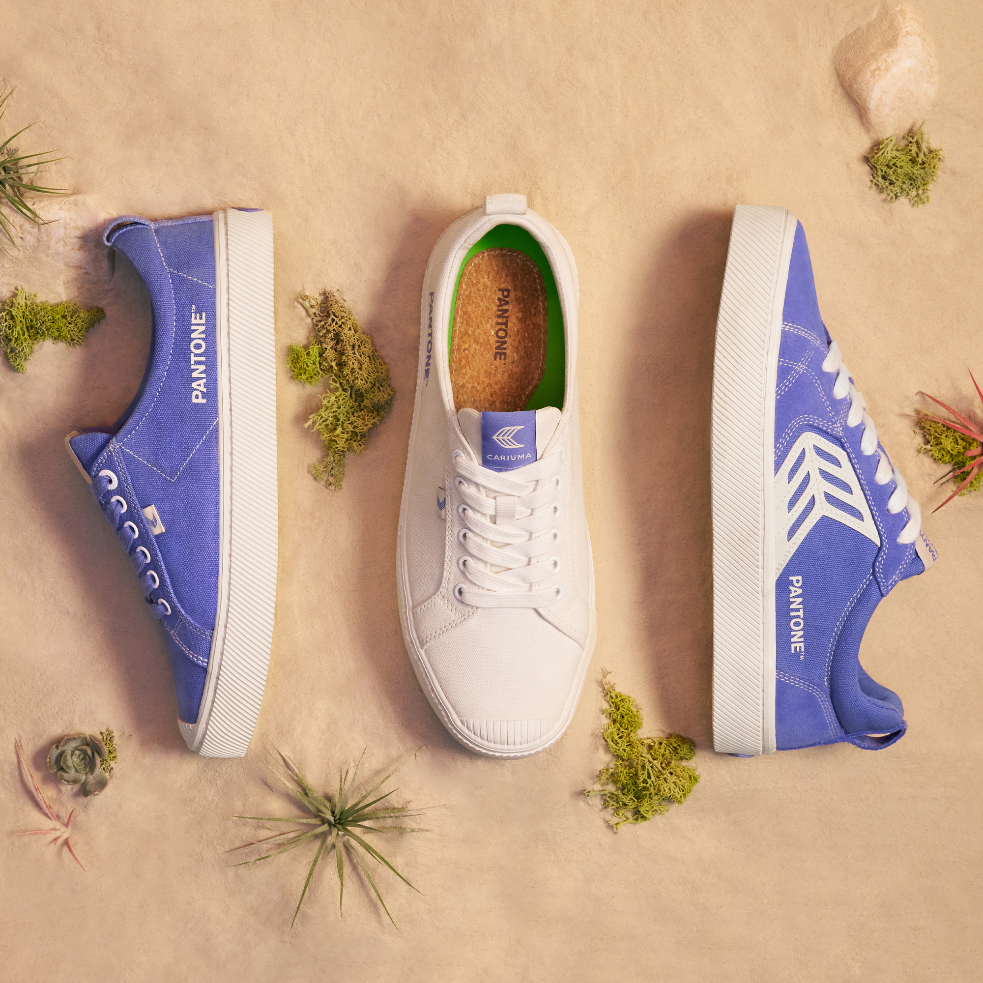
6) Create Branded NFTs using Very Peri
Very Peri is a color that Pantone has specifically created for the Metaverse, so why not dabble with it for your brand too. Yes, we are serious. Creating NFTs is a great way for brands to ensure that they expand their customer base and create long-lasting assets.
Pressman herself elaborated on the immense potential branded NFTs hold citing the success of the recent drops from Nike, Vans, and Gucci.
By using Very Peri, you can now launch a design or product line that looks the same on the metaverse and in the physical world. You can go from creating a new footwear range to creating NFTs that match. Very Peri makes it all possible.
And forget about shade discrepancy given the in-depth details Pantone provides about its custom color..
There is also no better color to create your first NFT in than the one created only for the metaverse and launched as an NFT itself.

Create designs using Very Peri with Kimp
The marketing world is becoming too fast-paced, isn’t it? And the end of the year especially is relentless. It is difficult to keep up with it all, but keep up you must.
The color of the year from Pantone is a milestone announcement, and all brands scramble for a small space in that bright limelight. We are sure you want to be one of those brands as well.
And you should be. With Kimp Graphics and Kimp Video you get unlimited design subscriptions that allow you to experiment with, and optimize, your marketing creatives for a flat monthly fee. We offer unlimited design requests and revisions for unlimited brands. And you can invite your whole team to manage your design projects – from over hundred design categories – alongside you, too!
Ready to enter the metaverse with Very Peri and Kimp? Sign up for the free trial now.
