Billboard Design Secrets: Get The Best Returns on OOH
When you want to get people to notice your business, what do you do? Shout from the rooftops. Literally. Through billboards that is to say.
You see them everywhere. On the highway, on buildings, near shopping centers, even when you wait for a bus at the bus terminal.

Even though you cross so many billboards during your daily commute, how many of them really make an impact on you? Probably just a handful, right? And these might be the ones from brands you already know well. Or billboards that had a memorable design.
Yes, there are many digital channels today for advertising. And these help you reach your audience right where they are. Still, you cannot ignore the power of outdoor advertising. For that reason, the global expenses on out-of-home advertising are projected to hit 42.4 billion U.S. dollars.
In fact, in the U.S. alone there were more than 350 thousand billboards in the year 2021. Given these points, remember that the competition is tough out there. But how do you face this competition?
Roll your sleeves and get ready to hear some quick billboard design secrets to give your brand a competitive edge.
And with these tips, you can be sure that yours does not get lost and forgotten amidst the thousands that people come across.
First Things First, Are Billboards Still a Thing?
The increasing number of billboards you see every day as you walk past busy streets should tell you enough about their relevance.
Brands still use them because around 26% of customers who see an outdoor ad visit the store. This implies that you are assured of reliable conversion rates for your billboard advertising.
Not convinced yet? You’ve got to hear this.
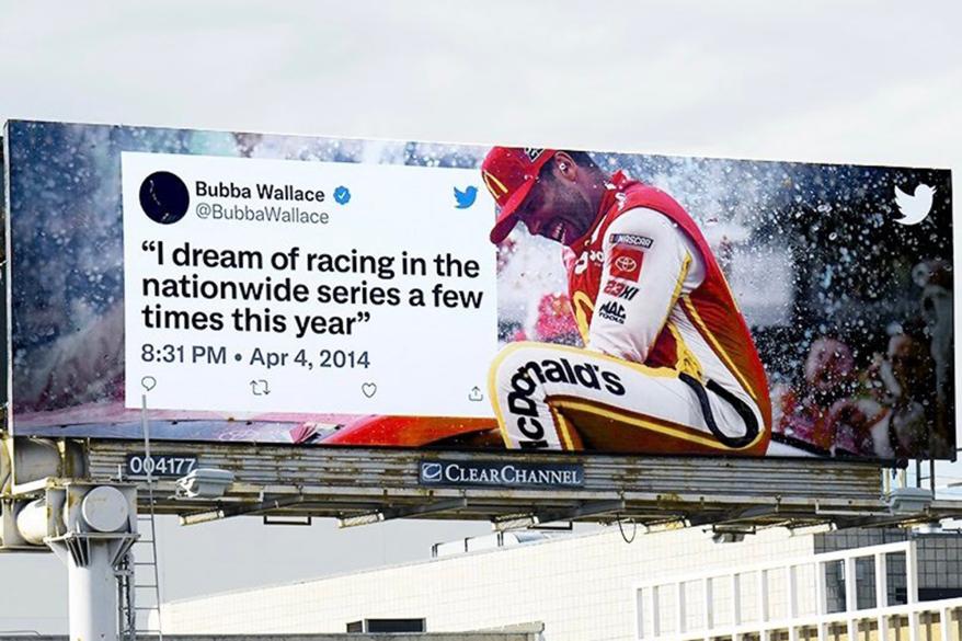
We know that brands big and small are busy Tweeting their promotions. Twitter, on the other hand, is busy advertising through billboards. Take a look at this billboard ad by Twitter.

It’s not just Twitter. Apple, Google, and even Netflix are pretty active in the billboard space. Now, that has a lot to say about the relevance of billboards in the digital age, doesn’t it?
Billboards help brands with a host of things like strengthening brand awareness and improving brand recognition. And through strategic placement of your billboard, you can easily win the hearts of your target audience and get them to take the intended action too.
Besides painted and print billboards, digital billboards are also very popular now. Think Times Square!
So, there are many ways to step into the world of outdoor advertising these days. In short, proper placement, well-planned content, and strong branding ensure that your billboards earn you the returns you expect.
But at the crux of it all, there is one more thing, an eye-grabbing design. Seeing all the fancy billboards around you, if you think it will be hard to keep up with the trends, fear not, we have 7 easy billboard design secrets for you. With these, you can take your billboard advertising to the next level.
7 Billboard Design Secrets to Ace Your OOH Advertising Game
1. Go for a clear and straightforward layout
The below design would have looked great in a social media ad where people can take their time and read what’s there. But on a billboard, the brilliant concept of superimposing the text within the silhouette of a foot is a risky bet. While the layout might be a hit the text might get lost.

For a globally popular brand like Nike, this design might work. Most people also might also instantly recognize the campaign. And that’s because they see the same pictures from these brands on social media. Thus they easily connect with them. But for a smaller brand, one whose logo alone will not ring any bells, this might not be the most effective billboard layout to choose.
On the other hand, an easy layout like the one below will be a fuss-free choice for most brands.

In the above design, the brand name and contact information are clearly distinguishable from the rest of the content. This will be a suitable approach for brands big and small. It tells people what is being advertised and how they can connect with the brand. That’s enough to get the right people to make the call.
Kimp Tip: Fancy layouts for your copy will definitely grab eyeballs. But one of the biggest billboard design secrets is to focus on the legibility of the message readable. So, choose a more conventional layout that most people will get at first glance.
Want a billboard design that will help expand the reach of your small business? The Kimp team is here to help.
2. Use contrasts to your advantage
What happens when you ignore color contrasts in your billboard design? Take a look at the example below.

If you had to look at the above billboard twice to notice the text “shine on”, we understand. Even the brand name at the bottom is not exactly easy to grasp at first glance. Designs with little to no contrast like this one do not make much of an impact.
When you use strong color contrasts, the design looks so much better. Don’t believe us. See for yourself from the below billboard.

In the above billboard, every single word pops out from the background. With a design like this, you can be sure that your customers remember the information you convey. While your brand colors are important, using them relevantly is even more important. Use them in such a way that they do not interfere with the message communication part.
3. Be wary of the fonts you choose
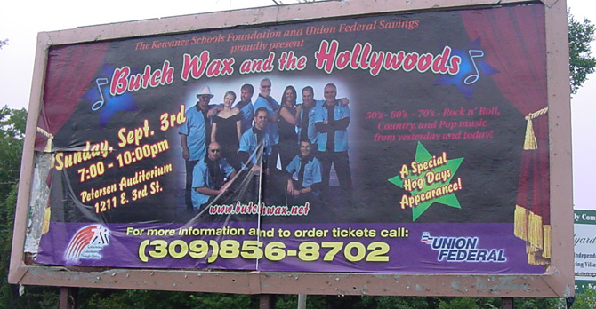
Do you think the below billboard design will make a good first impression? Probably not.

In the above design, if the visual clutter is one thing, the poor choice of fonts is another. Some fonts can instantly dilute the impact of your billboard. They make the design look less professional. And this can be bad for your marketing.
While choosing a font is a critical task in most designs, for billboards it matters a little more. Imagine reading the above billboard from a distance. Even the key details like the venue and date might be difficult to read. As a result, the whole purpose of the ad is lost.
On the other hand, a billboard like the one below will be easier to read.

The legible fonts and the contrasting colors popping up on a clean white background together make this design practical and the text, easy to read. If your target customers manage to retain at least the critical bits from your billboard, your design is a success.
Kimp Tip: If serif fonts suit your brand’s persona, pick ones that are easy on the eyes. Sans-serif clean fonts with medium strokes are the easiest to work with. And they are suitable for most brands. Script fonts are not exactly practical when it comes to the legibility aspect.
Confused about the kind of fonts that will clearly get your message across on a billboard, leave it to the Kimp team.
4. You cannot compromise on hierarchy
After looking at the above image, if you cannot recall any substantial information from it, we don’t blame you. The brand name, CTA, body text, everything is of the same size. To point out more specifically, there is almost no visible difference between these sections.
On the whole, when there are no priorities set for each visual element in a design, it becomes difficult for people to remember details.
With that in mind, look at the below billboard design to see what setting a clear visual hierarchy can do.

In the above design, firstly, the font size variations and accent colors help define the areas of focus. Secondly, the big bold font for the price adds a visual hook. Finally, once the billboard has your attention, you also easily recognize the important portions of the copy. To summarize, reading only these sections as you walk past the billboard will be enough to grab the information in it.
As can be seen from the above examples, visual hierarchy is a boon, especially in billboard design.
Knowing that your customers only look at your billboard for a few seconds, you should give them something solid to remember. And when you use clear distinguishers you are giving customers the option to read only a part of the billboard or the whole of it. Either way, the message reaches them.
5. The brand and message connection in your design
If the design, the brand, and the message all look like disconnected independent pieces, then you are getting it all wrong. Your billboard should be a place where all of these meet.
As you work on the fonts, colors, and imagery that convey the message, if you forget your brand colors, the purpose is not fulfilled. Every single promotional material of your brand, including billboards, are all pieces of the same puzzle. Even if one deviates from the visual style, the impact is not the same.
We always recommend maintaining visual consistency in your designs. Because through each design you are talking to your customers. Your customers might like to see a familiar visual style and tone in your promotions, at least until they make a strong connection with your brand.
How many of your brand elements to use and where to use them, all depend on your brand’s position in the industry and popularity in the local market.
Kimp Tip: For new brands, using the brand colors as the primary color scheme of the billboard will be a good idea. And your logo should also be easily visible. This will be the way to leave a visual imprint in the minds of your target customers.
6. Clear all the clutter
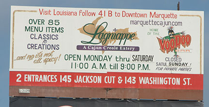
A visually busy design might not make any impact. Even worse, it leaves a bad impression on your brand. Like the one below. There is too much clutter. As a result, you do not know where to look or what to read within the first few seconds you look at the billboard.
There are several things wrong with this design. To begin with, there is too much text, too many fonts, too many colors, and a whole lot more. In this case, a cleaner and more refined look would have conveyed the information in a much more impactful manner.
After all, all the money you spend on getting a design and getting the right outdoor space should not be wasted simply because of visual clutter.
We’ll give you an example of a cleaner billboard look. And that will help you understand the power of eliminating clutter in your design.
The one below contains a lot of information. But it still remains visually pleasant. There is no chaos, whatsoever. And this makes it easy to get the message across.

Kimp Tip: Keeping the copy as brief as possible is the best idea. But if you do have a lot to tell, ensure that you set priorities and convey the information in a clear manner. Do not let your design elements clash with each other.
7. Tell customers what you want them to do
Of what good is a great design if your customers do not take any action after seeing it? Should they call you or visit your store? Do you want them to download an app or place an order? Be clear about the call to action in your billboard. And ensure that your design emphasizes this CTA. Like in the billboard below:

In this design, there are images that draw attention, the services are clearly listed out and what really grabs your attention is the contact details section at the bottom. While the rest of the space is filled with interactive visuals, there is a good amount of negative space around the contact details. And this is one main reason that makes this information easy to notice.
There are so many such ways in which you can create focal points in any design. Arrows, or pointed shapes all leading to one point or even a radially symmetric design with the central region emphasized can be used. These techniques seamlessly direct the users to the contact details.
When they see a number, they know that they can call to get more information or book a service. This encourages them to take an action after seeing the ad.
That’s a Wrap!
To sum it up, a great billboard has:
- The right colors and fonts that align with the brand
- A straightforward layout free from clutter
- Clear messaging and a strong CTA
While all of these are about the design of the billboard, much depends on the copy too. A strong copy that keeps the single-minded goal in focus combined with good design will make your billboard stand out, no matter how tough the competition gets out there. And that’s how you step strongly into the world of outdoor advertising.
Strengthen Your Ooh Advertising Strategy With Billboard Designs From Kimp
Getting a billboard space in a prominent location is not easy, we get it. That’s why you should make it count. A design that makes a strong first impression on your target audience or makes your connection with your existing customers even stronger is just what your marketing strategy needs. And with Kimp Graphics, this is possible. With Kimp’s subscriptions, you get your designs, just the way you like them. Unlimited iterations, interactive illustrations, visual consistency, whatever it takes to get your brand ahead in the competitive space!
Start now by signing up for a free trial.


