Outdoor Advertising: How Twitter’s Billboard Designs Get Results
The marketing world surprises us every day. What is mainstream one day is offbeat tomorrow. What is outdated today becomes a sensation tomorrow.
And this can be very confusing to brands trying to launch campaigns and get results.

Well, we just want to say that it doesn’t necessarily matter if the world considers something trendy or outdated. If the model suits you, give it your all. It will bring you results, as countless examples have proved to date.
One such often scoffed-at advertising medium is outdoor advertising. The argument is, as always, that all of us are on phones. And there is no one looking up anymore. But, we seem to forget that there are still many demographics that enjoy interacting with brands the traditional way.
Not to mention that the younger generation has finally caught up on the benefits of being outside and limiting screen time. A small benefit of the pandemic changing our lives, we think.
All in all, outdoor advertising is back and with a bang. Major brands are investing in it and actually going viral on the internet with their billboard designs. Weird how that worked out, isn’t it? The recent Twitter Manifestation Campaign is a great example. But that is not at all.
In this blog, we break down Twitter’s budding romance with outdoor advertising, especially billboard designs. We also bring you the latest trends in this medium and tell how you too can get results for your brand.
We are extremely excited. Hope you are too.
Let’s get started.
Outdoor Advertising: Effectiveness and Timeless Appeal
Before we get the lowdown of Twitter’s billboard designs and why they work, let us take a step back. What is outdoor advertising or OOH advertising? Why is it back in the news? Is it just a trend, or do we have the statistics to back it up?
Outdoor advertising or OOH (Out of Home advertising) encompasses all the advertisements that step out of your digital screens, and, more importantly, target customers when they are out of their homes. So no TV, no newspapers, and no digital ads. Just the good old-fashioned billboards and standees that all of us see everywhere.
But why are people investing in these again?
As the internet grows, and its population explodes, we encounter the problem of overcrowding. Along with it, the digital ad space is increasingly becoming expensive without actually yielding the ROI everyone is looking for.
So people turn to leverage the data they have for better targeting and apply them to outdoor advertising.
The Effectiveness of Outdoor advertising

The use of outdoor advertising is growing, and you can see how even the pandemic could not deter the brands from investing in it. That is because the reward is much bigger than the risk here.
What are these rewards? Well, historically, outdoor advertising has driven brand awareness, store visits, website traffic, and even sales. And the ROI in 2021 was close to 497% – even more than email marketing. Can you imagine that?
Yes, outdoor advertising has an impact across your physical and digital channels. Our existing digital channels are full of ads, and customers now know how to avoid them by skipping ads, blocking them, or even unsubscribing from services that spam them.
In complete contrast, an advertisement outdoors in the form of a billboard design breaks the monotony of the outside world and grabs attention. The tables have turned, haven’t they?
A major competitor for outdoor advertising has always been TV ads, but we now have the data that they are 382% more effective than TV ads. With everyone switching to streaming services, it makes sense, right? And digital billboards allow you to play the same content but to a bigger audience.
With such benefits and incredible ROI numbers, no wonder Twitter turned to billboard design for it’s latest campaign. And they have reaped the benefits too. Every one of Twitter’s billboard designs has gone viral and received great appreciation.
Let’s take a look at what the tech giant is doing right before we explore how brands can replicate these results.
Twitter’s Billboard Campaigns: Viral Hits all around
Have you ever wondered what makes a company try out a new medium of advertisement? When do you know you must start exploring?
Well, we wondered about that too. Especially in the Twitter billboard campaign context. So we did a little digging for all of us.
Turns out that Twitter always invested a percentage of its advertising spending on outdoor advertisements but stepped it up considerably in 2019. The company declared that it will spend 50% more than it did in 2018. This is because the uptake and response on their previous Subway ads and pop-up stands were promising.
To take the relationship between its users and the platform beyond screens, Twitter has constantly launched billboards that talk about important events. This gets the talk going and shows that Twitter is not just a platform to interact on, but a platform that cares about what you say too.
Let’s take a look at some of the landmark billboard designs that Twitter has launched in the past two years.
The Juneteenth Tribute Billboard in 2020
What is the USP of Twitter? Why do people join it? Well, mostly to follow their favorite voices and brands. Twitter knows this and has constantly leveraged the power of user-generated content, and this comes across in its Billboard Designs too.
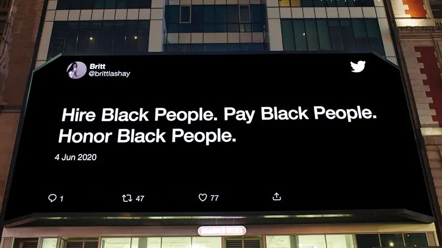
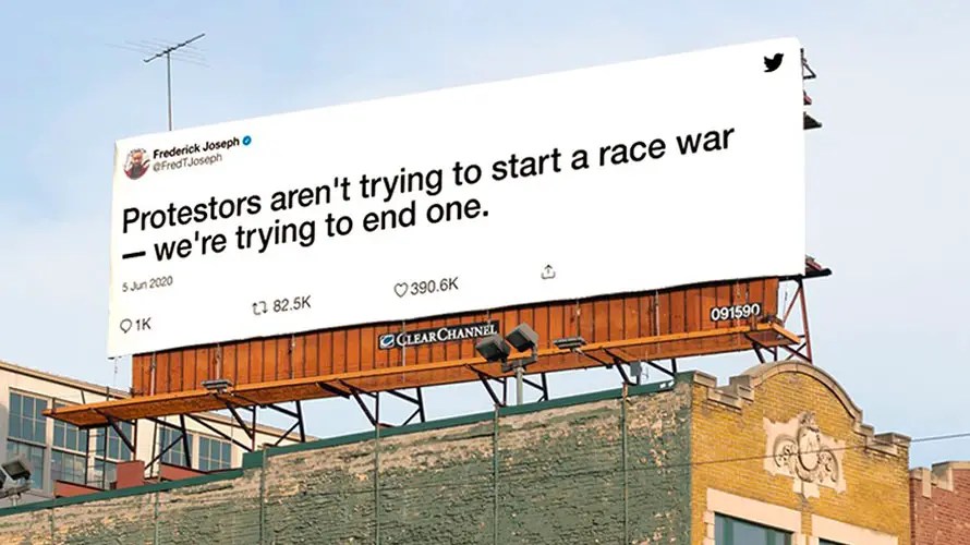
Why is it effective? Because it is simple and cuts directly to the chase. Not just that, the locations of these billboards are bang on. Twitter installed these in the cities that had been hubs for protests in the U.S. so people who care about this campaign the most would see it for sure.
As a platform looking to recruit thoughtful voices as its users, this Twitter billboard is a step in the right direction.
A campaign that tickles the funny bone
It’s not always serious work, is it? Some of the best memes online come from Twitter, so how can Twitter have a billboard campaign and not showcase that?
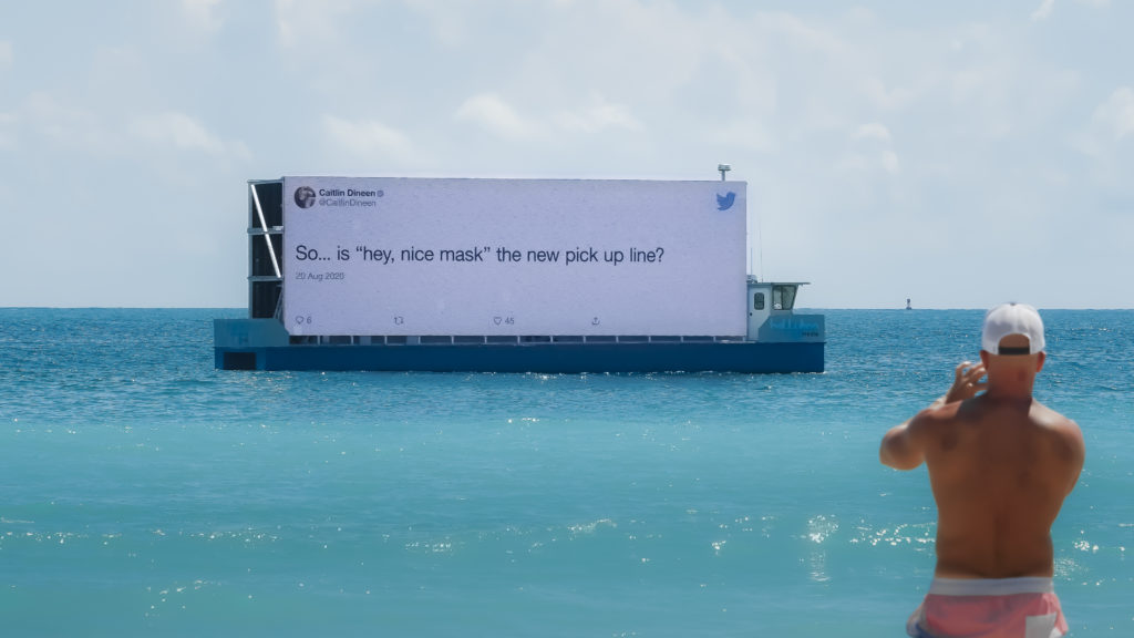
Check out these billboards from Twitter.
The jokes on masks tickled everyone’s funny bone and gave a good laugh amid trying times.
But Twitter also went a step ahead to show that they can take a joke too. People who poke fun at the site also got a feature on subways and in public places.
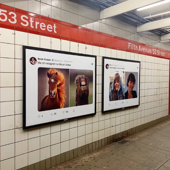
We can all safely say that Twitter understood the assignment here. What a great way to entice people to get on the platform if they have not. Also, posting tweets will make people search for those on Twitter and talk about it. Again, engagement comes trickling in.
Overall, it is a win-win situation.
2020 Summary tweets campaign
2020 was a weird and troubling year worldwide. The COVID-19 pandemic wreaked havoc on all our lives and we were all stuck inside our homes, anxious and on high alert. So, of course, people turned to Twitter to share their musings and thoughts. This increased when 2020 was ending, and hopes for a new year, meaning new beginnings, became real.
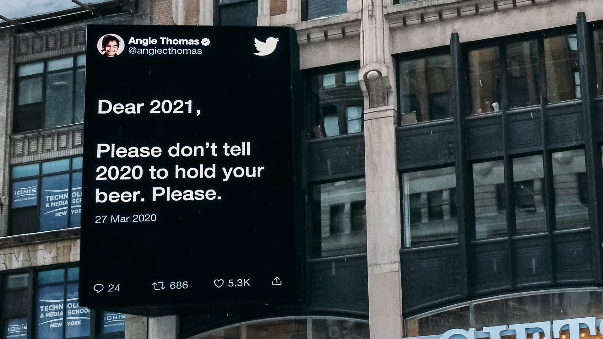
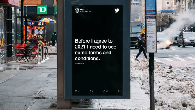
Twitter took this opportunity once again to showcase the power of user-generated content and celebrate the thoughts of its users.
After the billboards went live, the company’s official Twitter handle reposted the images tagging those who made the tweets.
If you are looking for proof that billboards can be appropriate for engaging your loyal customers online, this is it.
The Affirmation campaign
This is the latest addition to Twitter’s series of billboard campaigns. Recently, an affirmation campaign from Twitter went live. In this, the platform has featured a few old tweets from celebrities manifesting the success they have now. The idea is to show the world that if you put the word out on Twitter, the universe responds.
Seeing this, many took to the platform to share their affirmations, hoping things would change for them too.
Once again, the brand understood how to captivate its audience and delivered to the point.
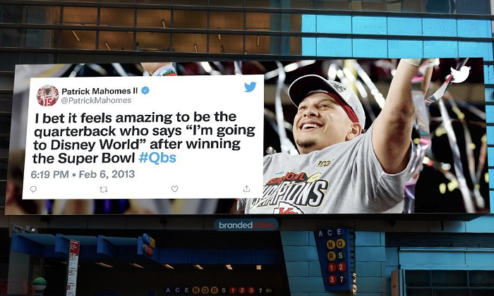
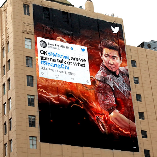
The only difference here is the billboard design. The company featured the images of the celebrities’ success to reaffirm the message they are sending. And this worked brilliantly for this series.
Acing Billboard designs in Outdoor Advertising: Tips and Examples
You have seen the response to Twitter’s billboard campaigns, yes? That and the multiple statistics we shared in our blog’s first section must have sealed the deal for you. It is time for brands of all sizes to invest in outdoor advertising.
Since we have done a detailed blog on outdoor advertising and the many formats available to you, we will concentrate on the most popular format here. So, this section will cover the best trends and tips for billboard designs.
Read on and get ready to launch your best billboard campaign.
1) Go Digital with your Billboards
We spoke about how billboards beat out their biggest competitor outside of the digital marketing spectrum, too. Yes, they are now much more effective than TV ads. And digital billboards are the biggest reason.
As video takes up the center stage in top-performing content online, the same trend flows into billboard designs too. Now, you can promote your favorite motion graphics content outside the digital realm as well.
In fact, some of the most captivating billboard ads in the past year have been those leveraging 3D designs and excellent video storytelling.
This is a billboard ad for a 3D LED screen product. Now, the billboard could have been a well-designed graphic design that promotes its products and specifications. But it could not have been as effective as the current billboard is.
Reports estimate that the Digital outdoor advertising industry will reach 50 billion dollars by 2026. This industry also saw positive growth of 19.2% in 2021, even amidst the pandemic.
But do customers like it?
49% of consumers agreed that they have seen some digital outdoor advertising billboards in the last month, and 69% of them accepted they took some action after seeing them. Those actions included looking up the brand, visiting the store, or sharing the advertisement on social media.
There you have it – web traffic, foot traffic, and social media engagement – everything a brand looks for.
Looking to create a captivating digital billboard for your brand? Sign up for the Kimp Video subscription!
2) Bridge the gap between digital and physical channels
Brands must not look at billboards as an isolated source of marketing that only attracts people who see you outside the digital world. If anything, this must be a way to cement your brand identity and present cohesive branding all around.
One of the major billboard design trends in 2022 will be a unifying visual identity that promotes an online identity via billboards. If you are planning to launch a billboard campaign, ensure that the design is in line with your brand style guide.
Choose colors, fonts, and overall design as per how your customers know you to date.
This way, when they see a billboard from you, they can instantly recognize it. You can then generate web traffic or awareness for a particular campaign via your billboards.
Looking for billboard designs that promote your brand’s visual identity? Sign up for the Kimp Graphics subscription to create a cohesive omnichannel campaign for your brand.

3) Use Visual Hierarchy to grab attention
When you jump into a popular medium, the process instantly becomes a double-edged sword. You must not look like you are trend jacking, and there is pressure on standing out amidst the crowd here too.
So how should your billboard designs look to stand out in 2022?
Well, whatever the format you choose – text, imagery, or video – remember you need your audience’s attention for your message to be successful. And that is why we recommend heavily relying on the principles of visual hierarchy.
The subject of your billboard design must be front and center always. It can be a headline, a product image, a screenshot like Twitter did, and so on. But by the rules of visual hierarchy, your billboard design must celebrate that in a way that instantly grabs the customers’ attention.
Look at this ad by Klarna. It is just a text-based ad, but look at the design. The first sentence is a bigger font than the rest. And the background color is a mellow pink associated with Millennials. Now everyone knows what they are talking about and want to know more.
This is a great example of visual hierarchy at work in billboard designs.
Kimp Tip: Pick colors and fonts wisely for billboards. These are the two major tools you have to grab a customer’s attention. Historically, bright shades of red, pink, blue, white, and green have had a higher chance of success. For font choices, pick something native to your brand, is easy to read, and target the audience for higher brand recall.
Wondering how to make these choices easily? Hand over the reins to a Kimp Graphics design team.
4) Show instead of telling
We are all for text-heavy billboards if you think that is the route that sells your message best. But the reality is that customer attention spans are getting shorter and shorter, and in 2022 we expect outdoor advertising trends to go the non-verbal way.
Yes, showing what your product can do with the power of visuals will be the dominating trend rather than conveying this through text. The power of storytelling can get you far better results from a video billboard or a well designed graphic than a bunch of text can.
And if you do need words, keep it as short as possible. Minimalist design styles are everywhere and can come in handy in billboard designs especially. Our brain processes visuals faster than text, so even if someone is glancing at your billboard, an image will be remembered longer than text.
Kimp Tip: Choose graphic design elements such as custom illustrations, brand mascots, doodles, infographics, product breakdowns, and so on to improve the impact of your billboard designs. Give people a reason to remember you so they will do business with you. And for this visual marketing is definitely the way to go.

Are you looking for innovative video or graphic design ideas for your brand? Worried about the costs? Why worry, when a Kimp Graphics + Video subscription comes at an affordable flat monthly fee, unlimited design requests and unlimited revisions?
5) Measure the impact
Last but not the least, this is a significant step to achieving a successful outdoor advertising campaign. You have created a stellar billboard, and it is already up in all the right places. But where do you go from here? How do you know it is a success?
To avoid the hassle of navigating all this we recommend designing your billboard ads in a way that makes it easy to measure an impact. And you can do this by:
Creating innovative and easy to find call-to-action phrases on your billboards. These will propel customers to visit your store, tag you in their stories, or tweet to you. If you want more concrete results, set up a QR code that takes people to a specific landing page.
This way, you know how many of your leads came to you from the billboard.
62% of billboard viewers agree they engage in mobile activity such as scanning a QR code, using a hashtag or applying a discount code after seeing a street-level billboard.
Kimp Tip: If you go the landing page way, remember that branding and design consistency is very important here. Your landing page design must be an extension of your billboard design so that customers do not get put off by the jarring change.
Looking for landing page design tips? Check our guide here. And if you need help with your designs sign up for the Kimp Graphics subscription to get all your designs done by a dedicated design team.

Launch high converting billboard designs with Kimp
Now that outdoor advertising is back in the game, are you excited? Do you want to get your brand back in the show and reach the right customers?
Well keep in mind that the effectiveness and ROI strongly depend on the billboard designs themselves. If you want to grab attention and make customers actually follow the CTA you are pushing, then graphic design is your best friend.
And it is more affordable than you think. Kimp’s unlimited design service includes design subscriptions for both graphics and video design. AND you can get unlimited designs and revisions. So test out all your ideas for your billboard designs with no additional charges per request or revision.
How great is that? Pay a fixed monthly fee and get as many designs as you want. Just the way you want it.
So why wait? Sign up today and get your hands on the best billboard designs.
