
5 Creative Packaging Design Tips For CPG Brands
You walk into a store shopping list in your hand. You tell yourself that you’ll only buy what you’ve planned. Only to be distracted by that creative packaging design on the shelves you walk by! You stop to take a second look and the next moment, the item is in your cart. Sounds relatable? That’s the power of packaging design for CPG (consumer packaged goods) brands.
The success of a CPG brand depends on how well its packaging manages to engage its customers right from the first interaction. So much so, that there have been times when bad packaging paved the way for the downfall of CPG brands. Like the time when the confusing packaging design of the Maxwell House Brewed Coffee was one of the prime reasons for the product’s loss of popularity.
Therefore, CPG brands cannot take packaging design lightly. While bad packaging mars the reputation, boring packaging design makes it tough for the brand to survive the competition. Therefore, CPG brands need to get really creative in order to keep their products and their brands ahead of the game. Want to know how to do that? Look no further. We’ve put together some of the best CPG packaging design tips for you.
But before that, shall we take a moment to reiterate the importance of creative packaging design for CPG brands?
Why packaging design is a game-changer for CPG brands
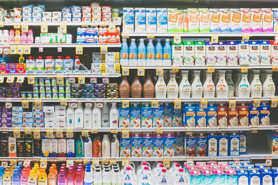
- The competitive landscape that exists in the CPG industry needs no introduction. Every day there’s a new business launched. In such a rapidly growing space, all tangible elements at critical customer touchpoints matter. And packaging design is one of them. The packaging design of a CPG brand introduces the brand to the target customers while also reinforcing the fact that the brand’s different from the competition that exists.
- Data shows that about 40% of the audience segment for the CPG market consists of Gen Z. And Gen Z consumers can be quite picky when it comes to the packaging of a product. For example, nearly 73% of Gen Z consumers prioritize reusable packaging. So, yes everything from the material to the appearance of the packaging, everything can influence the purchase that comes from one of the biggest audience groups for CPG brands.
- There was a time when a majority of the CPG brands existed offline but the pandemic changed everything. In fact, the CAGR of online distribution channels for CPG brands is expected to hit 8.3% between 2020 and 2027. Creative packaging designs get your product noticed on a crowded ecommerce search page. And for existing customers, your packaging design can be the identifier on the search page much like it is with shopping aisles at a physical store.
- CPG packaging design comes as a sampler of brand quality. Whether customers are shopping online or offline, they judge a brand from its packaging. Yes, even an online image of your product packaging can tell so much about your brand. For example, poor graphics on the label and colors that don’t align with your brand and industry can be bad signals.
Factors to remember about CPG brands
Having spoken about the importance of creative packaging design for CPG brands, let’s also look at some ground rules. There are a few signature traits that set CPG brands apart from the rest. These distinguishing aspects also happen to be decision-altering elements to consider while finalizing both the graphics and materials for the packaging. What are these dealbreakers?
1. Purchases happen often
People might not purchase smartphones every month but they are sure to buy breakfast cereals on a monthly basis. What does this mean? Consumers hold your product (in its original packaging) in their hands quite often. So, everything from how your packaging design looks to how easy it is to find information on it and how easy it is to open the packaging matters.
2. Fewer chances of extravagant budgets
In the CPG market, purchases happen often but the amount spent on each purchase tends to be on the lower side. Don’t you agree that the budget set aside for kitchen appliances and the budget set aside for everyday pantry items tends to be poles apart? So, when it comes to CPG packaging design, sensibility surpasses sophistication.
3. The market is heavily crowded
Yes, that’s an understatement. There’s an overwhelming number of choices when choosing consumer goods.
How many times have you grabbed a bottle of shampoo thinking it’s your favorite brand only to notice that it’s a different brand but with strikingly similar packaging? This happens quite often. That’s one more reason why you need to get really creative with your packaging design in order to stand out from your competitors.
Kimp Tip: Designs can be replicated but the emotions a design evokes cannot be! From the choice of imagery to the color palette and the fonts that go into the packaging, everything needs to work together to stir up the right emotions. One small slip, and the harmony of your design goes for a toss. That’s why working with a professional designer helps. Get Kimp!
5 creative packaging design tips to throw the spotlight on your CPG brand
As we discussed in the previous section, designing the packaging for CPG brands can be very different from designing for other industries. So, how can you tackle these differences and make your mark?
The key is to come up with a creative packaging design that attracts the attention of busy shoppers and tells them exactly what to expect when they buy the product. And in the cases of regular buyers, the packaging design is that visual identifier that helps the buyer correctly pick that one product even on a packed shelf.
So, there are a few things you can do to ensure that your CPG packaging design solves its purpose. We’ll look at these tips now and there’s one additional tip we’ll share toward the end, which is equally important in executing the whole idea.
1. Stand out instead of fitting in
We speak about creative packaging design for CPG brands because you need a bit of innovation to cut through the noise. As we discussed earlier, there are plenty of brands that offer the same product you offer. Moreover, if you compare the existing brands in your industry you are sure to come across cases where two or more product packaging designs are nearly the same. And there will be a handful that is passable.
Amidst all this, do you want your product to blend with the best-sellers or be ignored or be noticed? If you want your product to be noticed, then your packaging needs to be creative.
For example, the below packaging for the brand Love Ocean was created by a UK-based branding agency Pearlfisher. Consumers loved this and the playfully purposeful packaging won a lot of acclaim for the brand.
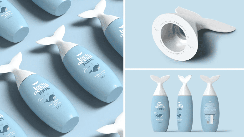
One of the many reasons the design grabbed eyeballs is its unique design. It’s not just about out-of-the-ordinary design but also the relevance to the brand and the brand message (ocean conservation).
Even on the most busily packed shelf filled with bottles of kids’ bubble bath, a product like this one is sure to make you stop and take a look. That’s the kind of effect a CPG packaging design needs.
2. Choose the right colors
If you have tried to create designs yourself you know that colors and fonts are perhaps two of the most difficult decisions about a design. Because they set the mood and carry the message on their shoulders. Choose them right and you are halfway there! But it’s not as easy as it sounds, is it?
In fact, it gets tougher when it comes to packaging design. Because your brand and your product have equal priorities. For example, just because Nestlé uses a monochrome logo in several places, the confectioneries sold by the brand do not all have the same monochromatic packaging. It doesn’t work that way!
This is another area where CPG brands differ. Since most of them have diverse product lines. Using the brand colors as the primary palette for every single product line feels impossible.
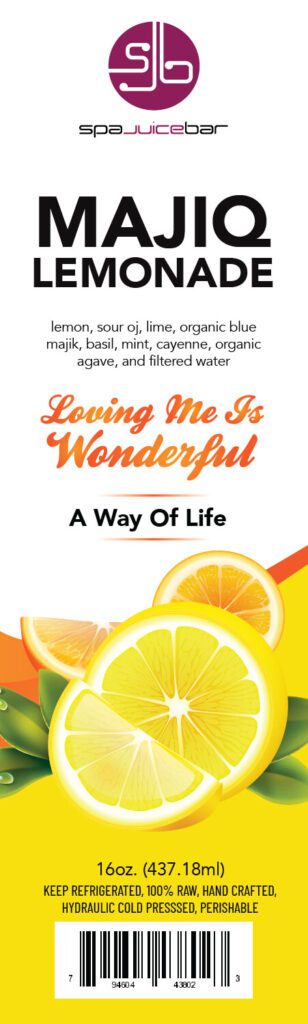
So, how do you choose the colors? Take cues from your industry. For example, if the particular product line is about organic food, the popular food branding colors – red, orange, and yellow, along with hints of green deliver the message clearly.
Another way is to take cues from the product or even the primary ingredients. For example, in an aisle filled with beverages, when you are looking for particular flavors you know that yellow is for mango/pineapple, red/pink is for strawberry. Who has time to scrutinize each label to find such basic details in a crowded shelf, right?
3. Go with practical font choices
As we discussed earlier, fonts are as important as colors because they ensure that your customers can read the label conveniently. A few ways to ensure this will be:
- Use clean sans serif fonts that occupy less space while also conveying the message clearly.
- Prioritize traditional font shapes over decorative ones because form follows function, especially on a packaging label.
- Pay attention to font formatting. You need the right formatting to establish a hierarchy. In other words, to guide users through the label effortlessly.
- Ensure that there’s enough negative space surrounding the text on your packaging labels. You do not want background patterns or surrounding graphics to overlap and affect the readability of the text.
- Finally, ensure that the font colors contrast with the background color.
Remember, your customers do not have the option to adjust the brightness or zoom in to see what’s written. So, aim at simplifying the experience and you can never go wrong.
In fact, the readability of text on packaging labels is not just a marketing rule but also an FDA requirement in most categories.
4. Imagery with a purpose
Labels without graphics look minimalistic and clean. But they don’t always make shopping easier. Images and illustrations make it easier for customers to make an immediate visual connection with the product.
To begin with, they perform the simplest most important task of telling customers what’s inside the packaging. For example, when you walk into a pet store filled with pet supplies, the simple comparison of dog food and cat food happens by looking at images of dogs and cats printed on the labels. Correct? This simplicity can be of great value to CPG brands. Even the most creative packaging design will be of no use if it does not convey the intended message.
It’s not just about adding images for an aesthetic appeal. It is about adding images with a purpose. How do you do that?
- As with the dog food example, in some cases, the images convey who the product is designed for.
- In other cases, the image conveys what the product is or how the product is to be used. If you could add a set of simple illustrations to communicate the process it makes things simpler for customers trying the product for the first time.
- Finally, the image you choose for CPG packaging design can also show what the primary ingredients are.
Kimp Tip: Struggling to narrow down on an idea for the imagery? Identify the one problem your product solves or the one strong benefit you would like to emphasize. A photo or illustration of this one element will be the single most valuable addon to your packaging design.
Need help creating unique illustrations for the most creative packaging design in a crowded market? Get Kimp!
5. Consistency is an absolute must-have
Your product packaging needs to fit seamlessly into your marketing strategy. It needs to work coherently with all other branding and marketing designs that represent your brand. Because in a lot of cases, people tend to connect with a brand on social media or through the brand’s website before they actually hold a product in their hands.
As a result, they already have an idea, an image created about the brand. In such cases, if the packaging design looks different from the picture the marketing designs painted, customers get disappointed.
And we all know that disappointed customers head straight to your competitors and they are least likely to return as well. About 91% of unhappy customers don’t come back to a brand after a bad experience. And packaging design has a strong role to play in this experience.
What can you do to avoid this?
- Have strong brand guidelines in place. These lay down the rules for your brand’s design – whether they are in the digital or print format.
- Constantly compare your packaging design and the rest of your marketing collateral to be sure that the fundamentals like the fonts and colors as well as the deeper traits like the mood of the designs align.
- Regularly share pictures of your products in their original packaging design on your digital channels including social media. This will help familiarize your online audience with the appearance of your products. That way, when they finally make a purchase, they know they are buying exactly what they saw.
- Aim for an omnichannel experience. Intuitively include your website details and social media handles on your packaging. Or at least consolidate the whole thing into a QR code on the label.
Level up your CPG packaging design with Kimp
Remember that one additional tip we mentioned we’d share earlier? It’s this – stamping your brand on your CPG packaging design. Because even the most beautifully crafted packaging that accurately conveys the idea will not work in favor of your brand if it does not carry your brand identity.
How can you achieve this?
- Display your brand name and logo prominently on the packaging. Do not let it get lost in a patterned background or a crowded layout.
- Lay down a visual framework for your brand’s packaging. Everything from how you use your logo, how you position it, and the way you add your brand colors as accents in your packaging design can be set as the ground rules. This signature style will become a representative of your brand.
A professional design team can make all this so much simpler. So, sign up for a Kimp subscription today. Register now for a free 7-day trial.