Beat the Heat: 25 Coolest Summer Fonts for Your Next Project
For most people, summer means – sunshine, vacations, and a wardrobe makeover. But for marketers – summer means, the time to revamp their designs to capture the vibrant energy of the season. The time to give their marketing materials their much-deserved seasonal makeover. And fonts happen to be the most crucial elements in design. Hence, today, we’re discussing summer fonts.

After all, for the best summer-ready designs, you need fonts that capture the fun and festivity associated with summer! Wondering where to start? You’re in the right place. We have curated a list of the coolest summer fonts guaranteed to boost those beachy vibes in your next design project.
Whether you’re designing for a one-off event or spicing up your summer social media campaigns, we’ve got something for everyone. So, let’s dive in!
25 Summer Fonts to Elevate Your Designs
To give you plenty of options to explore, we have rounded up some free fonts from the Google Fonts library as well as some paid ones. But what if you find a font you love and want to explore similar options? You can use tools like WhatFontIs to identify alternatives.
Or maybe you’ve already chosen your perfect summer font but are struggling to find the right pairing font? You can use tools like Designs.ai to find suitable font combinations.
With this in mind, let’s get started with our list of summer fonts.
Script Fonts – Paid
1. Sea Breeze

The font appears and feels exactly like its name – like a warm sea breeze. Can you ask for anything better for your summer aesthetics?
With its coastal charm, this one makes a breezy choice for summer sale announcements. Besides, this is also a great web font for your web banners, social media designs, and digital ads for summer campaigns.
KIMP Tips:
- Use Sea Breeze in big bold text headings because its slanted sleek strokes are not the easiest to read in small sizes.
- Given the clean lines, this font looks good on photo backgrounds or even summer patterns.
2. California
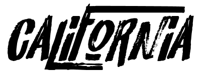
Statement summer tees or a fun beach party, California is just the font you need to uplift the energy in your design.
Its retro distressed style makes it one of the most unique summer fonts to explore. Also, its raw strokes make it a good choice for those times when you have to share a summer quote or a summer-themed message in your print designs or even when you have to experiment with bright summer colors.
KIMP Tips:
- Since California is a bold script on its own, pair it with something subtle.
- Keeping the distressed texture in mind, choose contrasting colors for the font and background to ensure that portions of the characters do not fade away into the background.
3. Tropical Asian

With irregular strokes for that personalized touch and dry brush like texture, Tropical Asian can easily complement diverse summer aesthetics.
Another point to note is that this font looks fun and can therefore work perfectly in designs created for a young audience. Besides, it’s free for personal use!
KIMP Tips:
- Got some vibrant tropical themes to work on? Then don’t forget to add Tropical Asian to your list.
- On its own, Tropical Asian has an exotic mood. Therefore, pair it with something simpler and not something with intricate patterns or busy details.
4. Forever Summer

Forever Summer is one of the most versatile choices in summer fonts. Because it is available as a font duo with one traditional script font and one brush-stroked sans-serif styled font.
Both these variations carry a playful style which makes them look fantastic in summer designs. And the variety also means that you can pair them effortlessly in your design without having to hunt for other fonts to go with this.
KIMP Tips:
- Use color and size variations to accentuate the subtle differences in the personalities of the font styles in this combo.
- Keep the overall aesthetic casual to align with the mood of this font.
Script Fonts – Free
5. Tangerine
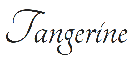
Tangerine is a brilliant chancery hand style font with breezy fluid strokes available in both bold and regular styles. The graceful lines and the sense of lightness this font carries make it a great choice for summer themes.
Moreover, the font also carries a happy vibe that resonates with the joy of summer. The elegant style of Tangerine works well in designs that call for a slightly formal tone. Like the summer menu of a high-end restaurant or even the hero text on flyers for summer events.
KIMP Tips:
- Given the bold strokes of the uppercase letters in this font, avoid using it in contexts that call for all caps.
- Use Tangerine in sufficiently large font sizes to maintain readability, as its intricate details can make the text difficult to read in small sizes.
6. Kaushan Script

If you are looking for semi-casual summer fonts that are neither too playful nor too traditional, then Kaushan Script is a wonderful choice.
The organic brush strokes evoke a sense of ease that’s perfect for summer aesthetics. Given the weight of the strokes, this font works well in headings and main text portions in a summer-themed design.
One main difference between this one and Tangerine is that this font looks equally elegant and is easy to read even in all-caps text sections. So, that’s what you should go with for creating eye-grabbing headings or subheadings.
KIMP Tips:
- The lively style of this font looks good both on digital and print designs.
- To create a visual balance and ensure readability, pair this font with a sleek lightweight sans-serif font.
7. Yellowtail

Need something even more casual than Kaushan Script? Then here’s a font to check out: Yellowtail! The smooth sweeping strokes and the modern tone are perfect for creating designs that carry a relaxed summer mood.
KIMP Tips:
- Yellowtail, like Tangerine, is not the most legible in small font sizes and in all uppercase characters.
- Besides, the bold strokes also can be heavy on the eyes and so you need a simple sans-serif font to tone it down a little.
8. Cookie
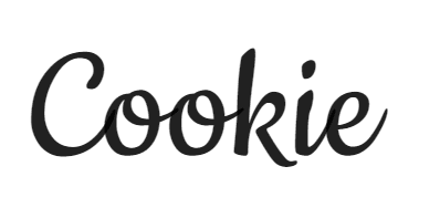
A sleek cursive font with an effortless style, Cookie carries a friendly vibe.
The subtle 1950s style makes Cookie a great choice for companies that have a more traditional visual identity or even in designs that call for a warm and welcoming heritage style.
KIMP Tips:
- In the right font size, Cookie is quite easy to read since there are no intricate strokes or flourishes in the characters.
- Moreover, like most cursive fonts, this one can look awkward in all-caps text portions.
- When it comes to font combinations, clean sans-serif fonts work well but if you need a more traditional touch, minimalistic serif fonts without ornate details can work too!
9. Cabin Sketch

Summer fonts with a rustic charm? There’s Cabin Sketch! With its sketch-like lines and imperfect strokes, there’s no better way to capture the laid-back summer atmosphere!
What’s more? Cabin Sketch is pretty fun to work with, in a variety of font sizes and applications. But yes, it has a more casual tone and hence might not work in formal aesthetics.
KIMP Tips:
- Cabin Sketch is one of the most versatile summer fonts that is captivating both in uppercase and lowercase characters. Furthermore, the legibility is also pretty good!
- However, given the textured strokes avoid using this font on busy backgrounds or in designs with too many details.
Sans-Serif Fonts – Paid
10. Palm Leaf

True to its name, the Palm Leaf font has distinct palm leaf details in its strokes. This is an upper-case-only font that aligns with the tropical themes often associated with summer.
Use this font for those times when you have to design a summer sale ad or a simple social media message with minimal text. As a matter of fact, the palm leaves details in the font mean that you can instantly establish a summer theme even without adding too many other summer-related elements.
KIMP Tips:
- For maximum impact of the palm leaf patterns on the font, use it against solid backgrounds in contrasting colors.
- It combines well with breezy script fonts as well as sans-serif fonts.
11. Suburbana

Suburbana is a modern sans-serif font that’s free only for personal use. Its urban style aesthetic and clean lines feel like summer in the city. Hence it makes a good option for brands with modern visual identities.
The wavy strokes of the Suburbana might even remind the viewers of a beach setting.
KIMP Tips:
- To add more vibrancy to the font, use cheerful summer colors or gradients in the text.
- Since this is a simple font on its own, use it in minimalistic designs rather than busy ones.
12. Bonoco
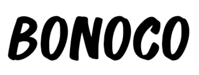
Bonoco has the fresh and unique personality of a script font and the contemporary style of a sans-serif font. This all-caps font is bold and hard to ignore!
While it does sport a casual theme, it’s not too unprofessional or playful. Hence, this font also makes a great choice for B2B ad designs that call for preserving a professional feel even in the summer themes.
KIMP Tips:
- For broad-stroked fonts like Bonoco, ensure suitable kerning for maximum impact and readability.
- To avoid overwhelming your audience pair Bonoco with simple fonts.
13. Luckiest Guy
Chunky fonts are some of the biggest trends anticipated for 2024 and yes we are seeing them in a lot of places. Going with the trend if you need some chunky summer fonts to adorn your designs and instantly bring them to life, then Luckiest Guy is the font for you.
It’s inherently fun and screams summer from every angle. Besides, it looks good in diverse color variations too! So, you can incorporate the chosen summer color palette confidently knowing that this font will not let you down.
KIMP Tips:
- This is an all-caps font and works well in big bold sizes but is not very legible in small font sizes.
- To further enhance the legibility, ensure clear kerning and choose colors that contrast well with the background colors. But yes, it does work effortlessly on solid as well as textured backgrounds.
Sans-Serif Fonts – Free
14. Fredoka
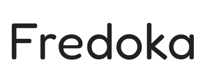
If you are looking for summer fonts with an upbeat personality, then you will love Fredoka. This sans-serif font is modern, highly legible, and aesthetically appealing on diverse backgrounds.
With its rounded shapes and casual tone, Fredoka is for those brands that want to appear approachable and friendly. With its fuss-free bold strokes, this font is suitable both for print and digital designs.
KIMP Tips:
- As can be seen, this is a simple font. So it is better suited for body text rather than headers.
- The minimalistic details here mean that you’ll have to accentuate your design with additional summer-themed elements to create the perfect summer aesthetic.
15. Bangers
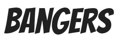
We’re now moving to something bolder in the sans-serif category on our summer fonts list. With broad and clean strokes, Bangers has a unique personality.
Moreover, there is a chirpy side to Bangers that makes it great for attention-grabbing elements like video thumbnail text or even the CTA text on summer sale ads.
KIMP Tips
- Whether you choose sans-serif fonts or serif fonts to go with Bangers, ensure that the line weight of the chosen style is sleek so that it balances the loud style of this font.
- Bangers looks modern. So pair it with contemporary themes. And yes, it’s not the best choice for designs meant to carry a professional tone.
16. Nunito
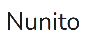
If you are looking for summer fonts that are fuss-free and can work in diverse settings, then Nunito is definitely one to consider. Moreover, Nunito comes in many style variations making it a great choice for elaborate designs that call for subtle font variations for a clear hierarchy.
Nunito’s simplicity and geometric letterforms make it feel fit for summer.
KIMP Tips:
- Nunito like Fredoka works better in body text rather than headers where you might need something bolder.
- To create a more vibrant summer design, pair it with a bold display font or a stylish script font.
17. Dosis
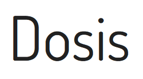
Dosis looks effortless and modern like Nunito but the characters are taller and slimmer for a more contemporary look. Its exceptional clarity is something that makes it an ideal choice for cool summer-themed designs – perhaps resonating with the clear summer skies.
KIMP Tips:
- The light and airy vibe of Dosis makes it a great fit with bold and chunky fonts.
- Take advantage of the weight variations available in Dosis – for example, the Extra Bold variation makes a brilliant choice for headings.
18. Changa
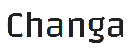
Bore of all the summer fonts that come with perfect elliptical and circular letterforms? Then perhaps you will like the unique square-shaped letterforms in the Changa font. Not the most common style you see in designs and therefore perfect for those times when you want to create something unique and eye-catching for summer.
In addition to all these traits, you’ll also notice the openness of the characters in this font which can help balance any traditional font.
KIMP Tips:
- Given the legibility of this font and its various line width variations, mix and match different styles and sizes to create a visually intriguing design.
- Embrace the geometric precision of this font and pair it with designs with clean and structured layouts.
Serif Fonts – Paid
19. Ocean Twelve

Like Forever Summer, the creative Script font we discussed earlier, Ocean Twelve is also available as a font duo with a neat script font to go with it. The script version elegantly balances the bold personality of the serif version.
While this does carry a hint of traditionalism like most serif fonts, the quirky letters and the creative manipulation of the baseline for each, make Ocean Twelve one of the most fun summer fonts to work with.
KIMP Tips:
- Since you already have a pair of font styles to work with, combine these versions for a sleek design. Or if you wish to go with the signature serif and sans-serif pairing, choose a lightweight font with structured letterforms that can balance the energy of Ocean Twelve serif.
- Ocean Twelve looks perfect in vintage themes and traditional print designs.
20. California Coast

California Coast is one of the most ornate summer fonts to work with. Whether it is a summer event in a professional setting or a grand summer celebration that calls for something dapper, this font elegantly caters to diverse applications.
Purchasing California Coast also means that you get the Ostuni Script Regular font in the bundle. This one starkly contrasts the classy feel of the California Coast font. Therefore it can be used as a secondary font that mellows down the aesthetic for summer.
KIMP Tips:
- California Coast is one of those fonts that look great in diverse font sizes. So be sure to try different variations both in sizes and letter cases.
- Since this one has a distinct personality and comes with alternates for each letter in the form of flourishes etc, give this font a try for core text elements, like a summer event’s core branding elements.
Serif Fonts – Free
21. Bree Serif

Bree Serif is one of the perfect fonts for summer aesthetics that call for an informal tone. Its strong readability makes it suitable for both print and digital advertising of your summer campaigns.
The energy and movement that the Bree Serif font evoke a sense of fun that summer brings with it.
KIMP Tips:
- The modern and minimalistic Bree family of fonts pairs well with the Bree Serif.
- Bree Serif is a lively slab serif font that’s hard to miss and hence suitable for use in the most vital portions of a design.
22. Cormorant

Got some up-scale summer designs and elegant aesthetics to tackle? Cormorant is the font to pick. This is one of those summer fonts that balance sense and style effortlessly. Because it doesn’t just look graceful but also feels easy to read in diverse font sizes. Thanks to the high-contrast strokes, and refined curves!
Sophisticated headlines or lengthy paragraphs in print designs, Cormorant works well in many applications.
KIMP Tips:
- Use Cormorant in lengthy text portions and places where legibility is paramount.
- From light to bold line weights, Cormorant comes in different styles. So explore them to create a cohesive aesthetic without drastic font variations.
23. Prata
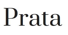
Belonging to the Didone classification of the serif fonts (known for their modern appearance and suitable for print) Prata is a charming choice for summer.
Prata is an excellent choice for elegant designs like a luxury brand’s summer sale or event, or perhaps one where you need a soft feminine vibe to target the women in your audience.
KIMP Tips:
- There is an air of refinement that Prata carries. So avoid pairing it with fonts having clashing personalities like something too bubbly or playful.
- A chic and mellow font with a modern personality will go well with Prata.
24. Coustard

Coustard is a classic serif font with a hint of modernity that makes it a safe choice for the promotion of professional summer events.
While enhancing the design, Coustard is also easy to read making it a versatile option for promotional designs created for various channels.
KIMP Tips:
- Coustard comes in two line width variations with the Black version being the best option for hero elements like headers.
- On its own, Coustard is loud. Hence if you do not want to overwhelm your audience, avoid overusing this font in your design.
25. Cinzel
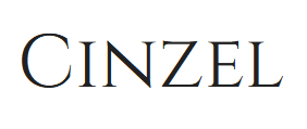
Does the Cinzel font appear to carry a classy vintage vibe? That’s because the font was inspired by traditional Roman inscriptions. Particularly, this one is noted for the legible high-contrast strokes.
If there are summer events meant to evoke a sense of grandeur then Cinzel is one of the best summer fonts for the job.
KIMP Tips:
- Due to the fact that this is an all-caps font, limit it to small text portions to avoid creating something too loud and overwhelming.
- Avoid pairing it with something crude or something very informal.
Still Can’t Choose the Best Summer Fonts? Let Your Designers Choose Them for You
In conclusion, there are endless typography choices to create the perfect summer aesthetics. But it all boils down to finding the right ones to suit your brand, your campaign, your audience, and your core message. If that seems like a challenge, working with a professional design team, like KIMP, helps. Ready to revolutionize your brand’s summer campaigns? Sign up for a KIMP subscription today.
Register now for a free 7-day trial!

