Capturing the Summer Aesthetic: Strategies for Seasonal Marketing Success
When the seasons change – so do lifestyles. As winter fades away and makes way for summer – as the focus shifts from mittens to margaritas. What does this mean for businesses? A call for new marketing opportunities. A shift in the marketing strategies. So, how can businesses don the summer aesthetic, embrace the new shopping patterns, and fine-tune their campaigns for the sun-kissed days ahead? We’ll tell you!
But summer marketing – should you really change your approach or plan special campaigns to welcome the sunny season? Well, think of what changes when summer makes an entrance:
- People are looking to revamp their wardrobe
- They want to bring some vibrant colors to their home aesthetics
- Some are planning their travel
- And most are looking forward to stepping out and spending time outdoors.
Evidently, with all these come changes in their spending pattern. Consequently, understanding these changes and aligning your marketing strategies to celebrate them will be great for your business.
In summary, yes, seasonal marketing campaigns like summer campaigns are great. And on-theme aesthetics are the key to making these campaigns work. In this blog, we’ll talk about creating the perfect summer aesthetic for your seasonal campaigns and then look at a few summer campaigns for inspiration.
Ready? Let’s dive in.
Craft the Perfect Summer Aesthetic: Tips for Marketers
Summer means different things to different people. The first step is to understand what summer truly means to your audience. This helps you come up with the best visual cues to establish the summer aesthetic. Additionally, this understanding also helps you plan the right campaign to boost sales and engagement.
Once you have these insights, then comes the question of how you visually represent the summer theme in your design. There are 5 effective tips to achieve this.
1. Find a picture-perfect summer color palette
Colors set the stage in any marketing design immediately communicating the mood and the theme of the design. Therefore, the first and foremost step in planning your campaign’s summer aesthetic is to choose summer-ready colors.
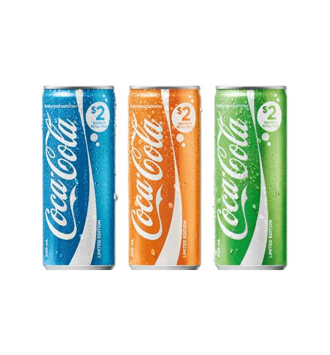
A few years ago, Coca-Cola launched its #colouryoursummer campaign featuring a range of limited-edition summer cans in bright vibrant colors. This is just one way of embracing the summer aesthetic through colors.
Overall, summer calls for bright sunny vibes and so go for vibrant colors that capture the spirit of the season. More particularly, here are a few quick ideas:
Looking to capture the energy that comes with summer? Then go with warm and energetic colors like sunshine yellows, oranges and even combinations of these colors. The below design exemplifies this idea.

Or if the goal is to capture the relaxation that comes with summer, the lazy beach days, and vacation, then go with calming colors like blue – and other nature-inspired palettes as you see in the below design.

KIMP Tips: Look for inspiration from the year’s color trends. Additionally, the chosen color should also resonate with your brand or the campaign somehow. That’s when it seamlessly blends into the design.
2. Adding visuals that capture the summer mood
The key to creating the perfect summer aesthetic is to transport users to the heart of the season. To achieve this, incorporate happy summer scenes:
- Photos of people having fun on the beach
- Families splashing in the pool
- Friends enjoying barbecues
- Couples strolling through sun-drenched parks
- Or children building sandcastles by the seashore.
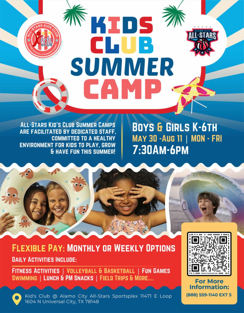
You can always align the photo with the summer campaign you are promoting to create a stronger visual impact and establish the theme effectively. The below flyer, for example, promotes a summer camp for children and hence the photo of kids with swim rings feels accurate and on-theme.
Similarly, identify the most relevant visuals for your design to create an impactful summer aesthetic.
3. Use personalized summer illustrations for authenticity
Imagery adds more depth to any design – that’s an evident fact. So, when creating a summer aesthetic by incorporating relevant imagery, if photos don’t seem relevant, illustrations are your best bet. This could be because you want to prioritize product photos or perhaps you want to use something unique and not just common stock photos of summer scenes.
In all such instances, you can explore custom illustrations featuring summer scenes. This adds a playful touch to your design. It also helps you customize the overall visual style to align with the campaign’s theme.
In the below social media design, for example, the illustrated plumeria helps create a summer aesthetic while also ensuring that the focus is on the cars and the message.
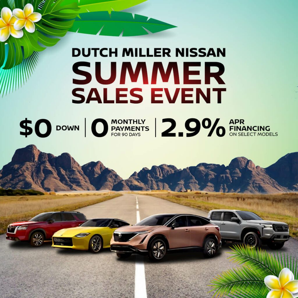
4. Sprinkle some sunshine through summer-themed icons
Sometimes, the idea is to promote your product, and elaborate summer-themed illustrations and photos might look out of place. In such cases, you can still establish the summer aesthetic by using simple summer-themed icons.
They could be flip-flops, sun, beach, palm trees, sunglasses, ice-cream cones, or even nautical elements. Or if you are promoting a specific activity, like travel during the summer vacation, for example, you can always add other related icons like suitcases and picnic baskets. Basically, anything that captures the summer state of mind.
Minimalistic doodles like the ones you see in the below email design will do the trick. Notice how the use of these summer icons like beaches and sun scream summer without deviating from the core message in the email.
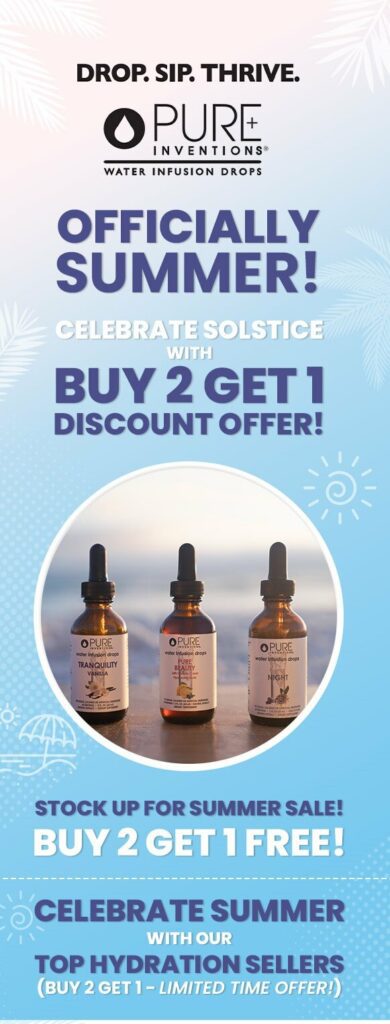
5. Make breezy typography choices
Without a doubt, typography makes or breaks the visual theme in a design. So, for your marketing designs to don the summer aesthetic you also need breezy typography that aligns with the theme.
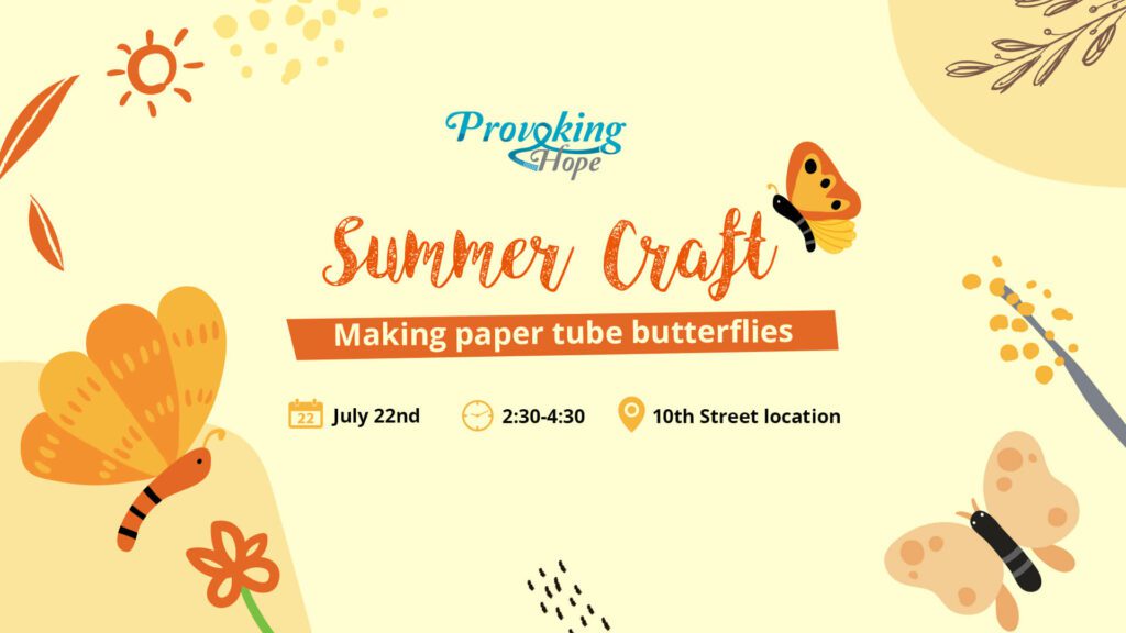
If it’s a fun event that you are promoting, a more casual font will be your best bet. Take the below web banner design for example. The fun Script font in it adds a lively twist to the summer campaign promotion.
Or if you do not want an elaborate font to interrupt the theme, a lightweight sans-serif font without a strong personality of its own will help subtly complement the theme. This will also ensure that the design is not too serious which is not something you want in a summer aesthetic.
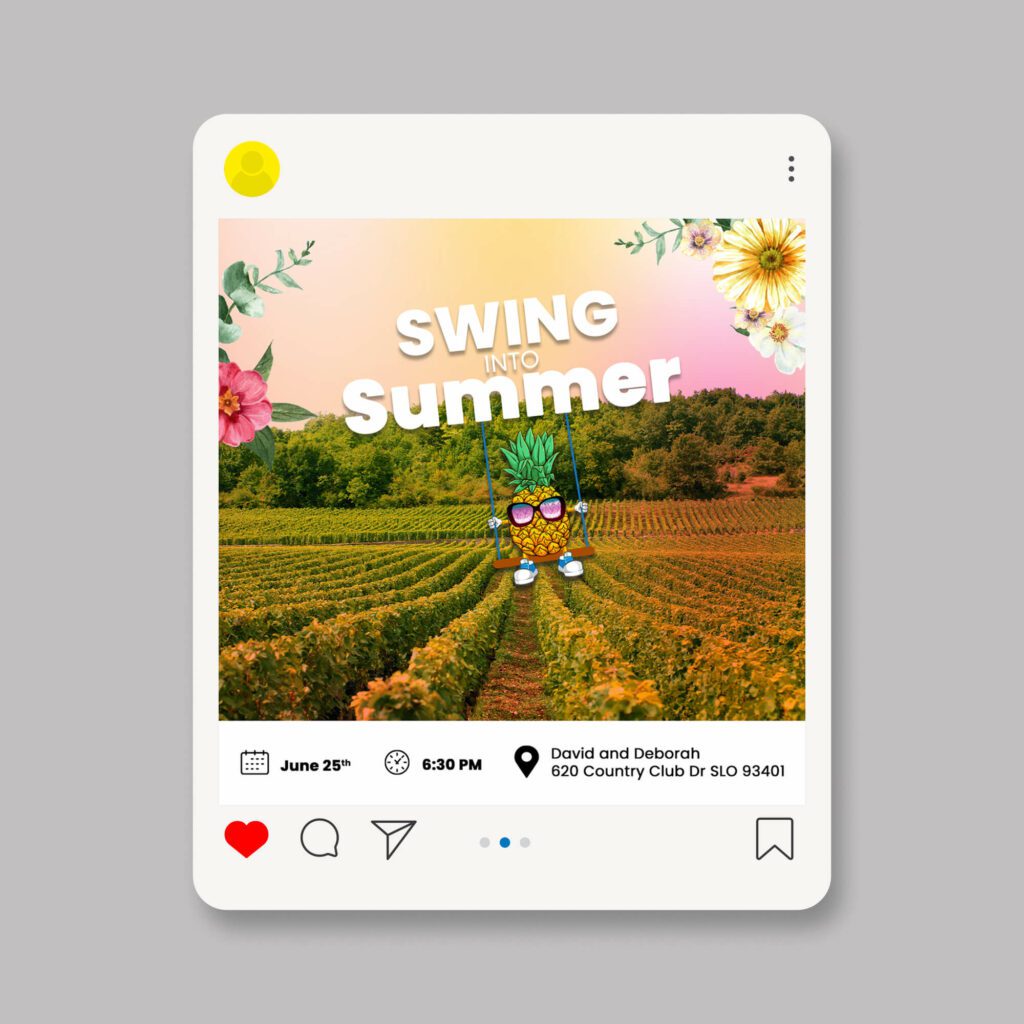
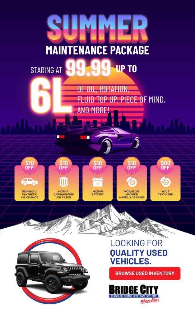
Besides choosing the right typeface or font family, how you style your fonts can also determine the effect. The below design shows how you can create a strong summer aesthetic through font styling irrespective of the typeface you work with.
The below design features a summer-sunset color theme which is also reflected in the colors used to style the word “summer” in the design. That’s just one way of using font styling to capture a summer aesthetic.
Now that you have a brief understanding of how to optimize your marketing designs to reflect a summer aesthetic, let’s talk about campaign ideas. We have rounded up some examples of summer campaigns from well-known brands for inspiration.
Summer Marketing: Campaign Inspiration
KitKat’s Summer Breakation
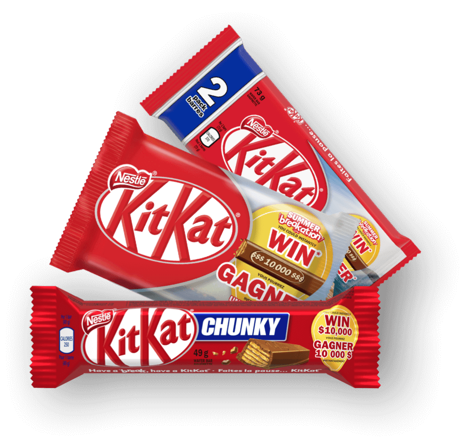
In 2022, KitKat came up with an engaging summer marketing campaign that let customers win a reward of $10,000 to plan their summer vacation. The campaign focused on the value of taking breaks and enjoying shared experiences during summer, resonating with the target audience seeking relaxation and connection in summer.
Moreover, the contest added an element of surprise, incentivizing purchase and engagement. Ideas like this one are more likely to boost sales as people purchase your product to try their luck and find the reward.
KitKat’s campaign here was simple but effective. Contests like this one are also pretty cost-effective. Because a campaign like this calls for:
- A few tweaks to your existing marketing designs – like the packaging design featuring the contest details and the winning ticket in the KitKat campaign.
- Promotional graphics like social media posts and web ads to promote the contest in the relevant channels.
But in return, you get boosted sales and increased brand mentions on socials too! These are factors that can help your brand stand out in the crowded summer campaign realm.
Need help customizing your packaging design for your summer campaigns? Get KIMP!
Mercedes-Benz Summer Event
The Mercedes-Benz Summer Event from a few years ago is a good example of creating limited-time sales as a part of your summer marketing. Tapping into the momentary spikes in shopping is one of the main objectives of seasonal marketing and Mercedes-Benz nailed this.
The event was about limited-time discounts on various Mercedes-Benz cars, along with a chance to win a tour of the Mercedes-AMG PETRONAS Formula One Team Operations Centre.
So, the campaign had both the crucial factors for engagement – rewards and a sense of urgency (the limited-time discounts on various cars).
The brand promoted this campaign through various social media posts as well as showroom advertising collateral in the respective showroom for a more localized approach.
Similarly, you can create a flash sale for summer focusing mainly on products in your catalog that are particularly relevant to the season. Because data shows that flash sales can boost transaction rates by about 35%.
When Carlsberg celebrated summer moments
The Carlsberg campaign promoted in the above video is a good example of using seasonal marketing to boost user-generated content. This was a campaign where the brand encouraged customers to share their best summer moments.
The brand also released a video compilation of some of the best moments shared by users on their website. By throwing the spotlight on user stories, the brand built authenticity and also effortlessly established how Carlsberg is a part of a majority of summer celebrations.
KIMP Tip: The brand used catchy web banners and short videos to celebrate the campaign and to announce the rules. To resonate with the summer aesthetic the brand included scenes that remind summer like summer sports and social gatherings. Engaging visuals like these are vital in promoting your summer campaigns and ensuring maximum engagement.
Nintendo’s digital freebies for summer
Freebies and branded merchandise in various forms are effective tools in seasonal marketing. They help communicate the theme of the campaign as well as motivate customers to engage with your brand.
The below post shows how Nintendo celebrated summer last year with its digital freebies. Digital products like stickers and AR filters are great branded merchandise options, especially for those last-minute campaigns! As long as the efforts expected of the customers are less, the campaign is sure to see a good conversion rate.
To celebrate this #PokemonPresents, you can now receive a special “Summer Fun” Jigglypuff in Pokémon Café ReMix! pic.twitter.com/OXHU2S5gd9
— Nintendo of America (@NintendoAmerica) August 8, 2023
In this case, Nintendo let users access the customized character in its summer outfit simply by logging in to their account. This is also a great way to retarget customers who have not visited your store or transacted with your business recently.
Lancome’s summer makeup tutorials
Educating customers is an evergreen idea to make your content work. Collaborating with influencers is a recently popular idea. Lancome combined both of these ideas in the below post.
Raise your hand if you're ready for the long weekend! 😎 Summer is the perfect time to add a pop of color to your makeup looks!
— Lancôme USA (@LancomeUSA) July 1, 2022
💓 Watch @JaleesaJaikaran and her sister, Shari share tips for a fun and colorful makeup look here: https://t.co/bg1TEp0RVU #HappiestTogether pic.twitter.com/HMFjxetMjJ
For this, the brand collaborated with beauty influencer Jaleesa Jaikaran and presented a makeup tutorial, particularly for summer. Thus the brand stayed within the theme and also created something engaging and useful to its audience.
This is a great idea to explore especially when you are looking to boost your local marketing strategies or niche marketing strategies with your summer campaign.
Bring Your Summer Campaign Designs to Life With KIMP
Irrespective of the campaign idea you choose and the content format you go with, visuals are an integral part of seasonal marketing. So, if you are looking to bring your summer marketing ideas to life, then you need strong visuals that accurately capture the summer aesthetic. A professional design team can help you there. And one way to cost-effectively tackle all your design requirements for your seasonal campaigns while also ensuring that your regular visual content workflow is not interrupted, a design subscription like KIMP might be just what you need.
Want to experience the perks of unlimited design? Register now for a free 7-day trial!
