When And How To Update Your Email Newsletter Design
Your email newsletter design plays an important role in building a relationship with your customers. And making sure that they connect with your brand, keeping you top of mind for when they’re ready to make a purchase. From the moment they subscribe, your newsletter design actually does a lot of the heavy lifting to keep your audience engaged.

This is why it’s important that you update it as needed to effectively get your messages across. And create value for your subscribers. In this blog we’ll be looking at some of the most common reasons you might want to update your email newsletter design. And how you can do this effectively.
Perks of having a well-designed email newsletter
- Channeling organic traffic to your website.
- Increasing brand awareness, and gaining the trust and confidence of your customers.
- Reinforcing your marketing campaigns.
- Showcasing your knowledge of your industry and the challenges your customers face – along with solutions that you offer.
- Generating warm leads for your business.
- An effective way to successfully introduce new products and services.
Stats that you should know about email marketing
- There are more than 3.9 billion daily email users and this number is expected to increase 4.3 billion by 2023.
- Marketers who use segmented email campaigns have observed up to 760% increase in their revenue.
- In the past year, 78% of marketers have seen an increase in email engagement.
- Email newsletters have been found to be the most effective ways to nurture leads by 31% of B2B marketers.
A note about email open rates
You know that the success of an email campaign will depend on the open rate. What you might not know is that a subscriber simply clicking to open your email, is not counted in the email open rate. An email is only considered a part of the open rate if:
- A subscriber enables the images in their email preview or in the full email.
- A subscriber clicks the link in your email.
The open rate is then calculated taking into consideration the number of people who will open your emails, divided by the number of emails that failed to reach the subscribers or bounced back.
All this to say – you’ve got to give your subscribers reasons to open your email newsletter. So let’s get on to when and how you should update your email newsletter design.
When should you update your email newsletter design?
Changing up your email newsletter design can keep your branding looking fresh, and engage your customers more effectively. But to be successful, you need to be clear as to the objective you’re trying to achieve. With the goal in mind, you can then work with your designer to make the specific tweaks that will help you achieve it. Below are some of the reasons why you should think about changing your email newsletter design:
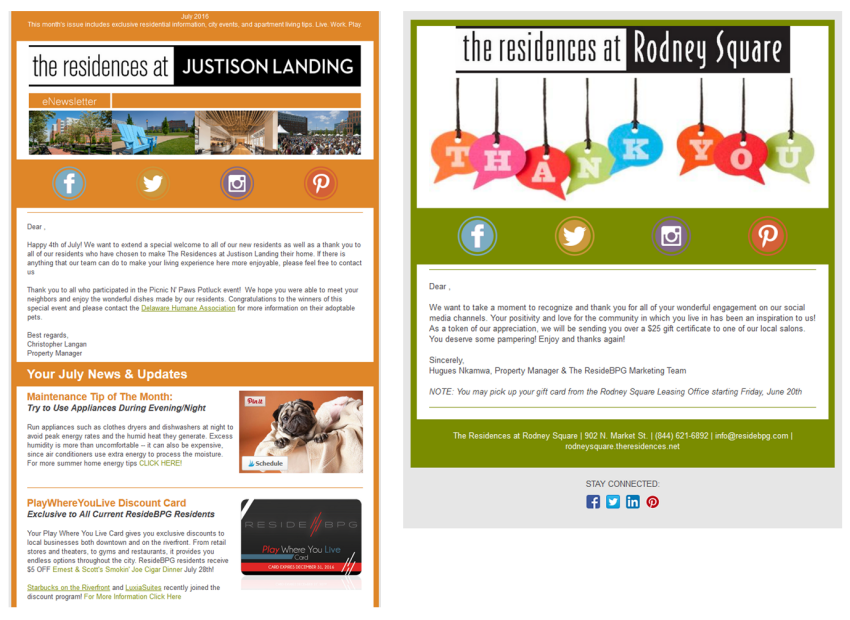
Update your email newsletter design to thank customers
If you would like to simply thank your customers for their support, especially in an unpredictable year like 2020, use a very simple design. Strip away any other information apart from the ‘thank you’ message. This will ensure that your intention comes across clear, and it won’t be misconstrued as a promotional or sales-oriented message.
Update your email newsletter design to celebrate a milestone
Celebrating a brand birthday or have just hit a milestone that you are feeling proud of? Share it with your customers and thank them for making it possible. You’ll want to break away from your usual email newsletter design to choose one that’s focused on this particular message. Let your designer know what the particular milestone is and the significance of it. This will allow them to choose the appropriate text and elements to emphasize.
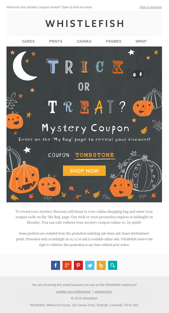
Update your email newsletter design to mark a holiday
Halloween and Thanksgiving are just around the corner. And in what seems like a blink of an eye Christmas and New Year’s Eve will be here. Your subscribers will be looking forward to these occasions, so get into the spirit with a themed email newsletter design. Updating your email newsletter design around a holiday is a fun way to connect with your customers. You can do this by wishing your customers a happy festive season, or promoting a related offer that you have,
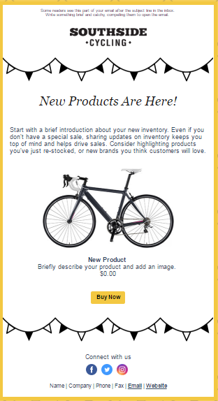
Update your email newsletter design for an impactful announcement
Have an announcement to make? Don’t want it to get buried under you usual email newsletter’s design various sections? Use this as an opportunity to simplify your usual newsletter and focus just on your announcement. In the example below, the emphasis in the email is to let customers know that new products are in store. And that message is the first thing that the eye is drawn to. Visual hierarchy, for the win!
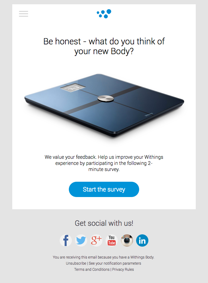
Update your email newsletter design to get feedback
Your email newsletter gets sent out to subscribers who have expressed their interest and investment in your brand. They did this when they signed up. So if you need feedback or insights into their experiences, your email newsletter is a great way to ask for it. Consider sending out a survey and providing a discount or entry into a contest in return for the responses.
How you can improve your email newsletter design
Now that we’ve coverd why you should update your email newsletter design, let’s take a look at how to do it. Here are some tips to keep in mind:
Change the templates that you are working with
Consistency is key for branding. But that doesn’t mean you should use the same templates until the end of time. If the template you are currently using gets you good results, it could be tempting to continue to use the same template over and over. But over time your results will diminish. You’ll eventually cross the threshold from repetition that means brand recognition to repetition which means your subscribers tune out.
You can proactively try out a new variation on your design every quarter, 6 months, or year. Or keep an eye on your results to see when they are decreasing, and make your update at that time. When you do roll out a new email newsletter design try doing some A/B testing to see what works best. If you need a hand with coming up with different variations, at Kimp we include unlimited design requests and revisions as part of our flat fee.
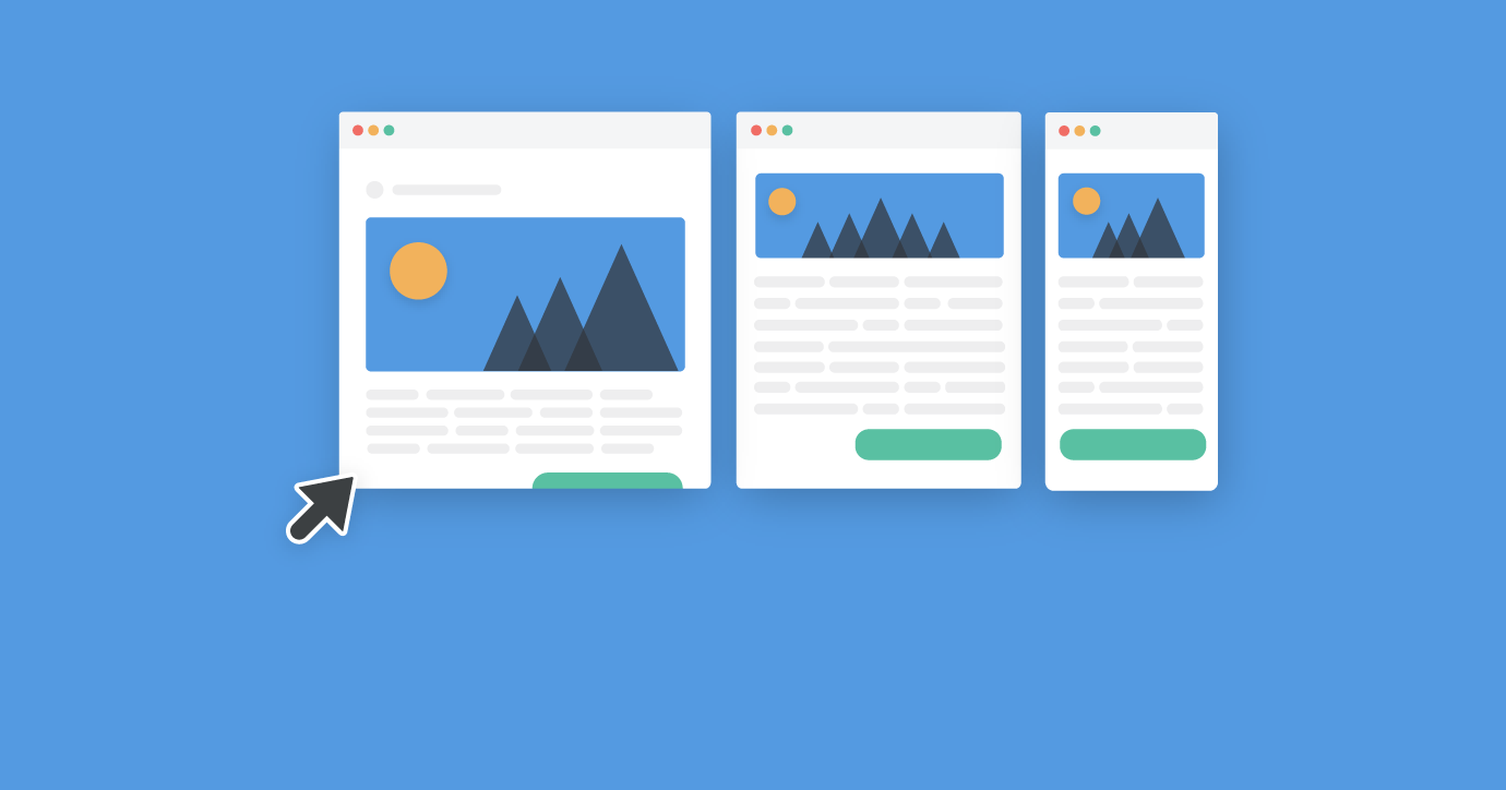
Use responsive email designs
Guess what? Emails that are not responsive across devices get deleted in just 3 seconds after being opened! Since readers will access their emails across a wide range of devices, your emails have to be responsive. Or your subscribers will not be able to see your full email or they won’t be able to make it out clearly.
Reduce options and see actions increase
In a study, a group of shoppers was offered a choice of 24 different flavors of jam. Another group was offered just 6. Surprisingly 30% of customers bought jam after they tried the 6 flavors. Only 3% of customers bought jam after they were given 24 flavors. Human beings can become overwhelmed when they have way too much to choose from. And while this may feel counter intuitive, offering fewer options is the way to get more actions. So in your email newsletter, cut down on the number of choices that you are giving your subscribers. And make sure that your content is super focused. Don’t try to cover everything and anything about your business and what it has to offer. Focus on what matters most to your subscribers and customers.
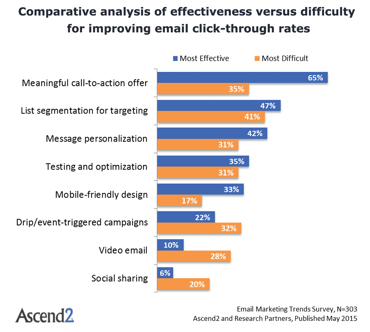
As seen above, having a meaningful CTA also plays an important role in improving click rates as opposed to something that is generic.
Send out more emails, but with less content
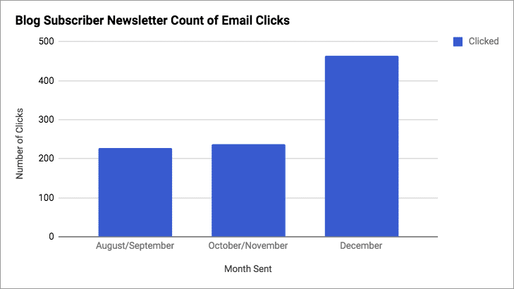
Kayako is a company that decided to completely revamp their email design. They initially sent out a bi-monthly plain text email with three links to their blog. And they switched to a weekly blog that was more visually appealing, and focused on just one blog. This new format directed customers to their most engaging content instead of splitting their focus.
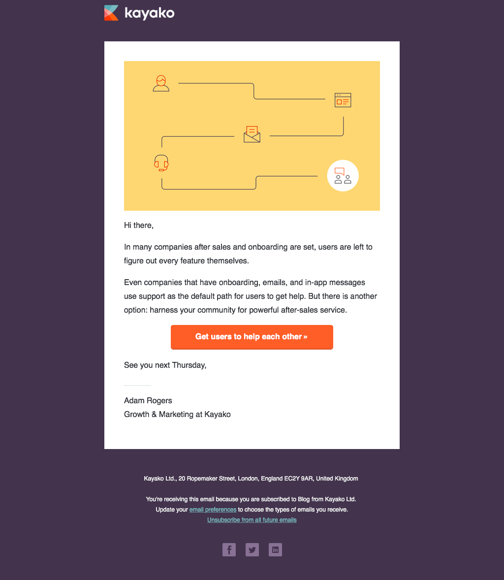
Kayako’s updated email newsletter design has less copy and a compelling CTA button. It also has an attractive color palette that reinforces the brand, a custom header design, and social buttons.
Even at a glance you can see that after the revamp, the design is much better than before. And guess what? Their click rates doubled too!
A/B test your new email newsletter design
Rather than waiting for results after you have sent out your emails, you can actually do some A/B testing. For example, version A could have a feature post and three supporting links. And version B could have a single feature post. Then send out the emails to different sets of the same segments to see how your subscribers respond. You’ll want to run this test over a few weeks to be sure you’ve got accurate results.
How good is your content?
A lot of the time, B2B emails will follow a similar format. But when you think about B2C emails, the competition is much more fierce. It really is a free-for-all, with the brands with the best designs and content getting the most engagement. So when it comes to your content, keep it focused, and clear. Let your customers know what they can expect in the subject line itself. Your customers may be reading the email while they are travelling or when they have a few free minutes. Show them that what you have to offer is more than worth their time.
Ready to update your email newsletter design?
Your goal with your email newsletters is to build and maintain relationships with your customers. This then helps you with generating more engagement and conversions. And that’s why changing up your email newsletter design from time to time isn’t just a matter of aesthetics. So be sure to assess if your designs are engaging, your content is original, and if you’re offering genuine value to your customers. Figuring out and acting on those answers will help you get the biggest ROI possible for your business.

