Holiday Packaging: 7 Useful Tips For An Irresistible Design
The holiday season is just around the corner, and you know what that means – the rush for the perfect gifts and festive essentials is on! Are you ready to make your products stand out in the holiday shopping frenzy? Now is the perfect moment to dive into the world of holiday packaging and infuse that magical touch.
Picture this: shoppers are dashing from aisle to aisle, browsing countless online listings, and it’s all about those initial impressions. Your holiday packaging can be the showstopper that instantly attracts customers, signaling that your brand is dressed to impress this festive season.

But here’s the big question: How can you make your packaging radiate that holiday charm? We’ll answer that question in this blog.
We’ll talk about some nifty secrets for crafting the perfect holiday packaging. Because we know how important it is to capture the festive spirit and make your products shine amidst the competition. So, are you ready to unwrap some holiday packaging secrets? Let’s go.
Holiday Packaging – Reasons Why It Matters
Every business wishes to tap into the buying frenzy during the holiday season. After all, the holiday retail spending is projected to reach $1.3 trillion in 2023. Therefore, custom holiday packaging tailored to this festive period can have a significant impact on your business. Let’s talk about some points that reiterate this significance:
- Did you know that about 27% of the total retail sales in the U.S. happened in the fourth quarter? Custom holiday packaging positions your products to capture a significant share of this lucrative market.
- Data shows that when it comes to shopping during the holiday season, nearly 56% of Gen Zers look for inspiration from TikTok and about 38% of Baby Boomers look for inspiration from Facebook. So, if your product manages to catch the spotlight on social media during holidays, there is a good chance of boosting sales. Creative festive packaging motivates customers to share content like unboxing videos thus increasing the exposure for your brand.
- Unique holiday packaging can make your products memorable. It’s a valuable branding opportunity, especially during a season when competition is fierce.
Do you want to leverage these benefits for your business as well? Then without a doubt, it’s time to consider revisiting your brand’s packaging for the holiday season. In other words, it’s time to work on your holiday packaging design. If you are looking for ideas to personalize your holiday packaging, then we have some tips + examples from brands as well. Let’s get to it.
7 Tips For Crafting Memorable Holiday Packaging
1. Keep it simple and memorable
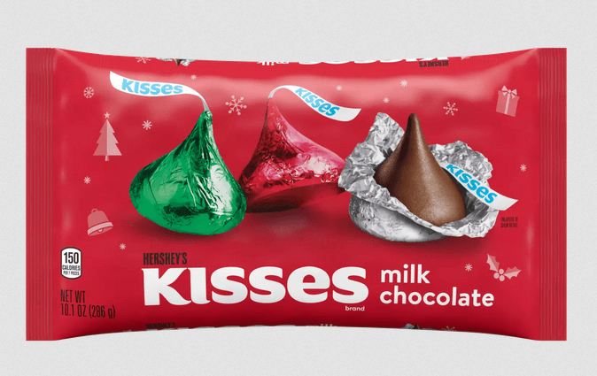
Believe it or not, less can be more in holiday packaging. Because the shopping aisles are filled with products in fancy festive designs and a flurry of colors, a minimalistic design can set your brand apart. This is the idea that Hershey’s went with, in the below holiday packaging.
The above design works because it stays cohesive with the packaging design for the rest of the Hershey’s Kisses range thus preserving the brand’s identity. Instead of going with the usual cluttered layouts and elaborate backgrounds, the brand chose to go with a simple background adorned with relevant Christmas symbols. This minimalistic approach works in the brand’s favor.
Similarly, come up with a simple holiday-themed design that incorporates the right colors – like the reds and greens in the above design. Or if it’s for the New Year, you could include grand colors of celebration like silver and gold.
Simple designs like this one allow you to make the product or the core subject in your packaging design stand out. Which is pretty essential, especially for a food brand that’s meant to show off the mouth-watering delicacies inside.
2. Consider interactive designs
Considering the amount of competition you tend to face during the holiday season, you need creative ideas that impress people and convince them to interact with your packaging. That’s achievable through simple design modifications. Remember those delightful limited edition Coca-Cola bottles where the labels could transform into bows? This old campaign is gold in holiday packaging inspiration.
Ideas like this one add an element of fun and encourage users to interact with your brand and remember it beyond the first purchase. To replicate this idea for your brand, design packaging with layers that can be peeled away or opened, revealing hidden patterns or messages underneath. It’s like a mini-unwrapping experience.
Ideas like this one allow you to maintain a sleek on-brand design on the outside like the signature red label on the Coca-Cola bottle with just the difference of the festive adornments in the design. Or if you would like to establish interactivity without spending on additional packaging material, include QR codes in your packaging or labels. This can then lead to a landing page with further interaction that establishes memorability.
KIMP Tips:
Ensure that the landing page designed for your campaign is visually cohesive with the holiday packaging design so as to ensure a seamless transition.
One way to ensure that your customers check out the exclusive holiday packaging you have introduced is to add a short video on the same on your website and social media pages.
Want to bundle up all these designs in one design workflow? Get a KIMP Graphics + Video subscription.
3. Create versatile customizable templates
One of the most efficient strategies in holiday packaging design is creating versatile templates that can be personalized for multiple festive occasions. By having a base design that you can alter for various holidays and celebrations, you save time and resources while maintaining a consistent brand presence.
For example, when you create one solid base design and popularize it around Christmas, you can then tweak it a little and you have another new design to work with for New Year.
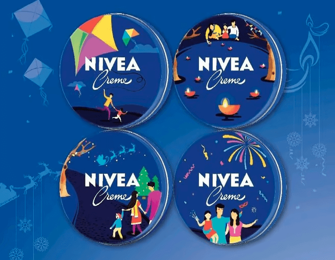
Nivea introduced a limited edition winter range in India with the below adaptable design. The designs were to celebrate the four main holidays in India in winter, namely Diwali, Christmas, New Year, and Makar Sankranti.
From the illustration style to the character themes, there’s consistency in various elements. Together they establish the core template. The subtle visual cues and illustrated icon adornments in the design establish the respective festival’s theme.
KIMP Tips:
To create an easily customizable design here’s what you can do:
- Create a base design that reflects your brand’s identity.
- Include modular design elements that can be easily swapped or adjusted, such as color schemes, fonts, and festive graphics.
- Lay down a set of symbols or illustrated icons that can be used as visual cues to represent each holiday.
- Use these elements to create different holiday packaging designs for different holidays.
4. Allow users to add their personal touch
Allowing users to add their personal touch to the holiday packaging is a game-changer. It not only creates a more intimate connection between your brand and the customer but also provides an opportunity for them to express themselves.
This can be in the form of a designated space on the label or dedicated stickers where customers can add personalized messages, making the packaging more suitable for gift-giving.
If feasible, allow customers to upload their photos or artwork to be incorporated into the packaging design. This personalizes the product and makes it truly one-of-a-kind. Or perhaps the option to personalize just the colors on the label.
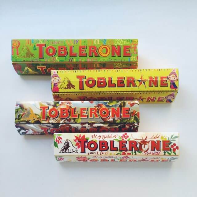
Toblerone achieved this with its #BeMoreImaginative campaign that introduced holiday packaging designs featuring creative works of celebrity artists and some blank packs.
5. Reimagine festive gift-wrapping designs in print
Reimagining the appearance of gift-wrapped boxes, complete with bows and all, can add an extra layer of charm and nostalgia to your holiday packaging suitable for both Christmas and New Year. When your packaging looks pretty and festive like a holiday gift box, it eliminates the need for gift wrapping and excites your customers too.
Krispy Kreme’s festive donut collection box is a good example of such holiday packaging designs.
To use this idea for your brand, use patterns that resemble traditional holiday wrapping paper for Christmas. You could also add festive elements that symbolize New Year celebrations like fireworks or confetti.
KIMP Tips:
When opting for such elaborate realistic designs, ensure that you choose high-quality printing techniques.
Additionally, printing techniques that create a tactile 3D effect or embossing details to mimic the texture of bows and wrapping papers add more value to the design further enhancing the experience.
Need help creating print-ready designs? Get a KIMP subscription.
6. Be mindful of the year’s design trends
The next tip is to make your holiday packaging relevant to the design trends of the year. Given the timing, you could take cues from the design trends of the running year or from the anticipated trends from the upcoming year.
From colors to visual themes, look for trends that align well with your holiday campaigns for the year and with your brand’s personality.
Starbucks, for example, introduced its lineup of holiday cup designs recently. Reportedly, these vibrant prints and patterns are inspired by the trend of using “bold and uplifting” colors.
To add variety the brand has introduced not one but four different prints for the holiday cups each being a creative interpretation of the festive green and red color combination. What makes these designs even more special are the elements that these designs are inspired by.
- The Partly Plaid cup, for example, takes cues from plaid scarves popular around winter.
- Whereas the Peppermint Swirl cup includes patterns that mimic peppermint candies.
- The Ribbon Spool edition evidently draws inspiration from ribbons which are popular during the gifting season.
- And finally, the Bauble Wrap patterns on the cups are a nod to Christmas baubles that adorn a Christmas tree.
That’s one way to incorporate Christmas symbols creatively into your holiday packaging. You can do the same thing by using relevant symbols like fireworks for New Year as we discussed in the previous section.
7. Do not ignore sustainability in the process
Amid the excitement of designing festive packaging, it’s crucial not to overlook the sustainability aspect. Data shows that nearly 71% of consumers choose products based on the sustainability aspect of the packaging. Furthermore, about 5 million tonnes of additional waste is generated on average during Christmas. These come from festive decorations, wrapping papers, and more.
So, any effort your brand makes to make sustainability an integral part of your holiday packaging works in favor of your brand.
Start by selecting eco-friendly materials for your packaging. These can be in the form of recyclable, biodegradable, or sustainable options that minimize the environmental footprint. Additionally, use limited resources instead of including unwanted packaging material.
Another way to do this is to encourage reusability by creating packaging that serves a dual purpose. Or something that your customers can easily repurpose. By doing this you are extending the life of your packaging beyond the holiday season.
One way to achieve this is to go with a minimalistic design that uses less ink and materials. Another is to adopt eco-friendly printing methods that use sustainable inks and materials, minimizing the environmental impact of the production process.
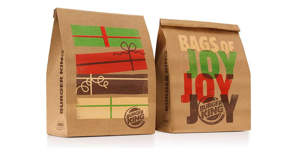
Such minimalistic designs do not have to be boring. You can use cheerful illustrations in bold beautiful colors that look good even on eco-friendly packaging materials. The below takeaway packaging designs from Burger King show how creativity boosts the visual appeal of sustainable packaging materials.
Executing Your Holiday Packaging Ideas
Now that we’ve explored the essentials of holiday packaging design, let’s delve even deeper into some extra tips that will make your packaging truly unique.
- Use AI to your advantage. AI image generators, for example, can be used to spark fresh design ideas. These tools can instantly create mockups so you can visualize your design before execution.
- Pay close attention to color accuracy when designing for print. Utilize color management tools to ensure that the hues chosen for holiday packaging digital design translate accurately to the final printed packaging.
- An additional requirement to ensure print-ready designs is to use high-quality images that do not look pixelated or distorted when scaled up or down on packaging.
- Select fonts that are legible in print and also consider their appearance on various packaging materials. For example, will the material add any textures that might interfere with the design?
While accommodating all these tips, working with a dependable dedicated design team makes things simpler. And if this also includes unlimited designs and unlimited revisions, experimenting with your ideas and fine-tuning them before the actual print becomes easy. That’s why several businesses opt for an unlimited design service like KIMP, especially during rush seasons like the holidays. Ready to explore the merits of unlimited designs this holiday season? Register now for a free 7-day trial.


